Get all your news in one place.
100's of premium titles.
One app.
Start reading
Creative Bloq
Creative Bloq
Technology
Joe Foley

The world's oldest football club just modernised its logo design, and fans are furious

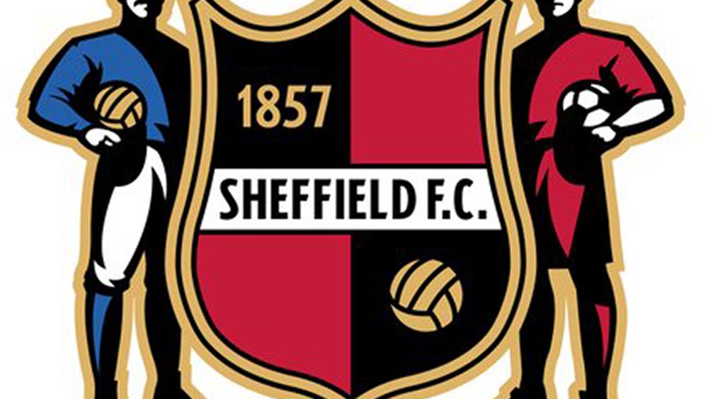
Sheffield FC logo.

Just while we were distracted by the World Cup, ranking the best World Cup mascots and the best World Cup logos, a controversy has exploded over the branding of the world's oldest football club. Sheffield FC has a new logo design, and it's not going down well with fans.

The English club was founded in 1857 and is recognised by FIFA as being the oldest still in existence. Until now, its logo had maintained design elements that have been part of the club's identity for most of that time, reflecting a proud heritage. The new one... well, you decide and let me know what you think in the comments.

Out with the old and in with the round. The old Sheffield FC logo (left) and the new design (right) (Image credit: Sheffield FC)

Revealed ahead of the 2026-2027 football season, the new Sheffield FC logo ditches almost every element of the previous design, from the shield to the two players that have always flanked it and even most of the colours. Instead, it's yet another roundel logo (see our features on the basic types of logo and why football clubs are changing their logos.

The radical modernisation strips the club's identity down to core elements: its name plus the abbreviation SFC, the year the club was founded, and the simplified declaration 'The First Club' (as in the first club of any kind?)

A post shared by Sheffield Football Club (@_sheffieldfc)

A photo posted by on

According to the club, which currently plays in the Northern Counties East Football League Premier Division, the new logo was inspired by its unique status as holders of a historic gold medal and FIFA Centennial Order of Merit.

The aim was to honour the past while marking a new chapter, it said. But for many fans, if there's one club that didn't need a modern logo, it's the oldest football club in the world.

Fans have described the new logo as “boring” and simply “horrible”. “The oldest club doesn’t need a 'modern' badge,” one complains on Instagram. “Why does it look like a logo for a high end, 5 star Chinese restaurant?” someone else wants to know.

Others have more technical misgivings. “The spacing of the text over the top arch is off, the font itself is poor. The SFC in the middle is unclear. It’s really poorly designed,” one person writes.

As with most recent football club rebrand, the aim in simplifying the design was probably to make the logo more versatile and easier to apply in digital contexts.

However, some fans are proposing alternative designs, suggesting that, if really deemed necessary, modernisation could be achieved without abandoning the design legacy of previous badges.

What do you think? Does Sheffield FC's new logo prepare it for a new era, or does it no longer look the part as the world's oldest club?

For more inspiration, see our pick of the best sports logos.

Sign up to read this article
Read news from 100's of titles, curated specifically for you.
Already a member? Sign in here
Related Stories
Top stories on inkl right now
One subscription that gives you access to news from hundreds of sites
Already a member? Sign in here
Our Picks
Fourteen days free
Download the app
One app. One membership.
100+ trusted global sources.