There’s a moment in every room – often late in the process – when the temptation is to add just one more thing. Another lamp. Another layer. An object that feels too good to leave out. And yet, more often than not, the most important design decision happens right there: knowing when to stop.
I’ve always believed that timeless interiors are shaped through editing, not accumulation. Coco Chanel captured this perfectly when she advised removing one accessory before leaving the house. The same principle applies to interior design. Restraint isn’t about minimalism or austerity – it’s about clarity: letting the strongest elements speak without competition.
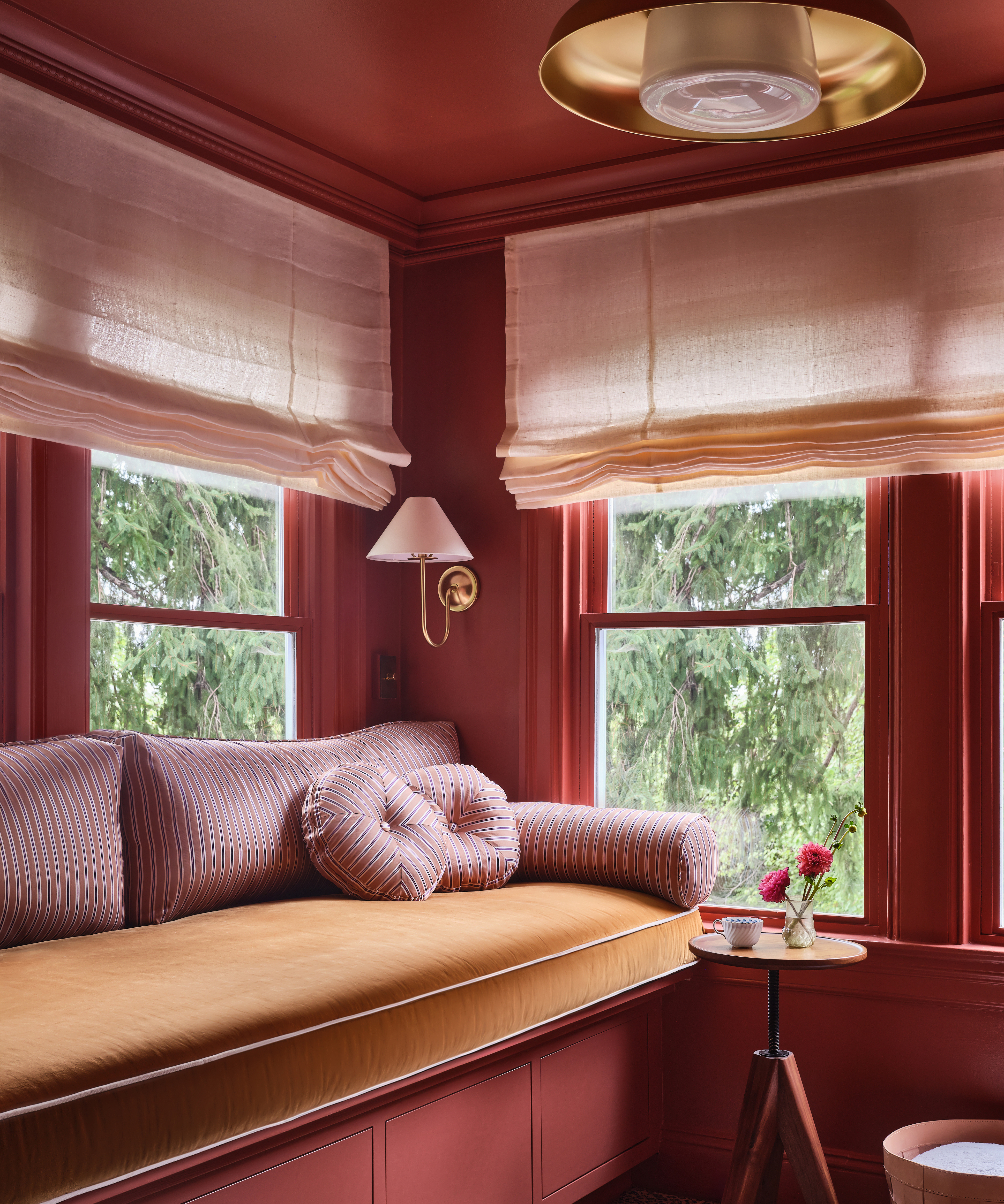
Punch still matters. I love drama, color, texture, and personality. But a room can’t have all main characters. When everything is vying for attention, nothing shines. That’s why I often think in terms of an 80/20 balance: eighty percent of a space acts as the canvas, while twenty percent carries the visual weight. Those star moments – whether a richly saturated wall, a boldly patterned rug, a singular piece of art, or a carefully curated collection – need room to breathe in order to be fully felt.
Before I design a room, I ask one essential question: where do I want the eye to go? That answer sets the hierarchy for the entire space. Maybe it’s an extraordinary painting, held in quiet relief against a tonal backdrop. Maybe it’s the geometry and color of a rug, anchoring the room while everything else steps back. Or perhaps it’s a story told through built-ins, where books, objects, and art come together as a single, cohesive composition. Once the focal point is clear, every other decision becomes easier – and far more disciplined.
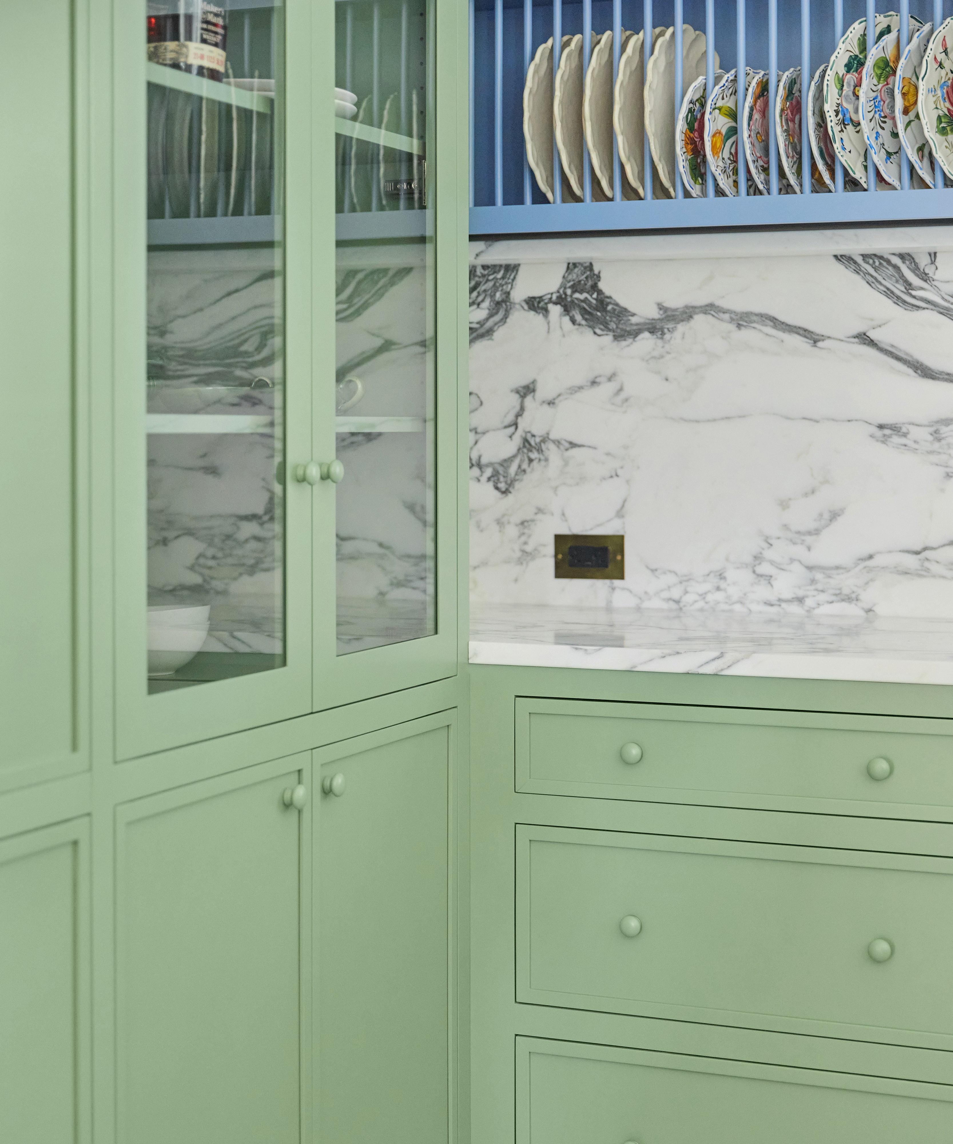
This is why developing a color story early is so crucial. At the start of a project, I map out what will be bold and what will recede – deciding which colors do the heavy lifting and which exist to support them. Where pattern leads, where color leads, where objects take center stage. A room doesn’t need every color in the palette to shout. Often, the most successful spaces rely on a restrained range, letting one or two tones take focus while the rest build richness and depth through material, finish, and texture.
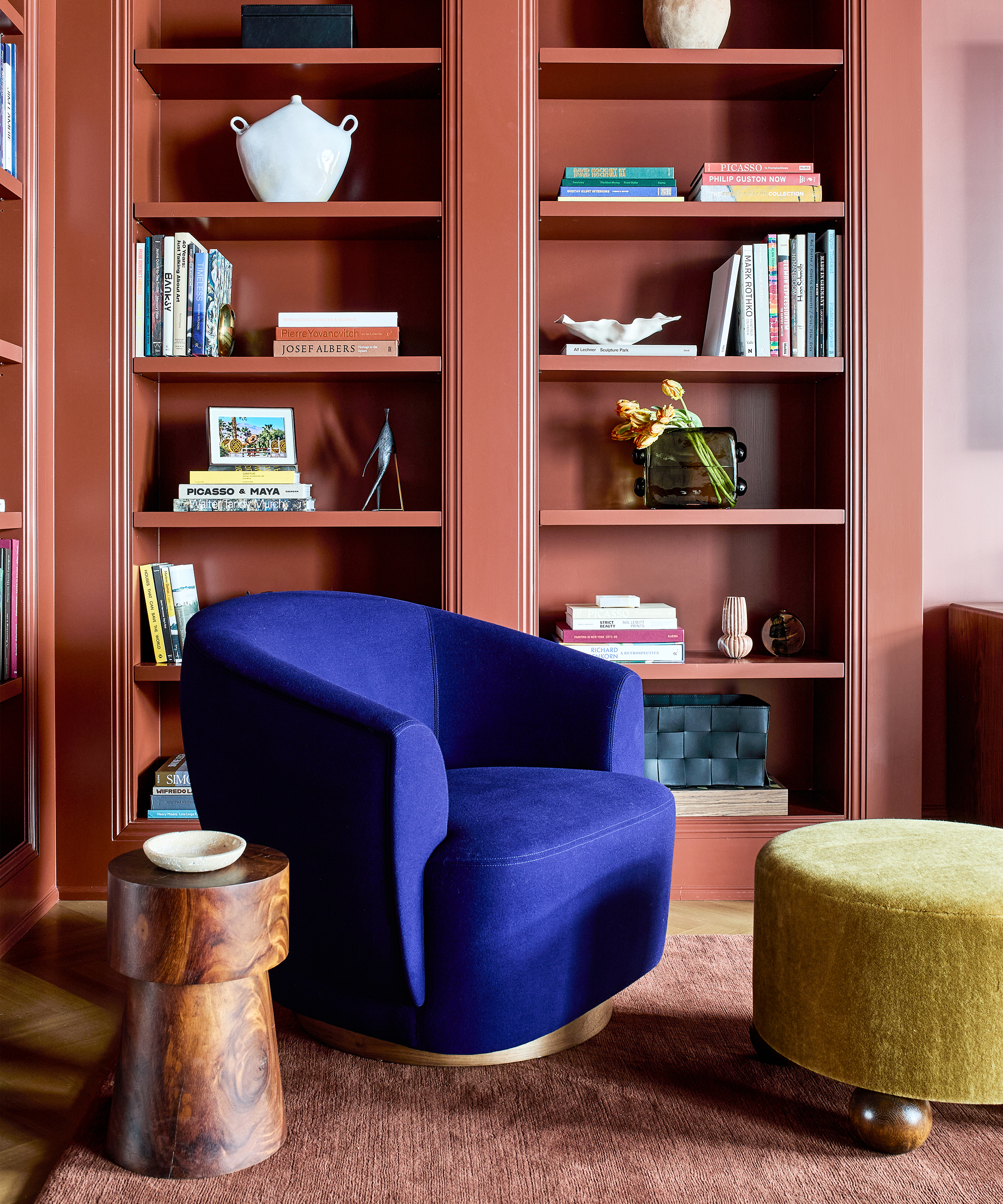
I think about push and pull constantly. If a rug is graphic and energetic, the upholstery might be calmer. If the walls are richly colored, the furniture can be sculptural yet neutral. Wood warms a space without adding noise. A hint of metal sharpens a palette without overwhelming it. These elements aren’t meant to compete – they’re there to reinforce the mood and create cohesion.
Restraint doesn’t make rooms boring. Quite the opposite. The most compelling interiors are often the most legible – spaces that feel intentional, digestible, and immersive all at once. They invite you in rather than overwhelm you. They reward attention instead of demanding it.
There’s a delicate balance at play. Rooms should feel full, but not overstuffed. Layered, but not cluttered. Energizing, yet calm enough to actually live in. When there’s too much visual noise, the eye has nowhere to rest – and when the eye can’t rest, the room never truly settles.
Editing is also what allows a space to age gracefully. Trends pass. Objects come and go. But a room designed with restraint has room to evolve. It can absorb new pieces over time without losing its identity. The most timeless interiors don’t exist in a vacuum; they live, leaving space for new colors, objects, and art – whether sourced from travel, gifts, or an irresistible urge for a sudden blast of room color.
Knowing when to stop is one of the hardest – and most important – skills in design. It takes confidence, patience, and the willingness to leave something out, even when you love it, especially when you love it. It’s like owning a beautiful piece of clothing: you don’t need to wear it immediately, or all the time, to know it belongs.
Good design isn’t about fitting everything in. It’s about showcasing the right elements so a room feels memorable rather than overwhelming. The best rooms aren’t the ones that show everything – they’re the ones that show just enough.