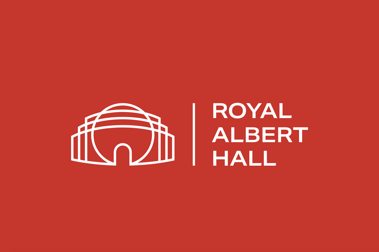
London's iconic Royal Albert Hall has unveiled a slick new brand identity, celebrating the artists, audiences, and staff that have shaped its 154-year legacy. Contemporary, lively and fresh, the revived identity is a beacon of accessible, adaptable design built for the future.
It can be a daunting task to rebrand an identity rooted in heritage, yet the Royal Albert Hall's rebrand feels both modern and timeless thanks to its flexible design. Built to grow, it's a brand refresh rooted in culture and enduring identity, crafted to resonate with generations to come.
Created by Global brand consultancy Brandpie, the rebrand is a digital-first evolution built to resonate with diverse audiences. “This project was about amplifying what makes the Hall amazing, not overshadowing that,” says Deva Corriveau, creative director at Brandpie. “The refreshed brand needed to honour and highlight the Hall’s role as a cultural catalyst and charitable organisation, without competing for attention.”
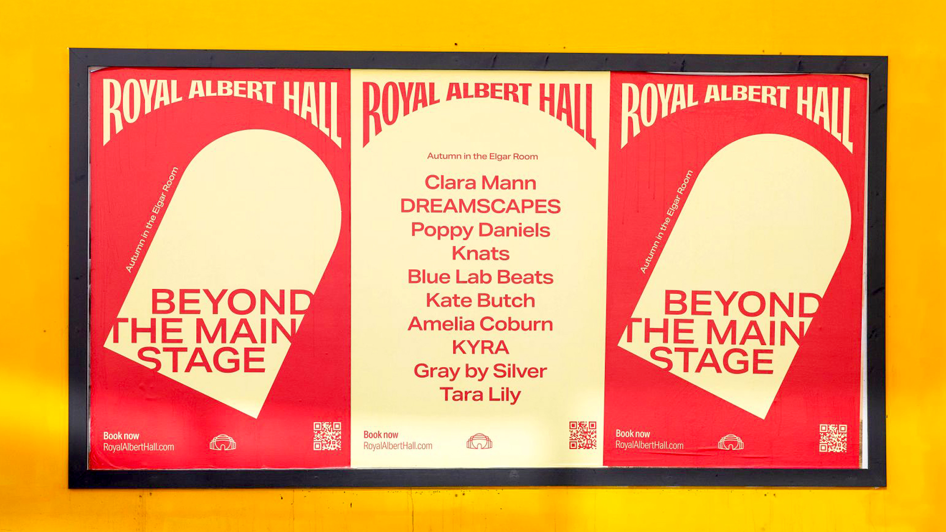
Central to the Royal Albert Hall's new identity is a curved motif that spans its new look, from typography to playful animation. The new icon logo features a contemporary rendition of the Royal Albert Hall's structure, paired with a new Masthead design that takes inspiration from hand-drawn Victorian typography and signage, embellished with "subtle nods to the bold poster graphics of the 1960s and 70s."
“We needed to apply craft and sensitivity – particularly with the Masthead – to find what worked for the Hall in today’s world. We rebalanced and refined the identity elements and simplified the system to re-establish a sense of pride and confidence in the brand,” explains Corriveau.
The typeface creates a sense of contemporary energy, using Aktiv Grotesk to build visual dynamism while staying timelessly elegant and accessible. The Hall's signature red has been refined to one bold 'Royal Red' tone, creating authority and cohesion throughout, while an extended secondary palette brings playfulness to the identity.
“We wanted to make something iconic and entirely ownable for this incredible organisation,” says Corriveau. “This was about elevating the Hall above the noise, amplifying what matters, and giving it the confidence to stand tall for decades to come.”
For more creative inspiration, check out this restaurant's vibrant branding or take a look at Soho Rep theatre's unapologetically weird poster art.