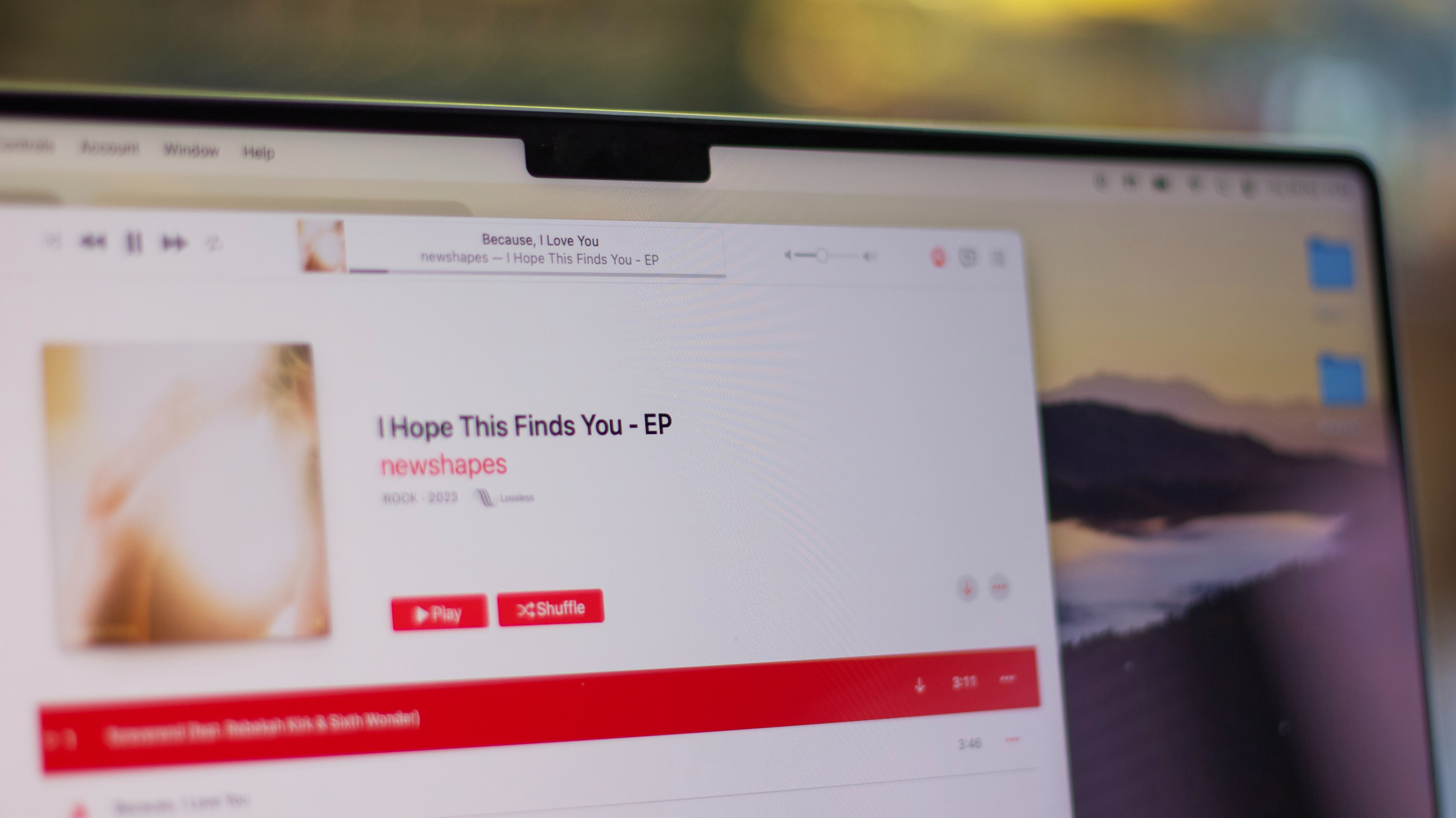
Why does Apple Music not understand how a 'like' button works? Why is this an issue in 2023?
I’m one of those people who have bounced between Spotify and Apple Music since Apple released its music streaming service in 2015 to compete in the streaming space. Then, when Apple rolled out its Apple One subscription bundle service in 2020, I made what has turned out to be a permanent switch — since the value of that bundle has been so great.
However, there has been one thing about Apple Music that has always bothered me, and it’s not that Spotify has a superior recommendation algorithm or that it has much better playlists. It’s that Apple Music, for whatever reason, hasn’t figured out how to correctly implement a simple way to like a song.
Apple Music’s ‘like’ button has been broken for years
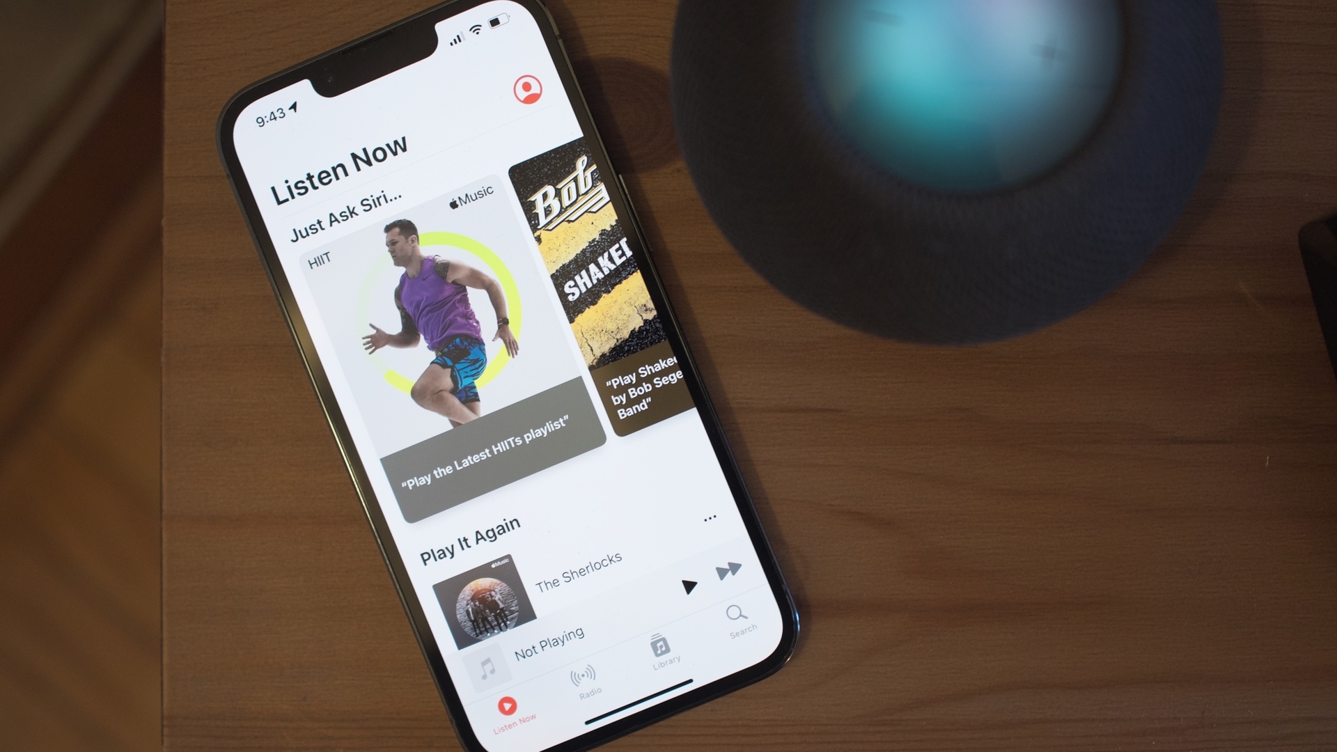
For years, Apple Music hid the 'like' button under a menu. When you were playing a song, you had to dive into the menu to find the option to like a song or add it to your library. Later, they finally brought this 'Add to Library' button onto the Now Playing screen, but kept a separate “like” and 'dislike' button in the app. I never understood the need for this — if I like a song, I want to add it to my library. Why make this more complex than it needs to be?
Then, Apple updated the Apple Music app with iOS 17 and I finally thought they had fixed the confusion — one like button to rule them all. But no! They somehow made it even worse. Now, the button on the Now Playing screen is to 'favorite' a song.
What happens when you favorite a song? It adds it to your library. Oh, okay. That makes sense. But wait! It also adds it to a new playlist called Favorites. What? Why in the world does this need to exist? Apple already has a Favorites playlist — it’s the Favorites Mix playlist that is automatically updated weekly for you. And there’s more! You can add a song to your library without favoriting it and adding it to that useless playlist, but that option is once again buried in a menu.
Apple Music, please rip off Spotify
This entire experience makes absolutely no sense. There are now two ways to 'like' a song and one does one thing and the other does two things. There’s also a 'dislike' button that is buried in the menu and that no one uses. Where is my 'it just works' company with this confusing piece of crap?
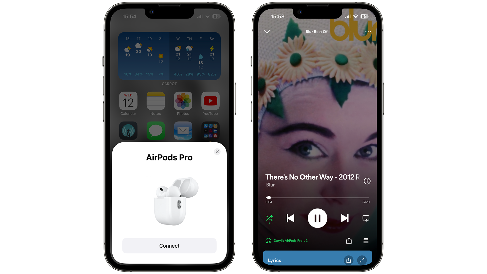
Please, Apple Music, just rip off Spotify with this one. The app has one button — an 'add' button — that adds a song to your 'Liked Songs' when you tap it. There’s no separate library and 'Liked Songs' playlist that you have to worry about. If you tap the “add” button after you already liked the song, a menu pops up if you want to add it or remove it from the playlists you have created.
That’s a great and simple user experience. There’s no separate 'like' or 'favorite' or 'dislike' button that you need to use in order to feed Spotify’s algorithm There’s one button. Do you like a song? Click the add button. That’s it. That’s all it needs to be.
I’m going back to testing both
Of course, Apple Music does have its advantages. The app is still the go-to streaming service for Lossless Audio quality and Spatial Audio, and a lot of artists have been releasing their music in these new formats on the platform. The Live Lyrics feature is definitely better than Spotify and the Now Playing update is far more beautiful and immersive than the Now Playing screen that Spotify currently rocks.
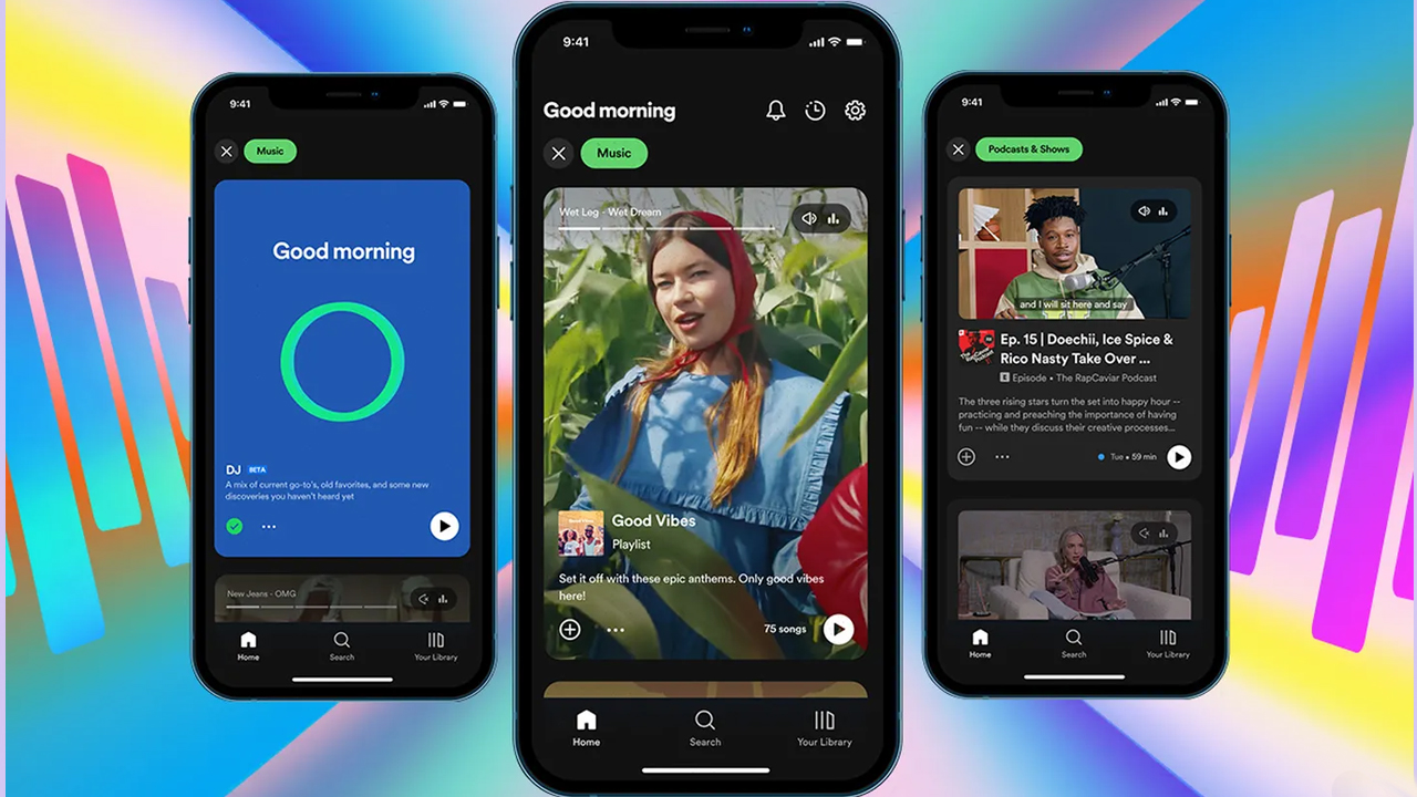
However, Spotify has added a lot of recent updates that make me consider switching back. From its new desktop, mobile, and TV app design updates to adding 15 hours of audiobook listening per month for Premium users, the company is really diversifying itself and adding a lot of value for its subscribers.
I’m going to give Spotify another try. With Apple One getting even more expensive and Spotify having a more coherent user experience, I’m interested to see if I’d prefer heading back to a world without Apple Music. At the very least, I’ll know how to actually like a song!

