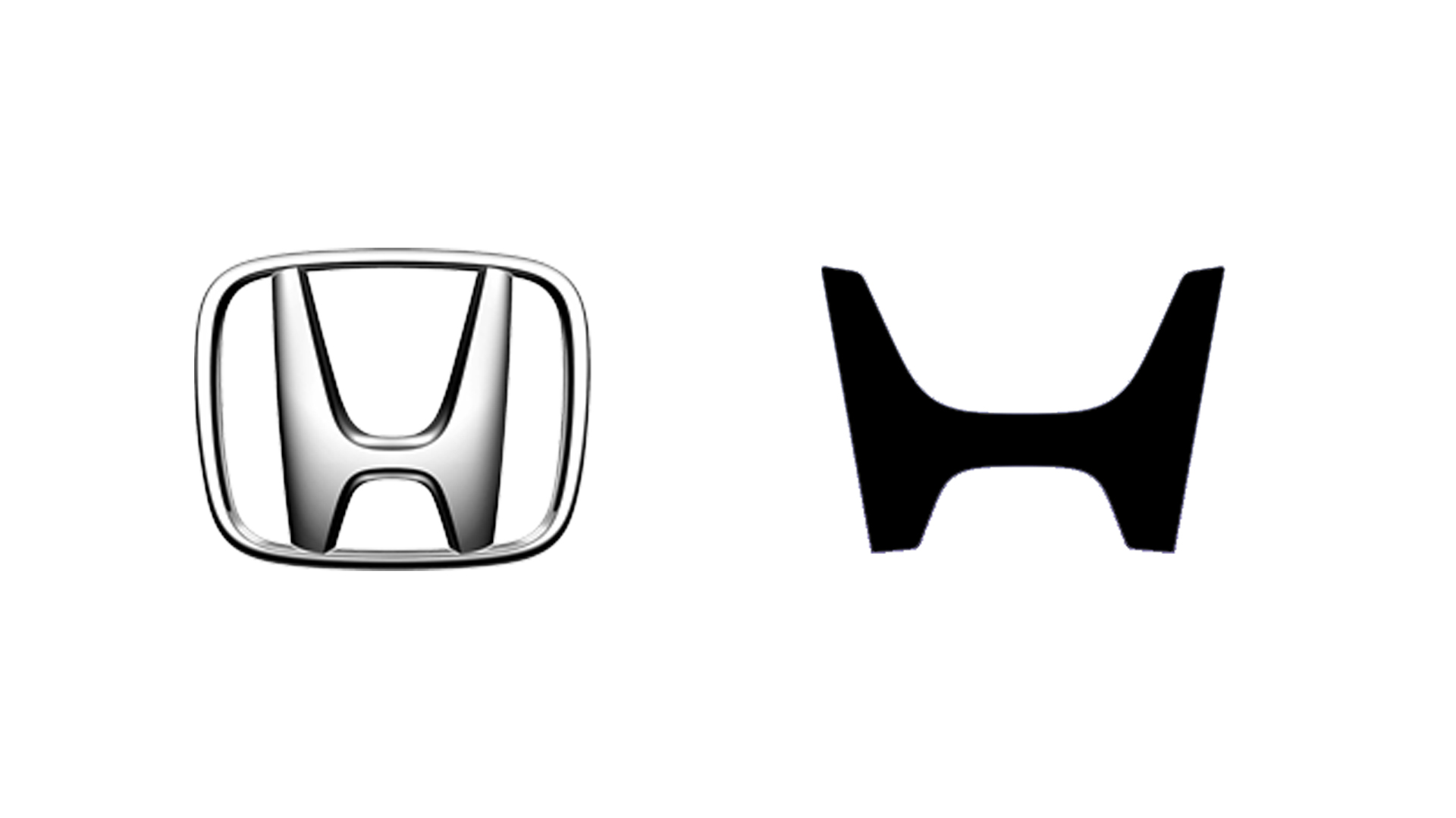
Logo trends come and go, and while simplified wordmarks were all the rage a few years back, things seem to be veering away from modernism once again – so much so that we've seen several brands take a leaf from their own history books when approaching new logos in recent years. And the latest to bring back an old logo with a modern twist is car manufacturer Honda.
At this year's CES, Honda revealed a bunch of new electric cars featuring an updated 'H' logo. Like most car brands over the last few years, Honda has finally moved away from the skeuomorphic metallic look. Honda has indeed opted for a flatter, simpler version of the symbol – but with its sharper lines and more outwardly angled points, this one actually harkens back to the brand's 1961 original. (For design inspiration, check out the best logos of all time.)