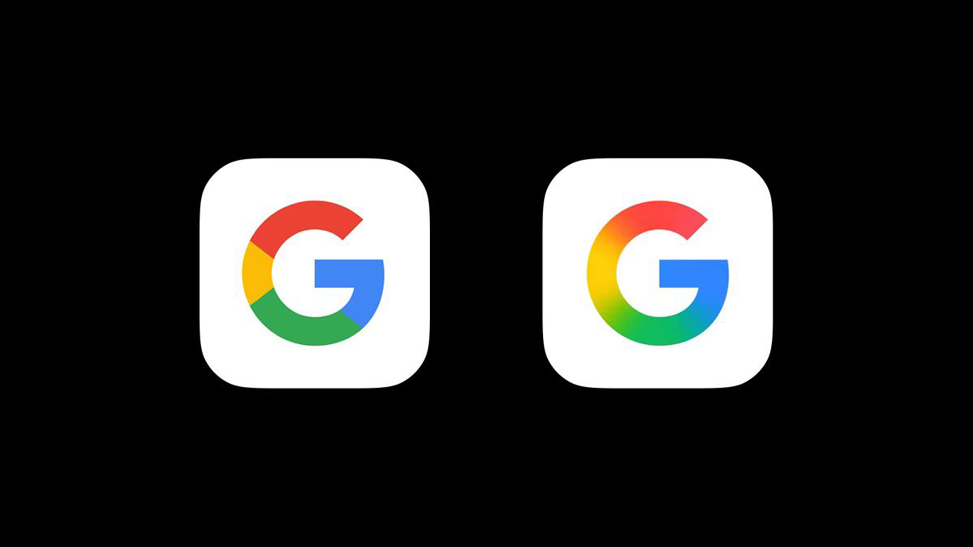
There must be something in the water in Silicon Valley. Several big tech and digital brands including Amazon and Adobe have revealed subtle tweaks to their logos this month, and now Google has dropped the first significant update to its logo in a decade. This one, however, is a little more noticeable.
Perhaps signalling the final death-knell for the harsh geometry of the flat design movement, Google has blurred the four colours of its 'G' logo into a rainbow gradient. The resulting effect is decidedly Instagram-esque, and, somewhat surprisingly for a logo that adorns millions of smart phone homescreens, the change is actually going down well. Is Google finally within reach of our best logos roundup?