
Without context, vast numbers are meaningless. Data can be incredibly dry, abstract and difficult to visualise. But sometimes scientists find clever ways of presenting complex information in creative, eye-catching and more tangible forms.
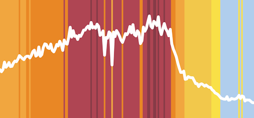
In 2019, Ed Hawkins, a climate professor at the University of Reading, created “climate stripes” to illustrate the global average temperature for each year since 1850 in the form of a coloured stripe. Now a cultural icon, these simple blue and red graphics have appeared on football kits, music festival stages and even a Tesla.