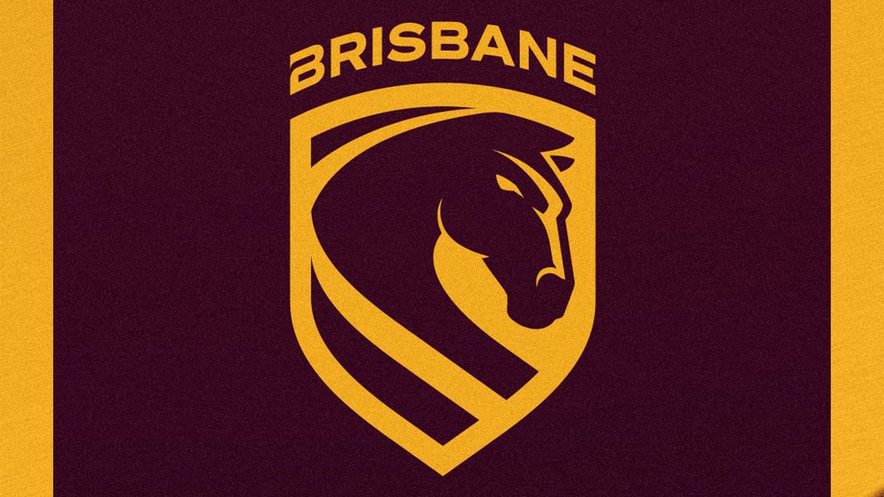
The Brisbane Broncos have unveiled a brand new logo – their first visual revamp in over 20 years. Rebrands are always a risk, but when it comes to redesigning beloved sports logos, designers have a whole fanbase to please. Understandably, it's not an easy task.
While the logo design marks a fierce new era for the Australian rugby team, the rebrand has received mixed reviews, from high praise to scathing reviews. With a thoughtfully crafted rebrand and a refreshed sense of identity, the Broncos charge forward with confidence in their new look, despite its divisiveness.
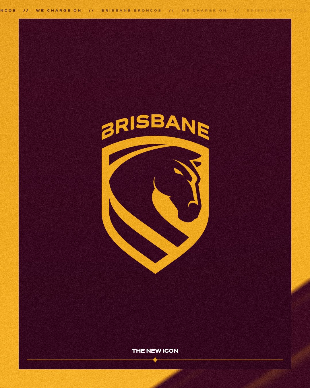
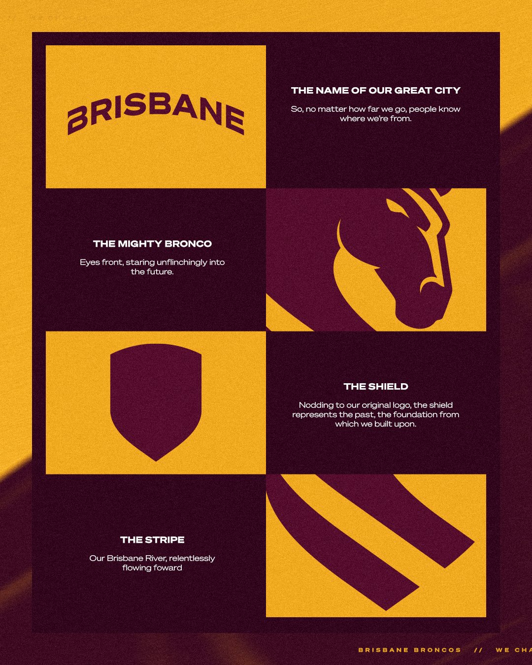
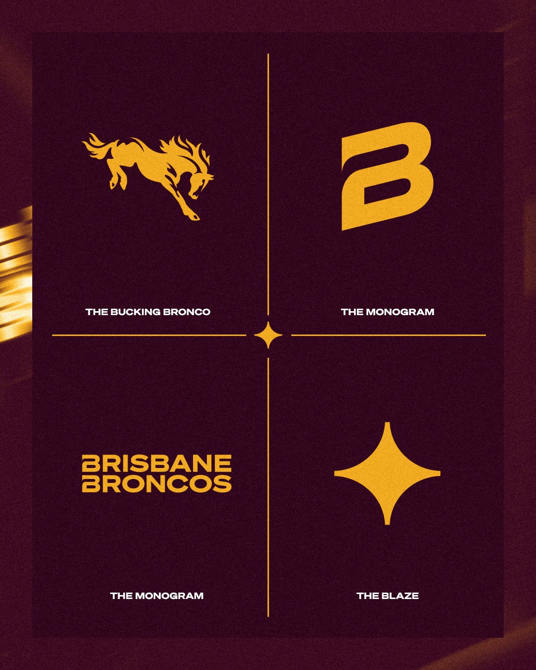
Created by global brand agency DDB Group, the broodier, sharper look takes on a modern appeal. A careful mixture of past and present, the shield motif gestures to the old design, while the bronco's fierce eyes stare forward into the future. The team's identity is reflected in the stripe design, representing the Brisbane River, while the 'Brisbane' wordmark proudly reflects their home. There's just one issue... those 'B's' are different, and now I can't unsee it.
While Broncos CEO Dave Donaghy claims, “This is more than just a logo - it’s a statement of who we are, where we’re from and importantly, where we’re headed,” not all fans were on board. "Broncos have single-handedly killed their club with that logo," one critic wrote. "This new one looks like a bunch of kids just whipped this up in a classroom project. A snake body with what looks like a Juvenile horse head plonked on top of it," another added.
Thankfully, some fans were more complimentary, with one writing, "I actually love the look of the new logo. A simple, yet modern take on our original logo from the late 80s to the late 90s." Another pointed out, "The different Bs will trigger design types, but otherwise a rare great sport logo update."
For more branding inspiration, take a look at this football team’s new logo that's pure fan service or check out why sports branding needs more originality.