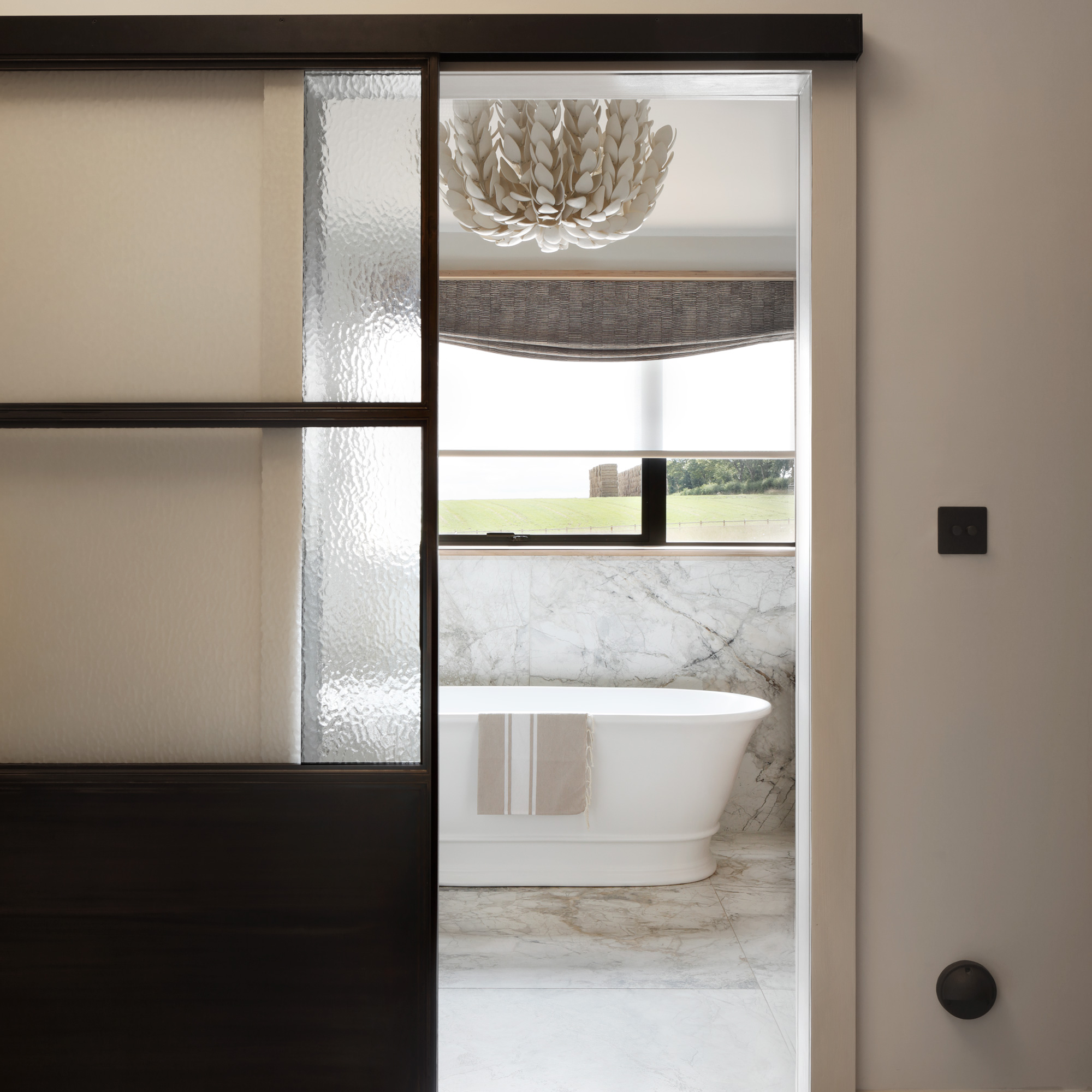
When you move into a property, you're always faced with finding a way to live in a completely new layout. From kitchen and bathroom ideas to living room and bedroom spaces, all with different room formats, sometimes it can be quite a challenge to find a way to make the space work for you.
This family hit this challenge head-on when they bought their off-plan new-build home in the Cotswolds, as the plans for the as-yet-unbuilt home weren't quite what the family had in mind. Here, the homeowner explains how they got around the initial layout conundrum to create these spacious and stylish en suite bathroom ideas.

‘We bought the house off plan from a developer,' she recalls, 'but when I saw the floorplans, it didn’t work for us at all. Every bedroom had a bathroom and they were all long and narrow. We changed the configuration completely, splitting the upstairs into two - one side has the master bedroom, dressing room, and ensuite, and the other has the children’s bedrooms, a study, and a family bathroom.'
'I was very involved in the whole process,' she explains, 'project managing and constantly checking measurements and coming to the site to make sure things were being done. I found inspiration for the house from its Cotswolds location, using lots of natural materials and calm colours.'
'We kept within our original budget because everything was planned and priced up very early on. The only thing that really changed was the toilet area and shower not having a door - it makes it feel much more open this way.’
'I wouldn’t change a thing if we did it again,' she says, 'it feels so serene and spa-like and reminds me of hotel-style bathroom ideas.'
The classic bath tub
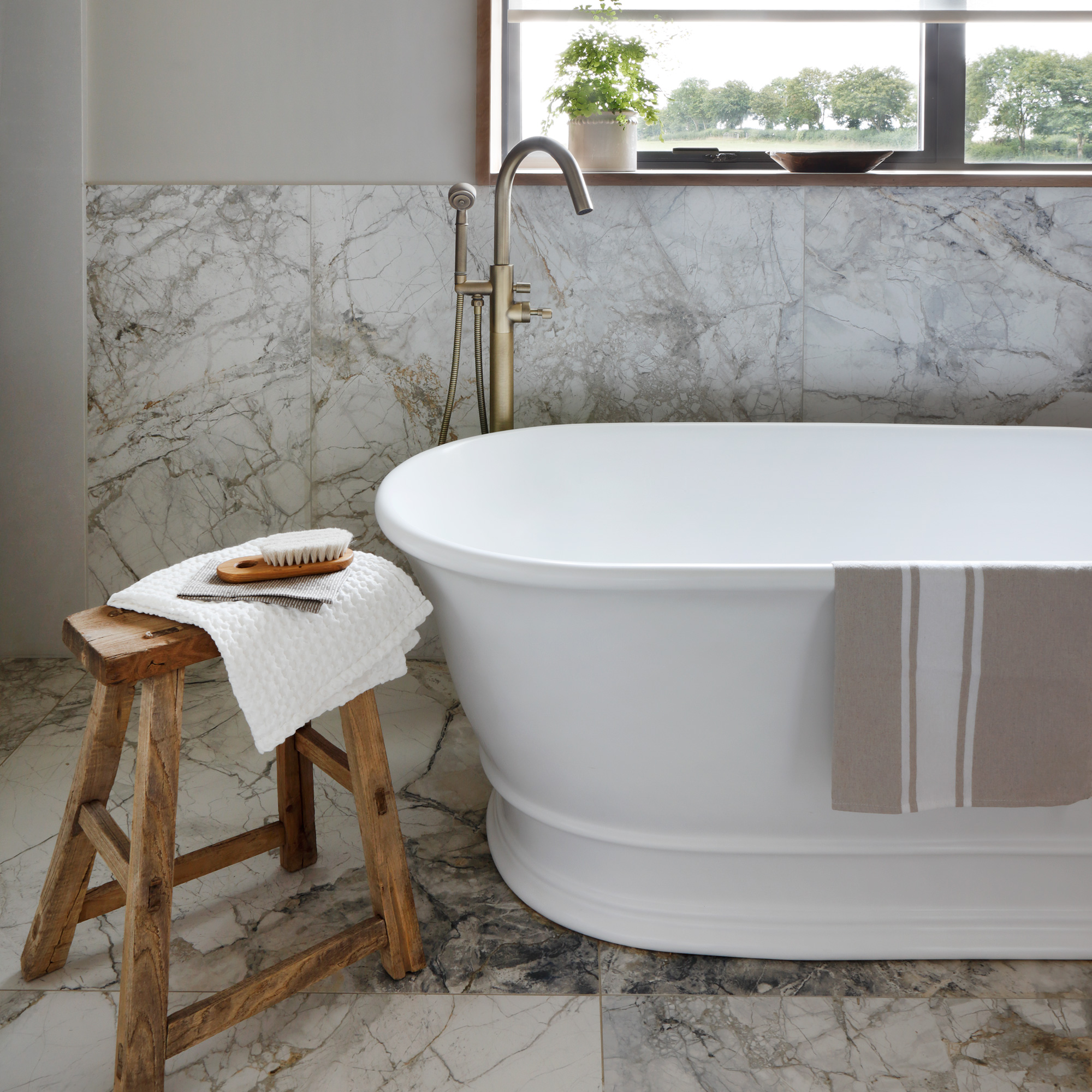
The first thing you see as you walk in, and the undisputed focal point of the room is the large classic freestanding bath tub. It's from BC Designs and is called the Bampton. Nestled under the window, it features a floor-standing bath mixer with a separate hand-held showerhead.
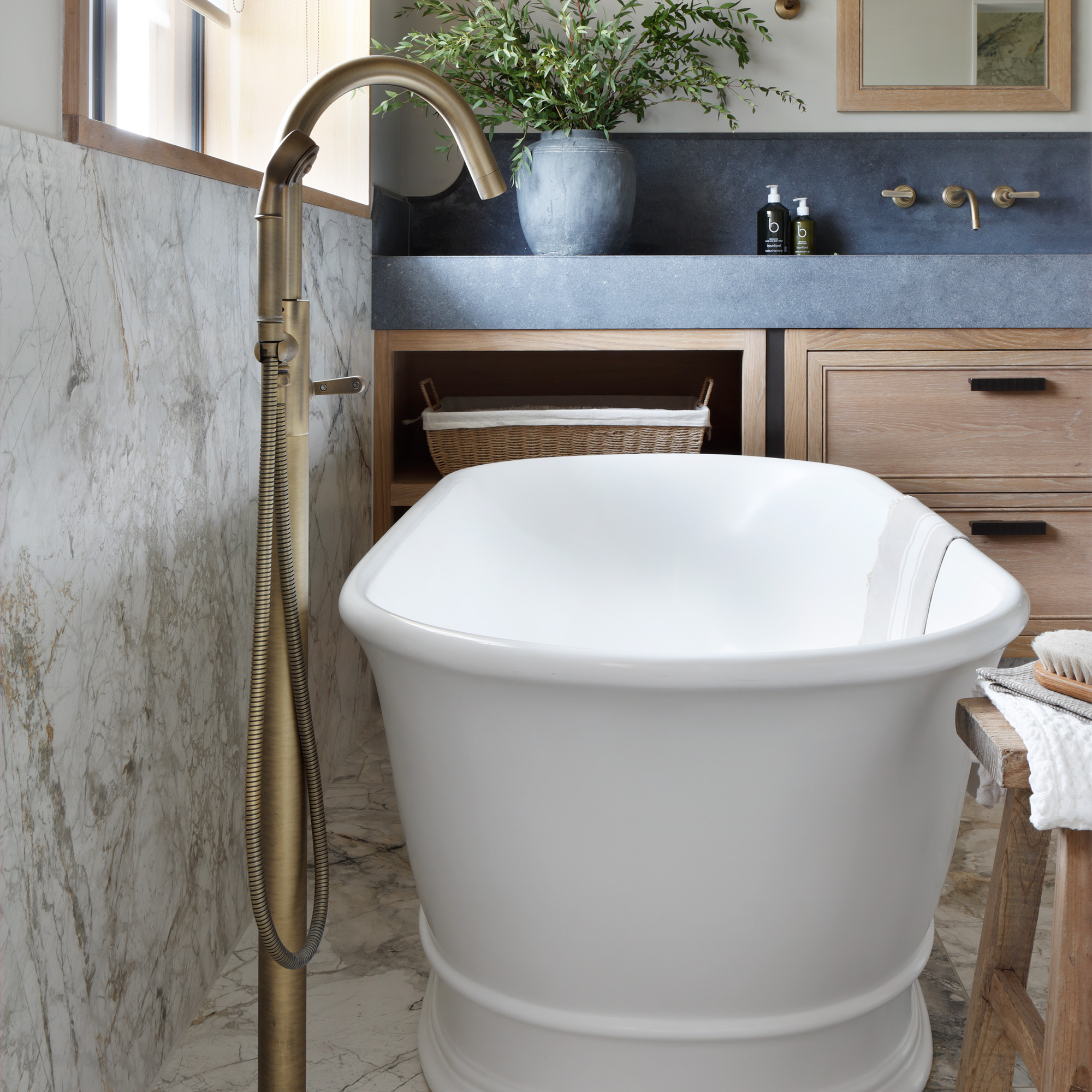
‘I love how simple the bath is – it’s traditional, but not overly ornate. Plus it was the right size for the room and went with all of our fittings.’
Above the bath, the window features a double-layered blind. 'We have a semi-sheer roller blind to provide privacy during the day, and then a relaxed Roman blind in front to add warmth and texture. It can be brought all the way down in the evenings.’
The stylish sink area
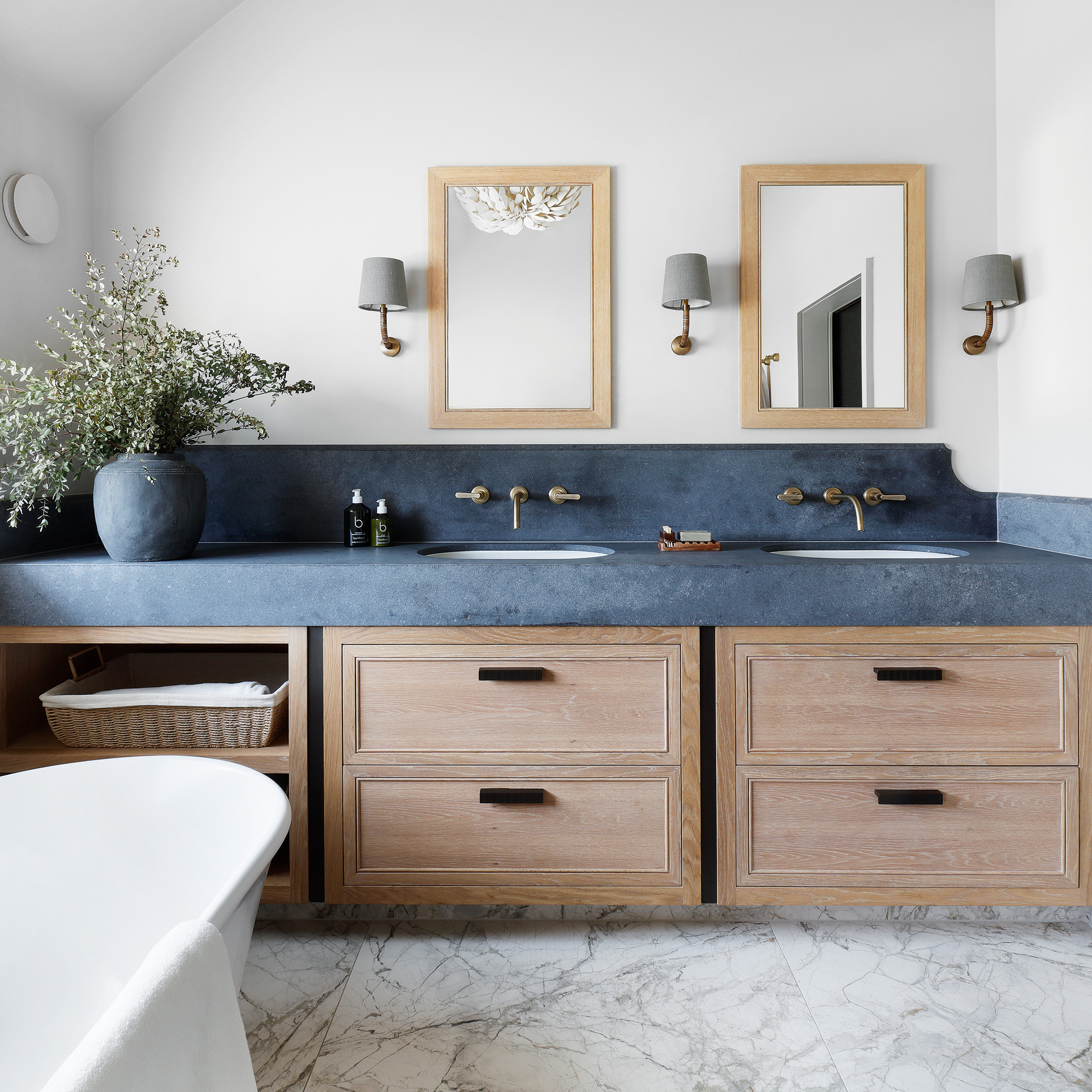
One side of the bathroom is dedicated to a large storage unit with built-in two washbasins. On the wall behind these are two matching mirrors, alongside three wall lights.
'Getting ready in the morning is so nice with a double sink,' explains the owner. 'All your own toiletries ready on one side.'
The bespoke cabinetry maximises the bathroom storage ideas under the double sinks. 'I think having lots and lots of storage in a bathroom is an absolute essential.'
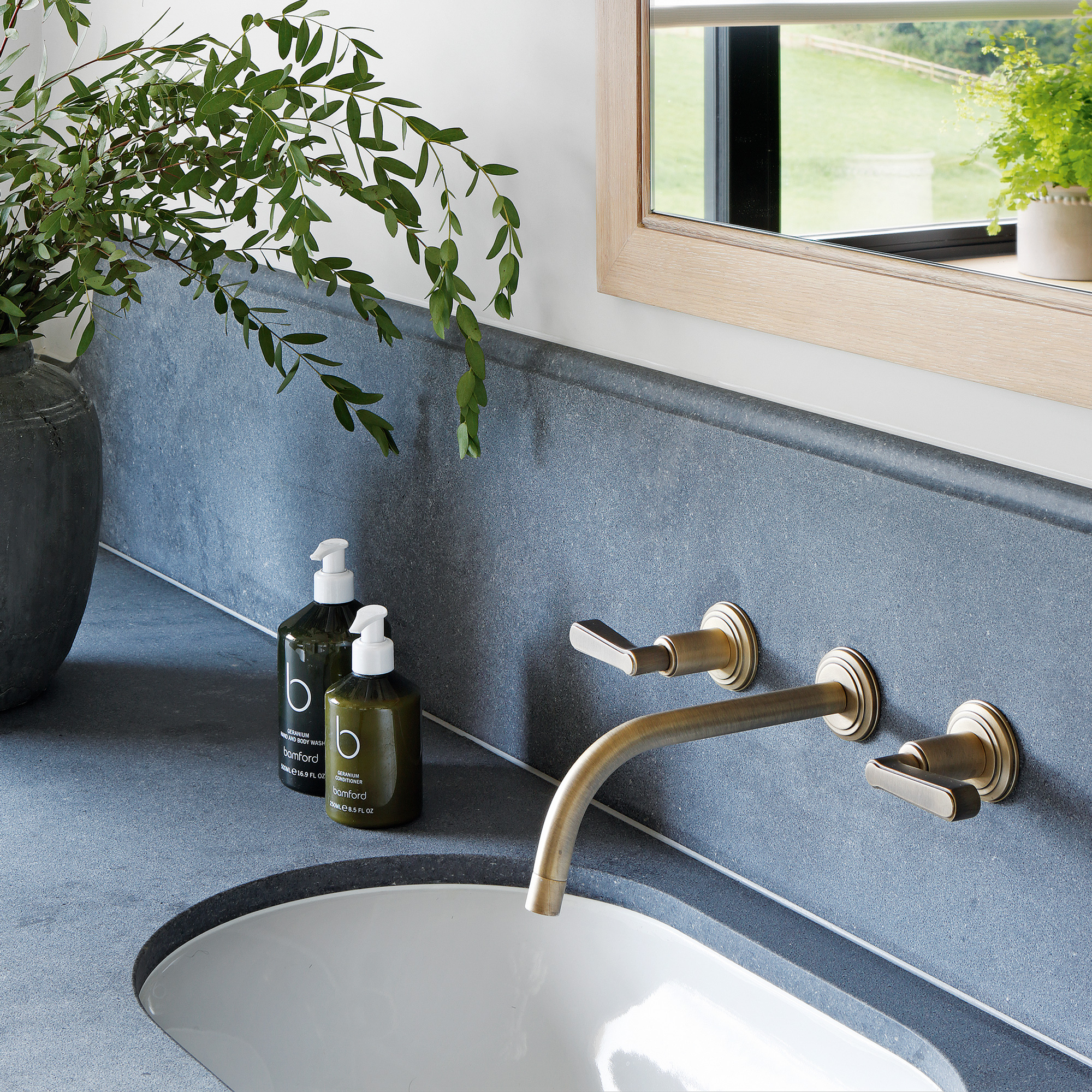
'The composite stone surround is really practical for a bathroom,' she says. 'It has a slightly tumbled, matt finish and looks like a Belgian blue stone.'
‘In the rest of the house, we’ve used a gunmetal finish on the fittings, but vintage brass felt a bit more luxurious here. It’s got a subtle gold colour.’
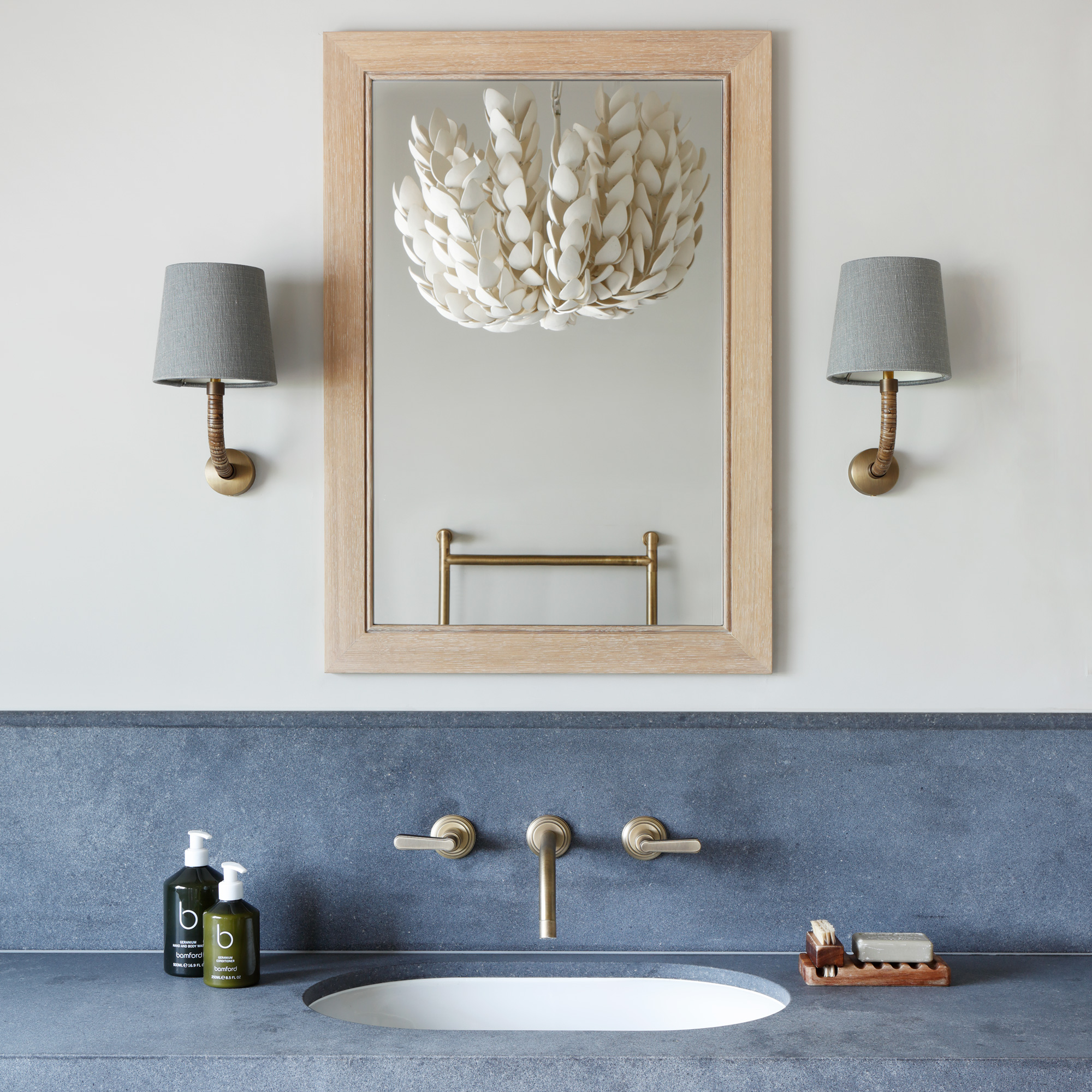
'I love all the bathroom lighting ideas we chose - the texture of the pendant light in the middle of the room is really special, it’s made out of lots of small petal shapes to look like a huge flower. And the wall lights add to the overall look.’
The shower area
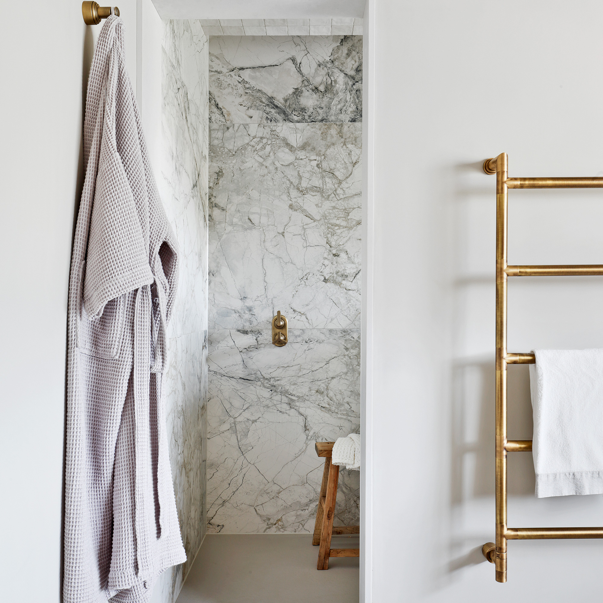
The shower space is partly open, and the combination of underfloor heating and a heated towel rail ensures that the room stays warm.
'The tiles were my point of inspiration,' she recalls, 'they really jumped out at me. Everything else was built from there and I chose all the finishes to go with it.'
'We had originally planned to have a door here but instead decided to have a stone reveal opening. It’s clad in composite stone, which is completely waterproof and makes it feel more open.'
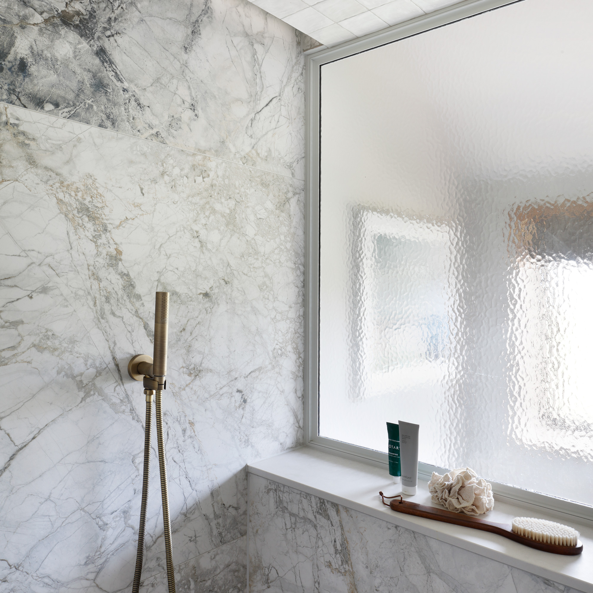
'We added a glazed panel in the shower space to allow natural daylight in so it doesn’t feel like a dark, enclosed space. We added white gloss Zellige tiles above the shower area for practicality, to stop splashes and mildew building up. There’s also a recessed LED light which comes on and highlights the beautiful tiles.’
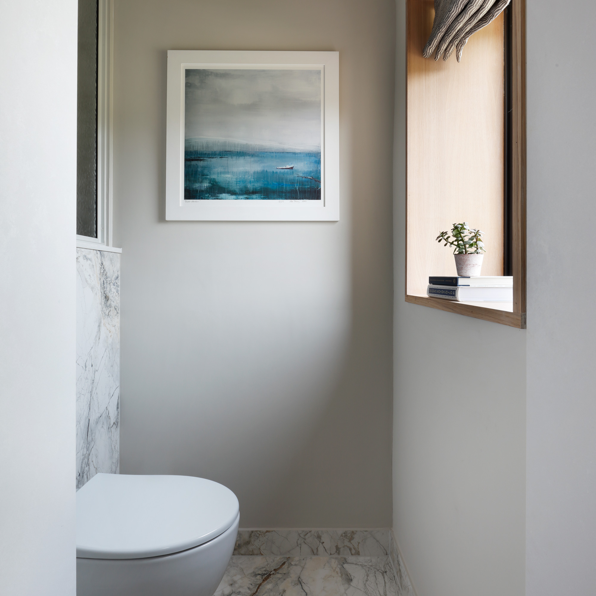
The space in between the shower area and the exterior window is cornered off for the toilet. The glazed panel behind the toilet means daylight that floods in from the window can reach the shower area.
Focus on... Quartz in a bathroom
This composite material makes a practical and hardwearing choice. Here’s what you need to know...
- The quartz that’s used in bathrooms and kitchens is a manufactured, engineered material, made by mixing natural quartz with other materials such as resin and pigments. This means it’s non-porous and much stronger than a natural stone such as marble.
- Quartz is a great choice for a bathroom because it’s unlikely to chip, is resistant to stains and easy to clean. It can be used anywhere – from shower enclosures and bathroom worktops to bath surrounds, wall cladding and floors.
- Available in a huge range of colours and finishes, you can find a design that is a solid colour (filled with reflective particles), one that closely mimics natural stone, or one used in this bathroom that is deeply textured and made to look like concrete.
- Seams can be more noticeable than in a natural material and it can also be an expensive option, depending on the design you choose. Expect to pay around £400 per square metre for a quartz worktop, but some cost well over £1,000 per square metre.


