Like many, I spent my Monday evening tuned in to the Apple launch event. Streamed to a worldwide audience, the brand took to the stage at its headquarters in Apple Park, California to unveil a range of new products.
We saw a brand new Apple Watch Series 10, as well as an updated colour for the Apple Watch Ultra 2. There was also a new range of Airpods, and new colours for some of the other models in that family.
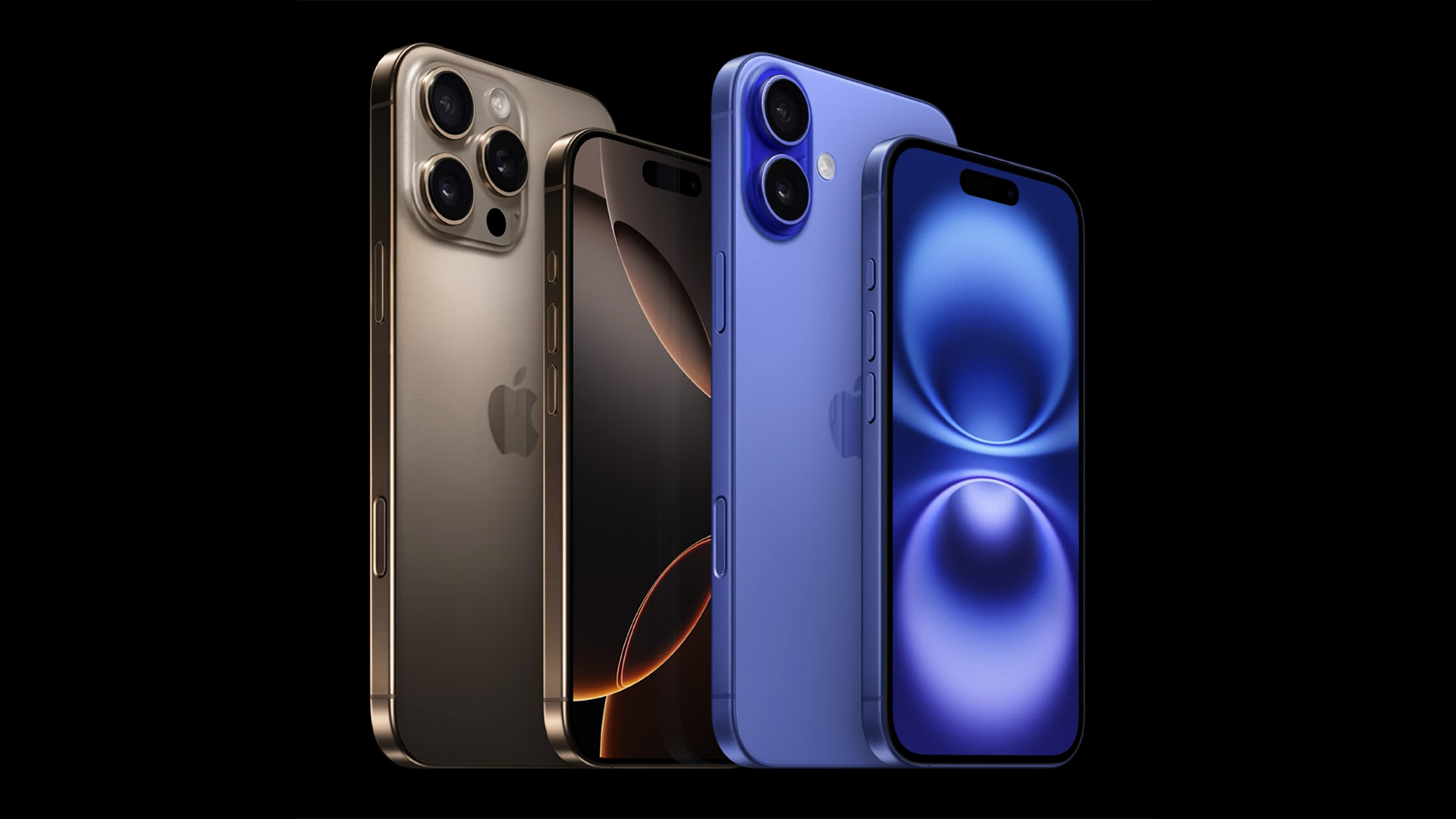
But of course, sat atop the tree was the new iPhone 16 range. With a range of smaller changes to the design and feature set, the one big upgrade came in the form of a Capture button.
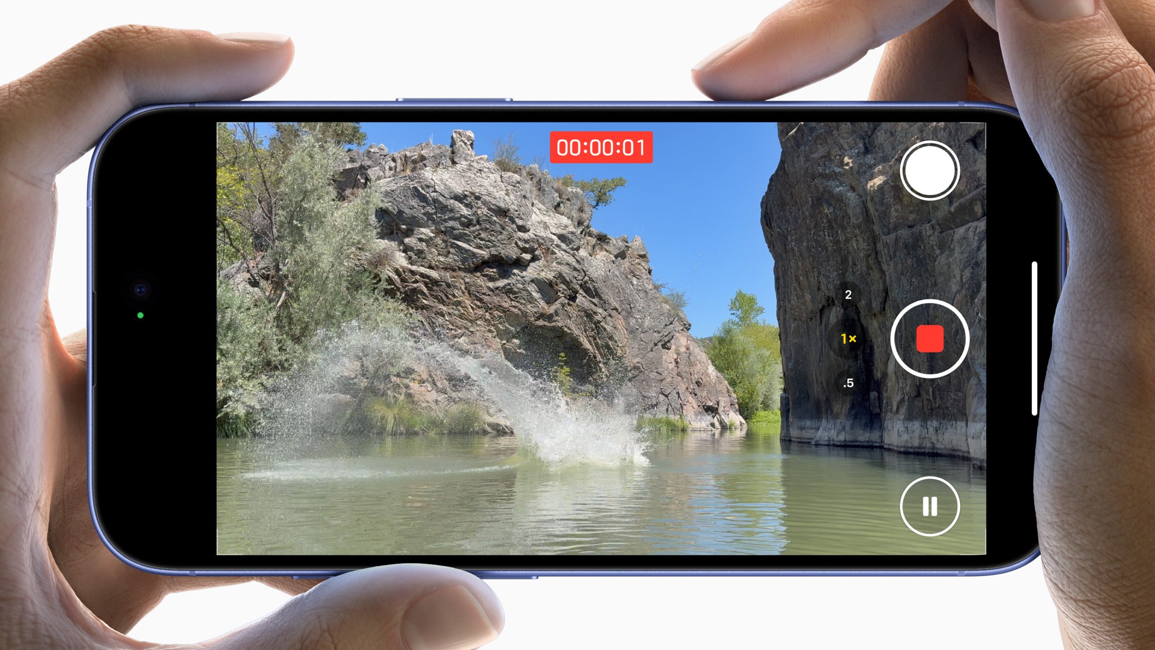
That's something we've seen rumoured for a long time. In essence, that aims to mimic the shutter button found on traditional cameras. By placing the 'button' on the top-right when held horizontally, the device mimics the traditional position used for shot-snapping over generations.
As a keen photographer myself, I was absolutely ready for this. There's nothing less satisfying than the soulless, soundless tap-on-the-screen shutter experience usually used on phones, so something more haptic and tactile was really appealing.
It doesn't stop there, either. As a haptic strip, users will be able to swipe to control different aspects of their photography experience, too.

Sadly, that's where I think Apple has overthought this one. See, in all of the videos from their event and thereafter, they show the swiping motion controlling pretty much every parameter on the camera app.
That seems utterly pointless to me. One of the things photographers love about having tactile buttons and dials is that they serve a purpose. But it's a single purpose. Okay, sometimes it might double up, but it's certainly not a single control for every function.
Having those individual controls means that you can develop a muscle memory. Watch a photographer who knows their equipment inside out – they'll make every adjustment without even thinking about it.
Sadly, when you put every ounce of control on one slider, you'll almost certainly lose that ability. By the time you've made your adjustments, your subject has run away and the lighting has changed, leaving you wishing you'd just pointed, shot and had something to show for it.
Had it just been used for a single function – a user-configurable one would be perfect – I'd feel entirely different. Like a custom button on a camera, that could have really elevated the photography experience. For now, though, I'm not quite convinced.


