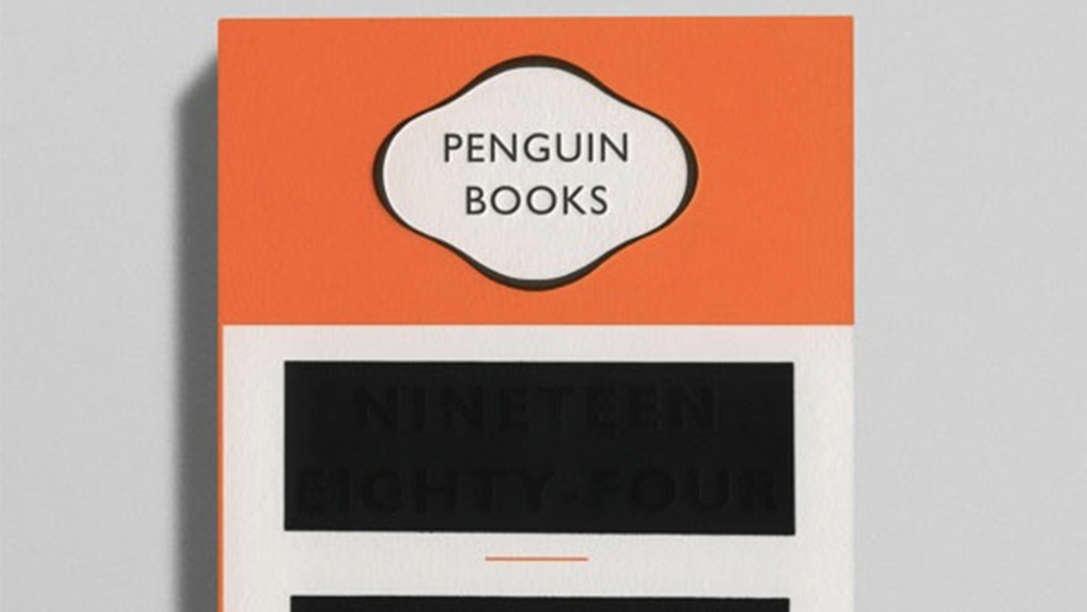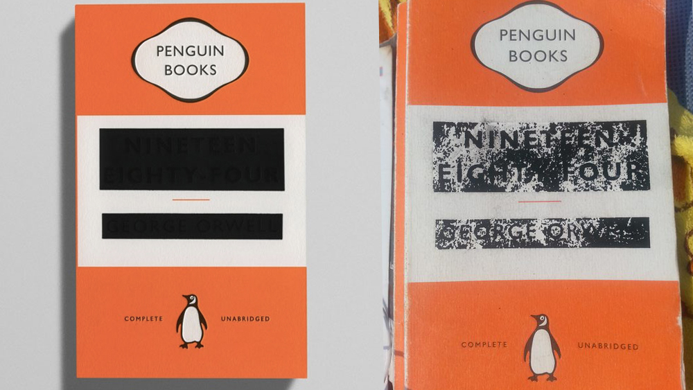
We're always told that you should never judge a book by its cover, but a strong look can sometimes do much more than just sell the publication. This clever design for George Orwell's 1984 is getting a lot of love for its simple and direct reference to the book's theme of authoritarian state censorship and the revision of history.
The name of the book itself has been redacted and is only visible in certain lighting conditions, and yet the book's fame alone may be enough for many readers to guess which title it is (take some inspiration from the best free fonts if you're working on your own non-redacted book covers).
1984 (George Orwell) - Penguin Books from r/DesignPorn
Currently receiving much discussion on Reddit, graphic designer David Pearson's design for Penguin's 2013 edition of 1984 references the look of redacted documents. It uses the traditional Penguin white and orange design and logo, which already made individual books rather anonymous. But it also uses matt black foil to hide the lettering. The strips over the title and the author's name were designed to fade over time, suggesting a hint of optimism that the truth will out.

For another classic book cover that's getting a lot of love on Reddit, see the Great Gatsby cover which makes very clever use of negative space. See the best current prices on Adobe's Creative Cloud apps below if you need to upgrade your own design tools.


