Ghostbusters: Frozen Empire will be released this month, and promotional material features a familiar design: the Ghostbusters logo. The original logo design became iconic after the first Ghostbusters film in 1984, but it almost never was.
The Ghostbusters logo was initially only going to be used on the eponymous team's uniforms and on the Ectomobile. It was when Columbia Pictures realised it also needed a design for marketing that more serious attention was given to the matter. The result was an iconic logo that remains recognisable today, although it's had some tweak.
As we look forward to the release of the fourth Ghostbusters movie (the fifth if we count the 2016 reboot, which we'd rather not), here's a recap of the history of the Ghostbuster logo, from 1984 right through to Ghostbusters: Frozen Empire (for more around upcoming movies, see the evolution of the Godzilla design).
The original Ghostbusters logo
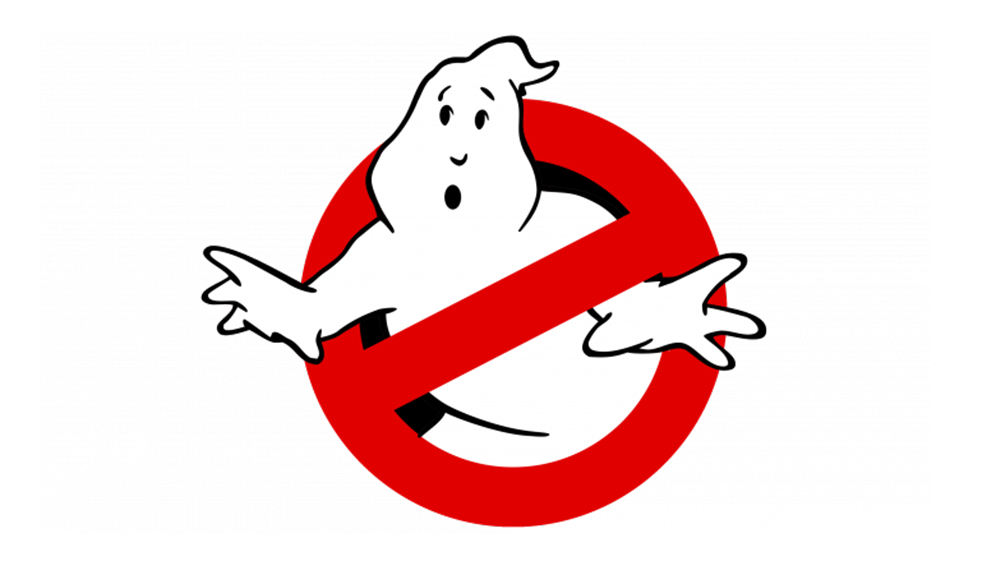
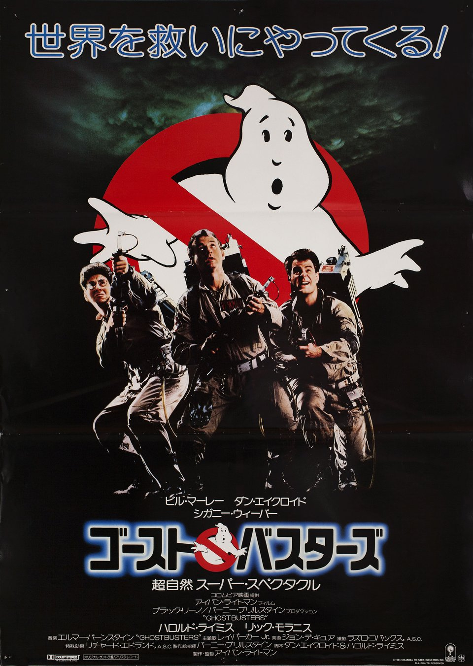
The Ghostbusters logo made its first appearance in the original 1984 film and immediately became iconic. In fact, it made it into our list of the best logos of the 1980s. But could have been very different.
Originally, the script described a logo on the Ghostbusters' uniforms, and designers hadn't put a lot of work into it. One early logo design that never saw the light of day shows what appears to be Thing from the Adams Family in handcuffs. The logo we know today was only developed after Columbia Pictures realised it wasn't going to obtain the rights to the name Ghostbusters in time for early teasers. That meant it needed a strong design that could stand in for the film's name, becoming synonymous with the film itself.
Illustrator Michael Gross, famous for his work on National Lampoon magazine, came up with the solution of the famous no ghosts icon that we know. And it worked perfectly. It's very graphic, clear and easy to interpret, it has a strong personality, and it was simple enough to work both on film posters and in smaller sizes such as on the Ghostbusters' uniforms. As a bonus, it could also serve as an 'O' in a Ghostbusters logotype.
However, despite being a solution for a legal issue, it led to another one. Harvey Comics sued Columbia on the ground that the ghost in the logo looked similar to Fatso from Casper. It eventually dropped the case, and the Ghostbusters logo has survived. It has so much personality, it even has a name, having been christened Mooglie by Ivan Reitman and Dan Aykroyd during shooting.
A quick bit of trivia. The racing red circle with a diagonal line through it is based on the international prohibition sign designed by The International Organization for Standardization and used for things such as no smoking signs. For the Ghostbusters logo, it was decided that the diagonal line should runs in the opposite direction, from bottom left to top right... at least in most applications. In some European and Japanese posters, a mirrored version was used.
The Real Ghostbusters logo
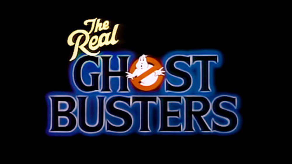
Within two years of the feature film release, Columbia launched an animated spin off for television with DIC Enterprises. Again, there were legal issues around the use of the Ghostbusters name, with Filmation objecting because of its own children's television series the Ghost Busters. Columbia's solution was to cheekily add 'Real' to its title. Other than that addition, the only changes were to adjust the logotype to better suite an animated series, with 'Ghostbusters' split over two lines and a spooky blue glow added around the serif font.
The Ghostbusters II logo
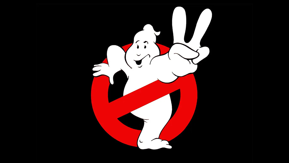
Ghostbusters II was released five years later in 1989. Since the original Ghostbusters logo proved to be so memorable, it made sense to use it again but to tweak it enough to make it clear that a sequel was on the way. The solution is as simple and literal as the original design. By using the same ghost, which is not at all Fatso from Casper, holding up two fingers, there could be no doubt as to what is being communicated.
However, I do have some issues with the Ghostbusters II logo. Firstly, why is the busted ghost smiling? And why bust it if it's preaching peace? But most of all, why include it in the film itself? The logo was a fun way to make the message clear in teasers and trailers, but it doesn't make much sense on the side of the Ectomobile or as the sign on their fire house headquarters.
Ghostbusters (2016) logo
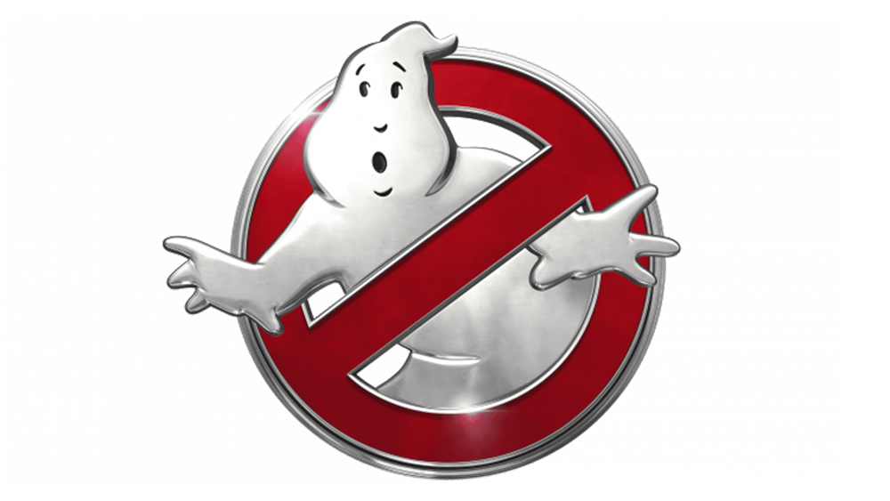
It would be over 25 years before the Ghostbusters returned to the big screen, and when they did it was in the form of a reboot rather than a sequel. Even so, Ghostbusters: Answer the Call stuck with the Ghostbusters logo we know, updating Mooglie and the surrounding circle by giving them a shiny 3D metallic look that resembles the badge of a car.
Ghostbusters: Afterlife logo
After dire box office results for Ghostbusters: Answer The Call, Columbia cancelled plans to make a sequel. Instead, it decided to relaunch the original Ghostbusters timeline with Ghosbusters: Afterlife in 2021, and they managed to get Bill Murray, Dan Aykroyd, Ernie Hudson, Annie Potts, and Sigourney Weaver to reprise their characters.
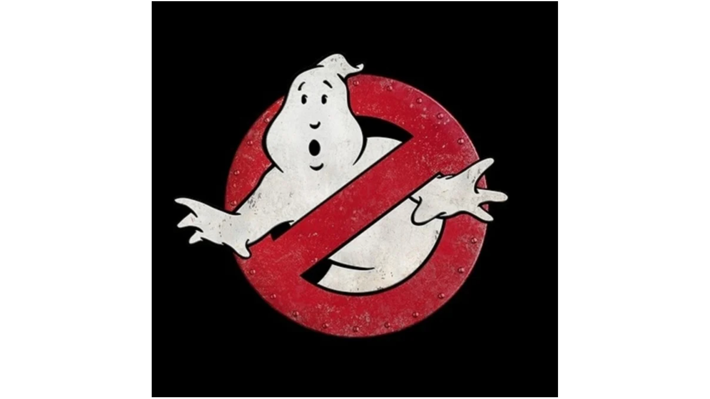
Again, the logo was a tweak on the original, with a more edgy, distressed look that sees the red circle of the no ghosts icon take the form of a metal door studded with rivets. This referenced the film's relocation of the main story from New York to a mining town in Oklahoma, and also the now rusting Ecto-1.
As a bonus, the end of the film sees a brief appearance of another, quite different Ghostbusters logo. During the closing credits, Mooglie is replaced with a Mini-Puft, with no explanation. Stuart Reeves, the designer behind it, posted about the design on social media.
Ghostbusters: Frozen Empire logo
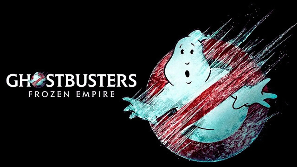
Finally, that brings us to the Ghostbusters logo for the upcoming release of Ghostbusters: Frozen Empire. Like the last film's design, the logo that's been used in teasers for the film has a link to the film's theme, only this time its much more obvious, with it being clear that the team is going to come up against some freezing conditions. The ice could be crystals formed on the Ectomobile itself, but Mooglie's classic surprised look just happens to work perfectly with the idea of being frozen still.
Ghostbusters: Frozen Empire will be released on 22 March, 2024.
For more cinematic logo inspiration, see our pick of the best movie logos.