Get all your news in one place.
100's of premium titles.
One app.
Start reading
Creative Bloq
Creative Bloq
Technology
Joe Foley

The hidden meaning in HBO's The Penguin logo may be a happy accident...

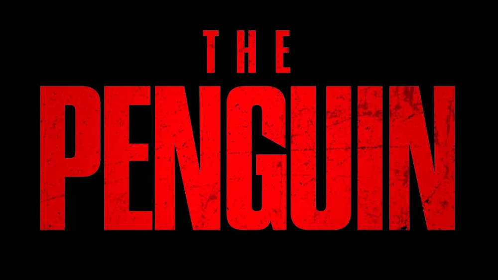
The Penguin logo.

HBO's The Penguin, a spin off from The Batman (2022), has received generally favourable reviews since it was released back in September. But people are just noticing what appears to be a clever detail in the logo design. 

The negative space in the 'G' in The Penguin title font appears to reference the series' protagonist, and perhaps even the actor behind the prosthetics. It seems that may be a happy accident, but one that the makers of the series have decided to exploit (see our pick of the best TV logos for more inspiration).

Sign up to read this article
Read news from 100's of titles, curated specifically for you.
Already a member? Sign in here
Related Stories
Top stories on inkl right now
One subscription that gives you access to news from hundreds of sites
Already a member? Sign in here
Our Picks
Fourteen days free
Download the app
One app. One membership.
100+ trusted global sources.