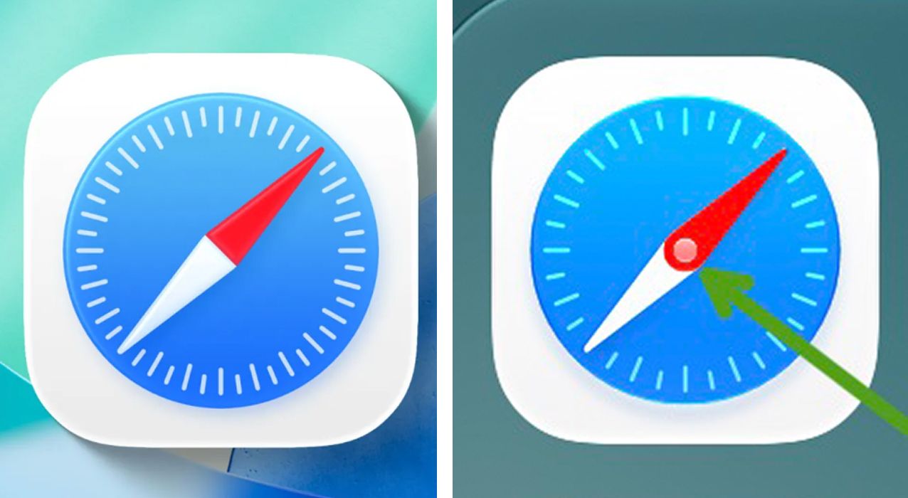
There's not long to go until the anticipated release of Apple's iOS 27 into the wild in mid-September, but the new iPhone operating system is already causing controversy. Alongside new 'Apple Intelligence' generative AI features and a rebuilt Siri AI, there are also inevitable design tweaks on the way, and some people think one of them is proof that Apple's lost its north.
I am, of course, talking about the great Safari logo controversy. Beta testers of iOS 27 have noted that the new app icon for Apple's browser now features a central pin and, confusingly, what looks like two needles overlapping as if they move independently like the hands on a watch.