Whatever you think of McDonald's products, it's hard to deny that the fastfood brand continually serves up stunning pieces of visual design. Over the years, McDonald's ads have included hugely inventive and eye-catching campaigns, often taking advantage of the already massive recognisability of its brand.
From blurry or pixelated visuals to minimalist campaigns that strip back the branding, McDonalds has produced some of the best billboard advertising and the best print adverts we've seen. Below, we pay tribute to some of McD's best to date and look at what made them so successful.
01. Minimalist McDonald's ads
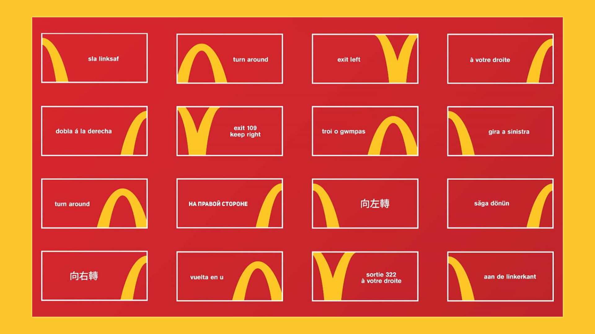
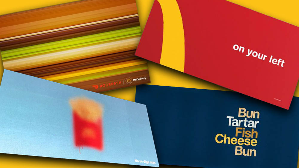
McDonald's golden arches are a massive asset, and the brand has made great use of how widely recognised they are. With the minimalist McDonald's billboard ads above, the design agency Cossette realised that the shapes in one of the world's most recognisable logos "are so ingrained in the minds of consumers that even if you cut them into pieces, they’re still familiar." And they can even be useful. It cropped in on details of the arches to create directions signs pointing to the nearest restaurant.
02. Blurry McDonald's ads
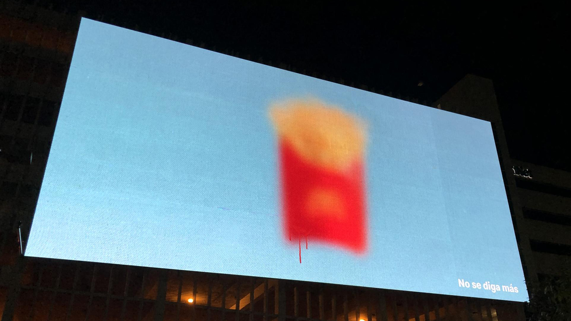
Don't worry, there's nothing wrong with your vision or your screen. These McDonald's adverts that were used in Puerto Rico are deliberately blurry, as if they're behind glass covered in condensation. But there can be no doubt about what they're advertising. With the slogan 'Say No More' in Spanish, this campaign is well aware that McDonald's colours speak for themselves.
It's just one example of how McDonald's has played with the ubiquitous familiarity of its products. We've also seen it pixelate McDonald's products to advertise the launch of a new restaurant in France and use front doors that resemble McDonald's products to promote McDelivery.
03. McDonald's DoorDash ads
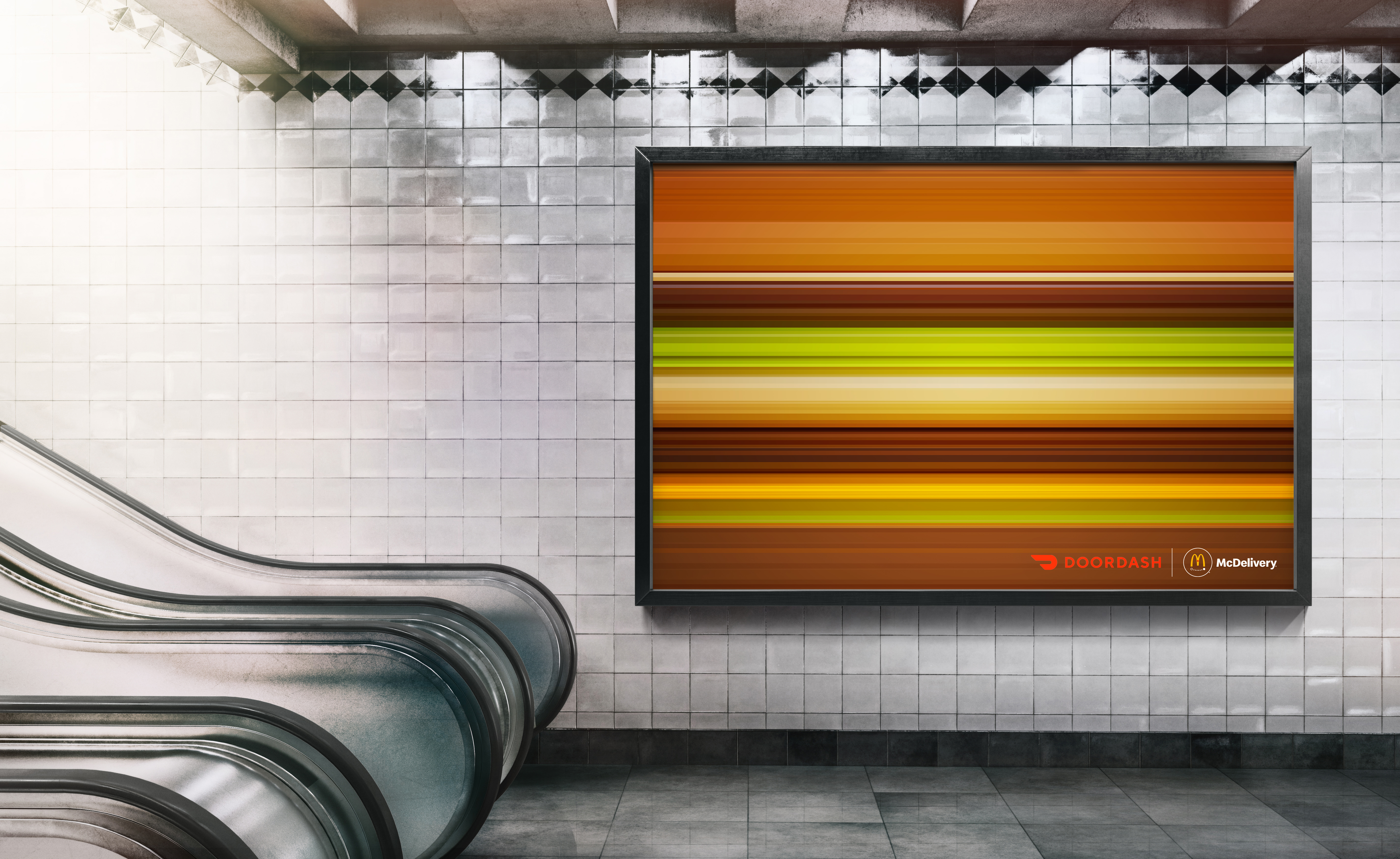
It's called fastfood for a reason, and McDonald's has realised that it can use abstract imagery of its products to communicate that speed. Designed to advertise McDonald's presence on the DoorDash delivery app in Canada, the 'Faster Food' campaign achieves a motion blur effect by breaking down the components of McDonald's sandwiches into horizontal layers of colour. And they're still recognisable.
04. Type-only McDonald's ads
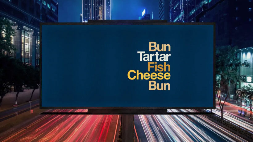
There's minimal, and then there's almost no branding at all. These type-only McDonald's ads offer few clues as to who is behind them, merely listing ingredients from some popular dishes: "muffin, egg, sausage, cheese, muffin", for example. Or "bun, beef, gherkin, lettuce, sauce, bun, beef, cheese, lettuce, sauce, bun". There's no logo, no tagline and they even use Helvetica instead of McDonald's' custom typeface, Speedee.
Designed by the agency Leo Burnett London and designer David Schwen, the ads were a play on a project called Type Sandwiches that Schwen created in the early 2010s. That all sounds a bit esoteric, but the campaign won a lot of attention and forced the viewer to think a little to work out who was behind it.
Honorable mention: Pepsi's National Burger Day advert
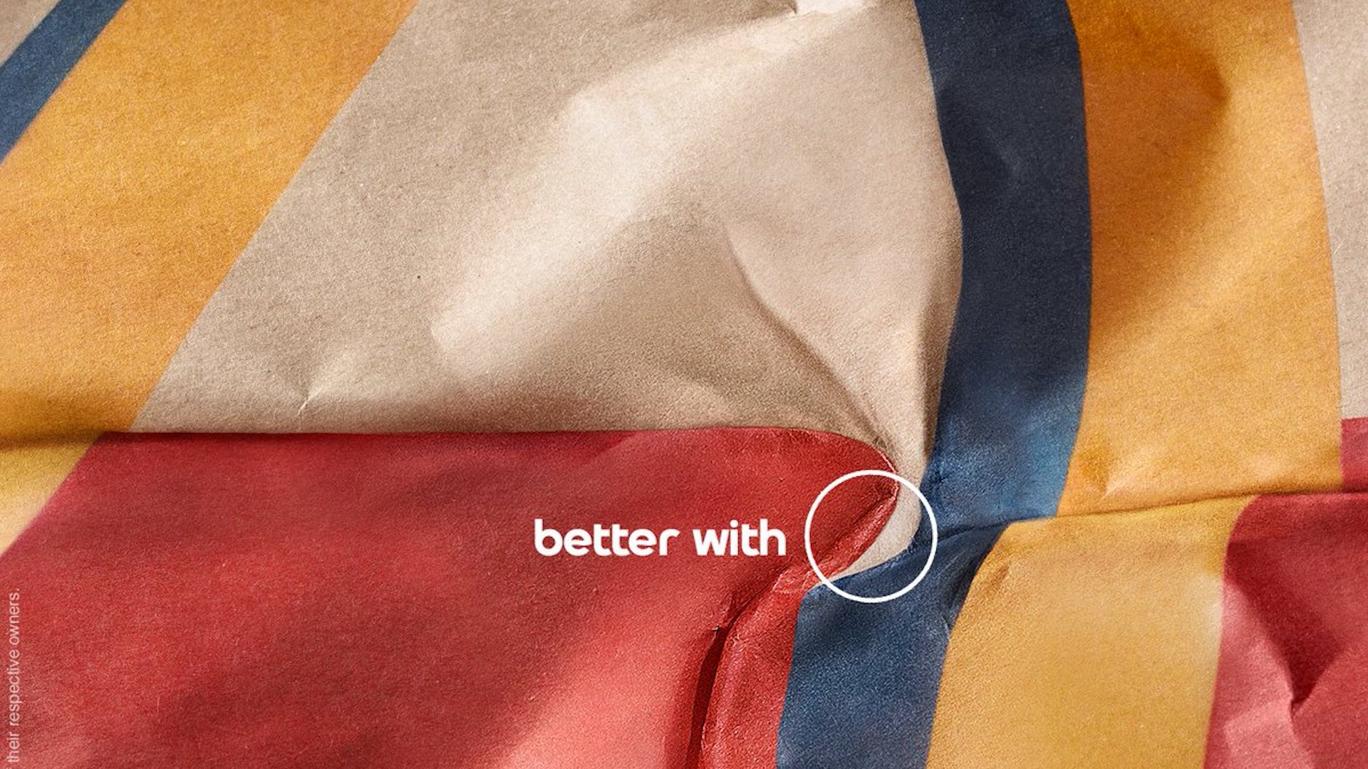
This ad isn't for McDonald's, but it's worth admiring again for how clever it was, sneaking a reference to Pepsi into the branding of a fastfood chain that favours Coca-Cola. Created for US National Burger Day in 2021, the advert was part of the #BetterWithPepsi campaign, encouraging people to drink Pepsi rather than Coke with their meals. Like some of the best McDonald's ads we've seen, there's no need to use the brand name for us to get the reference.
Looking to design your own ads? See our pick of the best graphic design software, or see the best prices on Adobe's Creative Cloud below.

