Get all your news in one place.
100's of premium titles.
One app.
Start reading
Creative Bloq
Creative Bloq
Technology
Tom May

The best typography of the 1960s, chosen by the experts

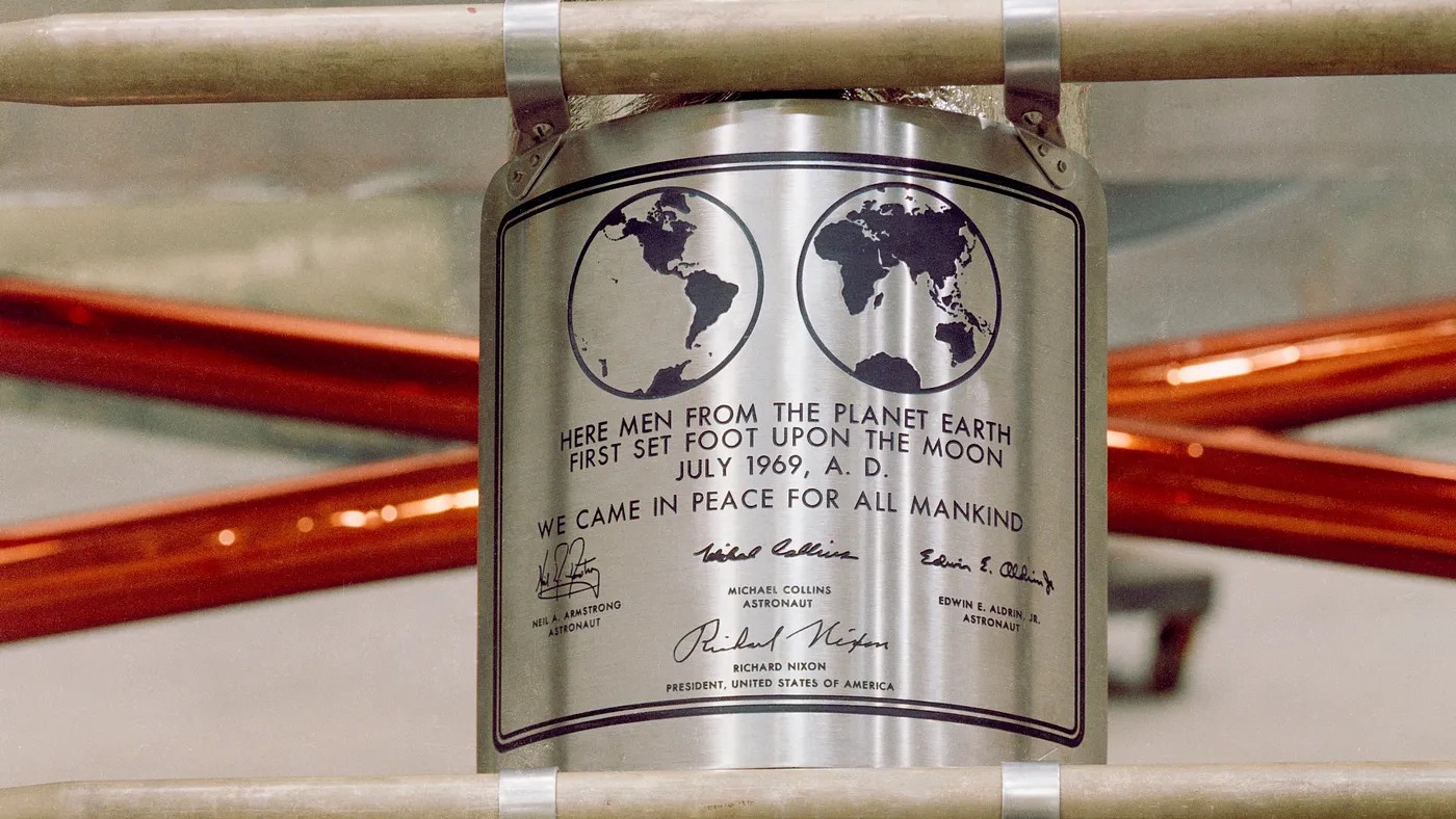
Closeup of the commemorative plaque NASA sent to the Moon.

The 1960s was a time of both cultural and literal revolution, and design was by no means immune. This was a tumultous period in typography, defined by bold experimentation and a dramatic shift towards geometric forms.

As electronic phototypesetting emerged and modernist principles reached their peak, designers embraced both the limitations and possibilities of new tech and new ways of thinking. The decade's typography trends also reflected broader cultural shifts, including space exploration, political movements, and radical departures from tradition.

Sign up to read this article
Read news from 100's of titles, curated specifically for you.
Already a member? Sign in here
Related Stories
Top stories on inkl right now
One subscription that gives you access to news from hundreds of sites
Already a member? Sign in here
Our Picks
Fourteen days free
Download the app
One app. One membership.
100+ trusted global sources.