Get all your news in one place.
100's of premium titles.
One app.
Start reading
Creative Bloq
Creative Bloq
Technology
Tom May

The best typography of the 1950s, as chosen by experts

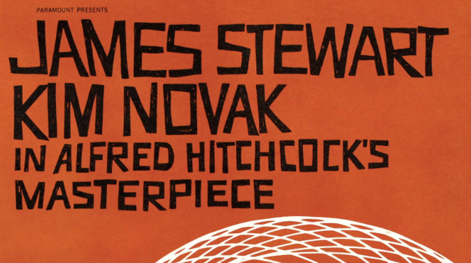
Section of Saul Bass poster for Hitchock's Vertigo showcasing his distinctive lettering.

The 1950s were a transformative decade for the Western World. As post-war economies flourished in North America and many European countries, the rise of mass production and advertising led to a booming consumer culture, with new appliances, cars, and other goods becoming increasingly available.

It was also a time that saw type design embrace new technologies and Modernist principles. Most notable of the era's typography trends was the rise of the International Typographic Style, a movement originating in Switzerland that emphasised clarity, objectivity and functionality.

Sign up to read this article
Read news from 100's of titles, curated specifically for you.
Already a member? Sign in here
Related Stories
Top stories on inkl right now
One subscription that gives you access to news from hundreds of sites
Already a member? Sign in here
Our Picks
Fourteen days free
Download the app
One app. One membership.
100+ trusted global sources.