Get all your news in one place.
100's of premium titles.
One app.
Start reading
Creative Bloq
Creative Bloq
Technology
Tom May

The best typography of the 1940s – our experts take a look back at the decade's most iconic fonts

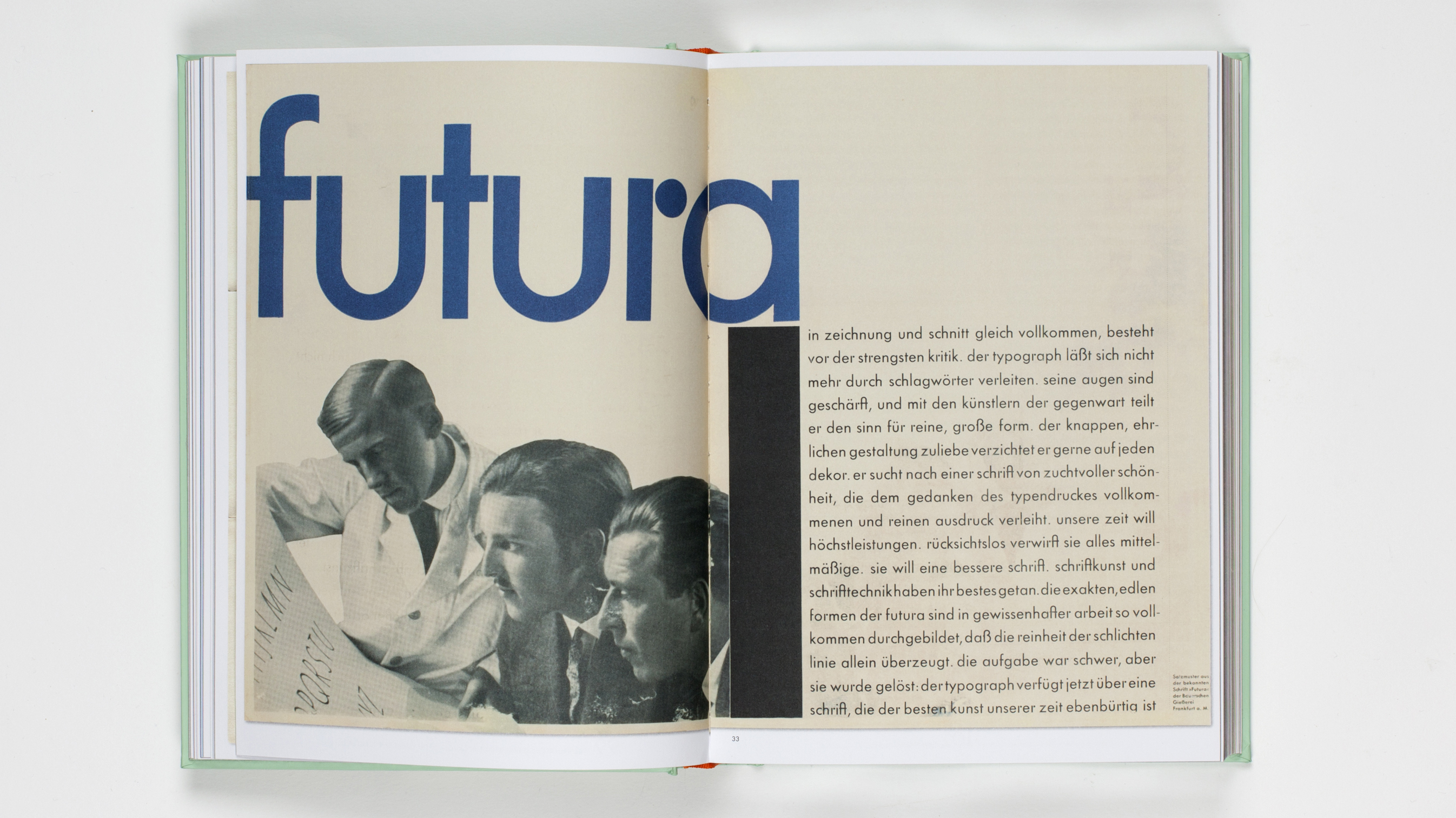
Spread from the book Futura: The Typeface featuring black and white photo of three men staring at a printout.

The 1940s was a decade shaped by global conflict, post-war reconstruction, and the rise of Modernist ideals. And the typography of the era reflects these dramatic contrasts neatly, with the best typefaces of the 1940s forged between the twin pulls of tradition and forward-thinking.

But looking at the typography trends of the time isn't just an academic exercise; it’s also a resource for modern-day inspiration. Whether you’re creating branding, editorial layouts or experimental art, studying these iconic typefaces offers lessons in design principles and adaptability that remain relevant.
Sign up to read this article
Read news from 100's of titles, curated specifically for you.
Already a member? Sign in here
Related Stories
Top stories on inkl right now
One subscription that gives you access to news from hundreds of sites
Already a member? Sign in here
Our Picks
Fourteen days free
Download the app
One app. One membership.
100+ trusted global sources.