For many people, the best Star Wars posters are among the most memorable and evocative movie posters made. From the original trilogy to the more recent prequels, there have been plenty of stunning compositions to promote the franchise, from clever minimalist teaser posters to extravagant main poster designs for each film.
Below we analyse and rank the best Star Wars posters as chosen by our team. For more ways to mark Star Wars Day on May the Fourth, see our piece on the best Star Wars fonts and how the Star Wars logo could have looked very different.
11. Star Wars Episode 1 poster by Drew Struzan
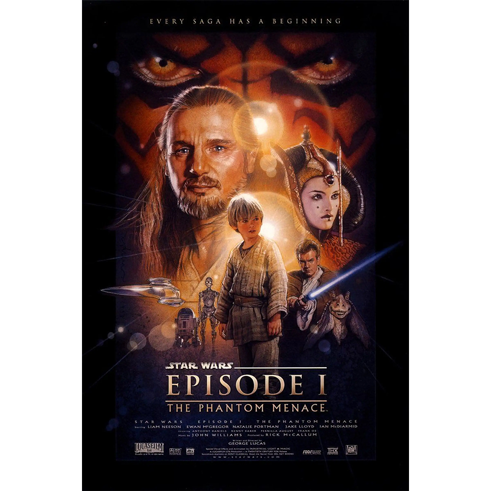
Drew Struzan is one of the artists most associated with Star Wars. He made one-sheets for the original Star Wars trilogy and went on to do covers for the Expanded Universe novels and more. He was the logical person to turn to for the release of the long-awaited prequel in 1999, and his design captured all potential that the movie had (whether you think it delivered is another matter). I particularly like Darth Maul's eyes starting menacingly from the background.
10. Revenge of the Jedi poster by Drew Struzan
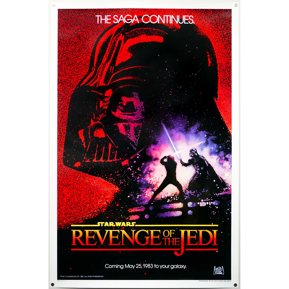
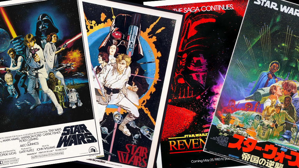
This Star Wars poster is also the work of Drew Struzan, but it couldn't be more different. An early teaser for Return of the Jedi from before Lucas decided to revert back to the original title (he decided that a true Jedi wouldn't seek revenge), it's bold and striking, with Darth Vader looming in the background in a striking two-tone red and black and a climatic fight scene in the foreground.
09. The first Star Wars poster by Howard Cheykin
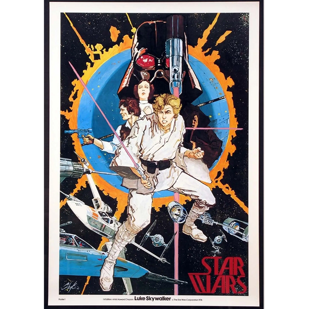
This painterly posters is believed to be the very first Star Wars poster produced. Printed in the summer of 1976, it was an early design for the first film. Luke doesn't look very much like Luke, but Chaykin only had a few stills and paintings by concept artist Ralph McQuarrie to base the illustration on. I love the mix of comic book and almost Japanese style, and note McQuarrie's early Star Wars logo in the bottom right.
08. The Last Jedi poster
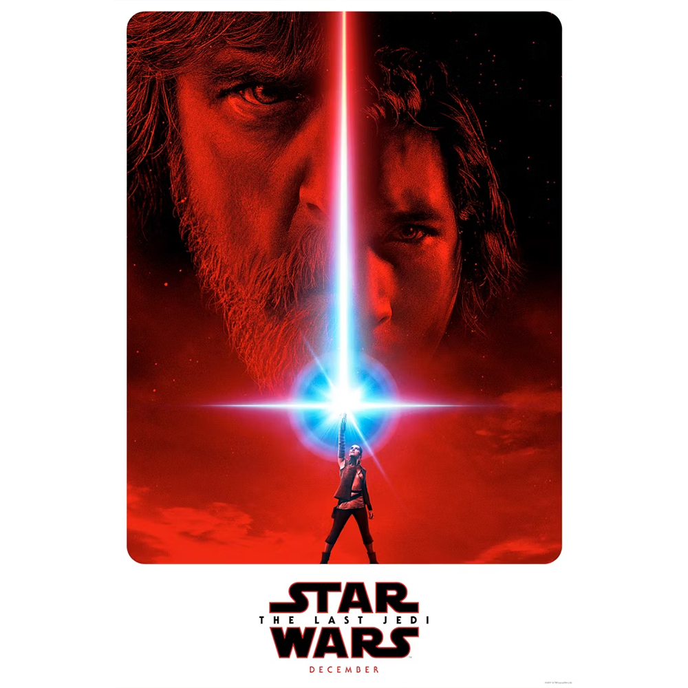
Simplicity is the key to the success of this Star Wars poster design for The Last Jedi, which features only Luke, Kylo Ren, and Rey. The minimalism and the flare from the lightsaber conjure up nostalgia, but the execution is modern and there's a subtext of the idea that the baton is being passed to the next generation.
07. The Acolyte poster
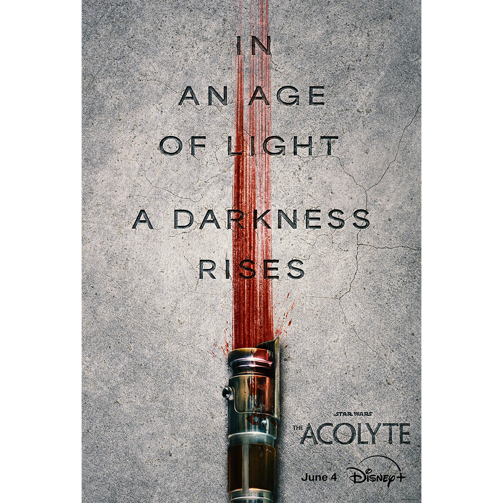
The newest entry on my list, the Stars Wars: The Acolyte poster is simultaneously both a tribute to previous designs and a huge departure. The minimalist use of the lightsaber recalls a classic Return of the Jedi teaser poster (we'll see that below), but the new illustration puts a gritty, gory, almost Tarantino-like twist on the motif. It's a clever design and clearly links the new Disney series to the Star Wars universe while also preparing us for something very different: a Star Wars-set thriller.
06. Star Wars Episode 1 teaser poster
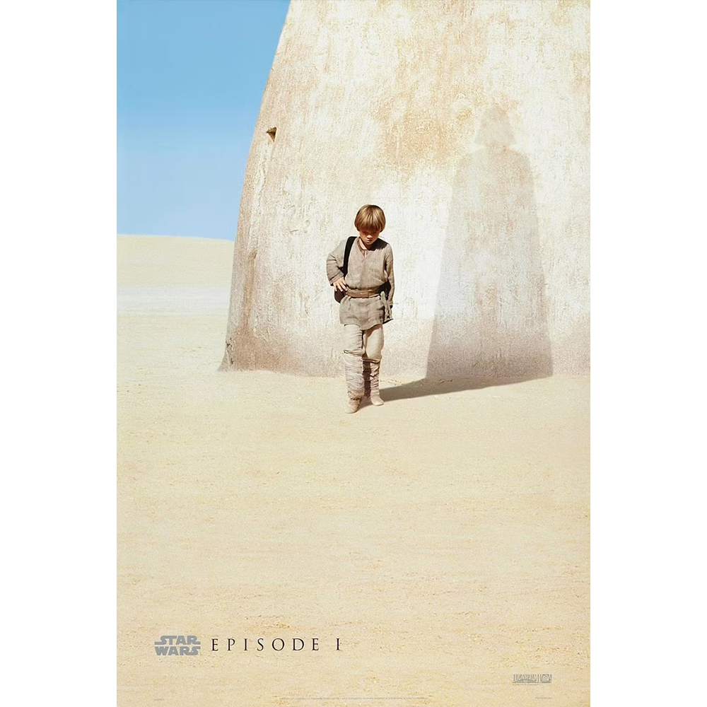
Designed by Ellen Lee, this clever minimalist Star Wars poster is very different from what we usually expect from the franchise. With no floating heads, lens flares or spacecraft in sight, it shows a young Anakin Skywalker walking towards us in the desert with his head down. But look closer, and we see he's already casting an ominous shadow of his future self. This has to be the deepest and most philosophical Star Wars poster, inviting us to question the impact of nature vs nurture.
05. Noriyoshi Ohrai's Star Wars posters
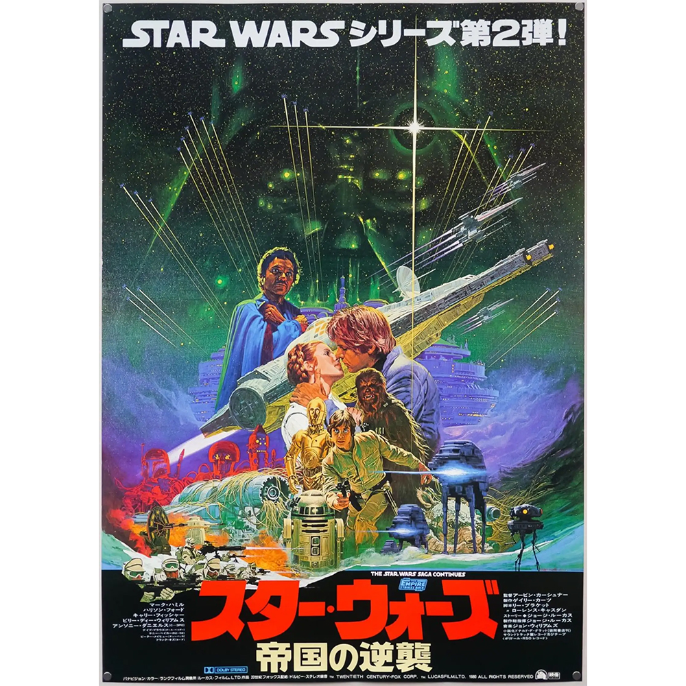
It's hard to choose a favourite from among the lavish action-packed Star Wars posters created by the late Japanese illustrator Noriyoshi Ohrai, but I think I go for the Empire Strikes Back. He packed so much into his compositions. That can sometimes be overwhelming and messy, but here it feels exciting and exuberant and gels well with the atmosphere of the films. The Japanese type just makes all the more intriguing.
04. Roger Kastel The Empire Strikes Back poster
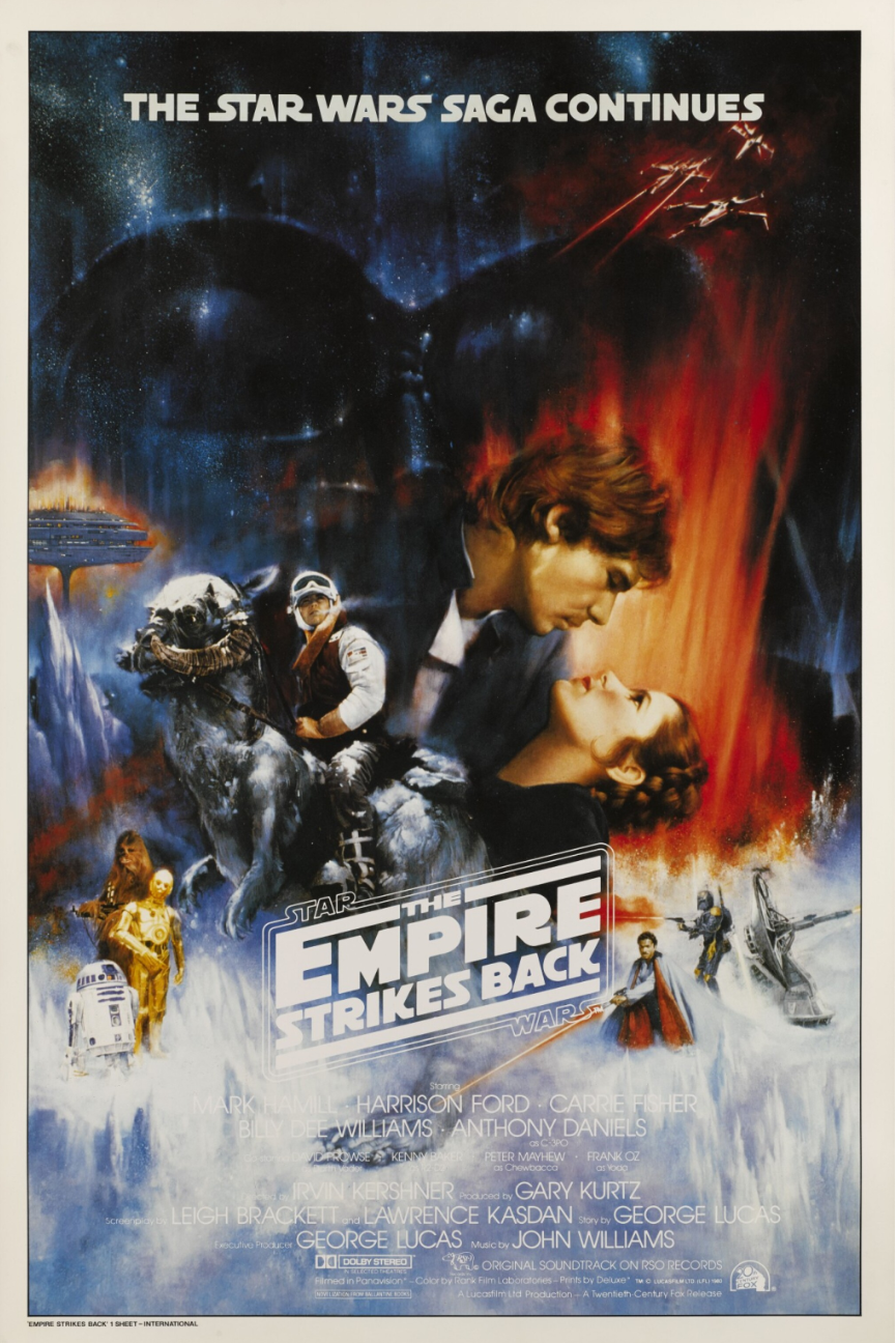
Gone with the Wind in space? Nope, this is another poster for the Empire Strikes Back. Designed by Roger Kastel for the US release, it was withdrawn in the end and replaced by a different design, reportedly because Billy Dee Williams complained that he wasn't featured despite his role as Lando Calrissian (contractual obligations are one of the main reasons we get the obligatory floating head design in film posters). However, I prefer the combination of fiery colours and the soft airbrushed look of this original version.
03. Star Wars poster by Tom Jung
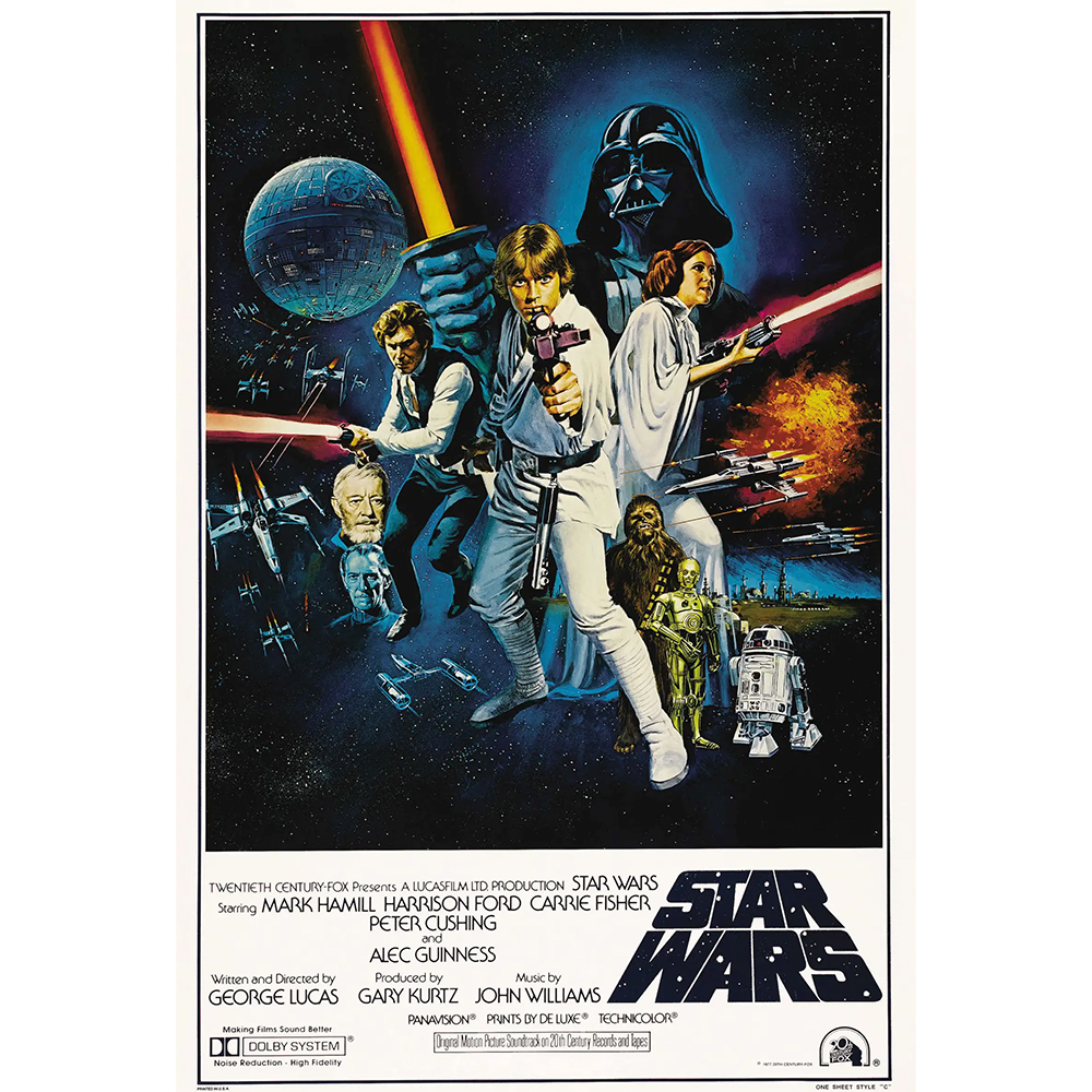
I might be biased here because I had a postcard of this on my wall when I was a kid, so for me, this is the Star Wars image. In a way there's nothing particularly clever about it: it's just all the main characters on a spacey backdrop. But the balance and proportion in the composition is expertly achieved.
02. Return of the Jedi teaser poster by Tim Reamer
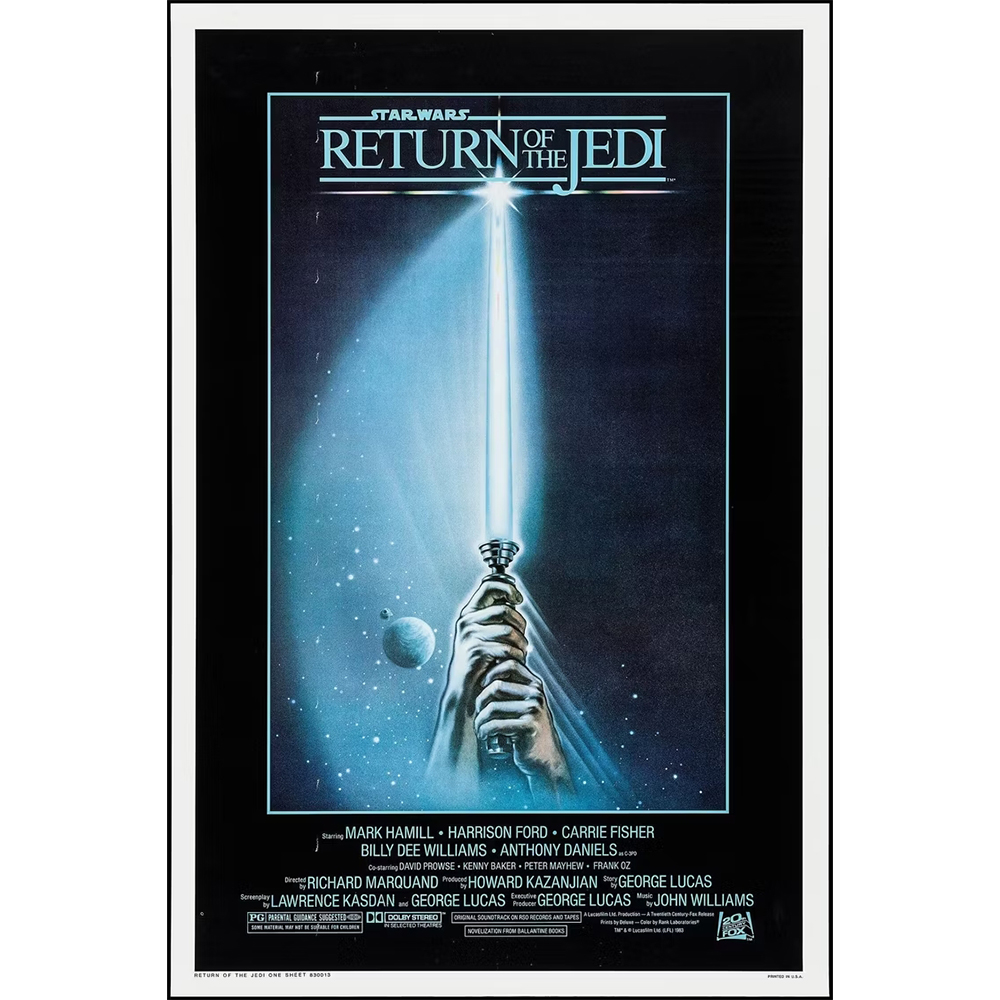
We've already seen a couple of minimalist Star Wars posters where the lightsaber did all the work. Here's the original inspiration from Tim Reamer, and it still makes an impact today. By the time the third film came along, the lightsaber was instantly recognisable among cinemagoers, so this poster would have worked even without the logo, but it's all the more powerful for the story it tells. At the end of the Empire Strikes Back, Luke lost his lightsaber fighting Darth Vader, so the poster tells us he's back and ready to continue the fight.
01. Star Wars poster by Tom Jung
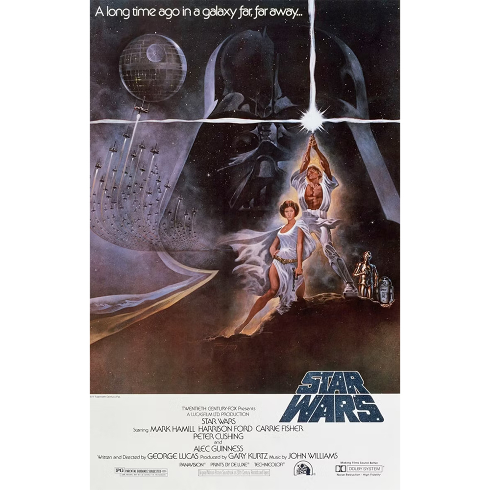
Finally, topping our list is another classic Tom Jung poster from the original Star Wars film. While the one we've already seen is perhaps better known, I think this one has the more evocative design. The asymmetric composition alone makes it interesting and fairly uncommon in movie posters, but it works.
I think the illustration perfectly encapsulates George Lucas's vision of the film as a combination of sci-fi, fantasy and adventure. An unusually muscular Luke Skywalker and Princess Leah look like they've walked into space straight from the cover of a swords and sorcery novel. It makes you wonder why Mark Richard Hamill didn't get cast for Conan the Barbarian a few years later. Turn to the background, and it seems we're in a different film but with equally epic scope.
For more inspiration, see our pick of the best movie posters.
