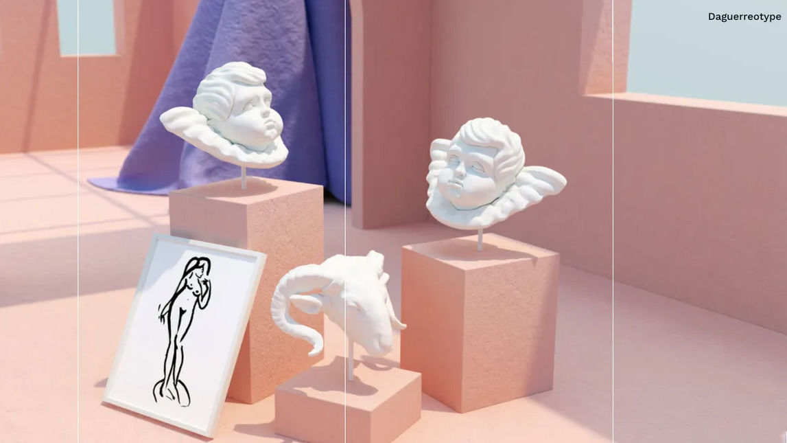
It’s been an interesting year for web designers, with AI being at the forefront of most designers’ minds. The enthusiasm isn’t dipping, but it’s fair to say it’s been tempered by a greater awareness of AI’s limits, as well as growing ethical considerations. This is one trend that’s not going anywhere anytime soon.
A few other common threads are woven through the year's hot design topics. There's a noticeable move away from minimalism with bold typography, maximalism, and nature-inspired designs taking a front row seat. Additionally, there's a growing drive to harmonise visual appeal with performance: users demand faster loading times without compromise, a challenging balance that designers continue to navigate.
On the decline are elements that hinder usability. “Clunky interfaces, lengthy paragraphs and overused design gimmicks are quickly falling out of favour,” says lead conversion expert Alice Khau from Neon Bright. Captivating your audience with well-chosen, engaging holistic design has never been more critical. You don’t have to do every single one of these trends. In fact, you definitely shouldn’t. But it’s good to have a handle on what’s out there to help you make better choices. We lead with the best trends before moving on to the worst ones.
Best web design trends
01. Experimental typography
Typography has taken a bold turn in 2024. Designers are playing with eye-grabbing fonts that serve as both text and visual art. Whether through texture, custom creations, vivid colours, intricate patterns, animated text, or quirky layouts – this trend is all about bringing individuality and a surprising feel to websites. Text is no longer confined to static lines; it flows, morphs, and interacts with other design elements on the page. It’s perfect for brands looking to stand out, especially those in fashion, art, entertainment or other creative industries. But remember to balance creativity with readability so that message strikes the balance between fun and accessible.
02. 3D typefaces
3D elements in web design have been around for a little while, but now they’re well and truly having a moment. From 3D graphics and animations to interactive elements, this trend adds depth and realism to your page, keeping viewers hooked and keen to explore further. Bubble fonts in particular are proving a favourite, adding joy and whimsy to the design in question.
03. '70s colours
Those ‘70s hues that were not long ago considered ‘bad taste’ are all the rage in 2024. Browns, oranges, and muted yellows have made a comeback in a big way, offering a warm and nostalgic feel, especially when paired with retro stripes, flowers, and other far-out patterns. These colours are ideal for brands looking to evoke a sense of history and tradition, not to mention stand out from the sleek AI-powered designs we’re seeing around. It’s warm and cosy, reminding users of a simpler time (even if they didn’t experience it the first time round). For more on this decade, see our best '70s logos and best adverts of the '70s.
04. Conversion-driven design
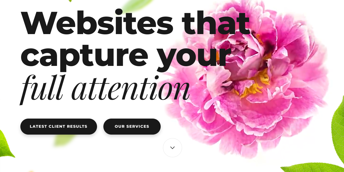
In 2024, the focus is on creating websites that don’t just look pretty, but perform well too. It’s been a priority for a while, but 2024 is seeing rise ever higher. Designers are focusing on creating holistic sites that prioritise user experience, with the goal of upping those all-important conversion rates. This includes using clear calls-to-action, creating captivating headlines, optimising landing pages lengths, and using data-driven strategies to boost user engagement and retention. The aim is to guide visitors smoothly through the user journey, turning casual browsers into loyal customers.
05. Performance optimisation

Speaking of function over form – gone are the days when looks were all that mattered. Now, site speed and performance are at the forefront of web design. Users expect fast-loading websites, and search engines reward them with better rankings. Designers are embracing lean development practices, compressing images, minimising code, and using efficient hosting solutions to give optimal performance. This trend is about delivering a seamless, speedy experience that keeps users satisfied and coming back.
06. Animation explainers
If a picture is worth a thousand words (although technically speaking, it’s closer to 84.1), then what’s a video? 1.8 million words, according to Dr. James McQuivey of Forrester Research.
Animation explainers simplify complex ideas into engaging, easy-to-understand visuals that take up less web page space and less cognitive processing power. They’re ever-popular due to their ability to capture attention quickly, convey messages effectively, and (if you’ve been creative), leave a memorable impression. They’re versatile, cost-effective, and perfect for digital platforms, making them an excellent tool for educating and persuading audiences whatever the industry. Arcplatforms has a good example on its landing page.
07. Anti-design
While anti-design might seem counter-productive, it has roots in punk – embracing rebellion and breaking the ‘rules’ to surprise and (hopefully) delight users with a jolt from the norm. This trend embraces chaos, asymmetry, Y2K fonts and unconventional layouts. It's all about defying expectations and creating a unique, sometimes jarring user experience that exudes insouciance with a dash of ironic humour. Anti-design is best for youth culture brands that want to stand out.
08. Colour gradients
We’ve seen this one simmer away for a couple of years, but now bigger organisations are embracing the fun, vibrant potential of colour gradients to add depth and interest. This trend is versatile, fitting various industries from tech to fashion. Use gradients to highlight important elements, and bring a sense of movement and energy to your web page. Or use two different colours for a punchier, edgier look.
09. Doodles
Another one that’s a product of the anti-AI push-back. Hand-drawn elements and doodles add a playful, personal touch to websites. This trend is great for brands that want to exude creativity and approachability. We’re seeing a lot of doodles-as-icons, backgrounds, and even animated elements, all of which add whimsy and individuality, breaking away from the overly polished, minimalist designs of the past.
10. Biophilic art
Nature-inspired designs are gaining popularity as biophilic art takes centre stage. It’s partly down to our increasing awareness of, and concern for, the planet. Companies are tapping into this and choosing designs that imply ‘eco-friendly’ or ‘natural’ (whether they are or not is another matter). Incorporating elements like plant illustrations, earthy colour palettes, and natural textures create a calming look that exudes health and purity. It's especially appealing for eco-friendly brands and wellness industries.
11. Maximalism
We have reached peak minimalism. And as with all peaks, there’s a pushback. From websites to interior design, maximalism is taking centre stage. It’s all about bold colours, intricate patterns, rich layering… essentially, excess in all its forms. It's about making a visual impact and creating a rich, immersive experience. Maximalism is perfect for brands that want to convey luxury and abundance. This trend allows for creative freedom and expressive designs, making websites feel vibrant and full of life.
12. SEO-first design
SEO is no longer an afterthought; it’s integrated into the design process from day one. Designers work alongside SEO specialists to create sites that are both beautiful, functional, and discoverable. This involves optimising site structure, using SEO-friendly URLs, and incorporating keywords naturally into the content.
13. Headless CMS
It’s been around for a while, but it’s reached trend-worthy status this year. A headless CMS (content management system) decouples the backend from the frontend, allowing for more flexibility. This approach means designers can deliver content across various platforms and devices. By using APIs to manage and deliver content, headless CMS offers greater scalability, security, and performance, making them ideal for companies that need to adapt quickly.
14. Client testimonials
In a world where fake reviews and made-up testimonials are commonplace, legitimacy has come under fire. We’re seeing a rising trend in client video testimonials, especially in the B2B website sphere, taking things up a notch from the classic written review. The video above is on VAFE's landing page.
15. Personalised team photography
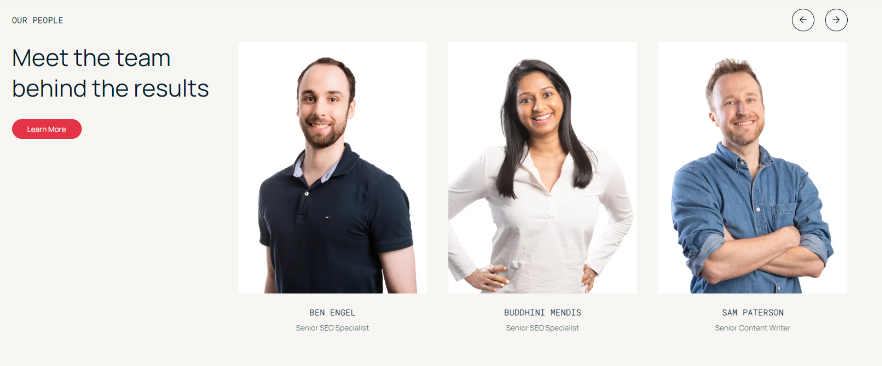
Showing off the team tells the clients a) you’re a legit business; and b) you have fun. By featuring real employees, you boost trust and make stronger connections with your audience. It’s a great way to convey authenticity and professionalism.
"Rather than just a series of headshots, we asked the team to strike two poses: one professional, one playful. Moving the mouse over each photo reveals the latter. It’s just one way to make our brand more relatable, while giving the team a chance to have fun and express their individuality", says David Pagotto, Founder & Managing Director of Sixgun.
16. AI design
AI design tools are revolutionising the way websites are created. From instant DALL-E doodles to reams of website code, the potential for creating infinite designs with minimal effort is huge. These tools can generate layouts, optimise user experiences, and create unique content at the click of a button. And because AI can handle repetitive tasks and data analysis, this gives designers room to focus on adding that all-important human touch.
Worst web design trends
Different strokes for different folks, or so the saying goes – and don’t let us cramp your style. That said, there are some trends that turn visitors off, and when conversions are the name of the game, this isn’t ideal. Some of the entries we’ve included because they just don’t work; others because they’ve been done to death and it’s time to move on.
01. AI design
AI design is a double-edged sword. Over-reliance can lead to generic, impersonal websites that all look similar. Without that human sparkle, layouts and content can quickly become un-engaging, and lacking in those all important opportunities for emotional connection.
The solution: balance AI efficiency with human creativity. Use AI for tasks like layout generation and optimisation, but make sure the final design has a personal flourish and unique elements that reflect the brand's identity. Incorporate custom graphics, unique typography, and personalised content to keep the site engaging and warm.
02. Excessive animations
Excessive animations slow down load times and can be overwhelming for users. Too many moving elements distract visitors from the main content and create a chaotic browsing experience. So if you’re going to use them (and if it’s appropriate, you definitely should), It’s crucial to use them in a way that complements the content rather than overshadowing it.
The solution: use animations judiciously. Focus on functional animations that enhance the user experience, like loading indicators or subtle hover effects. If you’re using animations as a centrepiece, focus on one big, bold feature. And make sure all animations are optimised for performance to avoid slowing down the website.
03. Parallax scrolling overload
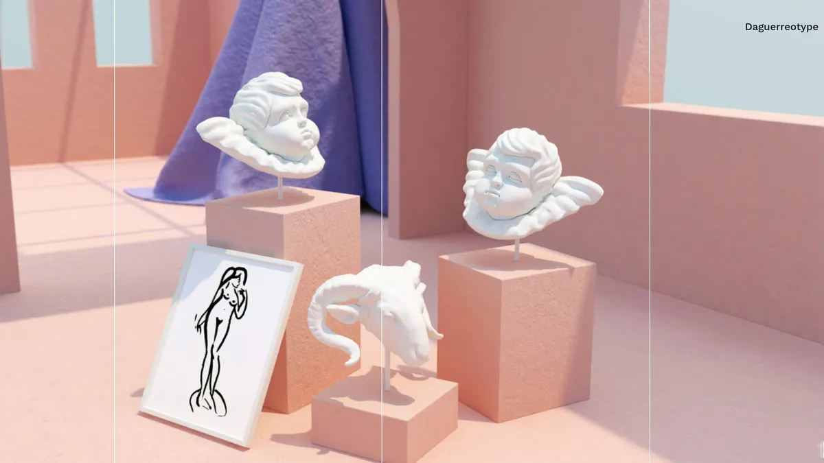
Parallax scrolling was one of our favourite trends from 2022. It can add depth to a site, but too much of it can be disorienting. When it’s overused, it can cause confusion and make navigation difficult. This trend can also lead to slower page loading times and negatively impact accessibility: users may find it challenging to focus on the content when there’s too much movement.
The solution: use parallax scrolling in moderation. Reserve it for key areas where it can enhance the storytelling or highlight important content. Make sure it doesn't interfere with the overall usability of the site, and test the design with real users to find the right balance.
04. Overuse of hamburger menus
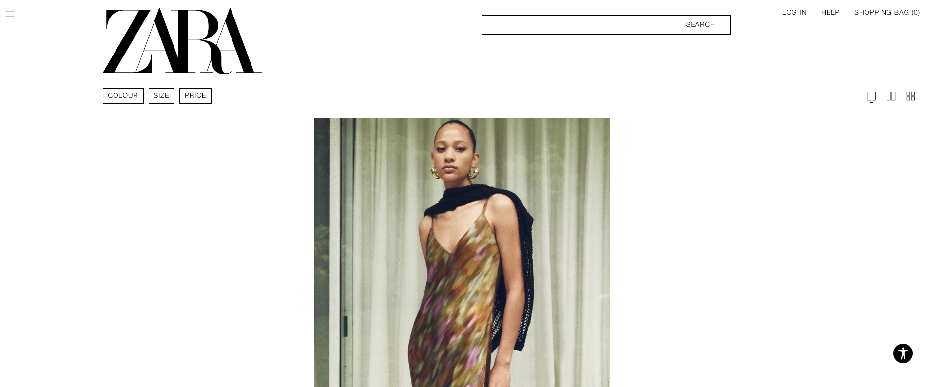
Hamburger menus are great for mobile design, but overusing them on desktop sites can hinder navigation. Users might miss important content, get frustrated with the extra clicks, or simply miss them. Desktop users typically prefer a more straightforward and accessible navigation system.
The solution: Save those hamburgers for mobile devices. On desktop sites, you have space, so use a clear and visible navigation bar. If you do opt to use a hamburger menu on desktop, make sure it’s easily accessible and that you don’t hide important links. Consider hybrid approaches where key navigation items are visible, with secondary options tucked away behind those three horizontal lines.
05. Heavy stock photo usage
We’ve all seen those pics of executives smiling around a laptop, or a woman laughing alone with salad. They had their moment, but by now, they’re overused; there really is no excuse. Relying too much on stock photos can make a site feel inauthentic, and unprofessional. Users appreciate original, high-quality images that reflect a brand's unique identity. Authentic photos look great and build trust.
The solution: Use stock photos sparingly and choose ones that align well with your brand's voice and message. Whenever possible, invest in custom photography.


