Get all your news in one place.
100's of premium titles.
One app.
Start reading
Creative Bloq
Creative Bloq
Technology
Joe Foley

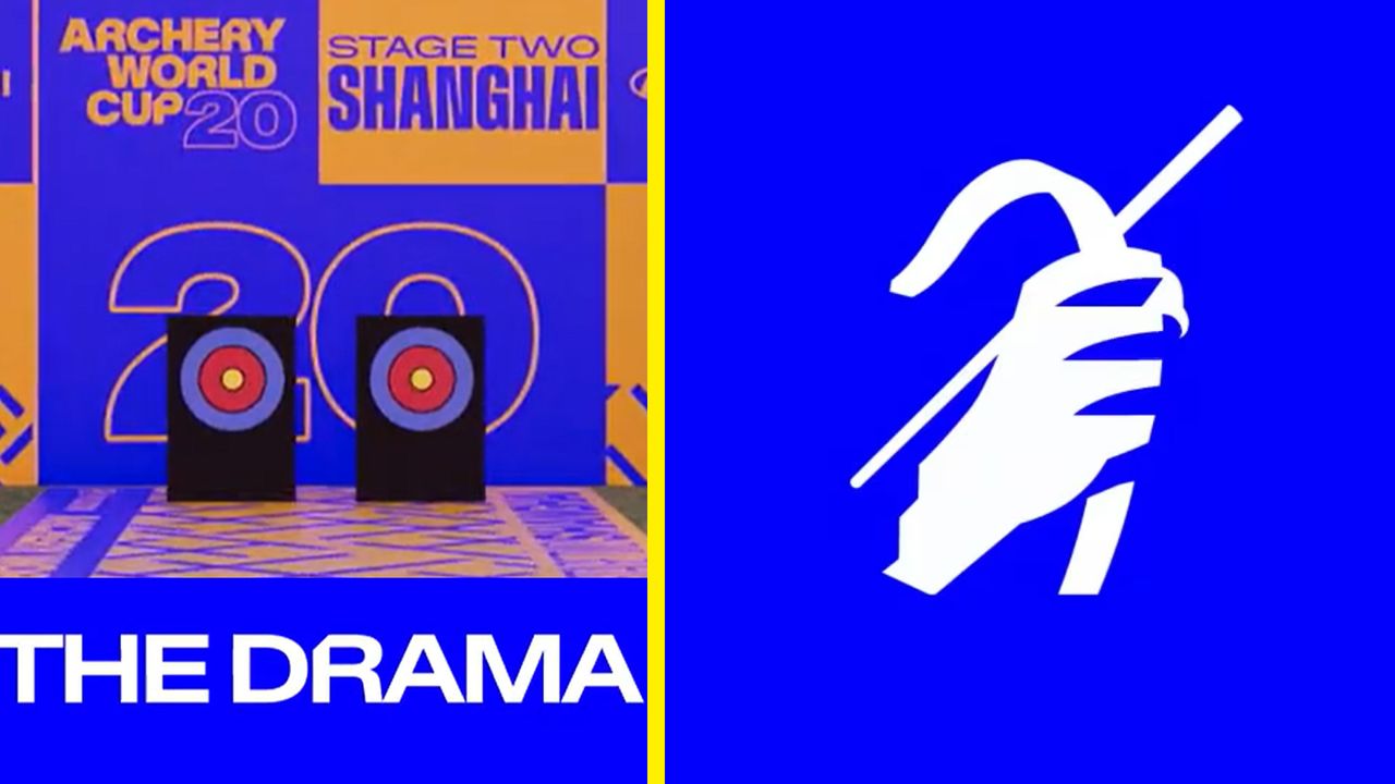
The Archery World Cup's dramatic rebrand has me quivering in anticipation

Archery World Cup rebrand.

Even the best sports logo designs can cause controversy. A redesign is almost guaranteed to spark pushback, as we recently saw with the new Newcastle United logo proposals.

But the new Archery World Cup logo might be one of the few that can avoid such a fate. A sharp (last pun I promise) rebrand has completely overhauled the identity of World Archery's competition, with striking colours, dynamic motion design and a new customised typeface.
Sign up to read this article
Read news from 100's of titles, curated specifically for you.
Already a member? Sign in here
Related Stories
Top stories on inkl right now
One subscription that gives you access to news from hundreds of sites
Already a member? Sign in here
Our Picks
Fourteen days free
Download the app
One app. One membership.
100+ trusted global sources.