I like Apple Music. I love the music selection, I like how seamless it is on my phone. I like how there’s still support for legacy hardware like iPods and old iPhones, and I like how it looks with its slick color scheme and interesting font choices. Apple Music is good, without a shadow of a doubt – but there remains one massive, glaring issue in my eyes: the desktop app.
The app on desktop, even on Mac, does work. It’s not an ugly app either, although it could look better. No, the issues are more useability problems with the library, the search function, weird idiosyncrasies within some really cool features, and other issues that need to be fixed so that Apple Music on my MacBook Pro can be as good as possible.
Make the mini-player more obvious

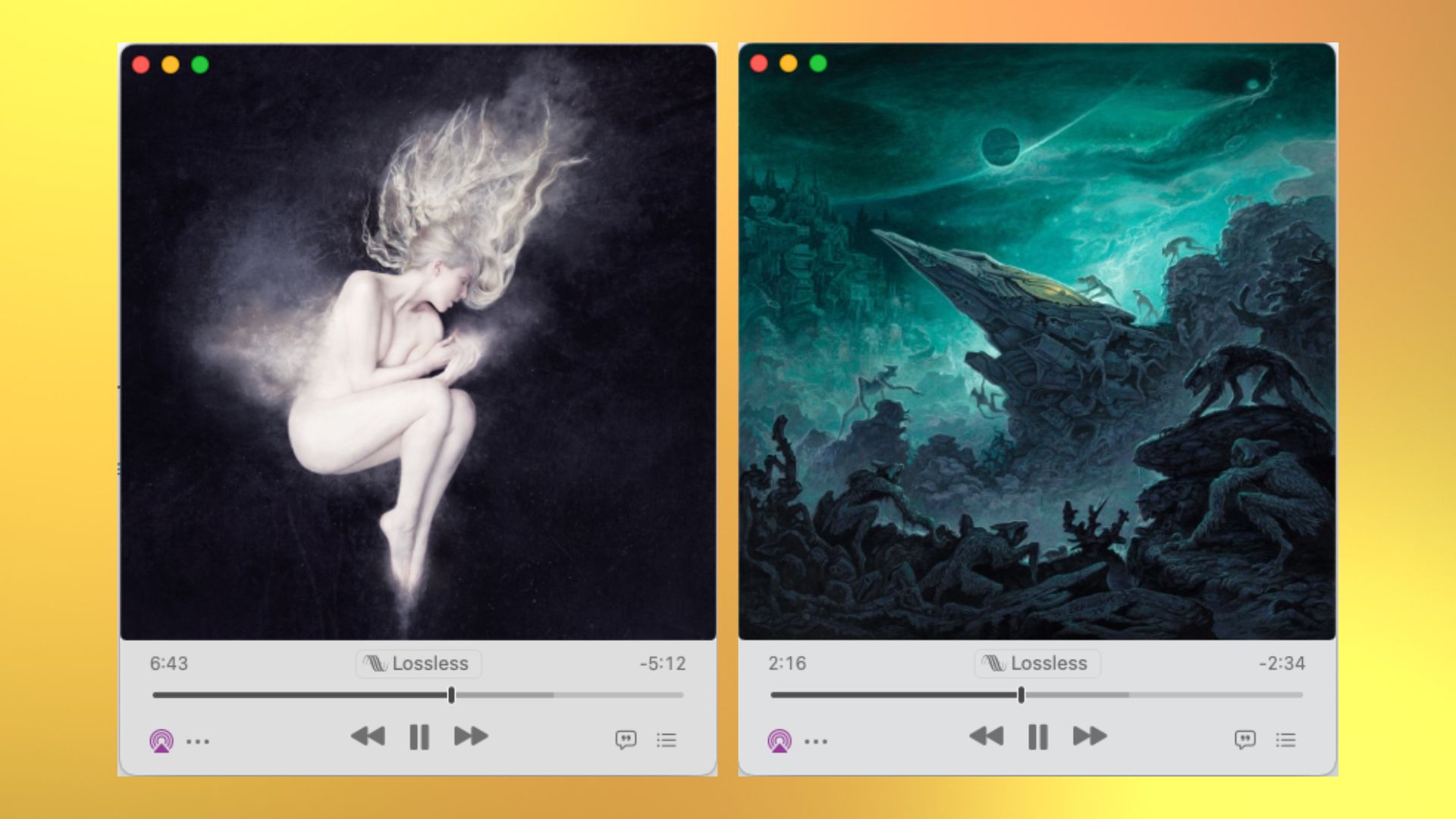
The mini player itself is great, letting me keep the window around while I work away on my MacBook. I can have it tucked away in the corner of a window on my second screen so that I can come back to it occasionally to press skip or check what's playing. The problem is finding it in the first place, and then working out how to close it.
It’s a small thing, but one that confused me for months. The only way to open the mini-player is to press the album art on the now-playing bar at the top, where you’ll see a small, difficult-to-decipher icon. Press that, and Apple Music shrinks down and becomes the mini-player. Nice. My discovery of this feature, however, led me to the next thing – now that I’d found how to open it, I wasn’t sure how to close it. Sure, the answer was a web search away – but it shouldn’t be.
To close the mini player you have to press the close window X button in the top left. That reopens the full-size Apple Music app, ready for you to press the album artwork to go back to the mini player when you want to. If you know this already, it's fine, but there are problems with these button conventions. I only discovered the feature because I thought that if I pressed on the Album artwork, I’d be taken to the album page, as it would in the likes of Spotify. It took me ages to work out how to close the player because the X button usually closes a window outright.
Make these functions their own buttons that are more clearly signposted, because as of right now, they are super user-unfriendly.
Fix the library tab

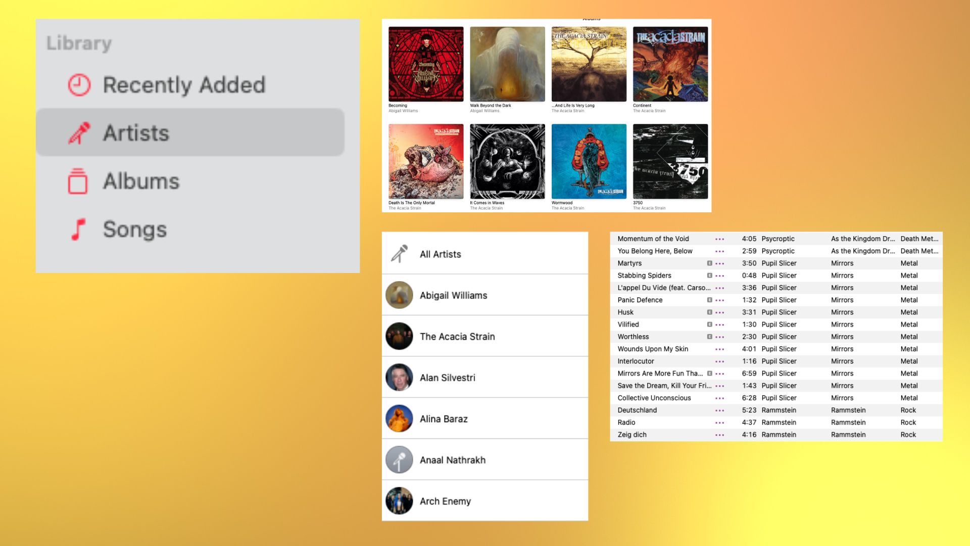
The library tab is useful, yes, but also a pain in the backside. For one, if you’ve got any kind of collection on your best Mac, it’ll be mixed into all the other music you’ve added to the library from Apple Music. It simplifies things, yes, but it’s also nowhere near as good to use as it could be. In fact, it sometimes means that there are two, or even three of the same album in the library, as it takes the tracks from your hard drive, from iTunes, and from Apple Music itself.
Searching the library is fine, but it’s slightly hidden away. To search the library, one can choose the option from the search tab, or use the tiny search button that occupies the space next to the sorting filter. Make the search function more obvious, and then make it more obvious where a track or an album is from to make this function better.
The now-playing bar needs to be better

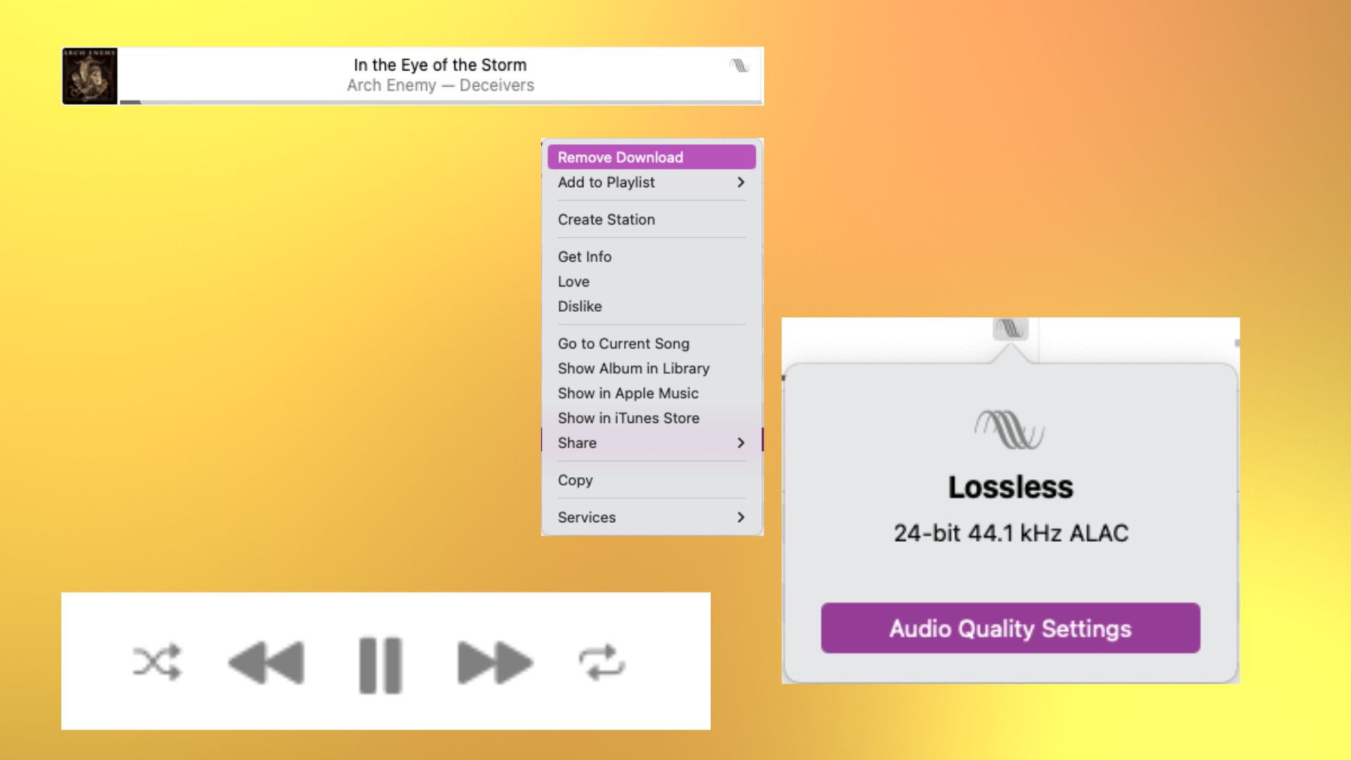
At the moment, the now-playing bar at the top of the app is fine. It tells you what’s playing, and how long it's been playing for. But it's not perfect, by any stretch of the imagination – it’s not particularly user-friendly, and there is way too much blank, unused space on larger screens.
I reckon the best idea would be to stick it all in the sidebar like Spotify and almost every other streamer does. Yes, it would take a little of Apple Music’s uniqueness away, but it would make it much better to use. Let me click on the album or the album title so that I can go to their respective pages, rather than using a hidden three-dot menu. Get rid of all the negative space and it will be a much better-to-use experience.
How to fix Apple Music on Desktop
Ok, so maybe the desktop app isn’t rubbish, but it certainly isn’t very good. It’s got loads of space that needs filling, as well as a cool feature in the mini-player that needs fixing to become more user-friendly. Considering how well thought out so many others of Apple’s apps tend to be, it feels strange that this one is utterly average.
With these fixes, however, Apple Music might become a whole lot more useable on my MacBook Pro. While it's unlikely that Apple will put too much credence into most of my ideas if just one of them makes it through then Apple Music will be a whole lot better.


