It’s difficult to move without hearing something new about Taylor Swift at the moment, whether she’s supporting her footballer boyfriend Travis Kelce at the Super Bowl or she’s announcing a new album at the Grammys.
The Tortured Poets Department is arriving in April, but it’s fair to say it doesn’t boast one of the best album covers of all time, or even one of the best we’ve seen from T-Swizzle – and people have been poking a bit of fun at it online too. And with an exhibition of the world’s worst album covers going on display in the UK, we thought it’d be a good time to take a look at some album covers that we aren’t fans of.
Peter Rabbitt – Roadstar
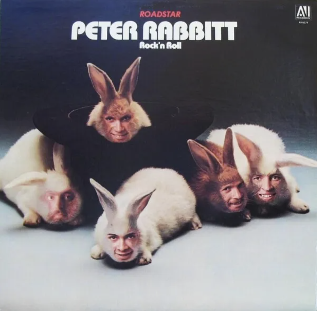
Good god. This is the album that started off the exhibition, and for good reason. Featuring the band members’ faces superimposed onto rabbits, it’s quite simply enough to give anyone nightmares.
The thing is, if the band had just used the original image of the rabbits, it would have been quite a nice album cover, reflecting their name and looking pretty cute. But the human faces give it an unsettling quality.
Drake – Certified Lover Boy

Sorry, it might have been designed by a renowned artist in Damien Hirst, but this is simply not a good album cover. It features 12 pregnant woman emojis in different hair colours, clothes, and skin tones, and the result was panned by critics and fans alike.
As we said in 2021 when Certified Lover Boy, it feels slightly distasteful to use so many emojis depicting pregnant women given the album title, but it’s also just not very aesthetically pleasing.
Maroon 5 – Red Pill Blues
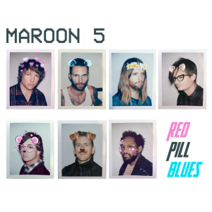
First of all, the album title has aged like milk given the appropriation of the ‘red pill’ and ‘blue pill’ concepts from The Matrix by many on the far-right, but the cover imagery isn’t much better.
Inspired by Snapchat filters (bear in mind that the members of Maroon 5 were all pushing 40 at this point) the cover features each band member pictured on Polaroid photos with filters on their faces. It looks like something a fan might mock up and post on Tumblr rather than a real album cover.
Melanie Martinez – Portals
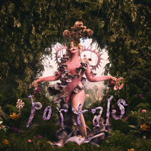
Erstwhile The Voice contestant Melanie Martinez made a name for herself with a childlike aesthetic and album titles like Cry Baby and K–12, but in 2023 released her third album Portals, a departure from her earlier look.
Now, Martinez takes on a new creature-like alter ego, with an album cover that looks a little like if you bought Björk from Wish. It’s not a bad concept, per se, but it definitely could have been done better.
Yeah Yeah Yeahs – Mosquito
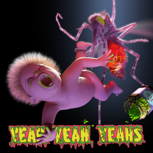
The New York garage rockers’ fourth album may have only narrowly missed out on the top spot in the charts, but its artwork certainly doesn’t deserve to be in contention for number one. Featuring an animated baby being gripped by a giant mosquito, complete with a bit of green goo, it divided opinion.
While fans were happy to get new Yeah Yeah Yeahs music for the first time in four years, they weren’t as happy with the cover, with some saying they thought it was made by a fan and posted to social media as a joke.
Grandaddy – Under the Western Freeway
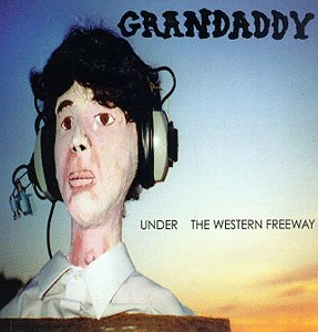
Grandaddy have had some interesting covers over the years, and the artwork for their 1997 debut album Under the Western Freeway is certainly up there.
It takes the form of a painting of a man listening to something on his headphones, and while it’s technically good it’s a bit unnerving, and along with the typeface used for the band’s name, it’s altogether not a very attractive album.
Madonna – American Life
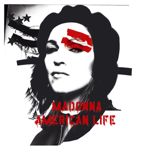
2003’s American Life was a divisive album for Madonna, and it occurred after another image reinvention for the singer following her role in the critically panned movie Swept Away the previous year.
And the cover featured Madonna as a revolutionary fighter, taking inspiration from Che Guevara, while her name and that of the album title were printed in a typeface that was part-militaristic, part-punk. The reception spoke for itself – by the end of 2003, the Queen of Pop had abandoned the image entirely.
Crosby, Stills & Nash – Live It Up
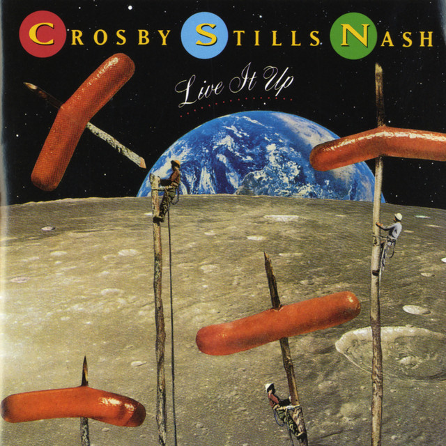
The supergroup’s 1990 album Live It Up has one of those covers that just makes you wonder what they were thinking. The cover art features hot dog sausages being roasted on the moon, but even this description doesn’t really do it justice – it’s bad.
The thing is, without the sausages, it wouldn’t be too bad. Not an all-time classic, sure, but it would have been a respectable album cover. This, however, is not one.
For some slightly better album covers, why not check out the 20 best album covers from the 70s? Or, take a look at this optical illusion album art.

