When it arrived in 2019, the Model 3 was a hugely significant car for Tesla. It represented the next major step in Elon Musk’s so-called ‘Master Plan’, where profits earned from selling the high-priced Models S and X were pumped into producing an electric car for the masses. It wasn’t uncommon for the Model 3 to be uttered in the same breath as the Ford Model T and Volkswagen Golf. It was a landmark car with the weight of the world on its shoulders.
Yet it almost bankrupted the company. Musk referred to the early days of Model 3 as “production hell” and claims to have slept in the Tesla factory as his company wrestled with the realities of mass-producing cars at an unfamiliar scale.
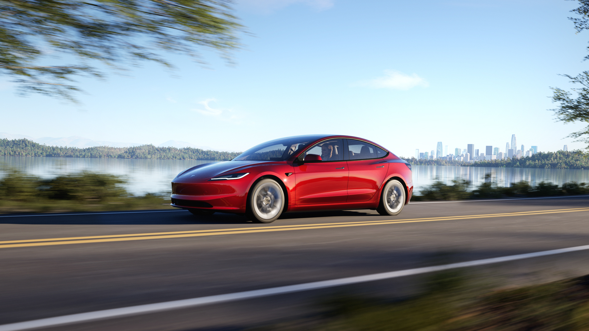
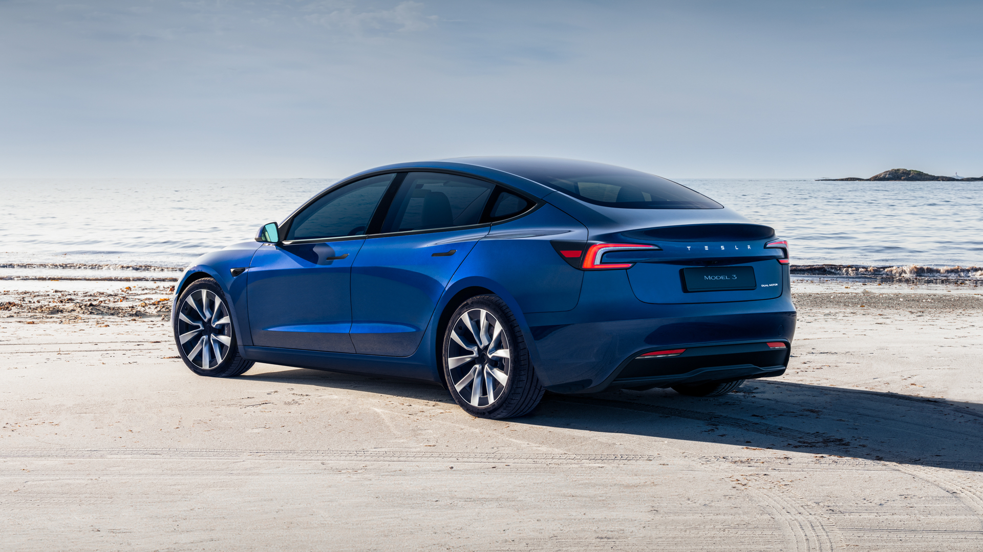
Fast-forward half a decade and, with production hell behind it and the Model Y one of the world’s best-selling cars, it’s time for a new Model 3. It’s known internally as the Highland and, while it doesn’t look like much has changed on the outside – save for some new, slimmer headlights and a modestly redesigned rear – there are bigger upgrades under the skin.
Have these changes helped propel the Model 3 back to the front of the affordable EV pack? Or has Tesla taken its pursuit for simplification a step too far? Read on to find out.
What’s new?
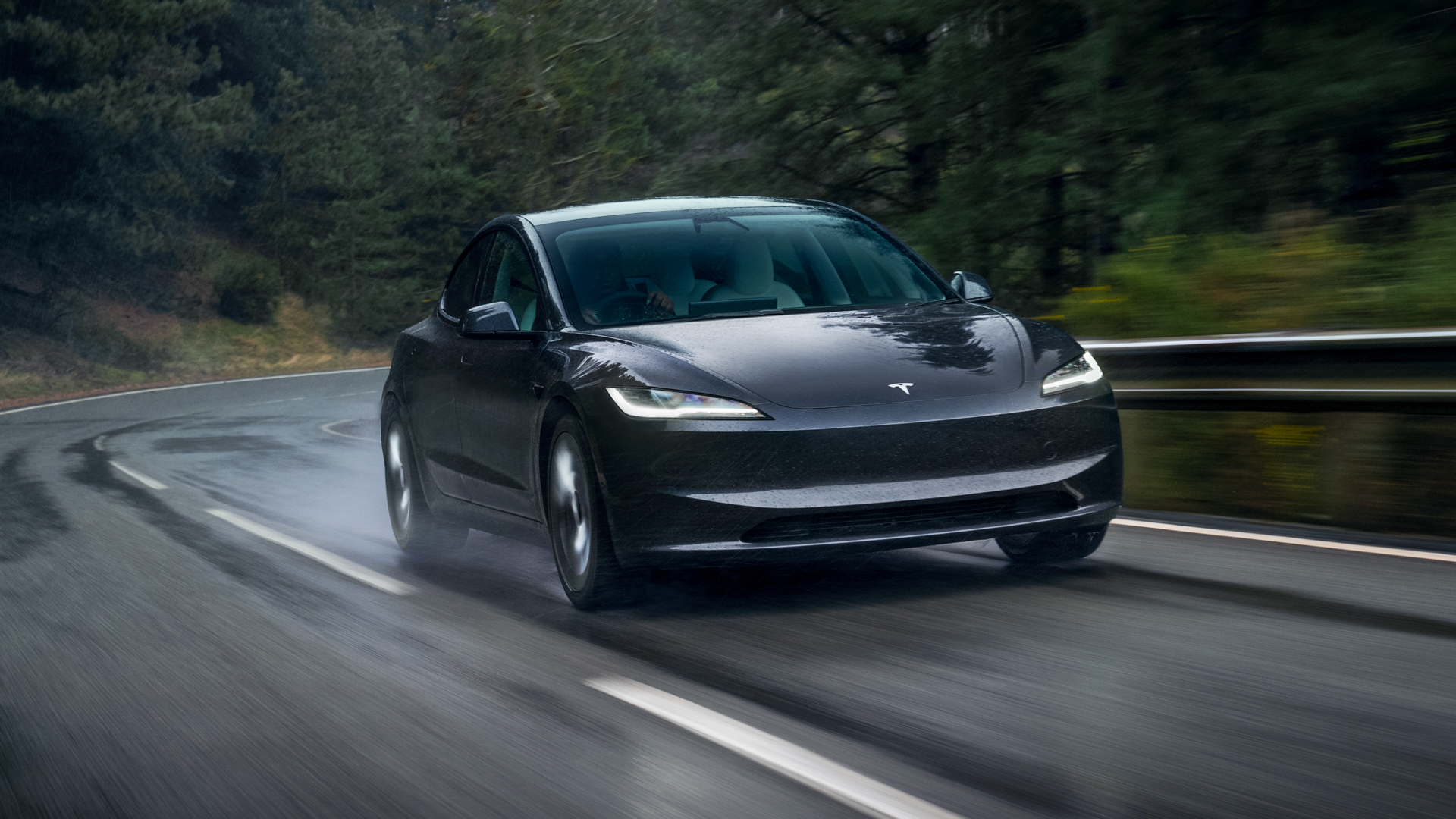
The new Model 3 has an updated front and rear end, as well as a revamped interior with new digital displays, ventilated front seats, ambient lighting and acoustic glass for reducing cabin noise, among other changes. Tesla has also updated the car’s suspension, wheels and brakes in a bid to improve suspension response, body isolation and ride refinement.
Hardware, performance and range
Build quality appears to have improved markedly over the previous generation of Model 3. The new car feels like it has been screwed together properly, and the interior quality is a particular highlight. What’s even better – and what has always set Tesla apart from the competition – is the electric drivetrain.
For this review I have the dual-motor version of Model 3. It’s called the Long Range All-Wheel-Drive and is priced from £49,990 at the time of writing. It has an WLTP range of 390 miles, accelerates to 60 mph in a claimed 4.2 seconds and has a top speed of 125 mph. It sits in the middle of the Model 3 family, £10,000 above the single-motor, rear-wheel-drive version, which has a WLTP range of 318 miles and a 0-60 mph time of 5.8 seconds. Above both is the Model 3 Performance, which also has two motors but hits 60 mph in a hypercar-like 2.9 seconds and has a top speed of 163 mph. All that power comes at a price though, as it costs from £59,990 and the WLTP range falls to 328 miles.
I covered a few hundred miles in the Model 3, including a trip from London to Somerset, and its efficiency consistently impressed, averaging between about 3.8 and 4.1 miles per kWh. Add this to a maximum charge rate of 170 kW and the excellent Tesla Supercharger network, and range anxiety is unlikely to ever cross your mind.
The Supercharger network has always been deeply impressive and today remains the gold standard for EV charging infrastructure. Simply enter your destination and it’ll tell you where to stop and exactly how long to charge for. It also estimates your battery percentage at each stop and at your destination. It’s still worth having a backup plan in mind, as with any EV, but since I first used the Supercharger network almost a decade ago I have yet to find a faulty charger, or needed to queue to plug in. The same cannot be said for other charge networks.
The Model 3 drives well, with great acceleration, good road manners and a quiet, smooth ride – all the things you should expect from a £50,000 EV. The cabin is light and airy, with good visibility, decent comfort and plenty of space across both rows. As ever with Teslas, and many other EVs too, full-bore acceleration feels like overkill for what is otherwise a sensible family car. That said, it’s still fun to quickly overtake slower traffic, speed out of junctions and surge down motorway slip roads. It’s never intimidating, or dramatic in any way, but raises a childish smile. I suspect the Model 3 Performance will feel like a very different beast.
The 3's one-pedal driving mode is nicely calibrated and I found I could complete most journeys without ever touching the brake pedal, thanks to the regenerative braking system, which is strong but easy to modulate precisely.
Interior and software
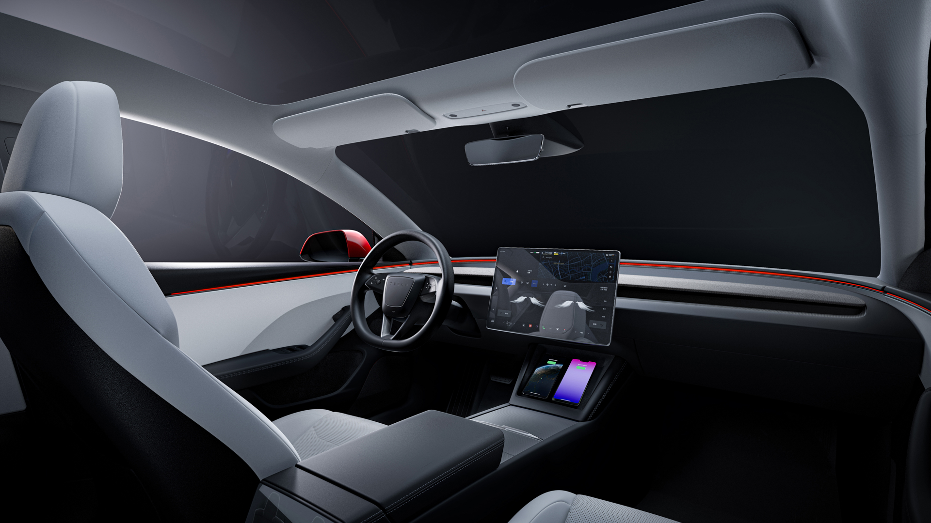
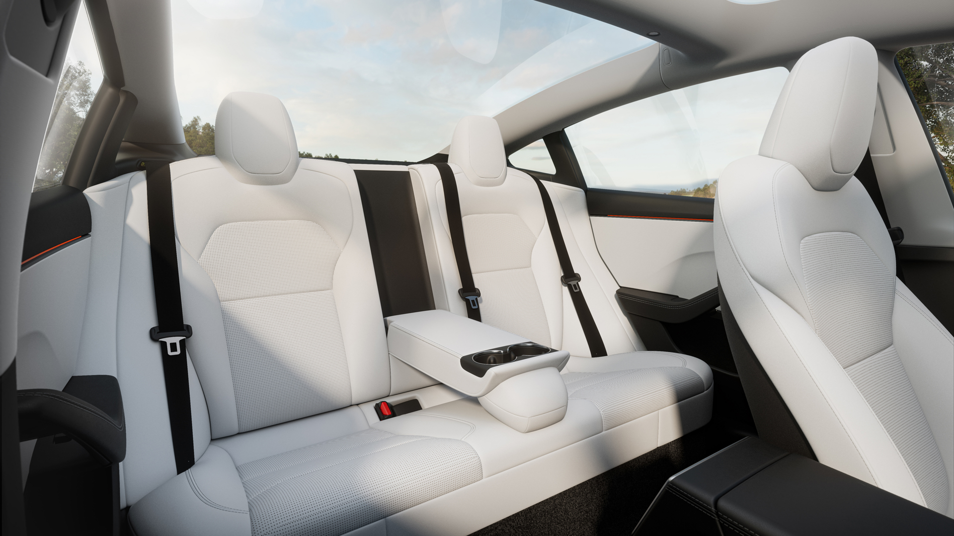
Despite the minimalist aesthetics, the interior is full of premium features like a large panoramic glass roof, heated seats (which are also now cooled in the front row), acoustic glass for extra sound proofing, a pair of wireless phone chargers up front and two USB-C ports in the back.
Rear seat passengers also benefit from a new display, located low down between the front seats and used to adjust rear air temperature and seat heating. It can also access streaming services like Netflix and YouTube, and even play games, but doing that on the move is only recommended for those with a strong stomach. Parents, you’ve been warned.
Up front, there’s a big touchscreen that handles almost everything, from the music, navigation and air conditioning, to vehicle settings, charging and the speedometer. It’s where you need to go to adjust the position of the mirrors and steering wheel, and even where the gear selector, headlight and wiper controls live.
And this, unfortunately, is where the annoyances begin. The door mirrors cannot be adjusted without going into the touchscreen system, and nor can the windscreen wiper or headlight settings. A button on the steering wheel performs one windscreen wipe with a press, and washes with a long press; either of these temporarily shows more wiper controls on a lower corner of the touchscreen, but the small icons can be tricky to tap accurately while driving.
There’s an automatic mode, but since that’s so unreliable – a common Tesla shortfall that has lingered for years – I recommend you avoid it. The windscreen would frequently be covered in rain, to the point of being dangerous, without the wipers noticing. They also often failed to register how heavily it was raining, and would sometimes come on for no reason at all. I know this is remedied with a press of a button and a tap of the screen, but asking the driver to take their eyes off the road when the automatic wipers have failed them is absurd. What's wrong with a stalk?
I’m left wondering how we are supposed to believe Tesla’s plans for fully autonomous vehicles when it can’t even get automatic wipers right.
Equally baffling are the indicators. Again, instead of fitting a stalk-like everyone else, Tesla asks Model 3 drivers to indicate with a pair of haptic buttons on the wheel, below their left thumb.
This is just about acceptable when changing lanes on the motorway, and to their credit, the indicators handily switch off when the car sees you have completed the manoeuvre. But when navigating a tight roundabout it’s practically impossible to press the correct button without looking.
Ferrari was also criticised when it deleted indicator stalks back in 2010, but it at least had the common sense to put a button on either side of the wheel, and because the steering is so quick you rarely need to steer hand-over-hand, as you do in the Tesla.
Even the gear selector is on the touchscreen. Mercifully, this actually works well and is more intuitive than you’d expect; there’s a slim, permanent line on the edge of the screen closest to the driver, on which you swipe upwards to select Drive and downwards for Reverse. There are also icons to tap for Park and Neutral. This works, but Tesla would rather you let the car change gear automatically, since it’ll go for Drive when backed up against a wall, or Reverse when there’s something in front. This isn’t as annoying as it sounds, but good luck figuring it all out without a demonstration first.
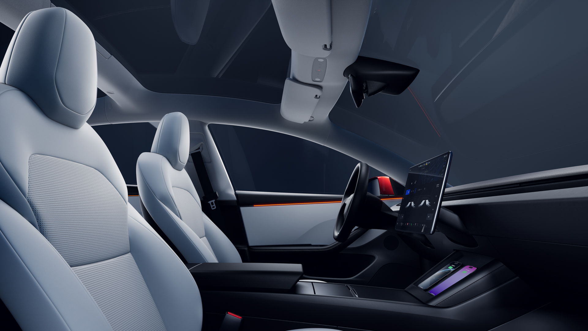
There’s even a third way to change gear, with a set of standard P, R, N, D buttons in the headlining behind the windscreen, along with a button for the hazard warning lights. Although when I say “button”, I actually mean a touch-sensitive icon that doesn’t move. This makes it difficult to give a quick blink of the hazards – something I do frequently to thank or apologise in city traffic – without looking up to check it's worked.
Removing switchgear like this screams “cost-saving” and delivers no benefit to the driver. Unless the 2024 Model 3 is the only car you’ve ever driven, flicking the indicator stalk with an outstretched finger is as instinctive as reaching for the seatbelt or checking your blindspot. Pressing a button isn’t simpler, quicker or easier, because there was zero hardship in the first place. All it does is add confusion and complexity – and the safety regular Euro NCAP agrees. New rules arriving in January 2026 will dock safety points from cars that do not have proper, physical switchgear for indicators, hazard warning lights and wipers.
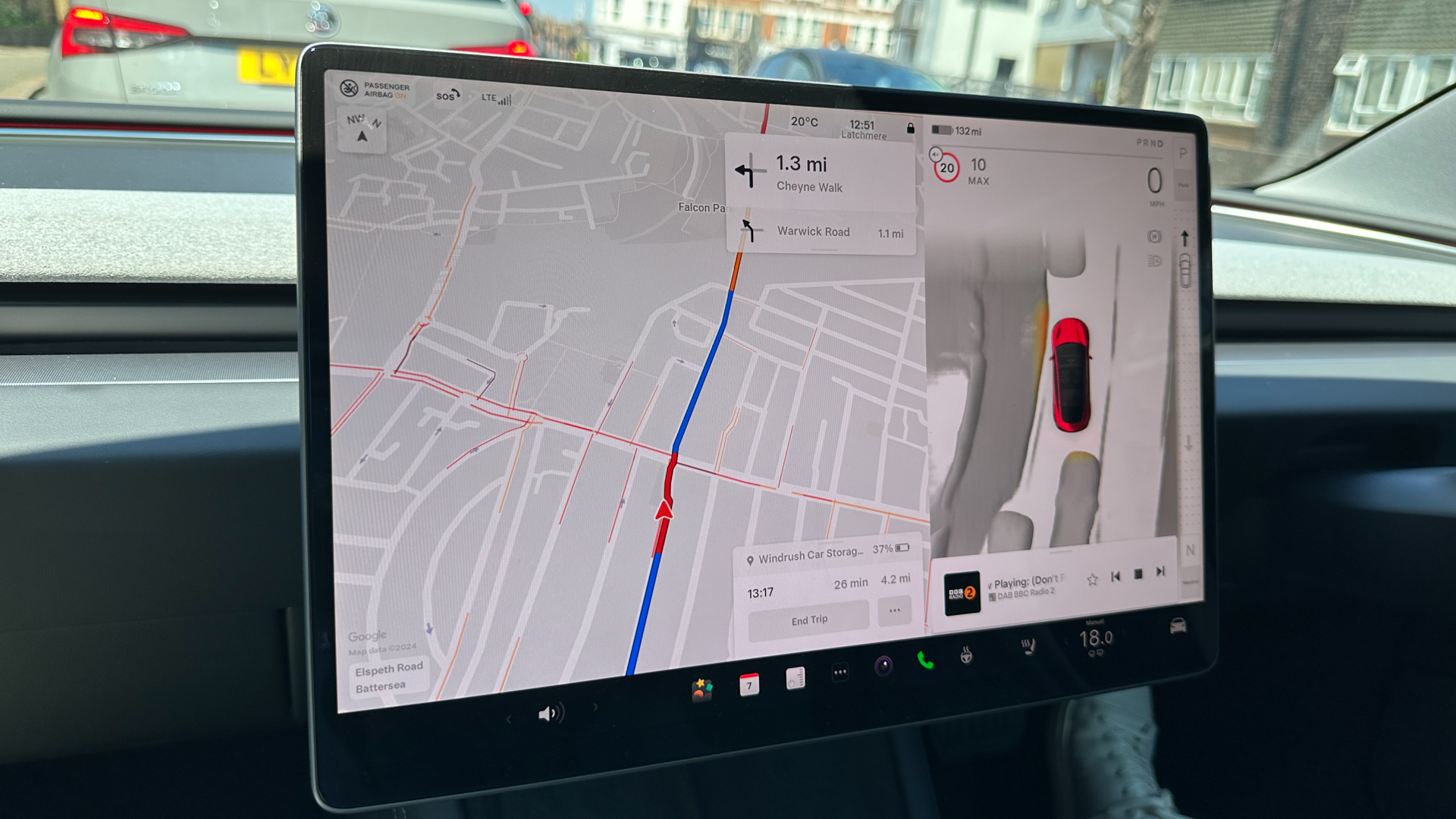
Lastly for the negatives – I appreciate this is starting to sound like a rant – is how the central display shows a virtual representation of what the car can see of its surroundings. This is primarily intended to show what’s going on when the Autopilot driver assistance system is activated, but remains in place when the system is switched off. Sometimes it cleverly shows nearby cyclists, trucks, pedestrians and other hazards, but it isn’t always reliable. Cars sometimes dance around the screen despite being stationary (another years-old fault), and sometimes pedestrians turn into cyclists, while trains and trams appear as especially long trucks.
These virtual objects turn red when the car thinks a collision is imminent, and the driver is audibly warned. The latter isn’t unusual for modern cars, and these systems sometimes make mistakes. But in my experience, the Model 3 makes more mistakes than most. The system had a habit of warning me about pedestrians walking safely on the pavement, well away from the road, and panicking when driving around parked vehicles. Yet, when a moped rider fired out into the road from between two parked cars, causing me to stop, the Tesla didn’t see a thing.
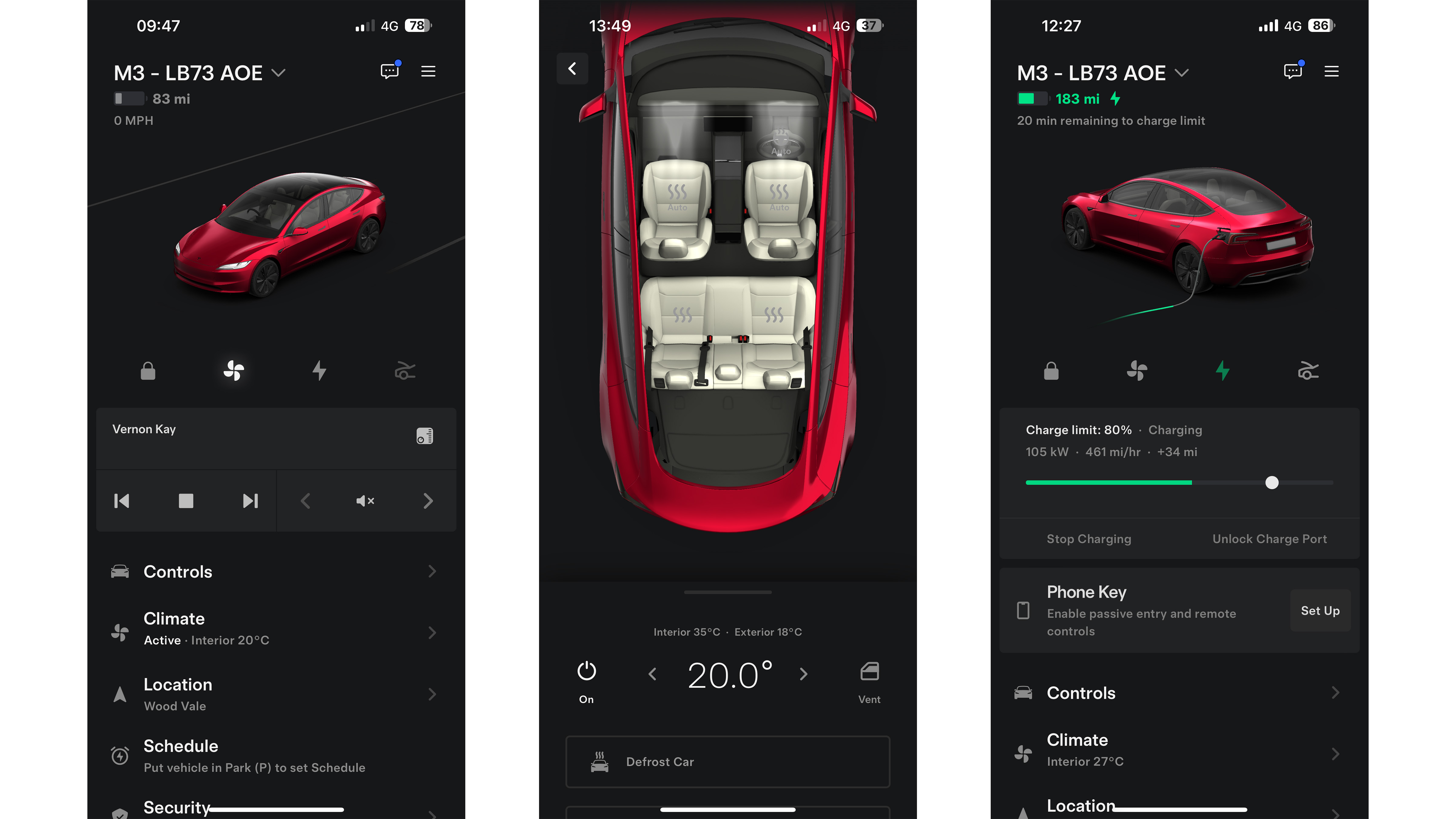
In better news, the smartphone app is fantastic. It’s easy to set up, fast to use and reliable. Although not unique to Tesla, it works better than any other connected car app I've used.
I loved being able to remotely check on the charge status or turn on the air conditioning before driving on a warm day, and your phone can be used as the key; just walk up to the car with your phone in your pocket, get in and go – then just park, get out and walk away. It's seamless.
Should I buy the Tesla Model 3?

Coming to a definitive conclusion on this car isn't easy. The Model 3 gets so much right – the charge network, the phone app, the excellent efficiency and great range – then fails on aspects that shouldn’t even be up for debate.
When did you last hear of a car being criticised for its indicators, wipers or gear selector? You don’t, because everyone else uses broadly the same standard controls, which are the result of decades of development and refinement. Indicator and wiper stalks did not need reinventing, in the same way no one asks for redesigned seatbelts or for six wheels instead of four.
When given a clean canvas to work from – such as with a charge network and a phone app – Tesla absolutely nails the objective. It produces the gold standard to which everyone else is compared, and for that it should be highly commended.
But when faced with decades-old tech, like indicator and wiper stalks, it just can’t help itself. To change these controls and force customers to relearn the hardwired fundamentals of driving a car is arrogant.
Sometimes this attitude is respected, even revered; akin to Henry Ford or Steve Jobs insisting they know what the customer wants before they realise it themselves. But this isn’t one of those moments. These are cost-saving changes with no obvious benefit to the customer.
The result is a car that somehow manages to hit the bullseye and miss the mark by equal measure. By almost every metric, the new Model 3 is among the very best EVs you can buy today, with top-notch technical abilities and a very real sense it could be the perfect car for almost everyone. It’s also keenly priced, nicely designed and packed with fun, useful tech. I just wish Tesla would stop with the hubris and reinstate the physical controls of the old Model 3. If it did that, I’d probably buy one. For now, the frustrations caused by Tesla's meddling with the fundamentals are too much to ignore.


