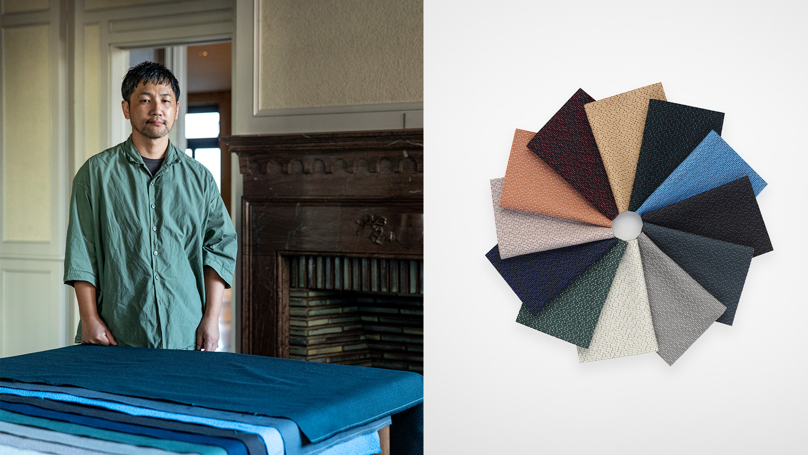
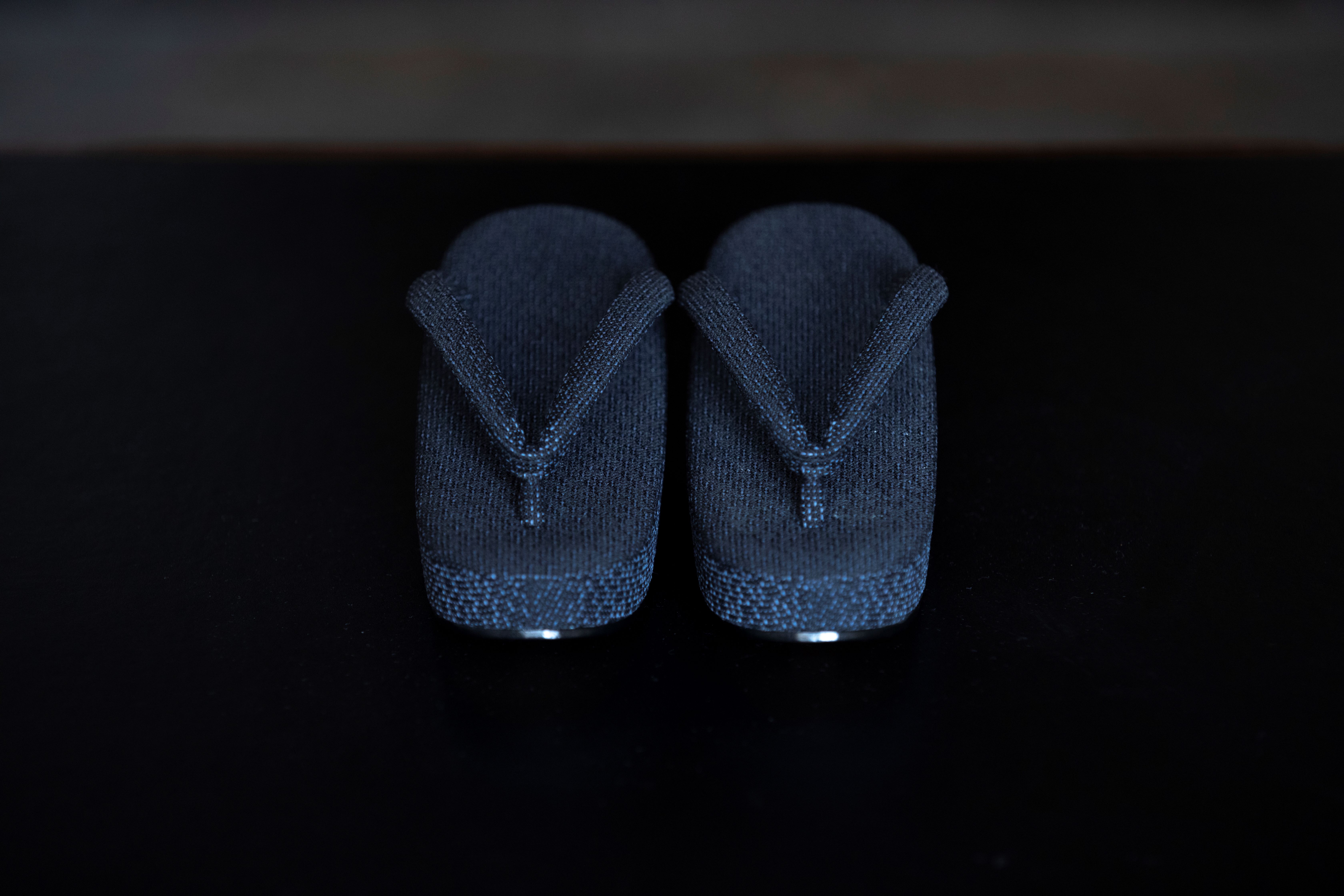
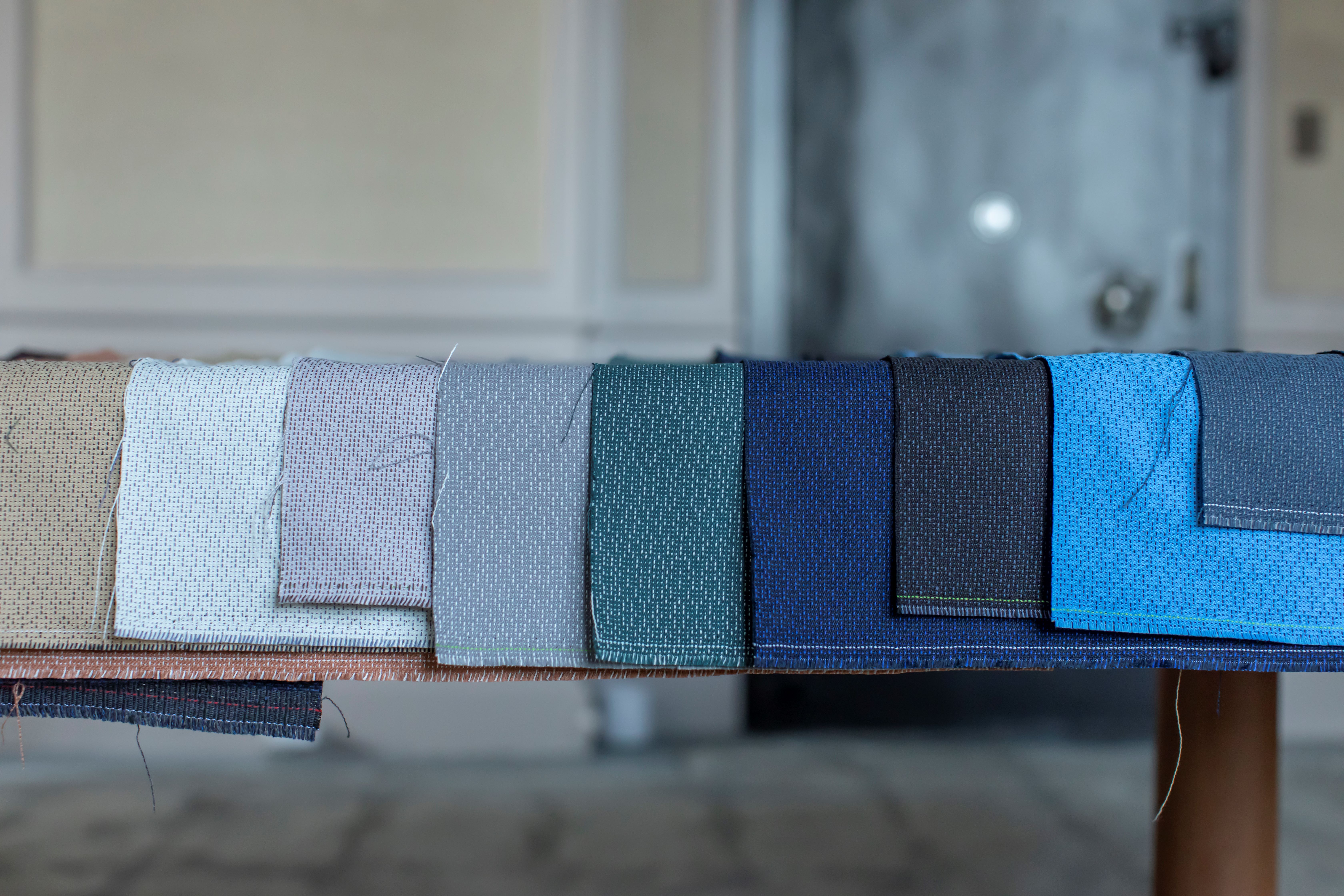
For centuries, Japanese farmers repaired worn clothing using a handsewing technique known as sashiko, with textile surfaces punctuated by rain-like patterns of countless single stitches. This practice, expressing a unique beauty through utility, is the visual starting point for ‘Ame’, a contemporary textile created by Japanese designer Teruhiro Yanagihara for the Danish company Kvadrat.
‘Ame’ – meaning ‘rain’ in Japanese – is Kvadrat’s first textile-to-textile product, crafted entirely of polyester recycled from fabric waste. Its material modernity is harmonised with the poetry of its concept, with a rhythmic design reflecting a modern reimagining of sashiko through its rain-like stitching.
Ame by Teruhiro Yanagihara for Kvadrat
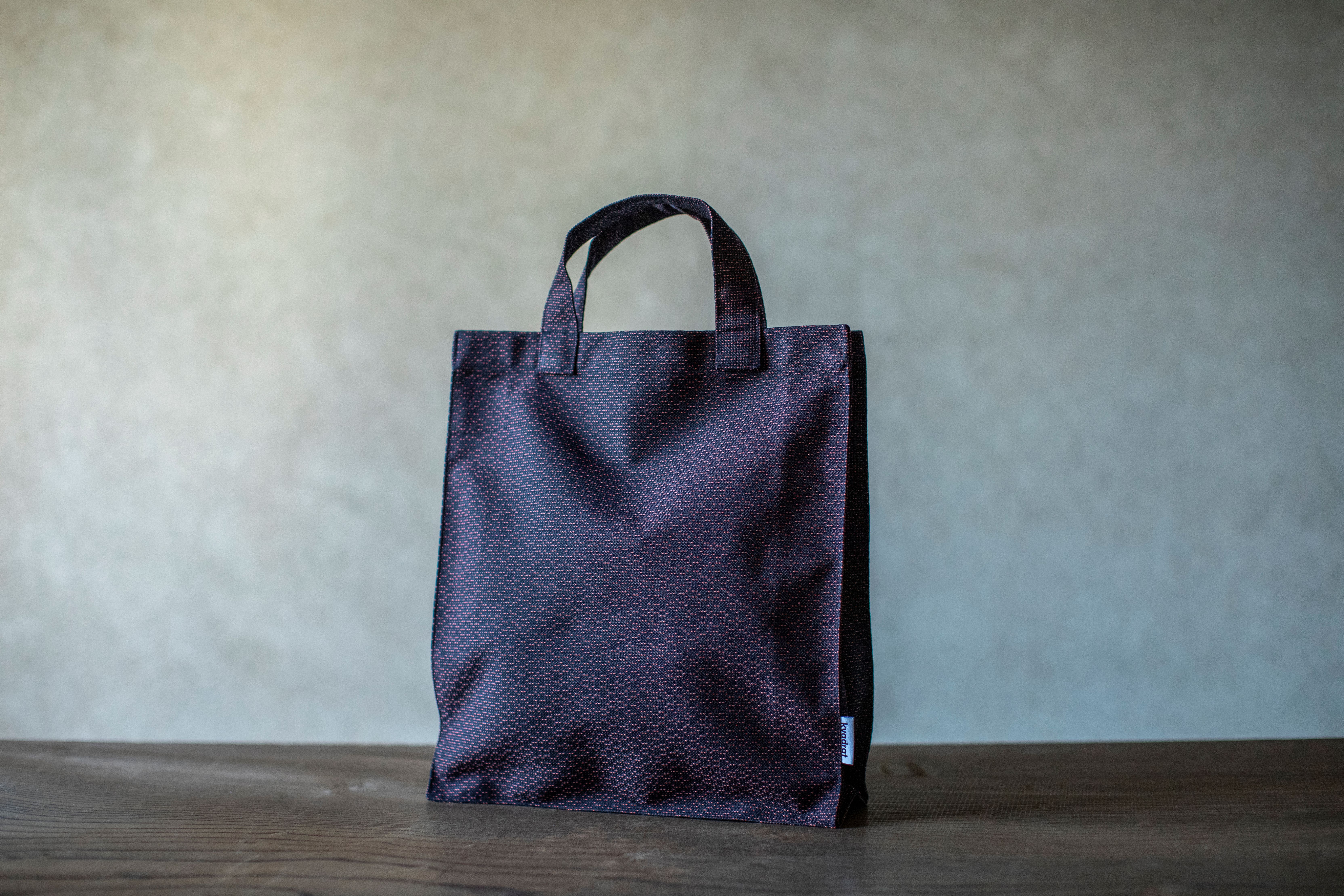
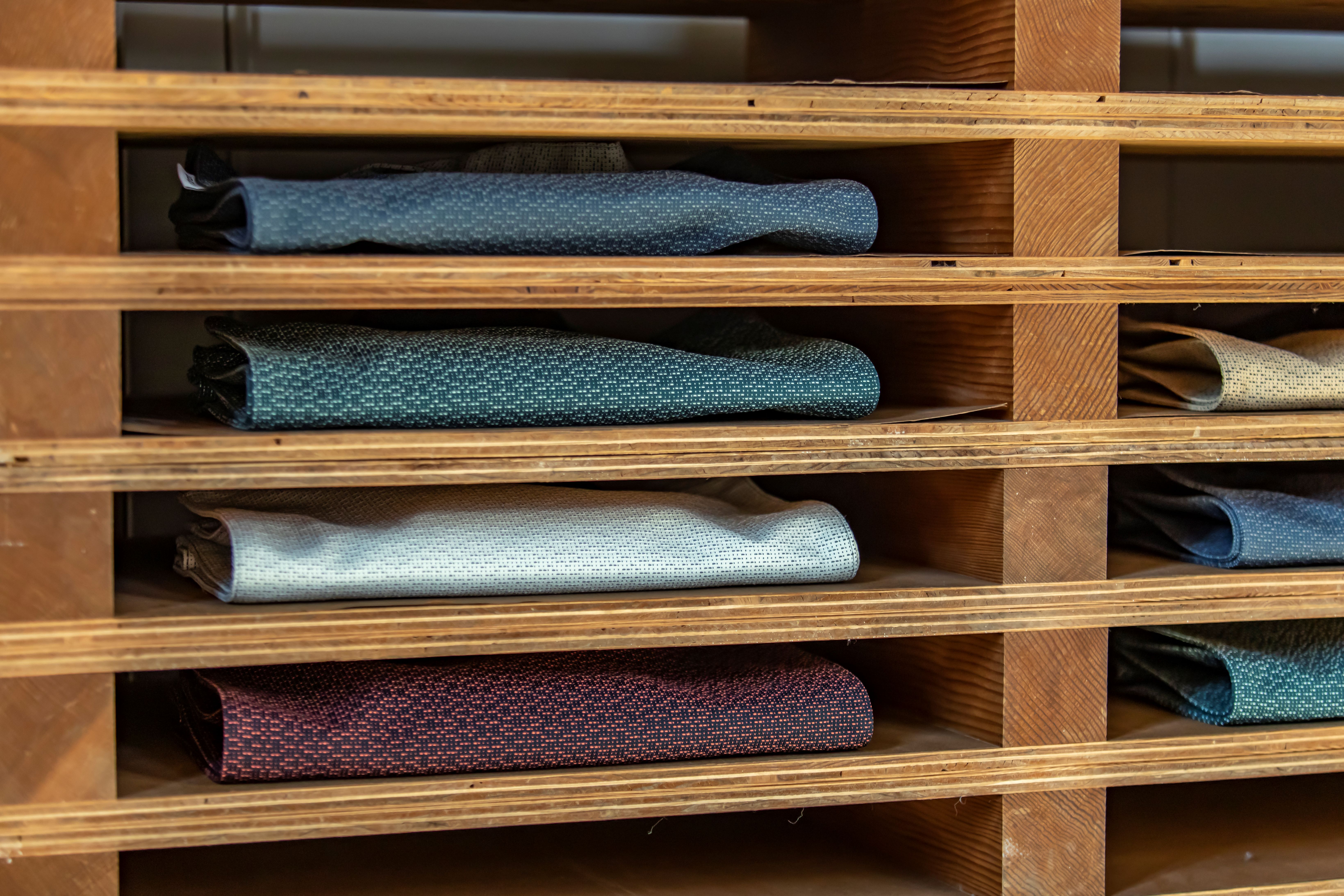
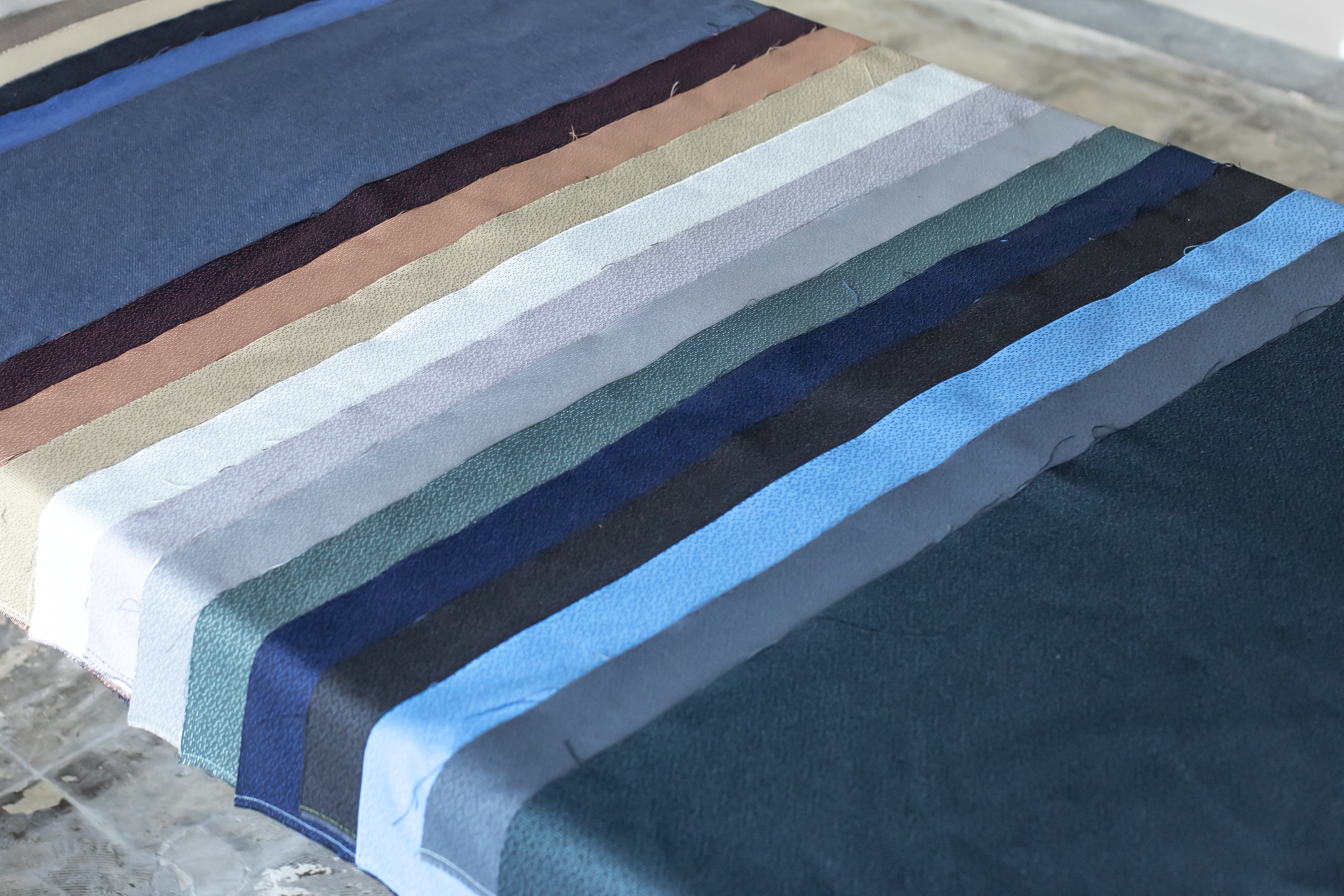
The textile’s in-between shades were inspired by Japan's traditional colour palette, in which deeply codified tones mirror the quietest changes of the micro-seasons. The shades are harmonised in two layers, in a modern riff on kasane no iro, the traditional art of layering kimono textiles.
‘Ame’ is the latest in a trio of textiles designed by Yanagihara for Kvadrat (following ‘Haku’ and ‘Autumn’) – all three connected through contemporary reimaginings of traditional Japanese ideas combined with the natural beauty of gently nuanced colours.
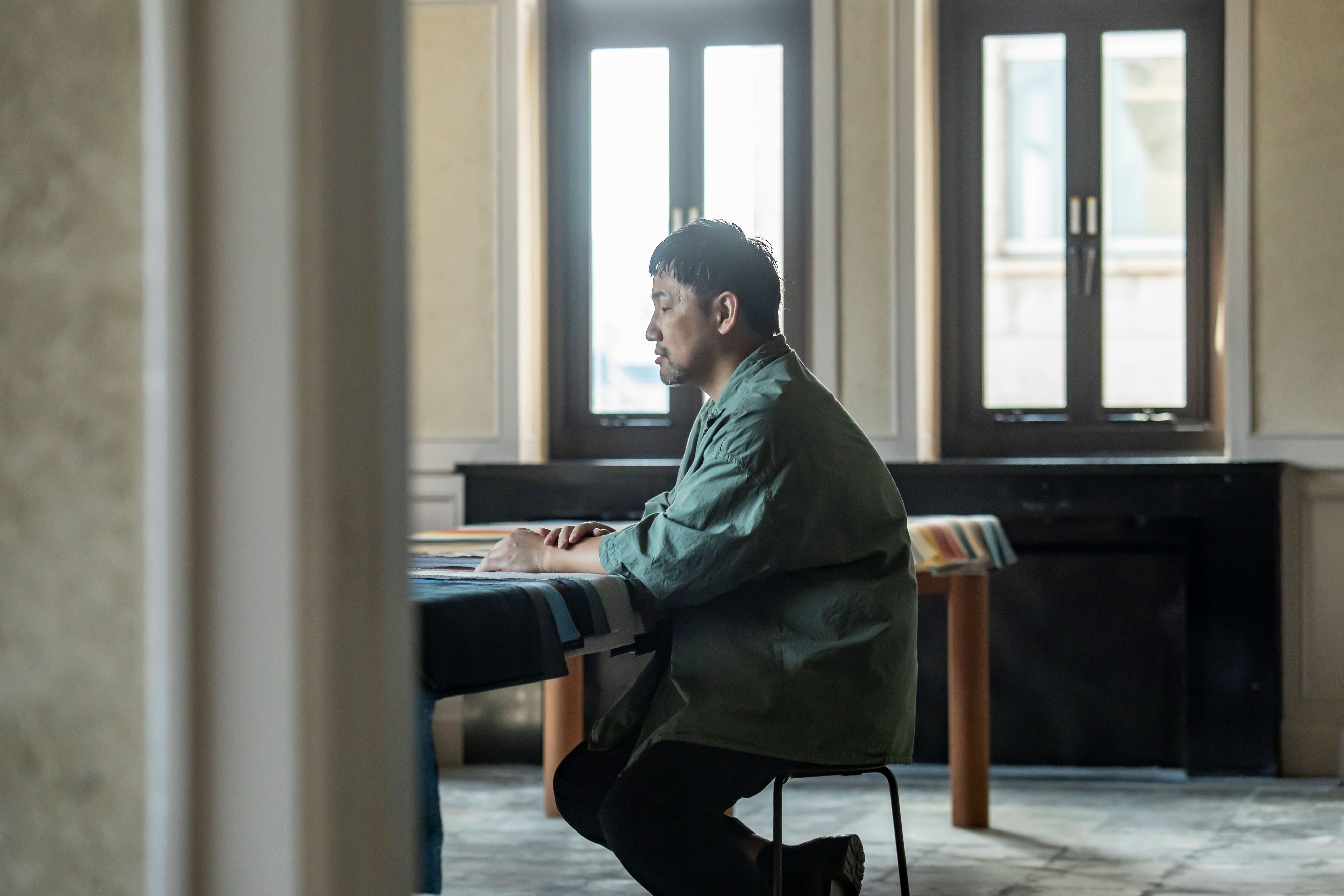
For Yanagihara, who has studios in both Kobe, southwest Japan, and Arles, southern France, an excavation of the past to create a timeless sense of beauty, combined with meticulous material research and modern craftsmanship, underpin his creations, whether it’s a chair, an interior or a scent.
This is reflected across his borderless designs – from 1616/Arita, a contemporary ceramics brand whose warm minimalism for daily life has placed a community of artisans in southern Japan firmly on the global design map; to the low-key calm of the Tokyo flagship for fashion brand Mame Kurogouchi, whose crafted minimalist interiors, softly flowing and light-filtering, echo the inside of a shell.
Another example is Vague (‘wave’ in French) – Teruhiro Yanagihara Studio’s experimental creative space, with iterations in Kobe and Arles, designed to spatially express its philosophies, with exhibitions, food research, material studies, creative residencies, pop-ups.
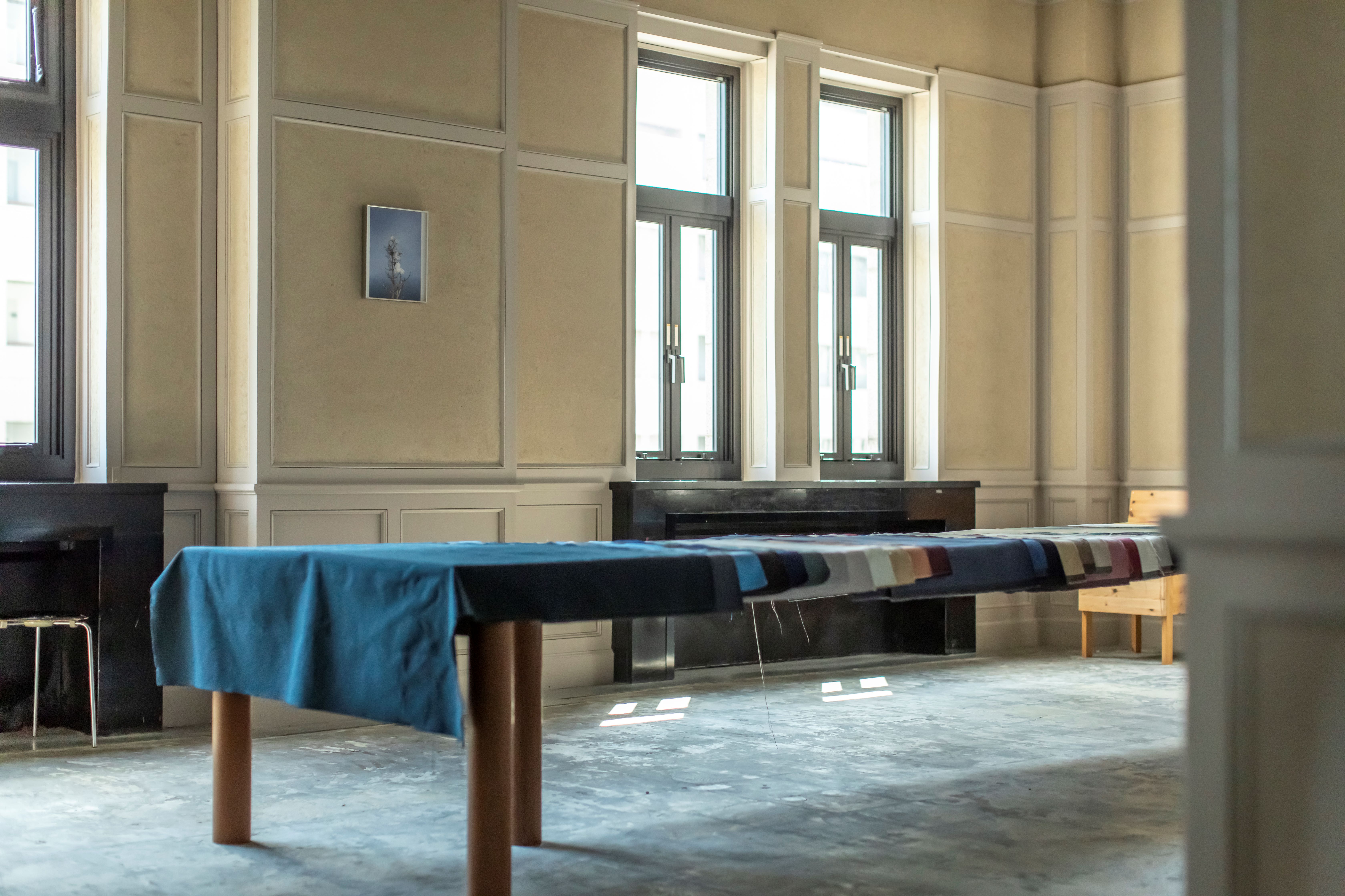
Here, Yanagihara talks to Wallpaper* from Vague in Kobe – a serenely expansive and art-scattered space spanning a 1938 former bank, walls cocooned in crafted expanses of tsuchikabe earthen plaster – about textiles, cooking and scenes from daily life.
In conversation with Teruhiro Yanagihara
Wallpaper*: Tell us about the new textile, ‘Ame’.
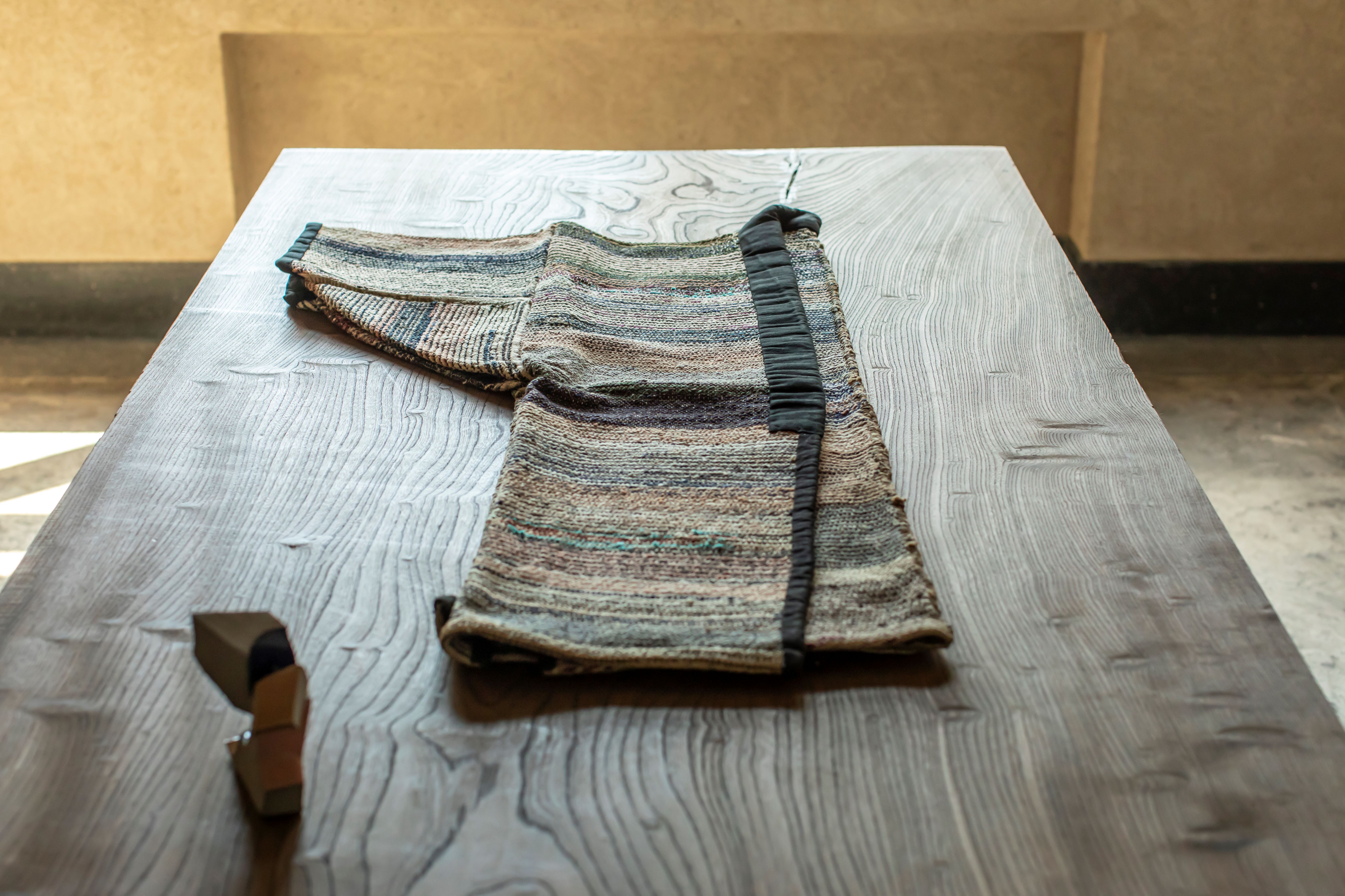
Teruhiro Yanagihara: The pattern is derived from a traditional stitching technique called sashiko. It’s not a designed pattern – it was created for everyday life. When farmers couldn’t afford to repair kimono, they would collect lots of small pieces of fabric called hagire and stitch them together. Mottainai – this is a key word. It means not wasting anything and it’s an important part of Japanese thinking. It’s about the beauty of valuing objects in daily life – which is very timeless and aligns with the sustainability innovations of Kvadrat.
W*: What was the starting point for the textile series?
TY: When I started collaborating with Kvadrat, I researched the history of textiles – and found a strong connection between European and Japanese materials. Even in terms of a kimono, a textile might come from China, then go to India and on to Europe. I became very interested in the Silk Road, how materials were transported and how everything was connected. This idea led to the first textile Haku and then Autumn. For all three textiles, we also explored Japan’s traditional colour palette.
W*: What is unique about Japan’s traditional colour palette?
TY: The colours are very subtly gradated and reflect the smallest changes in nature. In Japan, even within the four seasons, we have 36 micro-seasons. From light to dark, the colours change very gradually. These are shades taken from nature – rocks, seas, skies, fermentation processes.
W*: Can you share some examples?
TY: Even within ‘grey’ there are many variations. One colour is hai nezumi – a grey mouse colour. Another is hai sakura – the slightly grey shade of cherry blossoms when they start drying. The colour spectrum is like the moon, waxing and waning. With the Kvadrat textiles, we tried to reflect these nuances. Using textiles in a space impacts the whole atmosphere so we wanted to create a soft gradation of colours. There are many in-between colours here that are not usually in development.
W*: Spaces, scents, objects – what connects the many different things that you design?
TY: I often start by imagining a scene in daily life. The first time I visited the factory in Arita, I could instantly imagine a scene in which people were using Arita ceramics on a dining table. It was a very strong mental image – I could see the items being used in real life and then went on to make them.
W*: To what extent do you identify your designs as Japanese?
TY: Until the Kvadrat project, I always tried to design from a global perspective. I was always surprised when people outside Japan said my designs felt Japanese, for example when showing work at Milan Design Week. It wasn’t conscious for me – I thought my designs felt more European. At that point, I didn’t really want to show the Japanese-ness in my designs. But the Kvadrat project was a big turning point. I was able to fully appreciate the depths of Japanese beauty. More importantly, I realised that the traditional Japanese way of thinking is actually very global. Researching kimono, ceramics and textiles, I realised how many things that I thought were purely Japanese were connected to Europe. Everything is connected.
W*: How has this impacted your work?
TY: Now, I’m more interested in the places in-between. We’re working on projects in Abu Dhabi, Hong Kong, UK, Taiwan and we’re heading to India soon. We already have two Vague spaces, in Japan and France, with studio team members also based in London, Taiwan and the Netherlands. It’s about researching all the gradients and exploring the connections.
W*: And how about Vague, where we’re sitting now?
TY: We opened Vague in Arles in 2019 and in Kobe last year, to express the philosophy of our designs. Here, our studio is on one floor, alongside an artist residency space. Another floor has a gallery, showrooms, pop-ups, a kitchen and a café. We’ve also made our own natural scent brand, inspired by nature, called Lichen, which is based here. The building is a 1930s bank and artisans used earth from Shigaraki, mixed with sand from a Shiga river and Amami oil, to craft the natural plaster on the walls. We use the same ingredients throughout the spaces, but in different formulations to connect but differentiate between them.
W*: What is the most important element of this space?
TY: The atmosphere – kukan. The air that flows between the rooms is connected. Our design is about the invisible – about feeling as well as seeing. I don’t just design objects, I always try to make a connection with the space. So I want the textiles and the furniture and the atmosphere to all be in harmony and blend into one another.
W*: Finally, what currently inspires you?
TY: It’s always about the local. Just like cooking. We always use local materials. So in India, there is cotton and you dye it with saffron – using local materials to make the end product. In China, there may be another technique to dye textiles, but typically the process has the same roots. It’s like noodles around the world – they have the same roots but change in each region, adapting to the local environment. And the different types of pasta across Italy. Design is similar. It depends on the local ingredients – but ultimately it all has the same foundation.
