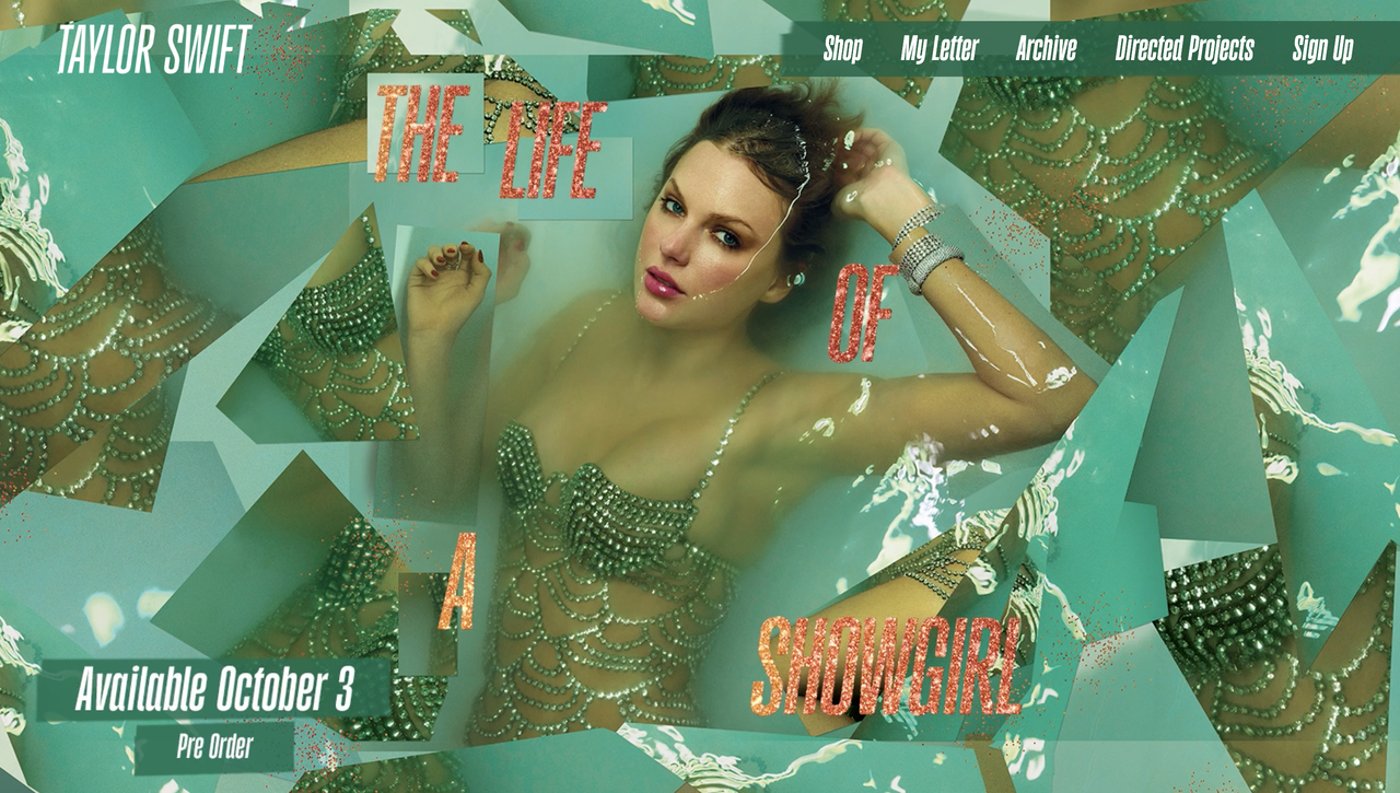
By now, Swifties have (somewhat) recovered from the collective hysteria of Taylor's upcoming album announcement, and while many were suitably enamoured by the cover design, there's one pressing fatal flaw – that colour scheme. While orange and green might make a fetching palette, it spells bad news for accessibility, meaning there's much to be learned from Ms Swift's design flaw.
You can employ the best designers or opt for the best website builder, but without accessibility at the forefront of your design, you risk alienating a huge audience. By today's standards, aesthetics and accessibility need to work in tandem, and sadly, Taylor's website misses the mark.