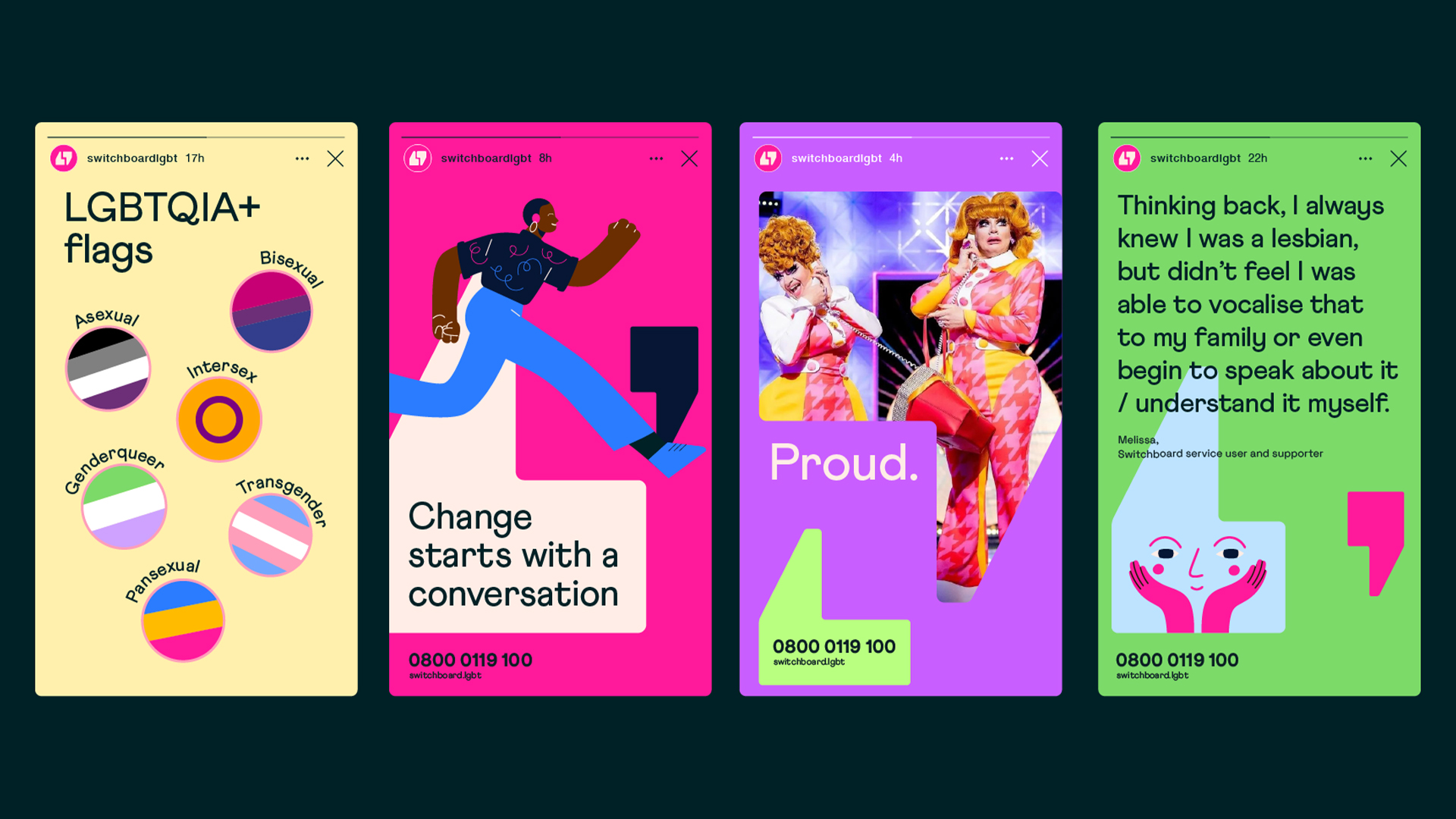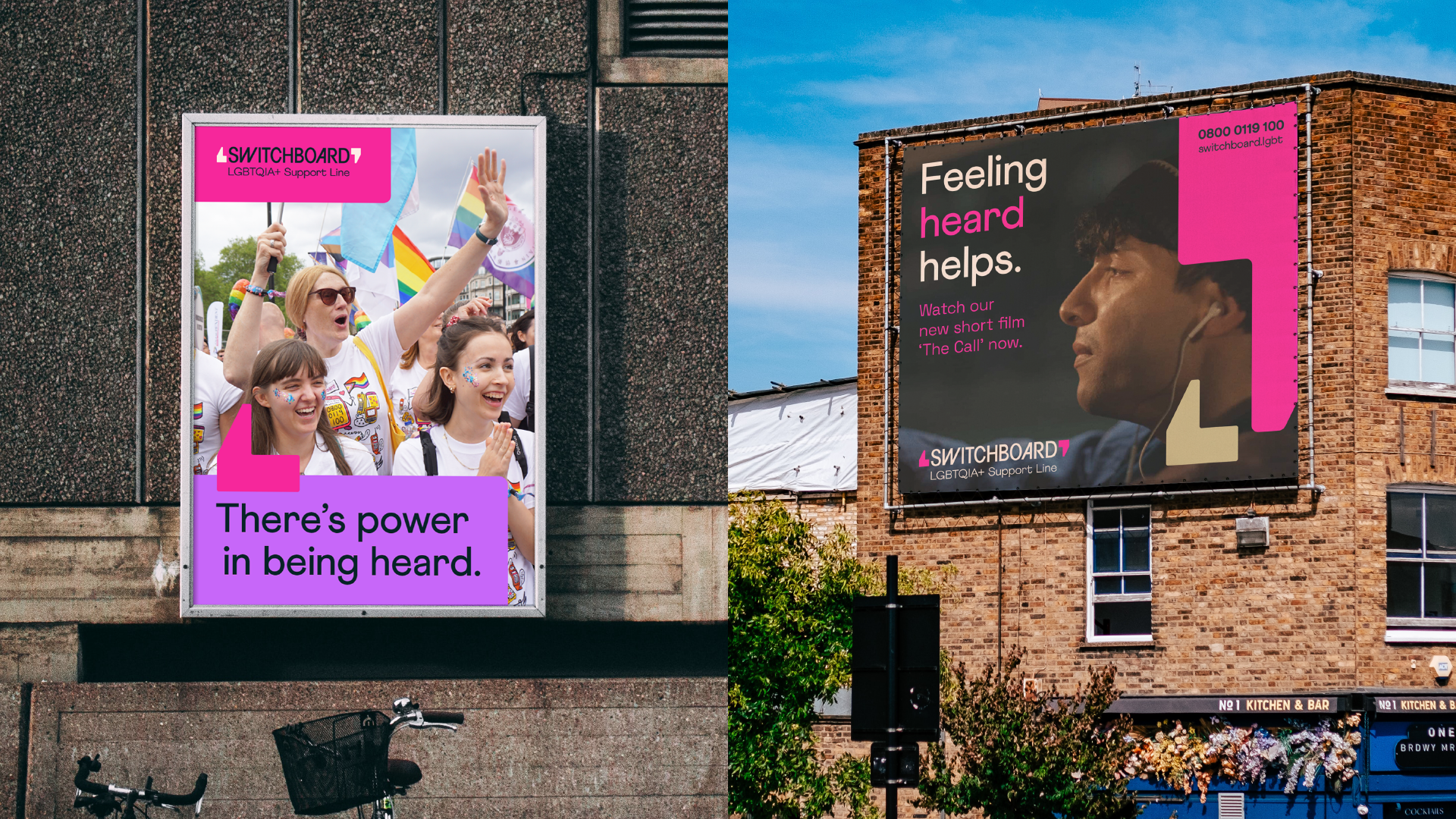
UK-based LGBTQIA+ support line Switchboard has unveiled a stylish new brand identity to mark its 50th anniversary. With a refreshed logo, contemporary colour palette and a playful new illustration style, the rebrand has a distinctly modern feel while honouring Switchboard's heritage with design motifs from its rich history.
Switchboard's reimagined identity feels in line with modern design trends, expertly balancing characterful design with bold graphics to draw the eye to an important cause. At its centre, the colourful rebrand is an amalgamation of the voices and experiences integral to shaping the support line and its wider community – a bright homage that embodies pride and strength.

Designed by creative agency Nice and Serious, Switchboard's rebrand began by defining three core principles that shaped the design process – 'illuminating', 'dependable' and 'sensitivity'. Speaking to Creative Bloq, senior designer at Nice and Serious, Anna Barton, shares that the team "developed a dynamic, flexible colour system inspired by the rainbow flag". Colours are also used to signify different tones, too: "Bright colour combinations are used to be ‘illuminating’, darker colours are used to be ‘dependable’ and pastel colours are used to be ‘sensitive’."
The new identity also features a refreshed logo, incorporating a clever speech mark motif taken from the helpline's archival badge collection. As well as representing the brand's history, it positions Switchboard as a "canvas for conversation," Anna says. "The speech marks are designed to be a blank canvas to create an appropriate mood for any theme," Anna tells Creative Bloq. "They could house anything from a celebratory, vibrant illustration for Pride, to a more sensitive photography campaign about a person's struggle and conversation with Switchboard."


At the heart of Nice and Serious' brand refresh is a dedication to preserving the helpline's legacy – something that was carefully crafted with the help of Switchboard's community of volunteers, trustees and staff. "The LGBTQIA+ community are from all ages and backgrounds, have diverse personalities and are all on a different stage of their journey," Anna shares. "Creating a brand that every person in the community could relate to was a challenge, and one that was important to get right," she continues.
Which part of the rebrand are Nice and Serious most proud of? Anna says that she feels a great sense of pride working alongside the helpline. "Switchboard has so much heart and soul behind it, and showing that visually has been an exciting challenge," she shares. "I hope that the community feel we’ve honoured the last 50 years of incredible work, and have set out an exciting path for the next chapter."

For more ingenious design from Nice and Serious, take a look at the delightfully imperfect National Landscapes rebrand. If you're after some iconic moments from the branding world, check out our collection of the best and worst rebrands of 2023.


