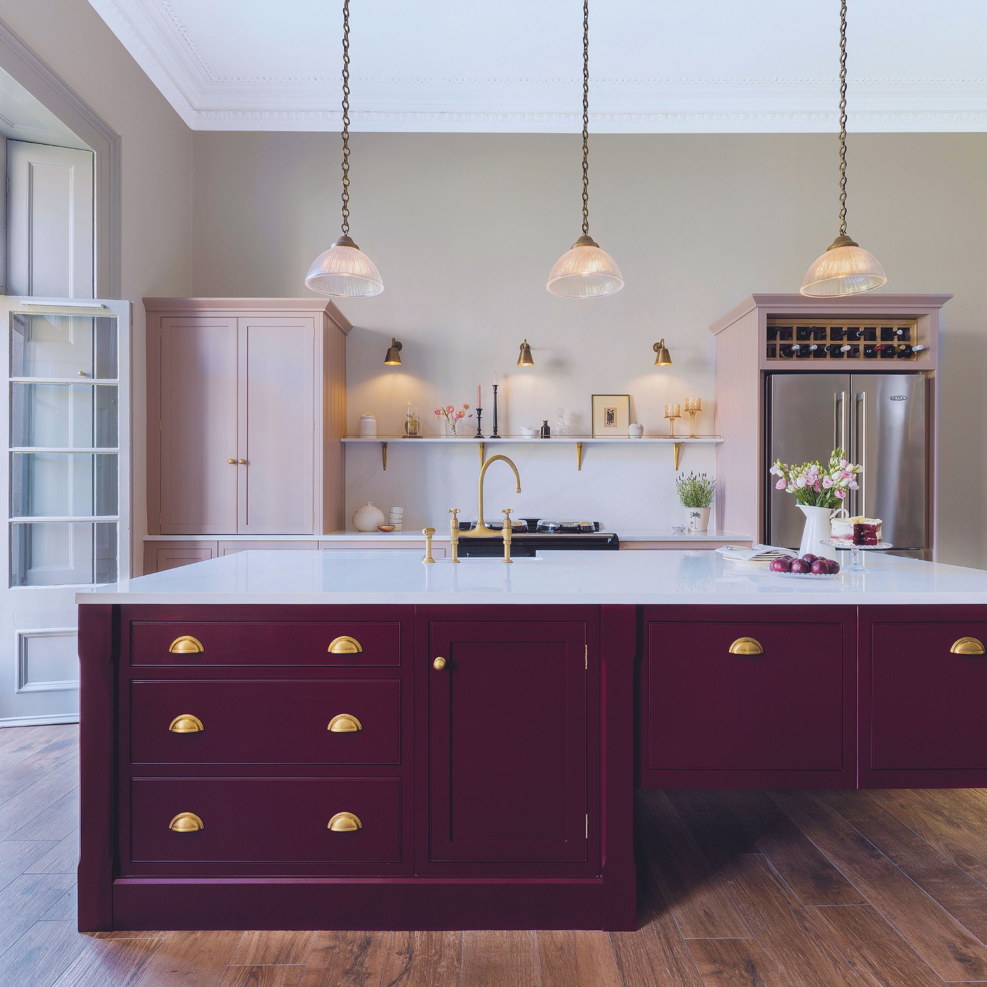
Designing a kitchen to suit a period home can be a challenge. The design needs to be guided by the room's architecture and original features, while also being functional for the family – whether busy weeknight dinners or hosting parties.
Traditional kitchen ideas, like those seen here, are vital in marrying these two elements together and will help you design a kitchen that works for both your space and your needs.
Keen to find a larger home to share with their growing family, Carolyn and Jimmie Hay needed to move quickly when buying a house to snap up this four-storey listed Georgian property around the corner from where they were living at the time in Edinburgh.
‘Houses in this location don’t come up very often, so just as soon as we became aware that this one was for sale, we made an offer,’ says Carolyn, a technology company executive.
While the setting, size and elegant period features of the house were perfect, the kitchen interior was less so. ‘It was looking dated and tired, with a rather strange-shaped island that we didn’t like,’ recalls stay-at-home dad, Jimmie.
‘We wanted to create a kitchen which was more sympathetic to the style and age of the house, with added warmth, and that drew on family-friendly kitchen ideas, where we would feel comfortable as a family and when friends come round.’
The decision to choose Harvey Jones as their kitchen supplier was easy, says Carolyn. ‘We had used the company to create the kitchen in our previous home and the team had done an excellent job, so we didn’t hesitate to go back,’ she explains.
They met with designer Sally Hinks of the Edinburgh showroom. They particularly wanted a kitchen island with a table-style section.
‘We were conscious that a large “block” island might seem too bulky in the space,’ says Jimmie, ‘and felt that having legs on one end would draw on freestanding kitchen ideas and make the structure seem less imposing and the room would feel larger.’
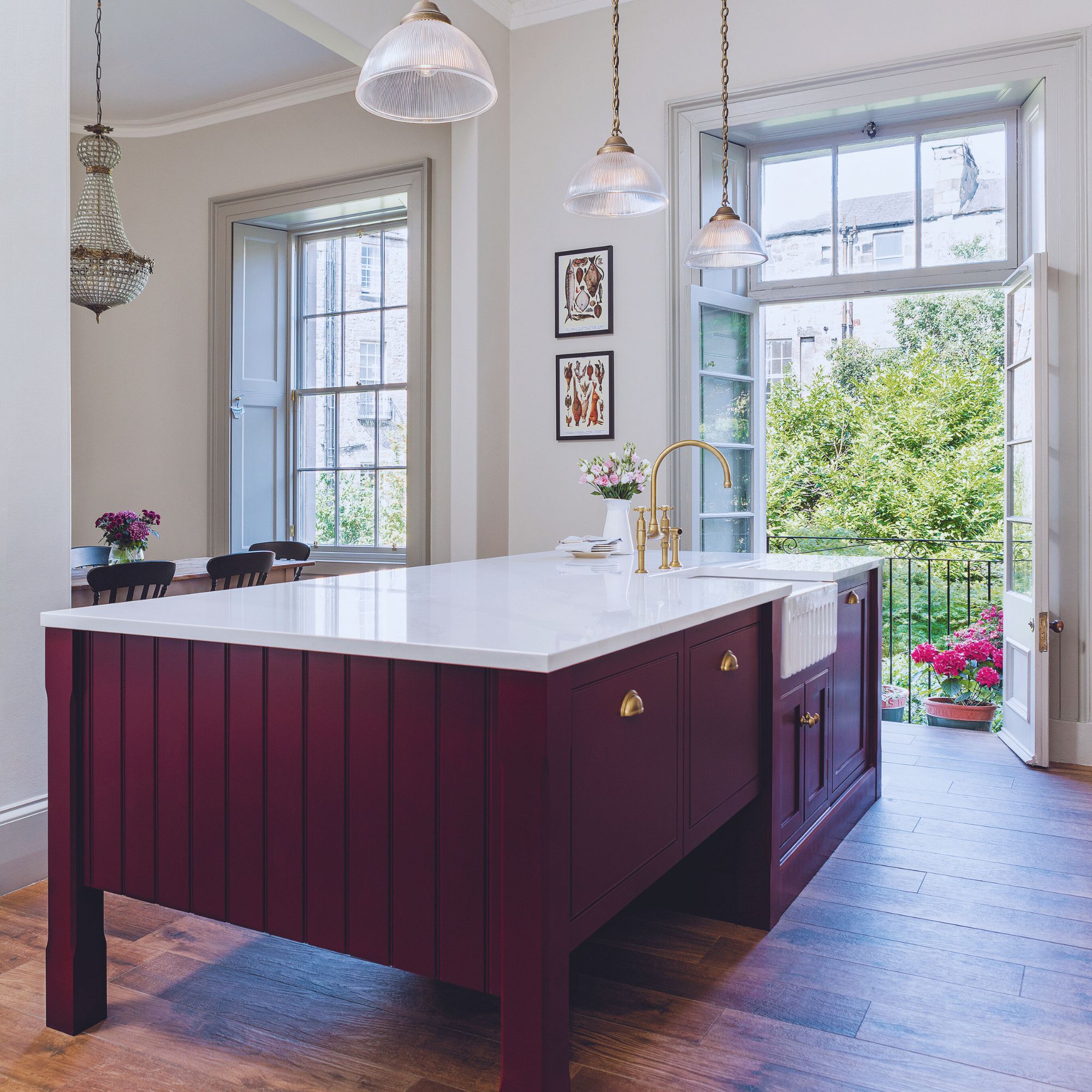
As well as having one-half of the island built on legs, inspired by a traditional cook’s table, Carolyn and Jimmie wanted the surface to be as large as possible since it was to provide the main preparation area.
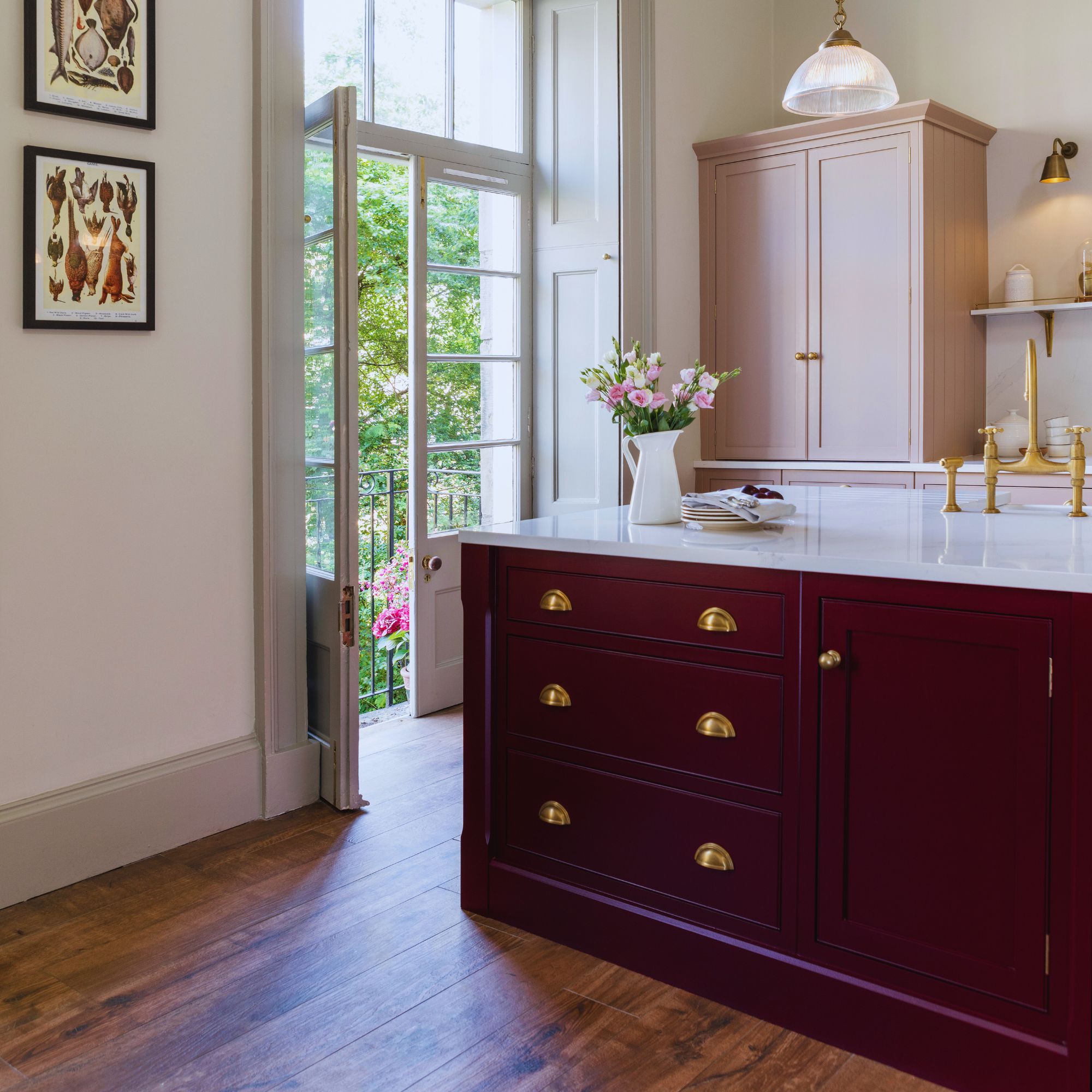
They were also keen to incorporate kitchen storage ideas, so chose not to have an overhang for bar stools and instead specified full-depth cupboards and drawers on both sides of the island. The character of the island is accentuated by traditional pilasters with chamfered edges.

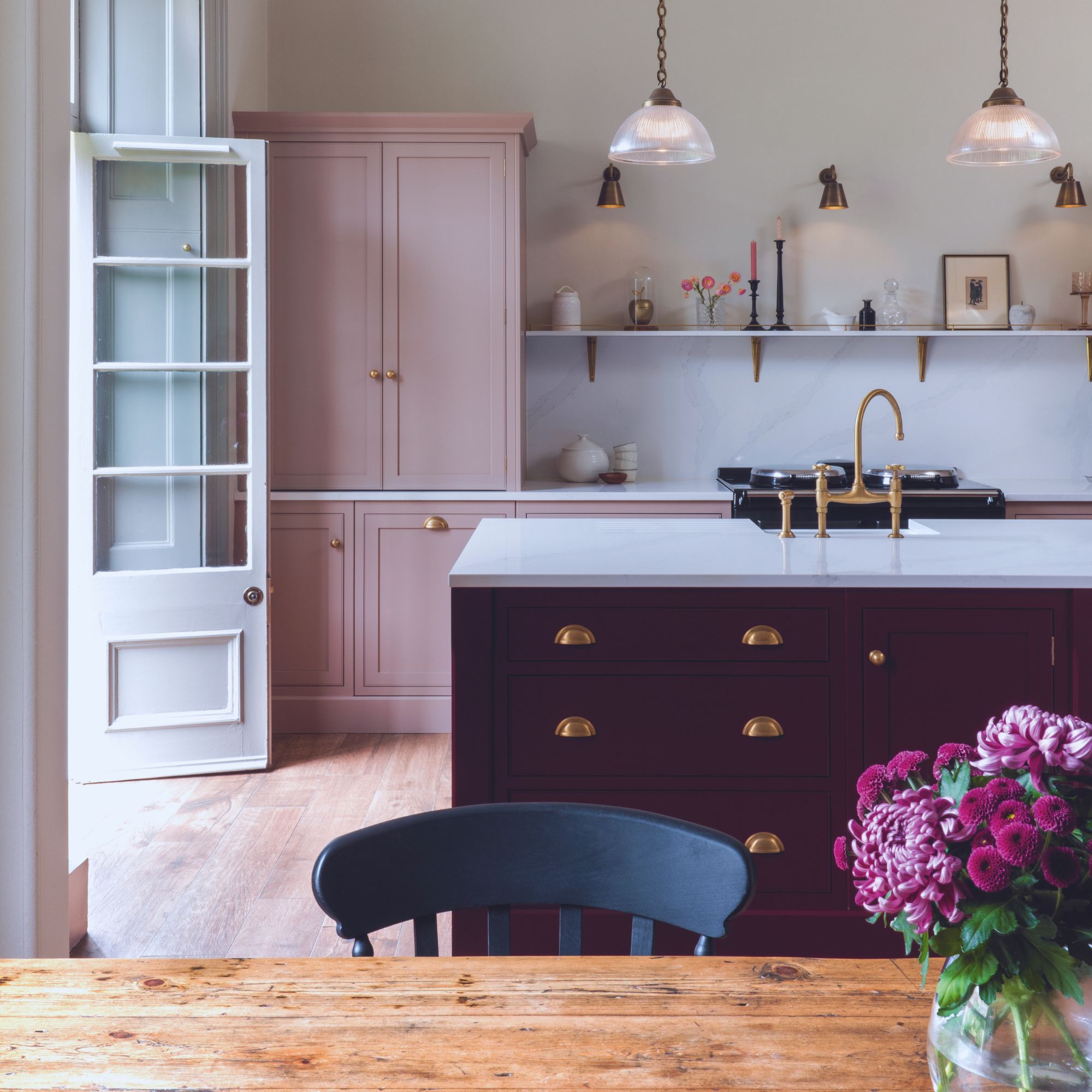
When planning the kitchen layout, Carolyn and Jimmie let their design be informed by the room's Georgian architecture. The two tall cabinets on the wall run have been carefully designed to be symmetrical, as are the base units between them. These cabinets fit in well with the grand height of the ceiling, which reaches a lofty 3.5m – more than one metre higher than is standard.
A similar sense of balance has also been applied to the design of the island so that its size works well with the proportion of the kitchen’s dimensions. The couple chose not to have wall units as they felt this would crowd the space.
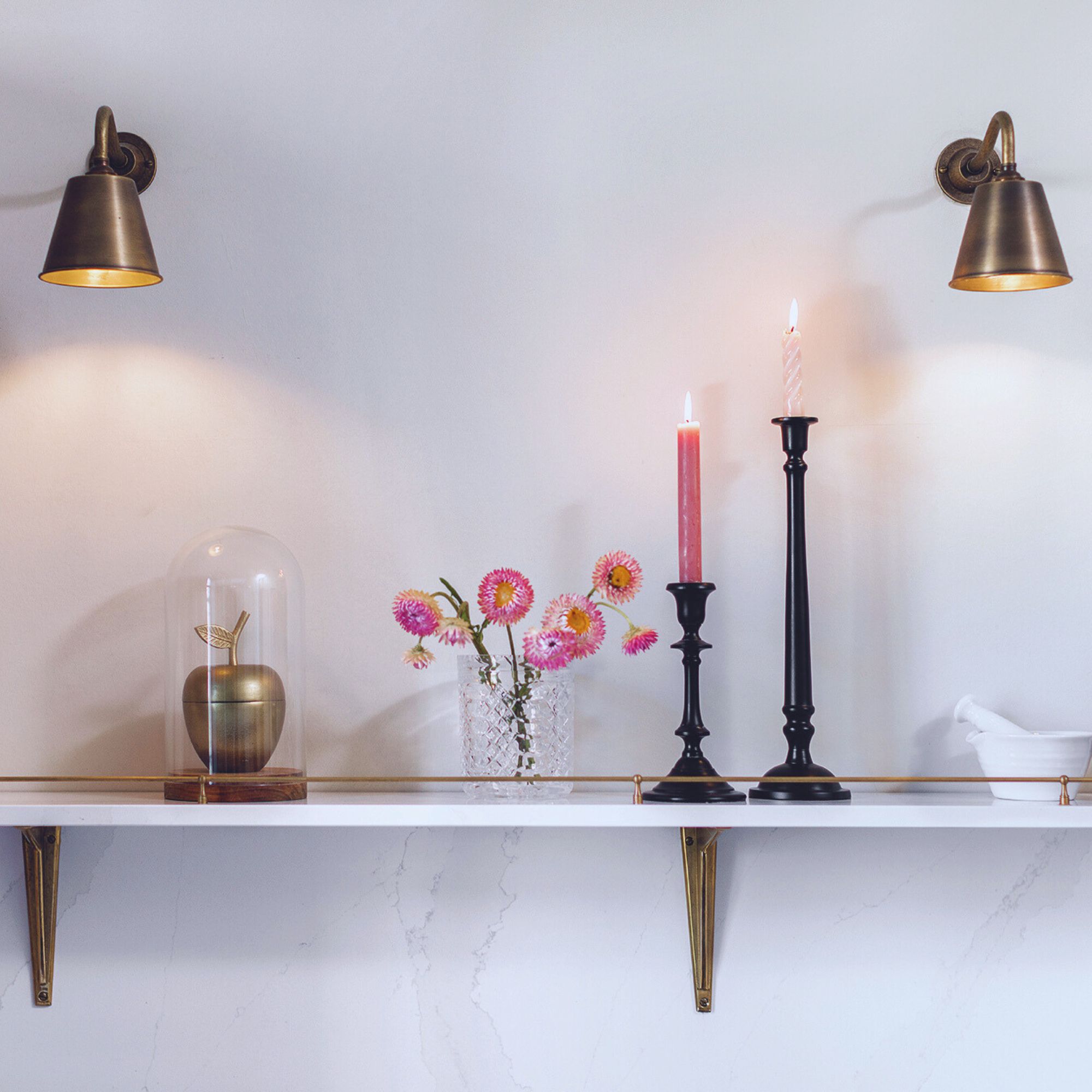
At the heart of the room is an Aga cooker, which adds to the cosy, welcoming feel. As the range is powered by electricity and does not have a flue, the clear wall space above is used for a slender shelf.
Made of the same marble-effect quartz surface as the splashback and worktops, the shelf is supported by aged-brass brackets and has a gallery rail, also made of aged brass to match, so that Carolyn and Jimmie can display artwork and decorative pieces. Wall spotlights above help to highlight the shelf, making the space a real focal point in the kitchen.
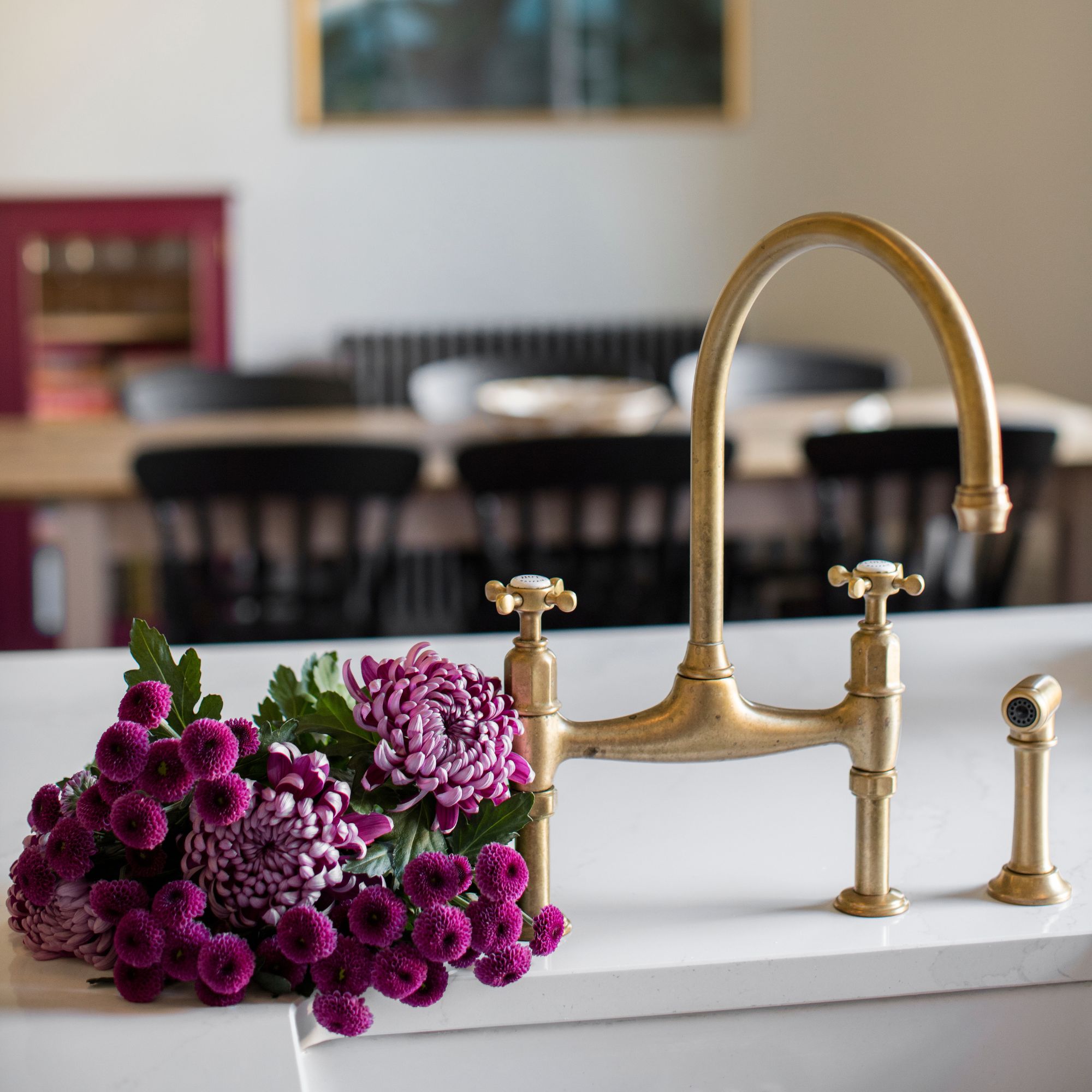
Pink kitchen ideas sometimes seem unconventional, but when combined with a deep red island, are perfect for this Georgian kitchen. Choosing a deep red for the island unit enhances the friendly feel and warmth of the room – after all red is a colour that will make a kitchen feel cosy – while an aged pink shade for the cabinets on either side of the Aga helps to soften the overall look of the space.
‘The kitchen design is classic and simple, and perfectly suits the proportions of the space,’ says Carolyn. ‘But most of all, I love our choice of colours – they introduce a little quirky character and really bring the whole room to life.’


