Mubi is putting a new spin on its logo design with the rebranding of Mubi Go. The subproduct combines access to the Mubi streaming platform with a weekly ticket to see a selected film at a cinema. And it's this traditional cinemagoing aspect that the rebranding aims to capture.
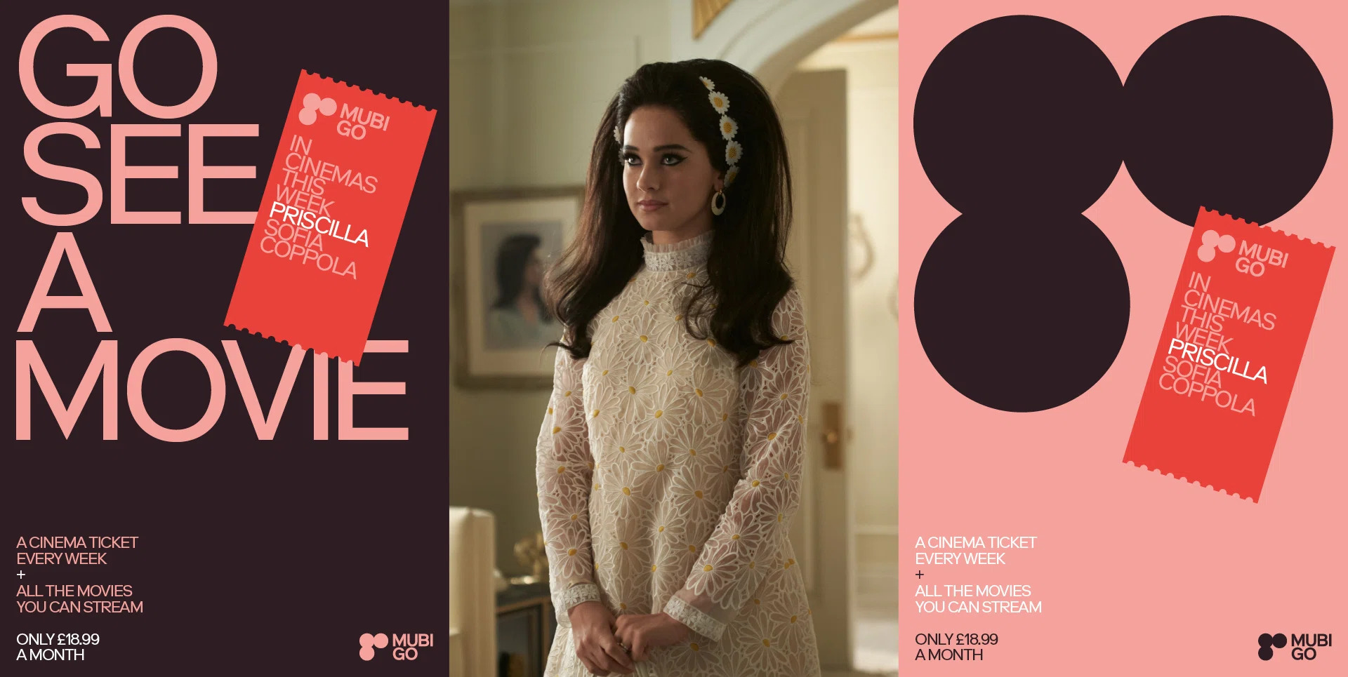
The new logo fits into the overarching Mubi branding while also finding new meaning. And it conjures up the nostalgia of getting tickets punched at the entry to cinema screens (see our pick of the best new logos for more inspiration.

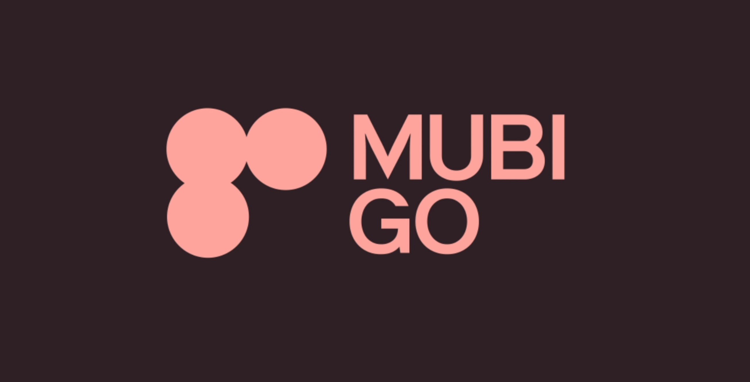
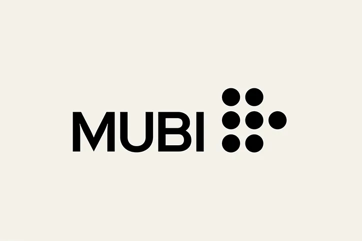
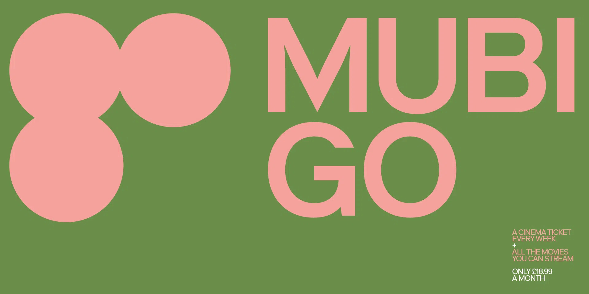
The design agency Spin already worked with Mubi on its overall branding with Pentagram. It designed the main Mubi logo, which comprises seven dots intended to represent the tradition of referring to cinema as the seventh art form. For the new Mubi Go logo, Spin has reduced the dots to three and found new meaning in them. They're rearranged to spell the word 'go' while also alluding to the shape of holes punched in cinema tickets on entry.

The typeface remains Norm's Riforma as in the main logo. But while the previous Mubi Go identity had a limited colour palette of yellow and black, it now adapts to match different films, making it more versatile, colourful and expressive.

In the broader rebranding, market materials are intended to be simpler and less copy-heavy. We're not sure that everyone will see 'Go' in the arrangement of abstract dots right away, but they also link nicely to the ticket-like perforations at the edge of design assets. All in all, it feels evocative and sits perfectly with the objective of getting people out of home and into cinemas.
For more recent logo design news in broadcasting, see the controversy of the abbreviated Disney Junior logo.


