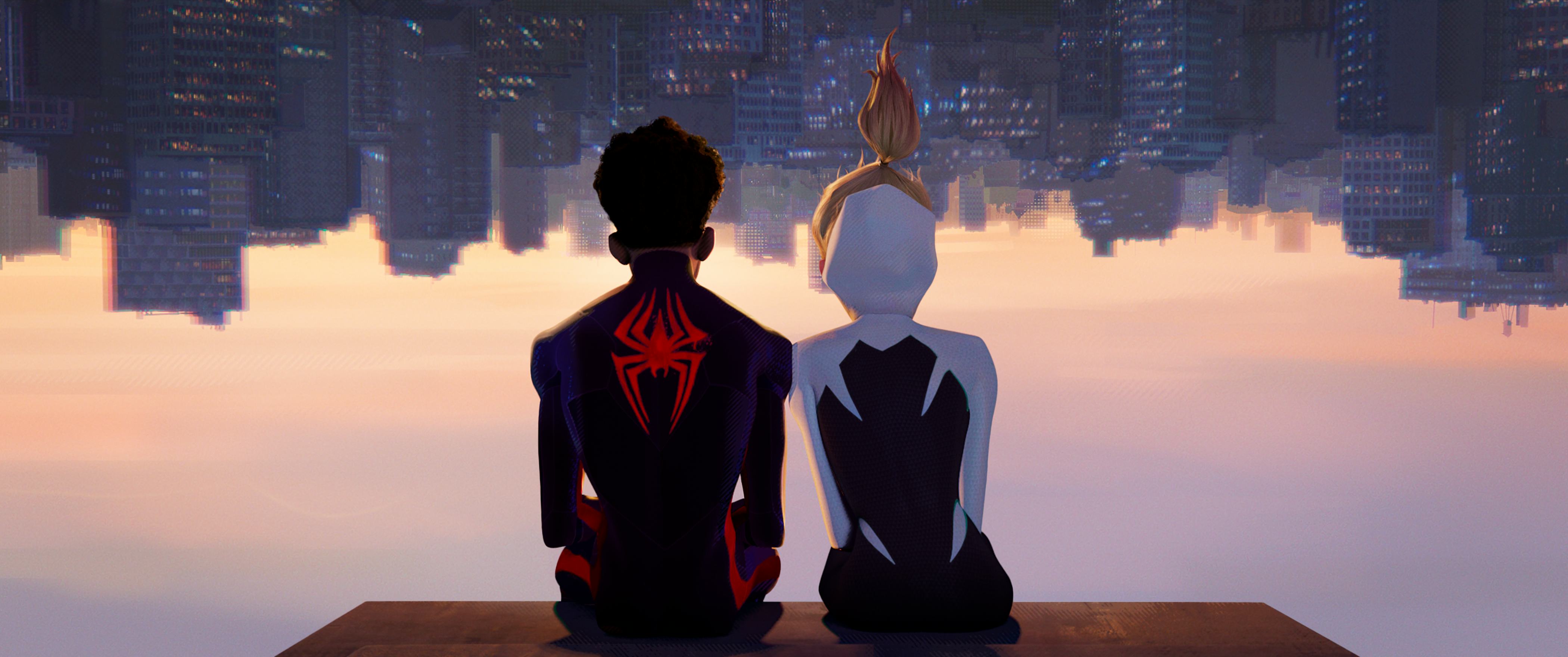
By all accounts, Spider-Man: Across the Spider-Verse is a smashing success. Not only has the film performed well at the box office up to this point, but it’s also received better reviews than most of the comic book movies and TV shows released over the past few years. It’s not hard to see why, either.
While the film’s cliffhanger ending has proven to be divisive among moviegoers, everyone who sees Across the Spider-Verse seems to agree that it is otherwise a visual and narrative triumph. Over the course of its 136-minute runtime, the film tells an even more ambitious story than its acclaimed predecessor, Spider-Man: Into the Spider-Verse, but it does so with the same skill, empathy, and wit that made the original stand out five years ago. It also, just as importantly, takes the visual accomplishments of Into the Spider-Verse multiple steps further.
In doing so, Across the Spider-Verse has not only delivered one of the most visually exciting animated films that has ever been made but it’s also proven, once again, that moviegoers don’t always have to settle for the flat, uninteresting visuals on display in many modern comic book movies.

At this point, it’s not all that controversial to say most Marvel Cinematic Universe movies and TV shows should look better than they do. Marvel Studios’ conveyor belt approach to filmmaking has resulted in dozens of movies and TV shows that, to the studio’s credit, all look similar to each other, but many of which also lack the visual vibrancy that one could reasonably expect based on their comic book source material. In recent years, the MCU’s increasingly shoddy visual effects have only made this particular criticism of the franchise all the more relevant.
The release of visually stunning superhero movies like The Batman and Across the Spider-Verse have similarly elevated fans’ complaints about the MCU’s consistently disappointing visuals. Into and Across the Spider-Verse prove a superhero franchise can spotlight multiple art styles and still look and feel visually cohesive. The MCU’s interconnectedness should not, in other words, prevent its entries from visually standing out from each other.
This isn’t to say the MCU needs to adopt the same visual energy or style as an animated film like Across the Spider-Verse, either. Films like The Batman and The Dark Knight could not look and feel any more different from Across the Spider-Verse, but all three boast the same level of care when it comes to the ways their worlds and characters are visually brought to life. The MCU may exist as part of a visual medium, but the franchise has long treated the actual look of its films and TV shows as less important than its scripts and actors.

If there’s one thing the success of Spider-Man: Across the Spider-Verse proves, it’s that moviegoers and superhero fans are hungry for more visual vibrancy in the films and TV shows they give their time and money to see. There are reasons to believe Marvel may be aware of how visually stale the MCU has become, too.
The studio’s decision to hire a cinematographer like Steve Yedlin (Star Wars: The Last Jedi, Knives Out) to shoot Thunderbolts, for instance, suggests that the film may end up having a far more distinct and visually appealing aesthetic than is common for the MCU. But if Marvel really wants to prevent the MCU from falling by the wayside, it’ll need to do more than hire just one talented cinematographer.
Marvel needs to start treating its visual output with the same level of attention as it does its interconnected canon — even if that means abandoning the production line approach that built the MCU into a Hollywood powerhouse.


