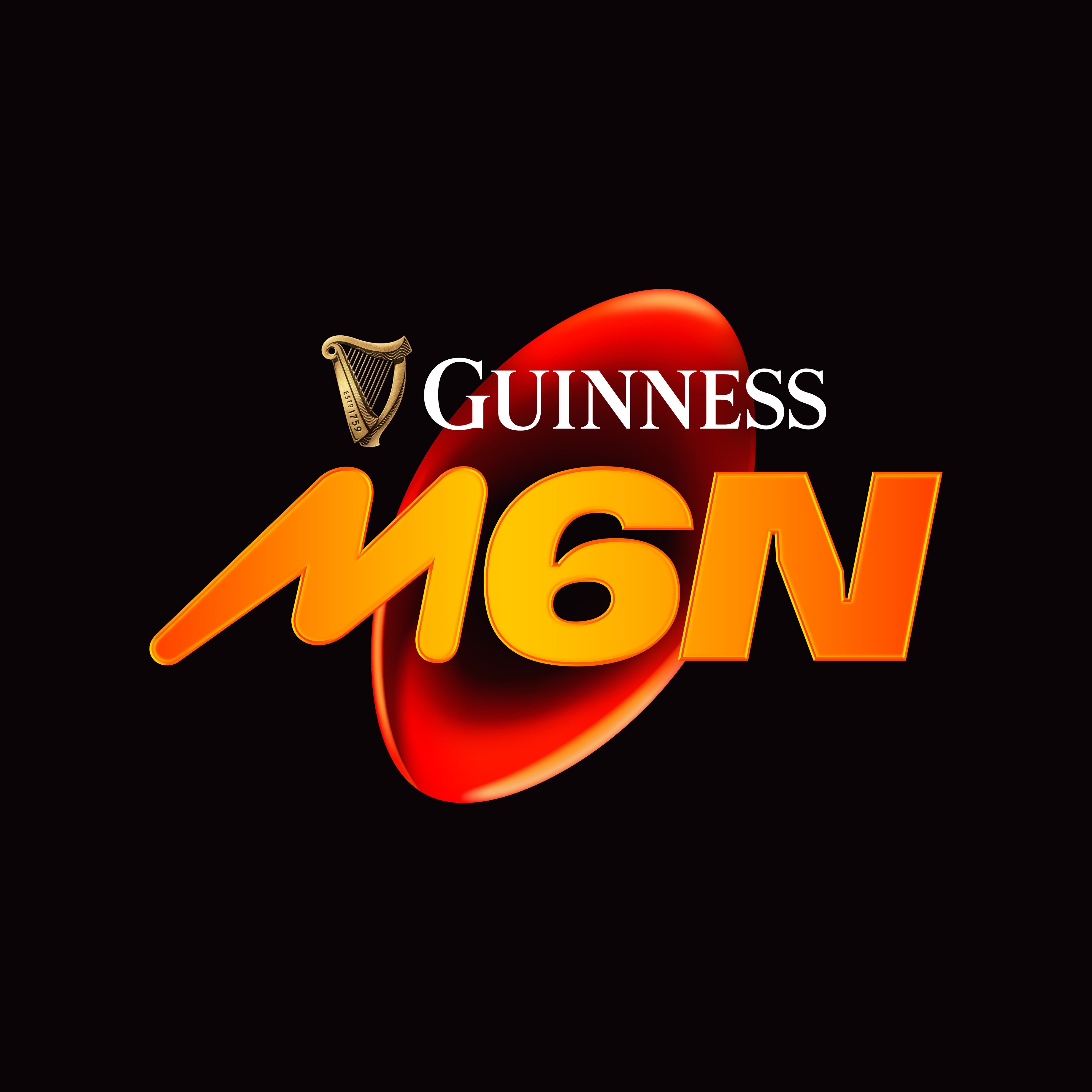
The Six Nations rebrand has provoked an angry reaction from rugby fans upset at the design of the new logo for the men’s championship.
The annual championship, involving England, Scotland, Wales, Ireland, France and Italy, pushed out a new look on Saturday evening with the men’s competition including a red and orange design.
The new logo for the men’s championship, which was won by Ireland this year, includes “M6N” on top of a rugby ball with the title sponsor Guinness.
While the women’s Six Nations logo has had a similar purple design in recent years, the men’s Six Nations has now aligned alongside the Under-20 brand.
The launch came with the caption: “Same Championship. Supercharged. New Brand.” Yet most fans were immediately upset, quickly replying with feedback, including: “Absolutely shocking” and “awful”.
Another insisted the rebrand had “zero identity,” with others likening the look to the game Crash Bandicoot or Mars bars.

One fan remarked: “This is genuinely the worst rebrand I've ever seen.”
While others asked why the previous logo needed updating: “This is horrible! The previous logo was so classy and reflected the history of the competition.”
Sponsored by Crash Bandicoot pic.twitter.com/g0GfG9ZVWu
— Stat Boy Steven 🇳🇱 (@StatBoy_Steven) November 30, 2024
“Cheap, tacky and hideous,” another fan replied. While another added: “Rugby is seemingly on the decline, for many reasons and now they’re trying to alienate what remains.”
“Looks like a computer game for the sega mega drive in the 1990s.”
The Six Nations maintains the rebrand is “connecting its rich heritage with the modern game, and articulated through a distinctive and bold new brand, it is designed to resonate with everyone from new and existing fans to the players and unions competing in this iconic Championship.
And while others questioned the marketing research, the official statement insists “extensive research and consultation with fans, target audience members, Unions and Federations, and international rugby players.”

The decision was made to align the M6N identity alongside “the recent introduction of the W6N and U6N brands, creating a consistent and versatile family of brands.”
The statement added: “More than just reimagining the brand logo of the Guinness Men’s Six Nations, the launch of the new identity is intended to articulate the evolution of the Championship and modern game of rugby. The electrifying action and experiences that fans look forward to and enjoy every year is expressed through the versatile new identity that has been informed by feedback from all corners of the game.
“Rich in heritage and returning bigger and better reach year, the Guinness Men’s Six Nations is set to celebrate its 25th anniversary, but its roots reach back to 1883, when the Home Nations competition was first founded.
“It's the heritage of the Championship that separates it from other forms of entertainment vying for the attention of fans, but a new brand identity offers the opportunity to better engage new fans, excite existing ones, and closes generation gaps.”


