Get all your news in one place.
100's of premium titles.
One app.
Start reading
Creative Bloq
Creative Bloq
Technology
Tom May

Six common font pairing mistakes and how to avoid them

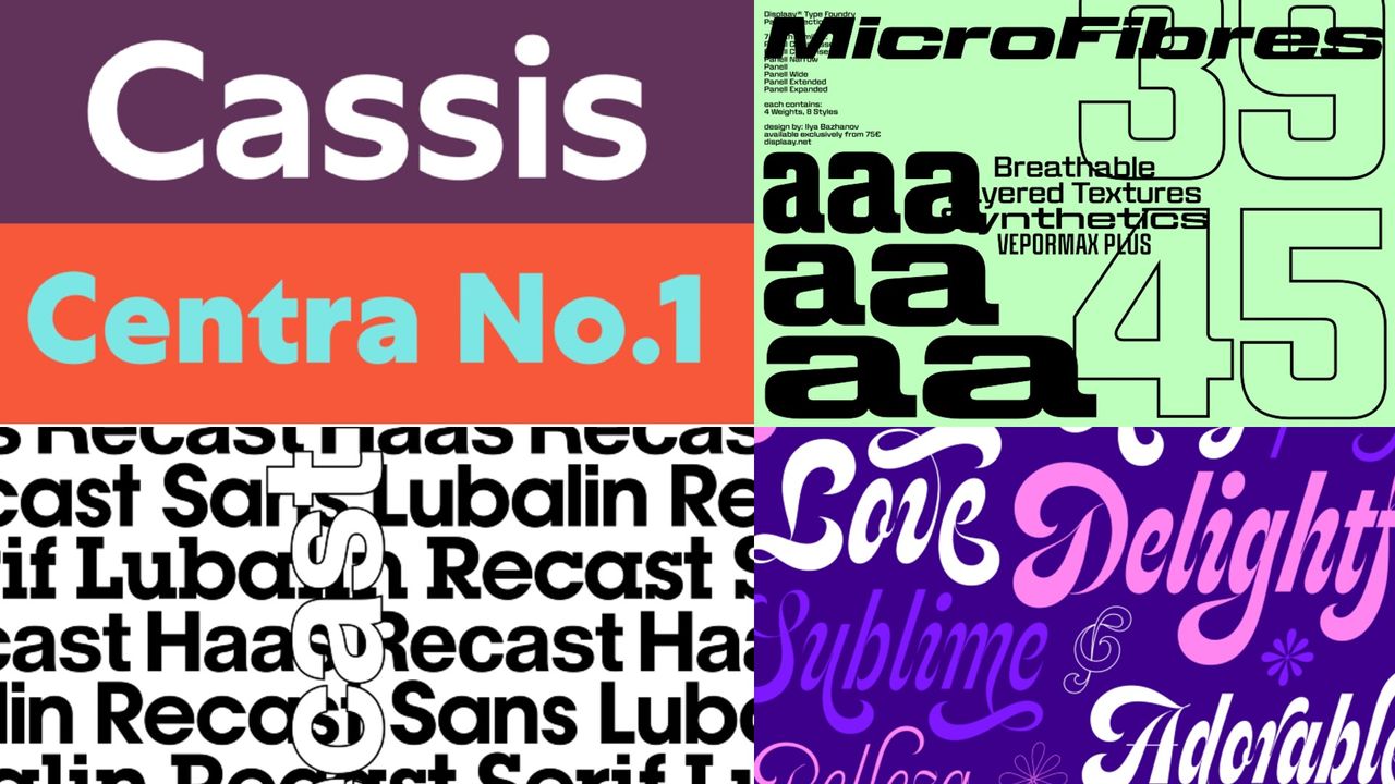
Selection of fonts.

You're putting the finishing touches to a brand identity. The logo feels strong, the colour palette is working and you're happy with the layout. But something's off and you can't quite put your finger on it.

You tweak the spacing, adjust the weight, move things around. The problem persists. Then it hits you: the fonts aren't working together. They're both great typefaces, but the relationship between them is creating a low-level visual friction that's quietly undermining everything else.

Sign up to read this article
Read news from 100's of titles, curated specifically for you.
Already a member? Sign in here
Related Stories
Top stories on inkl right now
One subscription that gives you access to news from hundreds of sites
Already a member? Sign in here
Our Picks
Fourteen days free
Download the app
One app. One membership.
100+ trusted global sources.