While a beautifully considered tonal scheme might inherently seem more ‘luxurious’ in its restraint and elegance, a high-contrast palette often has the edge, where the designer has gone one step further to surprise and delight, as well as create a sophisticated interior.
"Luxury isn’t always about restraint; it’s about creating memorable moments", agrees interior designer Carina Raymond of Studio Raymond. But it requires confidence and balance to pull it off. Tonal schemes can provide an unrivalled sense of calm and visual cohesion, but need textural interest for that extra oomph to prevent them from feeling flat.
We asked interior designers to weigh up the pros and cons of both tonal and high-contrast palettes, as well as their tricks of the trade for selecting the most expensive-looking color schemes and getting the balance right, whether that’s a soft, tonal approach or a dramatic, richly layered interior.
How to Make High-Contrast Palettes Look Expensive
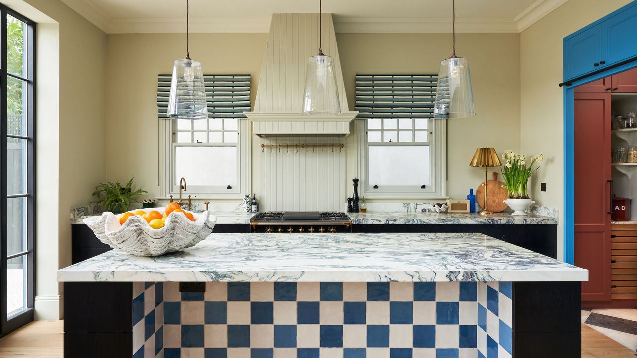
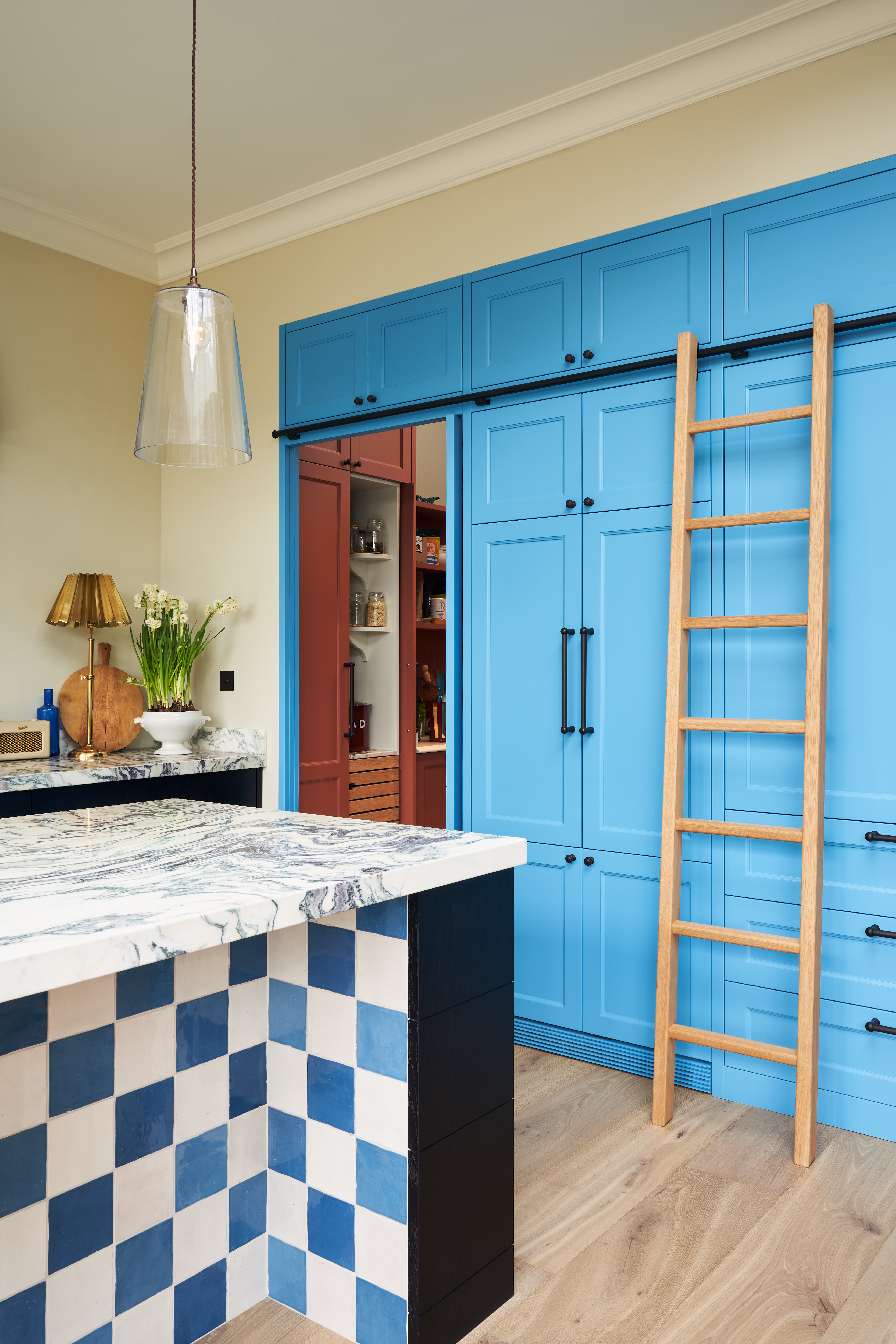
High-contrast rooms can create an extraordinary sense of drama and bring visual impact to a space when used well. "They immediately draw the eye and help highlight architectural details, beautiful joinery, or statement furniture pieces," says Carina Raymond.
The secret to making high contrast feel sophisticated rather than chaotic is to have an underlying thread that connects everything together. "Whether that's a repeated accent color, a consistent material palette, or a shared warmth throughout the scheme, there needs to be something creating cohesion behind the contrast," she explains.
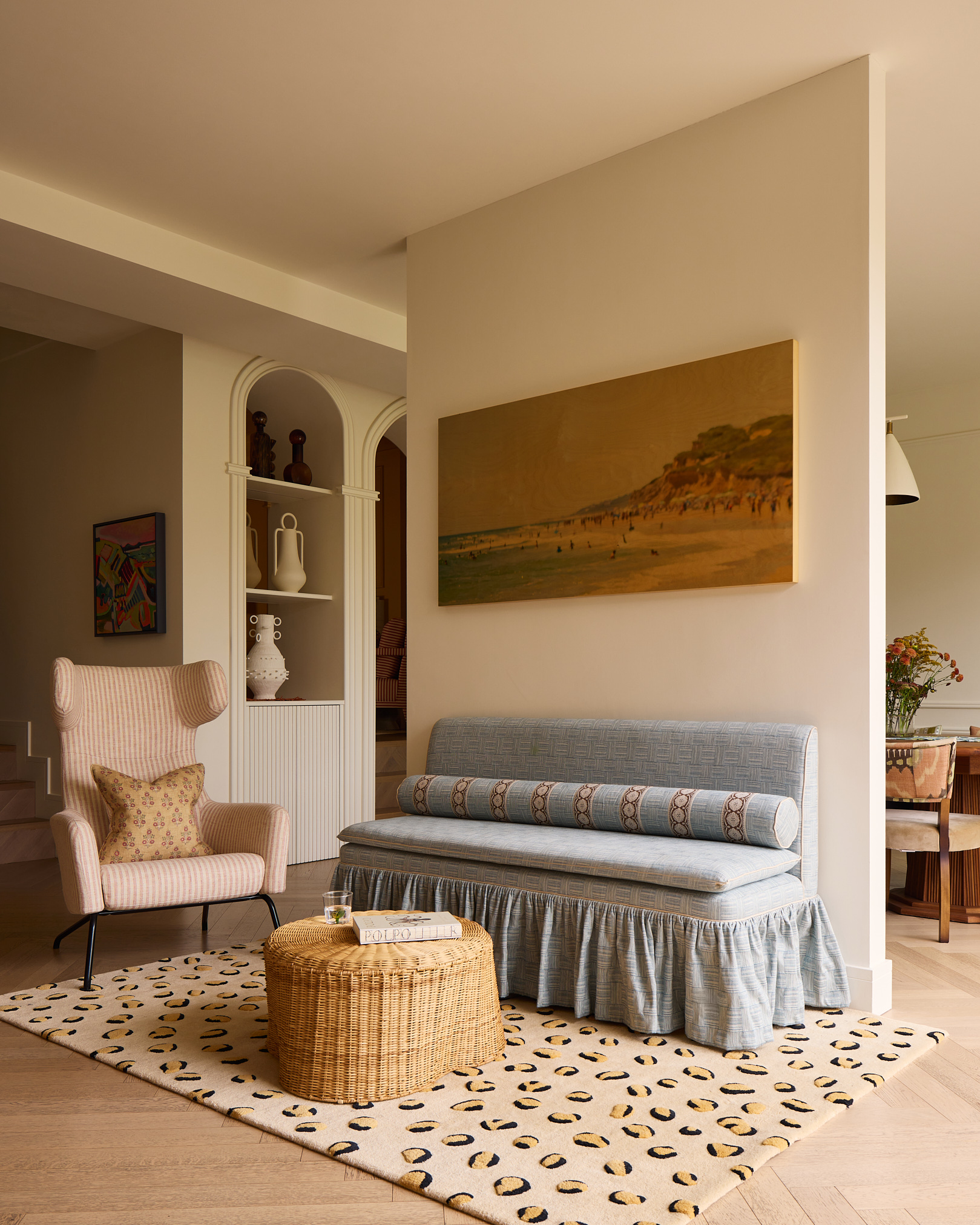
Interior designer Laura Stephens suggests using combinations such as deep espresso with ivory, charcoal with plaster tones, or rich burgundy against pale neutrals, which can make a room feel instantly more elevated.
"The key is balance — contrast works best when there’s a clear visual hierarchy rather than too many competing colors," she advises. "I often use darker tones to ground a room — through cabinetry, joinery or statement furniture — while keeping surrounding elements softer and lighter to create tension and sophistication."
Having contrast also helps architectural details stand out beautifully. It can emphasize shape, silhouette, and craftsmanship in a way that tonal palettes sometimes soften, so if you’re blessed with stunning period features, a high-contrast palette is an excellent way to celebrate them rather than letting them blend into the background.
A high-contrast interior can make a room feel more curated and intentional. "When contrast is used strategically, it creates drama while still feeling sophisticated — one beautifully judged contrasting element will usually have far more impact than several competing colors," says Sophie Pringle, founder of Pringle & Pringle.
Mistakes To Avoid When Using High-Contrast Palettes
High contrast can be harder to get right because it leaves less room for error. Certain color combinations can feel jarring if they aren't carefully considered, and too many contrasting elements can make a room feel fragmented rather than cohesive — and there's nothing luxurious about that.
"It's also important to remember that contrast in design isn't only about color," says Carina. "Contrasting textures, shapes, and materials can often create a richer and more enduring sense of luxury than relying on striking color pairings alone.”
Carina also warns that not every bold color works well alongside another, and introducing too many elements can diminish the sense of luxury rather than enhance it. "My advice is always to choose one or two dominant contrasts and allow the rest of the room to support them," she says. "A luxurious interior should still feel harmonious, even when it's bold."
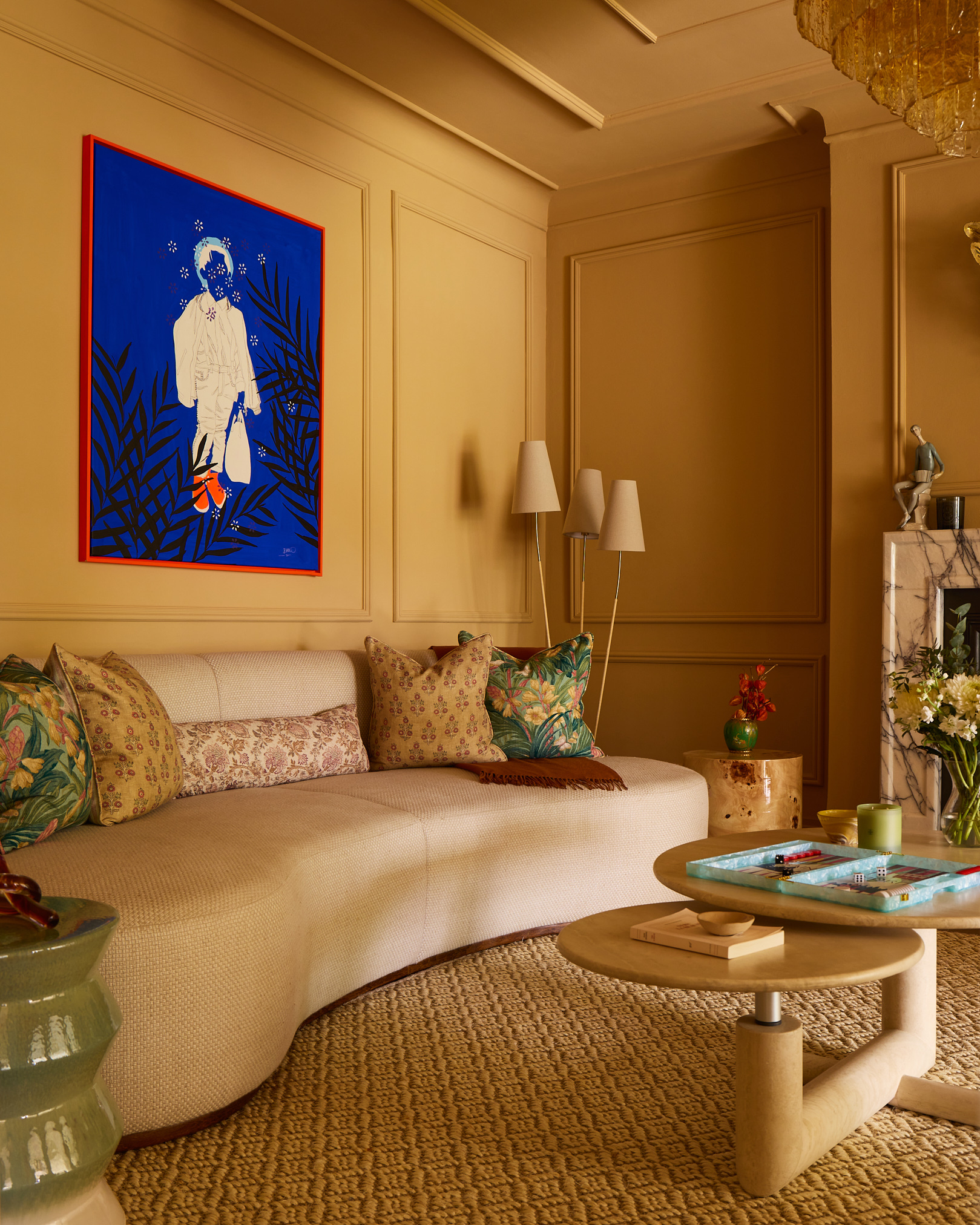
How to Make Tonal Palettes Look Expensive
If your aim is to create a sense of calm and visual cohesion, this is when a tonal scheme often comes into its own. When colors sit within the same family, your eye moves effortlessly around the room, which makes a space feel "considered and refined rather than busy," says Carina. It also allows the architecture, materials, and craftsmanship to take center stage rather than competing for attention.
The key is ensuring the scheme doesn't become flat. "We always layer different textures, materials, and finishes such as linens, velvets, textured wallpaper, natural timber, marble, and antique brass so there is plenty of depth and interest even when the color palette is restrained," she says. "Texture is what makes a tonal room feel luxurious rather than one-dimensional."
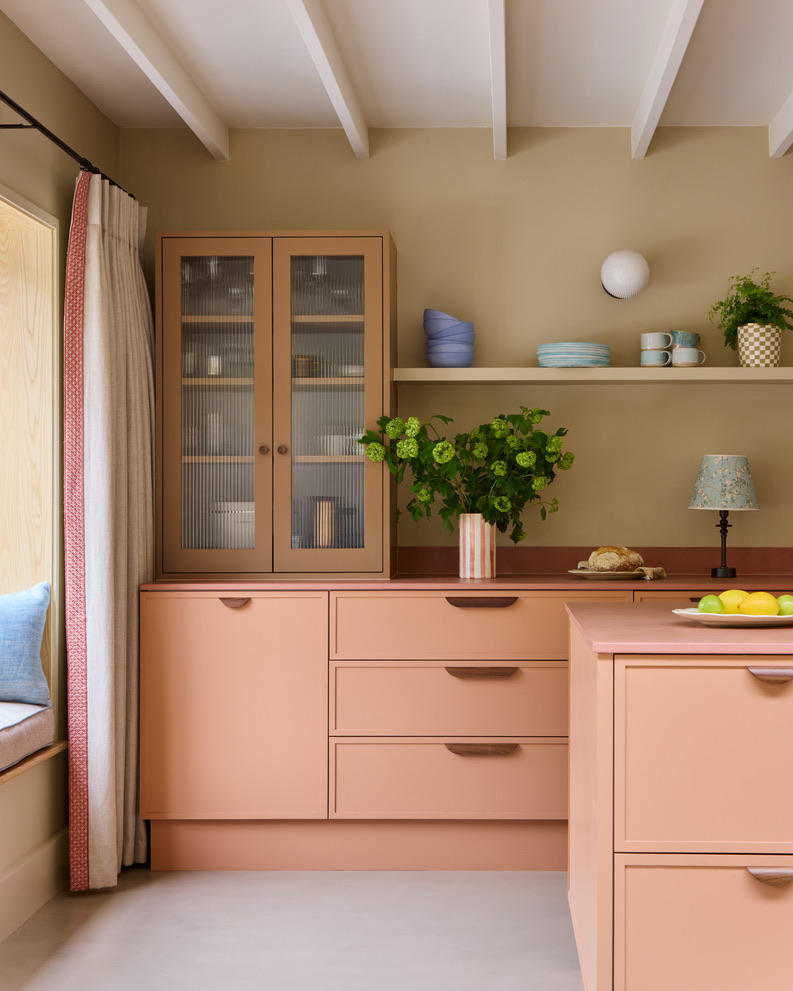
In terms of colors, Laura Stephens suggests mixing warm neutrals (oat, stone, caramel, chocolate) to prevent a room from feeling flat. "I love to use Paint & Paper Library’s color-graduated paint schemes for this, often using the darkest shade on the ceiling and a lighter tone on the walls,” she advises.
“Also vary the paint finish as much as the color itself — a matte limewash wall against a polished stone surface or soft upholstery against darker wood tones creates beautiful contrast without disrupting the serenity of the scheme," she adds.
Mistakes To Avoid When Using Tonal Schemes
The biggest challenge with a tonal palette is that it can feel cold, dull, or overly minimal if there isn't enough contrast or texture. "People often assume that using similar colors will automatically create sophistication, but without careful layering, a room can lose its sense of character," reveals Sophie Pringle.
"Even within a tonal room, there should still be moments that catch the eye and prevent the scheme from feeling overly controlled," she adds. "We always want a home to feel lived-in and personal rather than perfectly staged."
Laura warns that cooler grays in particular can become quite stark if they aren’t balanced with warmer undertones. "Lighting is also key to making tonal palettes feel luxurious," Sophie explains. "Adding layers of lighting — including wall, task, and low lighting — helps to create atmosphere and brings tonal interior schemes to life.”
Tonal schemes require more nuance than people expect. "Because the color variations are subtle, every material choice becomes more noticeable, so proportion, texture, and finish really matter," adds Sophie. "It’s often the quieter schemes that require the most careful consideration and curation."
Ultimately, the key to making a high-contrast palette look luxurious is less about making a statement and more about creating a point of delight within an otherwise balanced scheme. "Our advice is to start with a palette you know you'll love for years to come and then introduce color in a way that feels confident but measured," says Sophie. "A single unexpected accent can often create far more sophistication than an entire room filled with competing colors, as it’s given space to breathe if the surrounding palette is relatively controlled."
Carina adds that a sense of luxury isn’t really determined by whether a palette is tonal or high-contrast; it's about how thoughtfully the scheme is put together. "A beautifully layered tonal room can feel incredibly elegant and serene, whilst a high-contrast interior can feel rich, expressive and full of personality," she says. "The most successful homes are those where the palette reflects the people living there and feels authentic to the architecture of the space. That's ultimately what creates a sense of lasting luxury."
For more inspiration, subscribe to Livingetc's newsletter.