Refreshing the paint colors in your home as we approach the beginning of summer is a great way to bring a light and airy feel to your space, and Sherwin-Williams' latest color palette is full of summery hues to do so.
Named Summer Camp, the Sherwin-Williams palette has been created to complement the paint brand's June Color of the Month, Honeydew, and is full of uplifting pastel shades that lend themselves perfectly to the warmer months.
If you're looking to mark the start of summer with the latest summer color trends, read on to hear how experts recommend decorating with the paint colors.
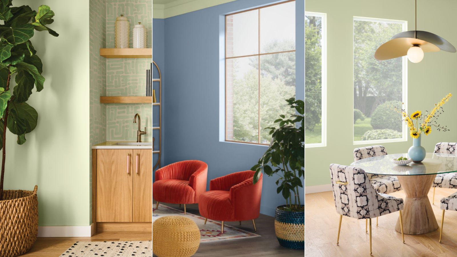
The Summer Camp palette comprises eight paint colors that reflect a soft take on classic summery shades, as well as more classic neutrals. 'Our June Color of the Month palette is a bright, effervescent collection where color comes into play,' explains Sue Wadden, Director of Color Marketing at Sherwin-Williams.
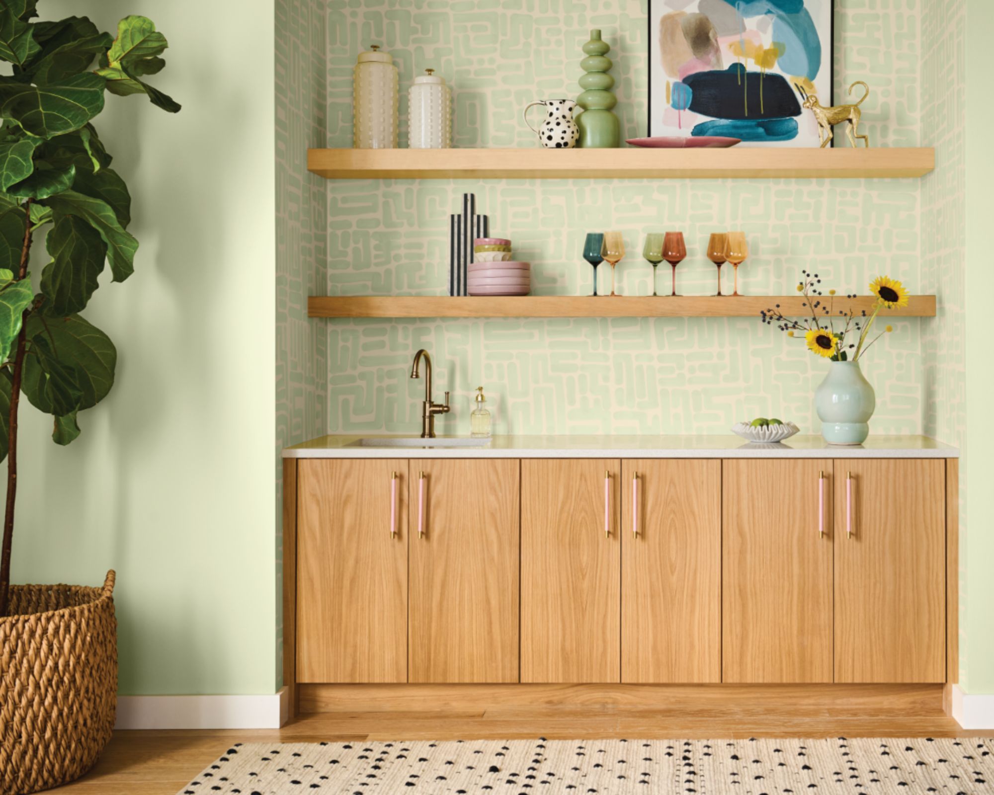
Perfect for pastel room ideas, the standout shade from the collection is Honeydew SW 6428, which Sue describes as 'a light and playful pastel green' which was 'chosen as June’s Color of the Month due to its cheery nature, reminiscent of the pure joy of carefree summer days as a child'. In the kitchen pictured below, Honeydew is used across the walls, creating a colorful yet calming backdrop.
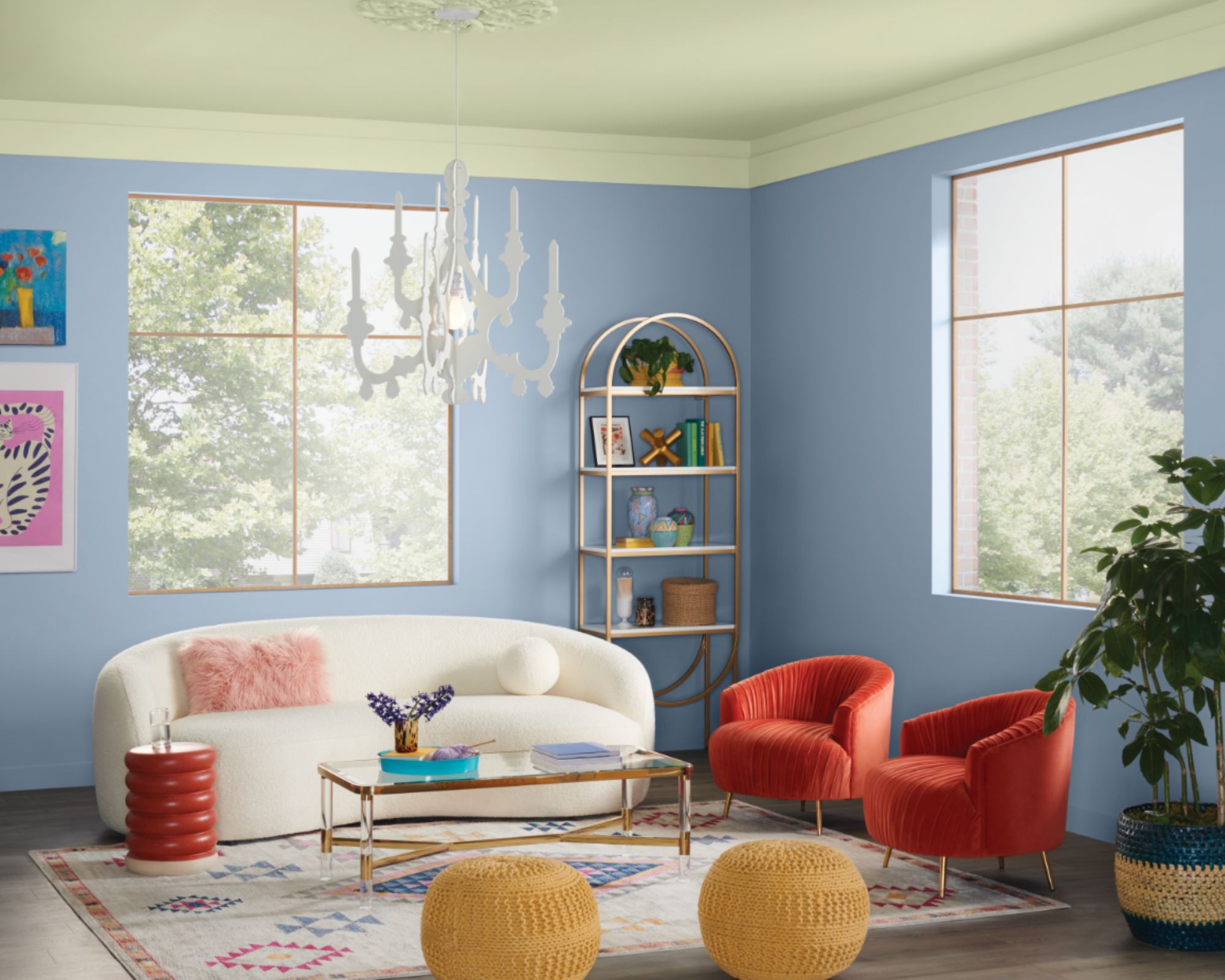
Also included in the Summer Camp palette is Breathtaking SW 6814, a soft shade of pastel blue; Fresh Zest SW 9662, a creamy pastel yellow; and Jovial SW 6611, a warm peach color.
'These fun-loving hues spark nostalgic wonder and inspire a unique and playful style,' says Sue.
If you prefer decorating with neutrals, the other four shades are less saturated. Pure White SW 7005 is a bright white with a subtle yellow undertone; Aleutian SW 6241 is a dusky slate blue; Touch of Grey SW 9549 is a calming gray with soft purple undertones; and Rain Cloud SW 9639 is the darkest shade in the palette, a deep slate gray.
How to decorate with the Summer Camp color palette
The colors within the Summer Camp palette work well on their own or as color combinations for rooms, whether you want to lean into a colorful look or stick to the palette's more muted hues, depending on your decorating style.
For interior designer Kathy Kuo, Honeydew stands out as a favorite shade from the palette: 'I love the freshness and brightness of this versatile light green. In many ways, green can almost function as a neutral – it pairs well within so many different interior design styles and it's very organic and nature-inspired so there's always an element of calm.'
While Honeydew is versatile enough to use in pretty much any room throughout the home, Kathy highlights it as an excellent choice for nursery color schemes or living spaces that follow a summery theme.
'I love that you could use Honeydew for a super-cute nursery or kids' room, or in a chic Palm Beach-esque living room or dining room,' says Kathy. 'It feels fun and summery without being a gimmick.'
Beyond Honeydew, the other pastel colors within the palette can be used to create playful color pairings for a full-on summery look. Sue recommends using Honeydew as the dominant room color, and other hues from the palette as accent colors for a balanced look.
'I recommend pairing Honeydew with a similarly playful and soft shade like Fresh Zest, a pastel yellow, or Aleutian, a light blue, as an accent color to get the perfect combination that bursts of vibrant liveliness without the boldness of more saturated shades,' says Sue.
With all of the palette's colorful hues, Sue advises sticking to rooms with plenty of daylight to make the most of their light and airy appeal: 'Bring them into a room with lots of natural light where you want a fun and fresh personality to shine, like a kitchen or even a quirky colorful yet soft bedroom.'
For a more understated look, turn to shades such as Pure White or Touch of Grey and use them as backdrop colors throughout the home. To add interest, you can then use darker hues such as Rain Cloud across trim detailing, creating a sophisticated and timeless look in all types of spaces.
Whether you're inspired by the uplifting pastel tones of the Summer Camp palette or prefer to keep things more pared back with the range of neutral hues, there's something in this palette for all homes and interior design styles.