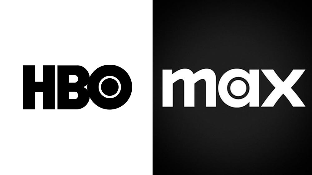
Ah, HBO Max. Sorry, I mean just Max. Warner Bros Discovery's streaming platform did away with its association with HBO back in 2023, prompting all manner of confusion. Viewers mourned the loss of the prestige that the HBO name carries, and mocked the need for a new 'The one to watch for HBO' strapline in the absence of the network's name. And now, somehow, Max has managed to make things even more confusing.
Max has launched a new monochrome colour palette, with white text and a black background replacing the previous striking blue. And as many have pointed out, it suddenly looks a lot more like the also monochrome HBO logo. The first rule of the best logos is that they could never be mistaken for something else. Guys, do you want to be associated with HBO or not?