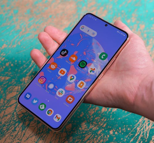
The comparison between Samsung’s Galaxy S line and Apple’s iPhone has never been more apt.
With the launch of the Galaxy S22 series, Samsung is returning to a successful design and polishing up the edges — in more ways than one. Where the Galaxy S22 Ultra is clearly a Galaxy Note by another name, the S22 and S22+ are refined versions of the S21 and S21+. Trading plastic for glass and polished metal, but largely keeping the broad strokes the same. An “S” upgrade (to borrow Apple terminology) rather than a dramatic rethinking of the whole Galaxy line. Samsung's bleeding-edge mobile aspirations now lie with the Z Fold and the Z Flip now.
The Galaxy S22+ is the middle child of Samsung’s new family of phones and an excellent option for anyone looking to get a taste of a polished, all-inclusive Android experience. It might not be exciting, but it is tremendously capable.
Input may receive a portion of sales if you purchase a product through a link in this article. We only include products that have been independently selected by Input's editorial team.
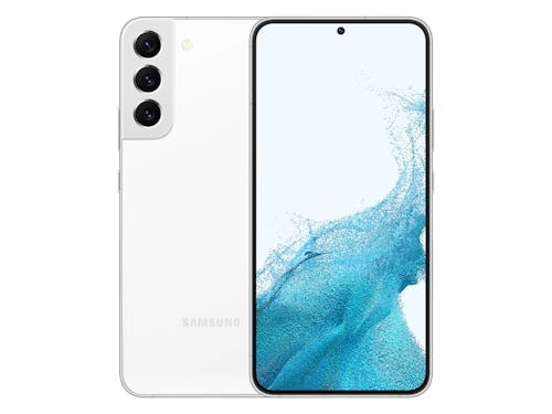
Tuned familiarity
The S21, much like the iPhone 12, was a major departure for modern-day Samsung. After a couple of years of slapping curved, “waterfall” screens on its premium smartphones, the company embraced flatness, clean lines, and found an elegant way to incorporate a ridiculous amount of cameras onto the back of the phone. As a lifelong iPhone owner who’s only occasionally dabbled with Google’s Pixels, I found the S21 (and especially the S21 Ultra) hot. Enviable.
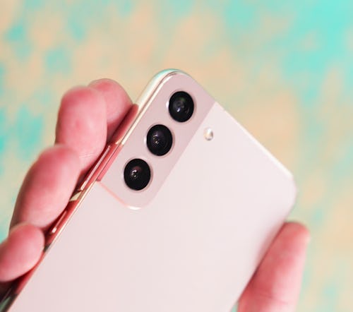
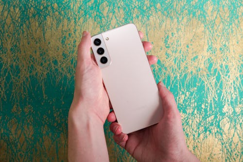
Changes to that winning formula in the S22+ are minor. The back of the phone is entirely flat rather than featuring a gentle curve towards the edges. The contour cut camera “plateau” no longer flows directly into the metal rim around the perimeter of the phone and instead stops just short. (A tweak I think is bad for both aesthetic and hand-feel reasons.)
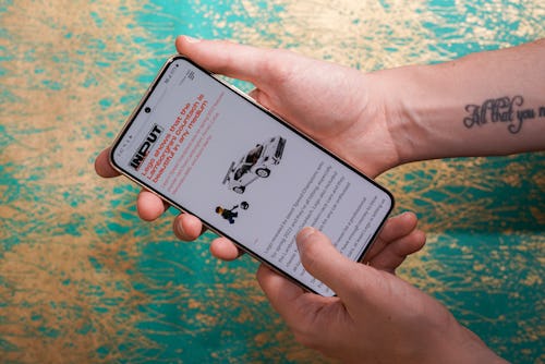
How the phone feels in the hand is tricky, because the S22+ is unavoidably large, and it isn’t even the largest phone Samsung is selling this year. The rounded rails around the edge go a long way to make it comfortable to hold, but this is the one instance where the flat front and back work against it. No transition between the two leaves the S22+ with sharp edges. An equally large device like the Pixel 6 is more comfortable to hold because it's more curved. My personal phone, the iPhone 11, is both easier to hold and even more smooth to the touch. The shiny rails also pick up fingerprints rather easily; definitely get a case if you hate that.
I’m glad Samsung’s embraced flatness and is celebrating an already aesthetically appealing design. It does come with some trade-offs, though.
Screen time —
The 6.6-inch Dynamic AMOLED display on the S22+ is plenty big and ridiculously bright. Both the S22+ and the S22 Ultra reach a peak of 1,750 nits of brightness this year, and in my experience, that’s made the S22+ more visible, whether you’re inside or outside.
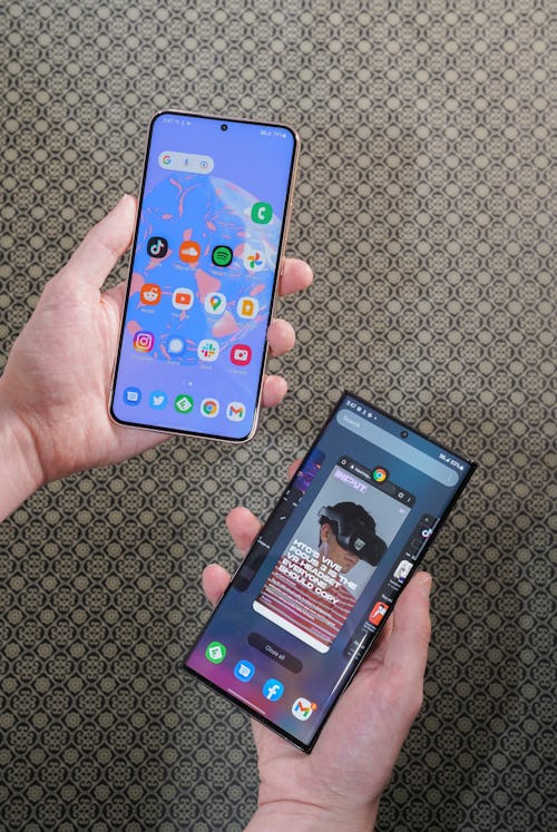
In comparison to both the Pixel 6 and my iPhone 11, the S22+ is easier to read and use in direct sunlight. There are differences in max brightness and screen technology between all three phones and there isn’t necessarily less glare, but the S22+ was consistently the one I preferred to look at.
I’m not entirely sure that’s because of Samsung’s Vision Booster tech, which is supposed to intelligently adjust the brightness and contrast of the content on your phone to be viewable in even the most glaring outdoor situation. I never caught the S22+ changing contrast levels or anything like that when it was brought into the sunlight as you might with an auto-brightness setting. But it did look better, so whether or not Vision Booster is just marketing jargon or a real feature, something was working right.
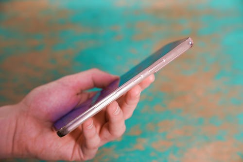
An eye-melting screen isn’t the only improvement. The whole S22 line features an adaptive framerate that maxes out at 120Hz and makes scrolling and the collection of small animation throughout One UI 4.1 seamless and smooth. As a bit of an outsider to Samsung’s phones, these features were nice, but what stuck with me was how nice having a flat, practically bezel-less display on your phone is. Samsung gives you a lot of screen to play with if you want to use it. I personally would prefer a smaller phone, but I’m not mad looking at this one.
The guts —
Internally, the S22+ uses the same 4nm chip as the rest of the line — the Snapdragon 8 Gen 1 — which definitely leaves it some headroom for the next few rounds of software updates. I struggle to form an interesting opinion about the last several years of smartphone chip advancements because at this point we’ve lapped the kind of work or play I try and get done on this kind of device. The S22+ is very fast. It handled heavier games like Genshin Impact without stutters or slowdowns (though the phone got a little warm) and zipped through light photo editing easily. To put things another way, I never once thought about the fact that this phone was using a different chip from last year’s flagships because I didn’t have to.
The battery powering the S22+’s massive display is 4,500 mAh. On my first day using the phone with the brightness maxed out and some heavy use, it burned through that increased capacity surprisingly quickly. I still made it through the day, but with 30 percent left in the tank. Letting go of my excitement over having an overly bright screen dramatically changed that number. With auto-brightness and a very light day of use (some YouTube, occasionally checking Twitter, and taking photos) I ended the day with around 60 percent of the battery left.
I think there’s still reason to be concerned about the smaller 3,500 mAh battery in the entry-level Galaxy S22, especially considering it’s smaller than the 4,000 mAh battery in the S21. The S22+ has had enough for me, though. At least for now.
Night photography

The big focus of Samsung’s camera changes this year is improving night photography. Smartphones have taken huge strides in improving night shots with the advent of computational photography and “night modes” but add any other element in the mix like the “blur” of a portrait mode or even just movement in a night video and things pretty regularly hit the fan.
Night moves —
With the cameras — and more importantly, the software — of the S22+, Samsung has made some noticeable improvements for anyone who owns a relatively recent flagship smartphone. Before we get into those, let’s get the basic specs of the cameras on the S22+ out of the way.
The S22+ camera array includes:
- Selfie: 10 megapixels (f/2.2)
- Wide: 50 megapixels (f/1.8)
- Ultra-wide: 12 megapixels (f/2.2)
- 3x telephoto: 10 megapixels (f/2.4)
In general, the S22+ is able to consistently capture a level of detail that a device like the Pixel 6 isn’t able to quite match. I still prefer the way Google’s phone chooses to color most night shots, but Samsung does at least in my opinion edge things out in terms of clarity.
Night video is even less clear cut. The S22+ produces a bright and visible (as in, I can tell what’s going on) video, but I would not describe it as “good” without more light. That’s the reality of night modes and night shooting across modern flagships. You generally need a bit more light than you think. It feels like splitting hairs to say that the S22+ shoots the best night videos because I’m not sure any new smartphone does, but Samsung’s sure is brighter.
Are these changes big enough to warrant cringe-y branding like “nightography?” No. But will they make a difference for someone who hasn’t updated their phone in a while? Probably.
The photo aesthetic —
The rest of the S22+’s camera performance is more familiar. Samsung’s phones still oversaturate photos in comparison to other phones, but once you get over the quirks, the results are great. Portrait shots with the S22+ are impressive (Samsung's AI Stereo Depth Map is the real deal), with a much more natural blur and cleaner edges on hard to capture bits like hair. I don’t think I have any use for a telephoto zoom, but the results on a hardware zoom versus a software zoom are still preferred. There's no doubt that the 30x hybrid zoom is impressive compared to the iPhone 13 Pro’s max 12x digital zoom. Nobody needs a ridiculous 100x Moon-capturing Space Zoom, but if you desire it, you'll need to step up to the S22 Ultra.
My main issue is the S22+ and Samsung’s preference for warmer, oversaturated photos. It’s not offensive, but skies are sometimes blown out, faces are smooth, and anything that’s bright is decidedly bright. It’s an acquired taste. Fortunately, there's a pro mode where you can nerd out on manual camera settings and get the look you want.
Samsung world
One UI is mature. Samsung has allowed some bloat to return (there are still duplicates for apps that are already built right into Android 12), but the rest of the Android skin feels super usable, provided you’re not digging through settings.
Partnerships with companies like Google and Microsoft mean that in some cases the S22+ defaults to apps and experiences that are just better overall (Google Messages), or that plenty of people already have some familiarity with (Microsoft Office and OneDrive). Combined with the Galaxy Watch, Galaxy Buds, the Galaxy Tab S8 Ultra, and new features built on top of laptops running Windows 11, Samsung has a fairly cohesive little ecosystem on its hands.
That’s another reason why the comparison to the iPhone feels apt. This generation is to me, the first one where you could live entirely inside Samsung’s ecosystem and have a really great time. I know that's already been happening. But for the outsider, maybe you had another Android phone, or maybe you’re just tired of Apple, Samsung’s water seems fine. The calendar app, the extra browser, even the gallery. They all work fine and aren’t eyesores. I personally don’t want Samsung’s duplicate apps to come pre-loaded, but thankfully, they're easily ignorable if you prefer Google's alternatives.
You could live entirely inside Samsung’s ecosystem and have a really great time.
That’s really the story overall. Not much has changed with the S22+. There are meaningful improvements — better portraits, slightly better night performance, and a faster chip — but they’re going to be the most meaningful to someone who doesn’t already own the S21+ from last year. And the price upgrading year after year could catch up to you. The S22+ is $999.99 which for a while was the price of entry for any flagship smartphone. That price has continued to creep up — the S22 Ultra starts at $1,199.99 and the iPhone 13 Pro Max starts at $1,099.99 — without dramatic changes to what you get when you buy the “best” phone from a manufacturer.
If you didn’t upgrade last year, the S22+ has features I think most people could appreciate, at the right price. There’s no reason to pay more for the Ultra unless you’ve already committed to the Galaxy Note lifestyle, and the only reason to step down to the S22 is if you’re comfortable with a smaller battery and prefer a smaller screen. If you did buy an S21 last year, there’s very little reason to upgrade at all.
Samsung’s offerings are the same — it has an even more compelling family of phones, tablets, and smartwatches to offer you. If you’ve had your taste you might not need more. But if you haven’t, it really seems like there’s never been a better time to buy in.


