Ask any real estate agent, and they will likely emphasize the importance of the first room of the home: the entryway. The influence of this space means it has a habit of splitting design opinions, but more often than not, these experts can agree on one thing, and that's a subtle, neutral color palette.
Whether we're selling or not, our entryway color choice is impactful, but Romeo Beckham just gave us an unexpected source of inspiration in the shape of his monochromatic entrance hall. Though narrow (a trademark of urban abodes, after all), the space feels bright and inviting, but his accessories also feel effortlessly cool.
'When staging your home, one of the most important areas to focus on is the entryway. This is the first impression that potential buyers will have of your home, so you want to make sure it looks its best,' comments Rinal Patel, a Philadeliphia-based licensed real estate agent. She shares her entryway staging tricks, starting with a color scheme like Romeo Beckham's.
'Consider painting the walls a neutral color,' Rinal says. 'A bright or bold color can be too much in such a small space and may not appeal to buyers – stick to neutrals like white, beige, or gray for a more timeless look.'
Decorating with neutrals, particularly white, like Romeo, creates the illusion of space in even the narrowest of entryways – a decorating technique that will impress potential buyers (or anyone who visits our home). However, we can accentuate this color further with another design trick that Rinal says is almost as important as the right color: good lighting.
'Make sure the area is well-lit. A dark and dreary entryway will not make a good impression on buyers. Add some light fixtures or lamps to brighten up the space,' she comments.
Paint aside, Romeo has dressed his entryway with artwork with a curated selection of artworks that bring just the right amount of color to the otherwise neutral space. He also painted his radiator a deep black hue that juxtaposes the subtle wall color and pairs well with the dark art frames.
Rinal similarly urges us to invest in artworks that might accentuate our space, but we shouldn't stop there. 'Add a rug, some plants, or other decorative items to make the space more inviting. You can also add a bench or a side table to give potential buyers places to put their things,' she comments.
'Finally, make sure the space is clean and clutter-free. A cluttered space can make a bad first impression and be a distraction from the rest of the home. This will also avoid any potential trip hazards.'
Shop Romeo Beckham's entryway edit
We can't all have a London townhouse, but we can replicate Romeo's style with these inspired buys below.
From $3 per sample at Backdrop
Described as Backdrop's 'cleanest, pure white,' this easily-applicable, washable paint is 'green-certified,' making it a great choice if you want to get the look sustainably.
From $110 at Saks Fifth Avenue
Diptyque designed Baies to recall the sweet scent of a rose garden by the water's edge. It comes in a mouth-blown glass colored during production for a shiny finish that lets you see the candle flame.

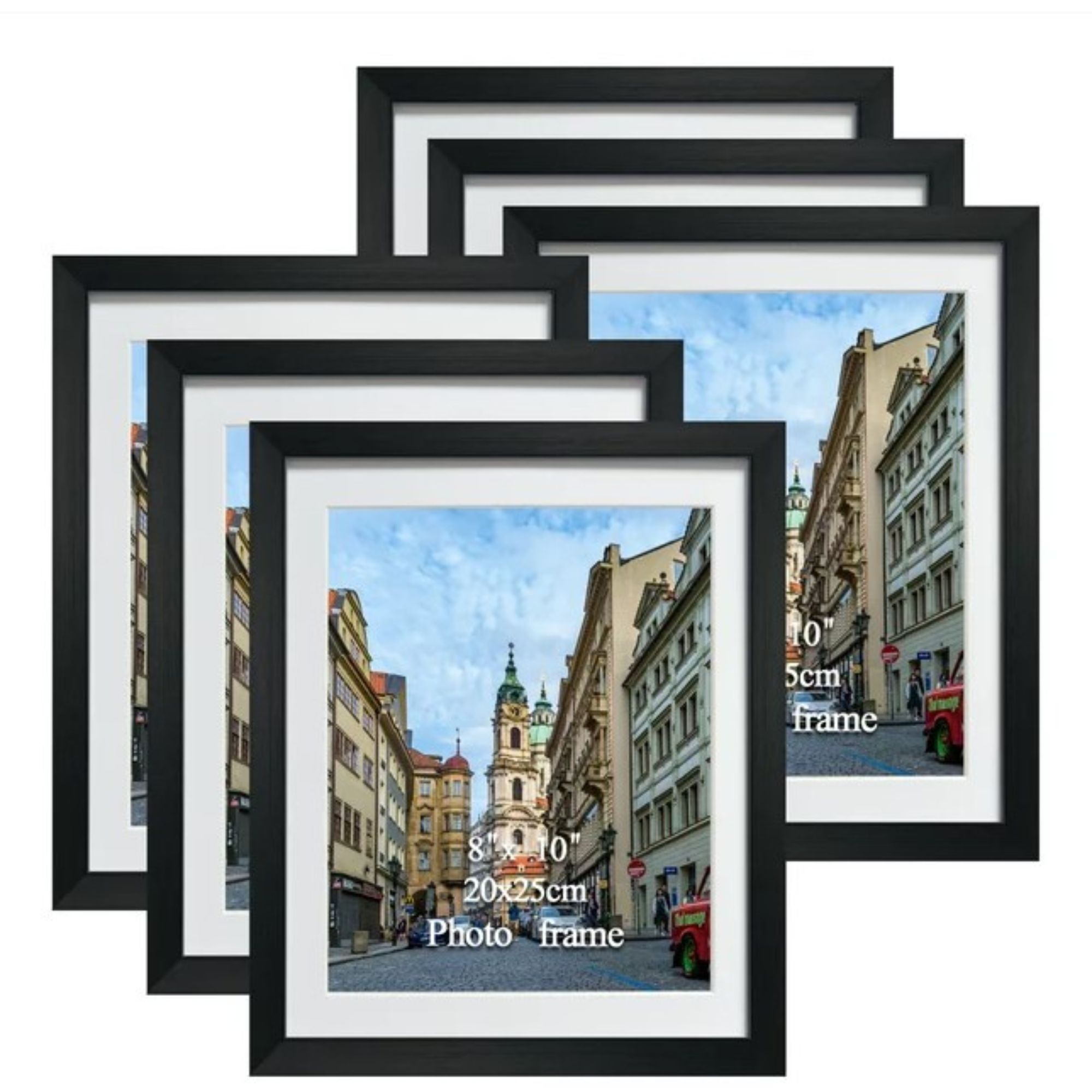
Romeo has decorated his walls with artwork in black and white frames, such as these from Walmart. This 6-pack features 8x10 picture frames – so we can display your memories just like him.


