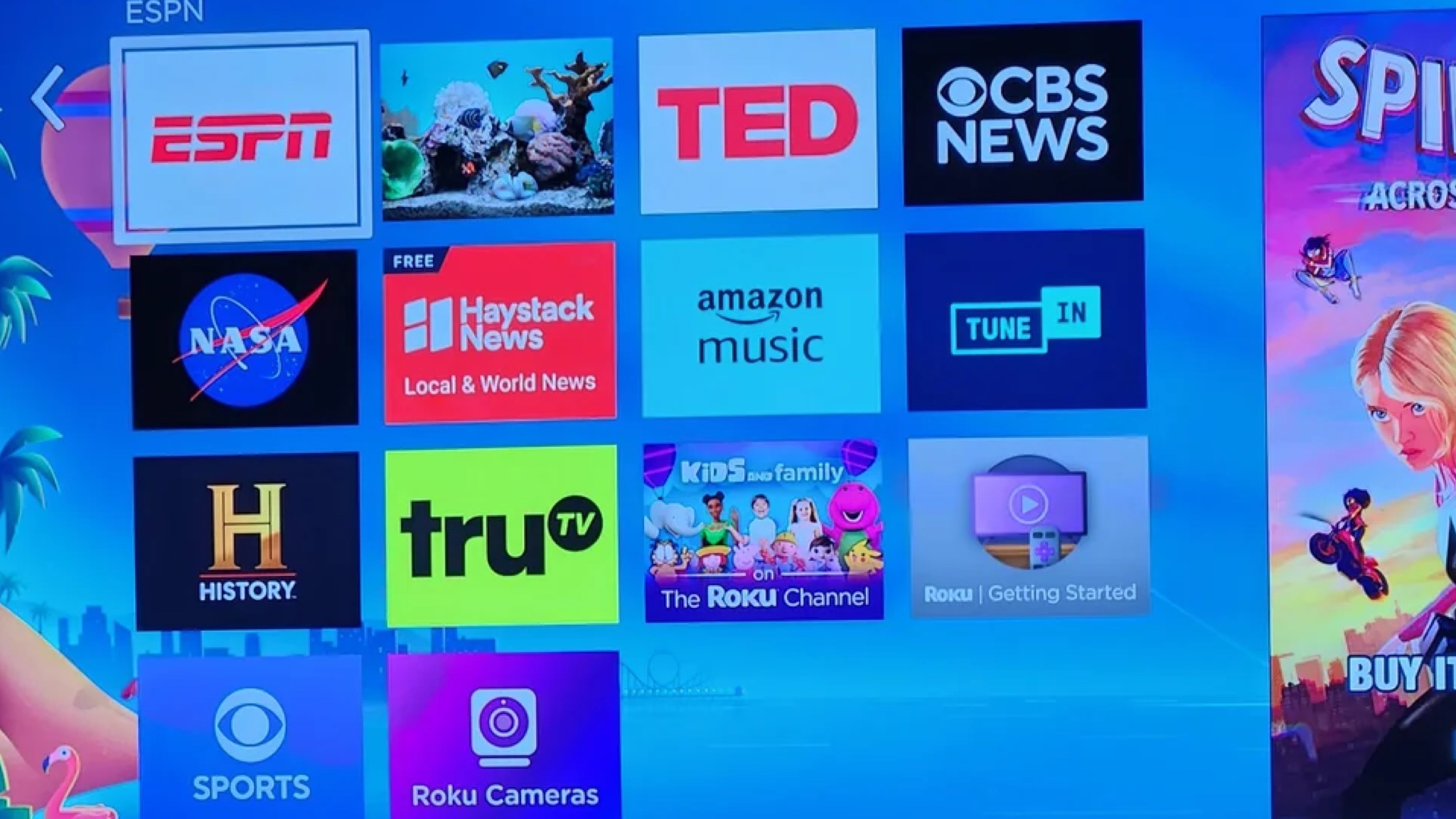
The image at the top of this story may be the next generation of Roku's smart TV interface, which is currently being tested. The image, which was posted to the r/Roku subreddit, has been confirmed to be the new revamped look, as multiple Roku owners found it appearing on their TVs over the weekend.
Roku has since confirmed, via the Cord Cutters News site, that the images are indeed a new home screen design that Roku is testing. Although, it has not yet been made official about whether it will be rolled out to streaming devices like the Roku Streaming Stick 4K or TV models that use the OS.
As you can see from the image above, the big change here is the number of tiles. Instead of a three-column grid with four rows, which is what the current Roku interface uses, it's a four-column grid with four rows. That means instead of twelve tiles you get sixteen.
Is this the next-generation of the Roku TV interface?
Maybe. But the fact that it's only appearing for some users rather than all users suggests that Roku is currently experimenting rather than committing to this new design. It may go with this design or something very much like it, or it might decide that actually it's quite happy with the way things are.
The last time Roku made a significant update to its TV interface was in April 2023, when it tweaked the home screen design. But Roku tends to announce new streaming devices in September – it introduced the 2022 Roku Express in September of that year – so it's possible that it's testing interface changes in anticipation of launching a new streaming device next month – we already Roku among the best streaming devices for your TV.
Then again, maybe it's just changing for the sake of it. Apple's been moving things around in tvOS and Google TV rearranged the on-screen furniture earlier this year too, so perhaps Roku is just planning to freshen up its interface to stay current. The firm isn't currently saying much. It's confirmed the legitimacy of the screenshot, but beyond that it's a case of no comment for now.


