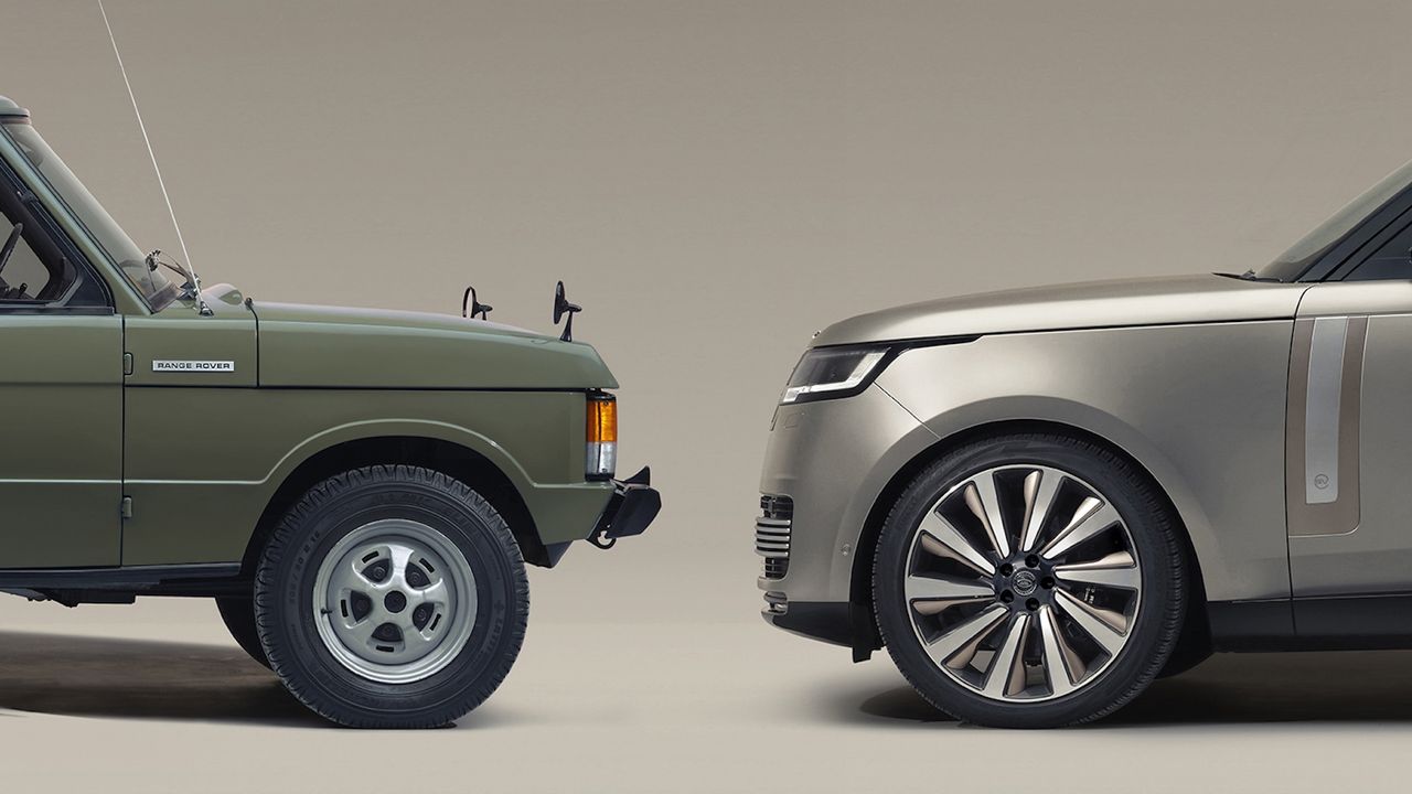
Earlier this month, news of Range Rover's new logo, the first in the brand's 55 year history, was met with raised eyebrows. Rather like Jaguar's much-derided rebrand, the new 'RR' symbol was seen a weirdly goofy look for a storied luxury car brand. But it turns out the new look involves more than just a new symbol.
In a new interview with Design Week, Range Rover has revealed more about the rationale behind the new identity, along with an updated version of the Range Rover wordmark. Far less of a departure in style, the new wordmark features subtly tweaked lettering, aimed at "decoding and recoding Range Rover’s existing DNA into a set of guidelines that support modern luxury communication.”