
The Meta Quest Pro does not make Meta’s vision for the metaverse any more real.
It’s wrong to expect the $1,500 high-end mixed reality headset to, but it’s worth reiterating. The company’s splashy vision for the future of the mobile internet is as much a technical problem as it is a social one, and a great new virtual reality headset isn’t going to change that overnight.
Still, the Quest Pro is arriving at a critical time for Meta. After over a year of teasing what many assumed was a successor to the Quest 2, the Quest Pro is something a little different. Beating Apple’s rumored mixed reality headset to the punch and one-upping the competition on some important features, the Quest Pro targets a more niche audience of professionals and creators by improving features on the Quest 2 and also focusing on an entirely different use case.
The Quest Pro is a major feat of engineering that's an excellent test of the technology Meta expects to offer in future headsets and augmented reality glasses. But the mixed reality headset is very much a test with new compromises right alongside its cutting-edge features. And most unfortunately, the Quest Pro also illustrates the limitations of the company's current software suite, which is arguably more key to getting people to spend time in the metaverse than having perfectly-tracked limbs.
Pancake lenses change everything
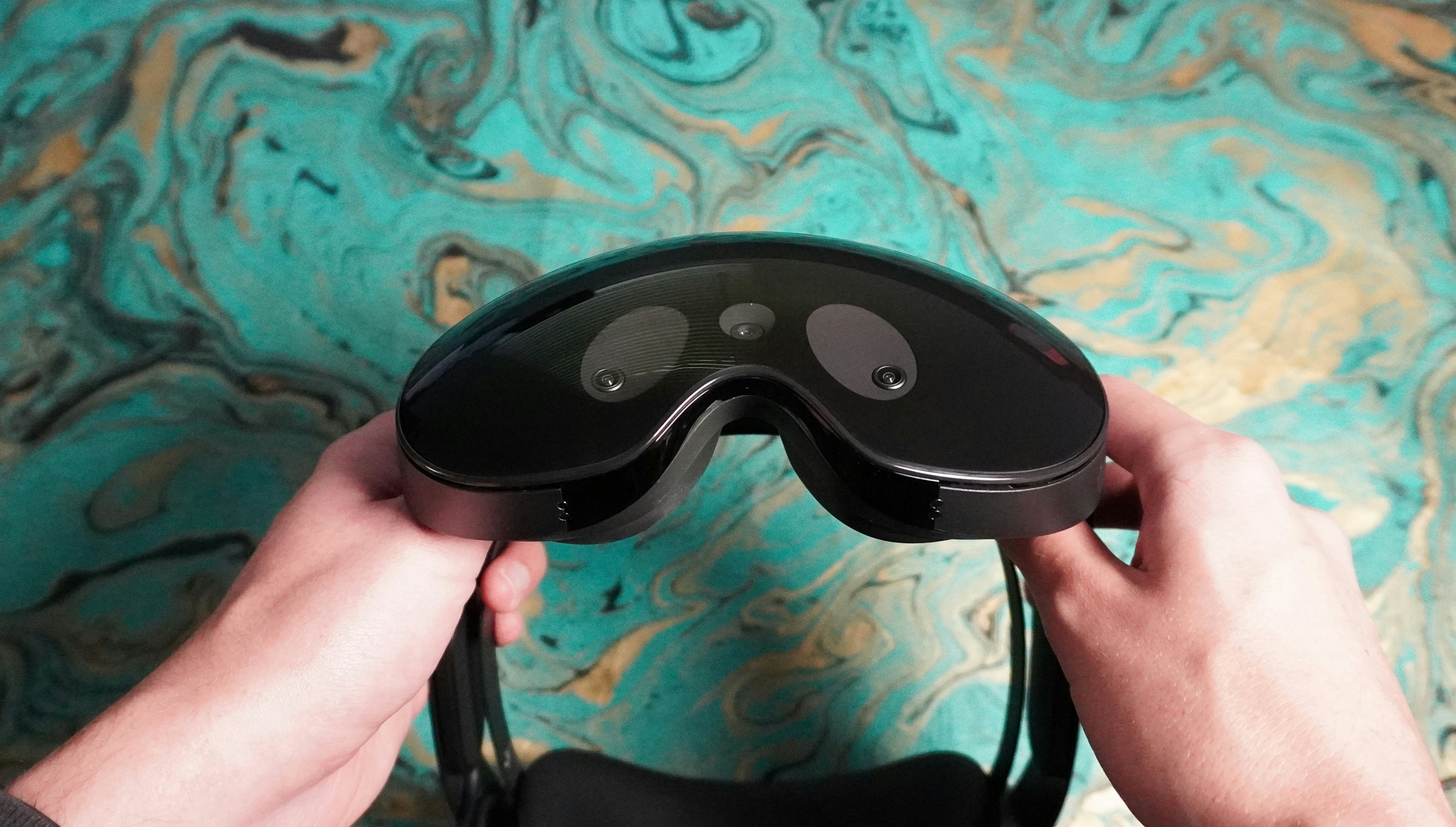
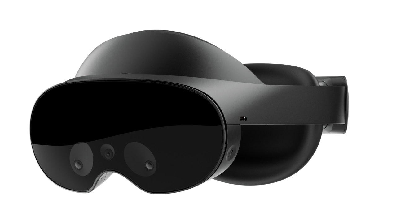
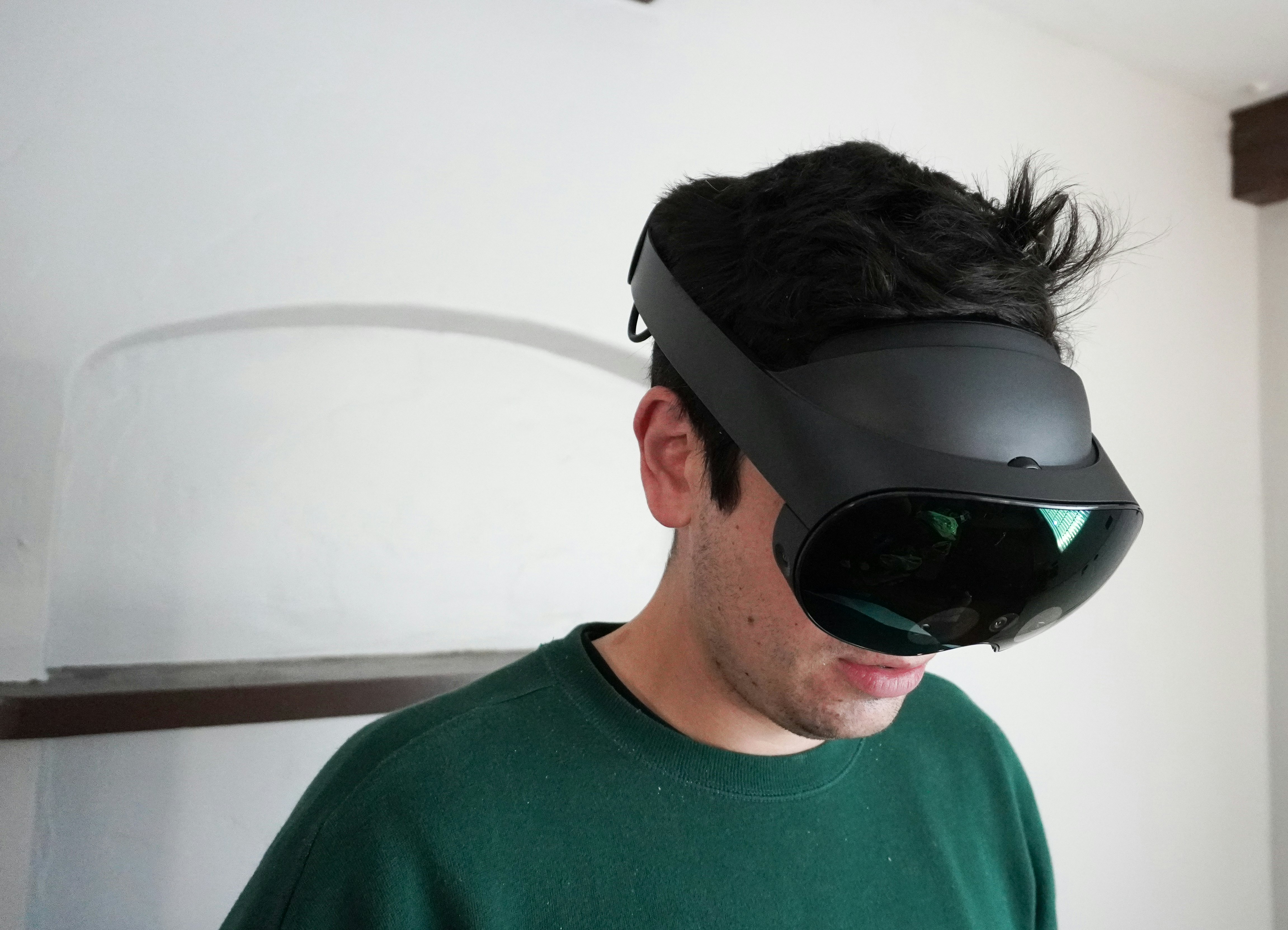
The first thing to notice about the Quest Pro is that it cuts a much smaller profile than the Quest 2 or any other Oculus headset that came before it. It’s much more VR “visor” than VR “goggles” (your peripheral vision is unobscured by default), and a large part of that has to do with how Meta has changed the optics on the inside of the headset.
Rather than the Fresnel lenses of the Quest 2, the Quest Pro uses pancake lenses, which, true to their name, are flatter and allow for the lenses and displays to be closer together — and closer to your face while you’re wearing the headset. That means the Quest Pro is slimmer without compromising image quality, at least on paper. The Quest Pro specifically has two 90Hz mini-LED displays with a 1,800 x 1,920 resolution. It’s an improvement in quality compared to the Quest 2, but not as dramatic as it sounds in use (a theme of the Quest Pro). Spend enough time looking, and you’ll notice the edges and pixels, but at least they’re piped into your eyes through brighter displays with smoother refresh rates.

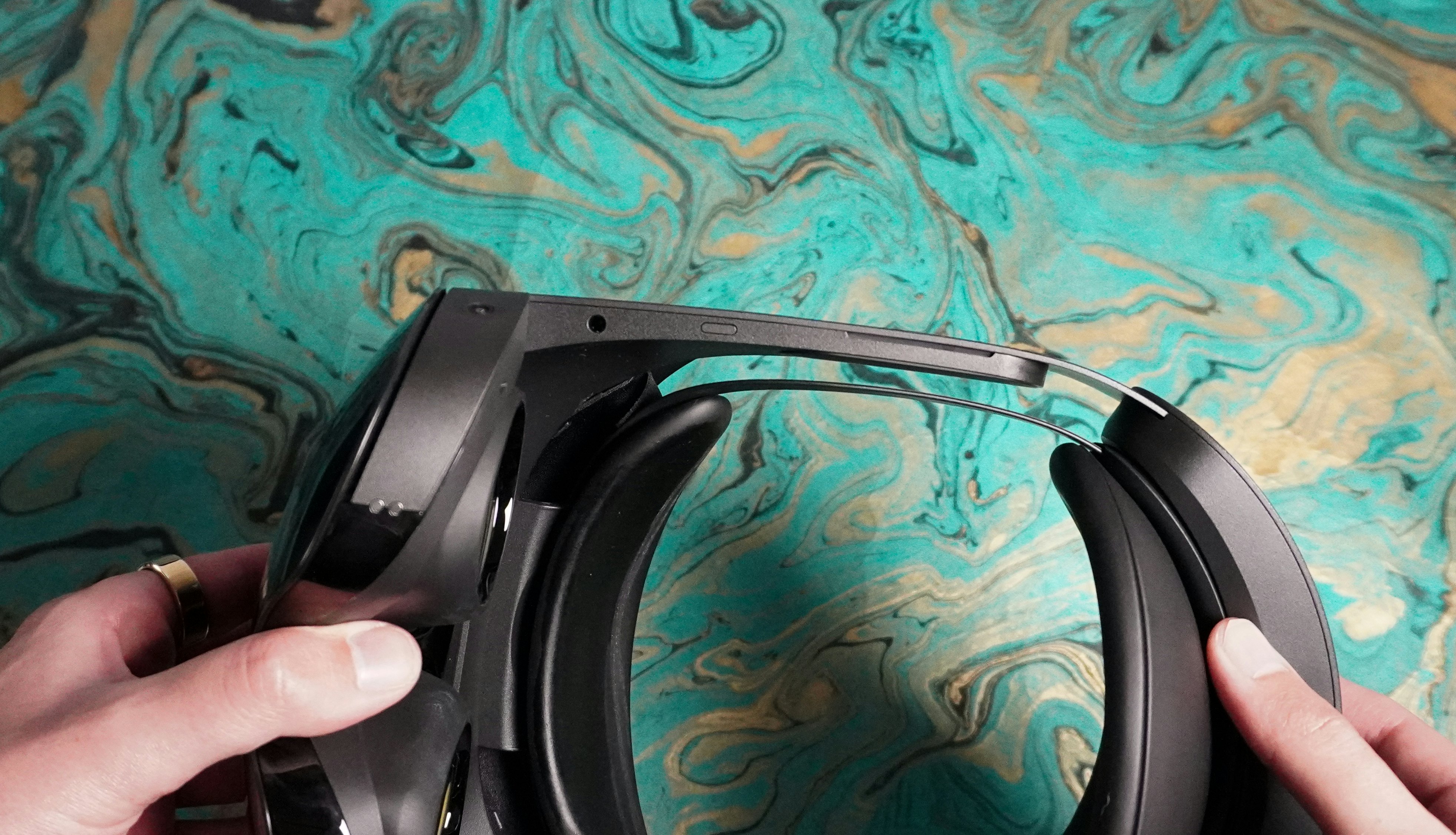
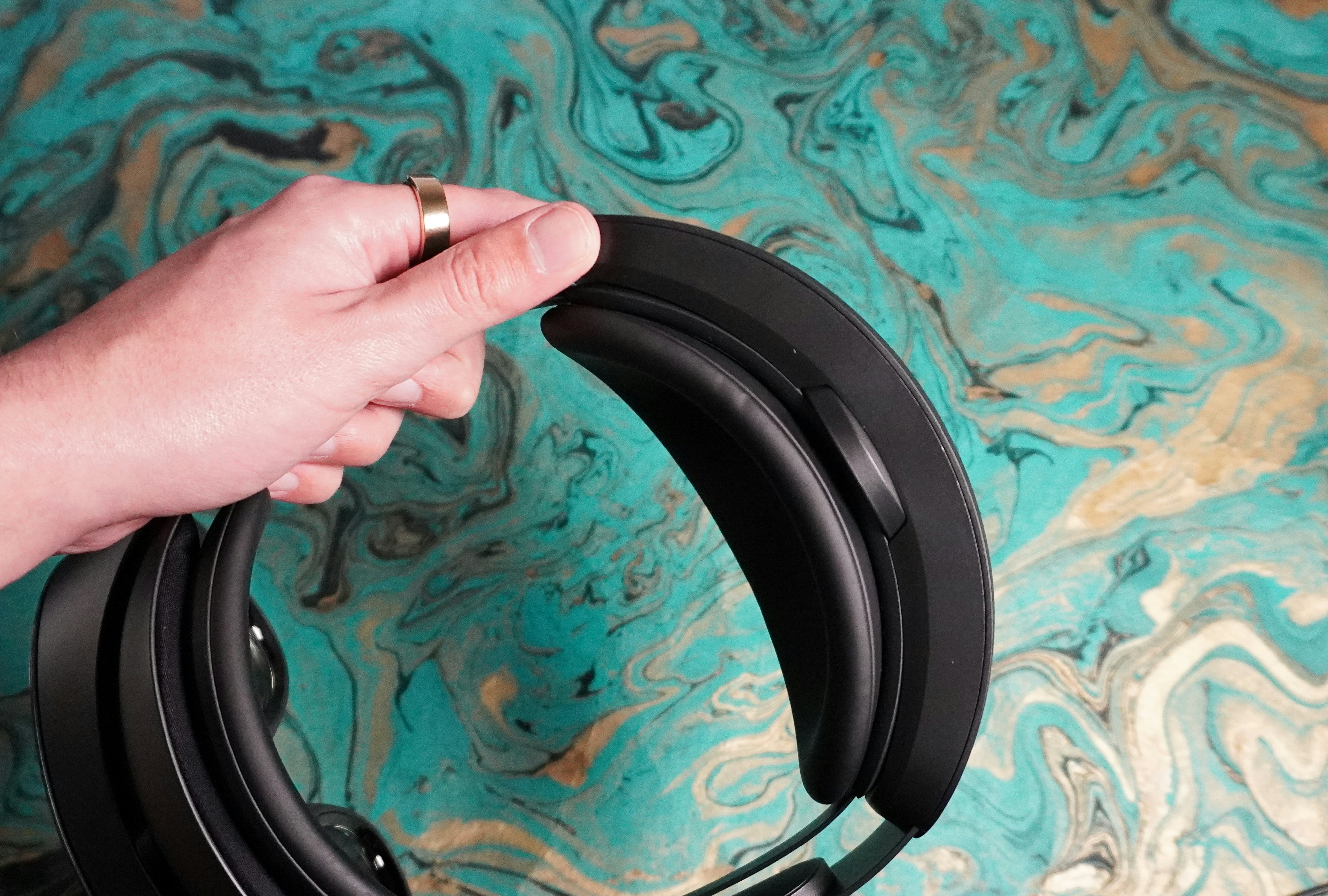
Because the Quest Pro is open on the edges, you can actually peek at your phone or watch without taking anything off, a handy change that does mean you need to attach (with satisfying magnets) the Quest Pro’s partial light blockers to be more properly immersed. That modularity is part of the mixed reality vision Meta has for the device, along with the changes to how you put it on and take it off. Instead of using a combination of top and side head straps, the Quest Pro has a single knob-adjustable strap, not unlike the Quest 2 Elite Strap accessory. This puts pressure on your forehead and the back of your head while wearing the device but more evenly balances the overall weight since the battery is stored in the strap.
That change goes a long way to making the Quest Pro feel more premium and comfortable out of the box, though it did lead to some light marks on my forehead and slight discomfort if I over-tightened the strap. It’s one of several trade-offs that comes with the new tracking features and more experimental tech included in this premium headset. In total there are five new cameras inside of the Quest Pro and a new color passthrough camera that enable face and eye tracking, and four cameras on the outside of the device for hand tracking.
All these cameras allow for (entirely optional) “expressive” avatars in apps that support face and eye tracking, a passthrough mode for the main Horizon Home launcher, and several productivity-focused apps that launched or received major updates alongside the Quest Pro. Strangely, though, the design change I found most compelling among these was the dock Meta includes to charge the Quest Pro and the new Touch Pro Controllers. If there’s any lesson to be taken from the Quest Pro, it’s that virtual reality headsets should use charging docks by default. It’s so much easier than plugging in a cable, and it makes putting on a headset on a whim a lot simpler.
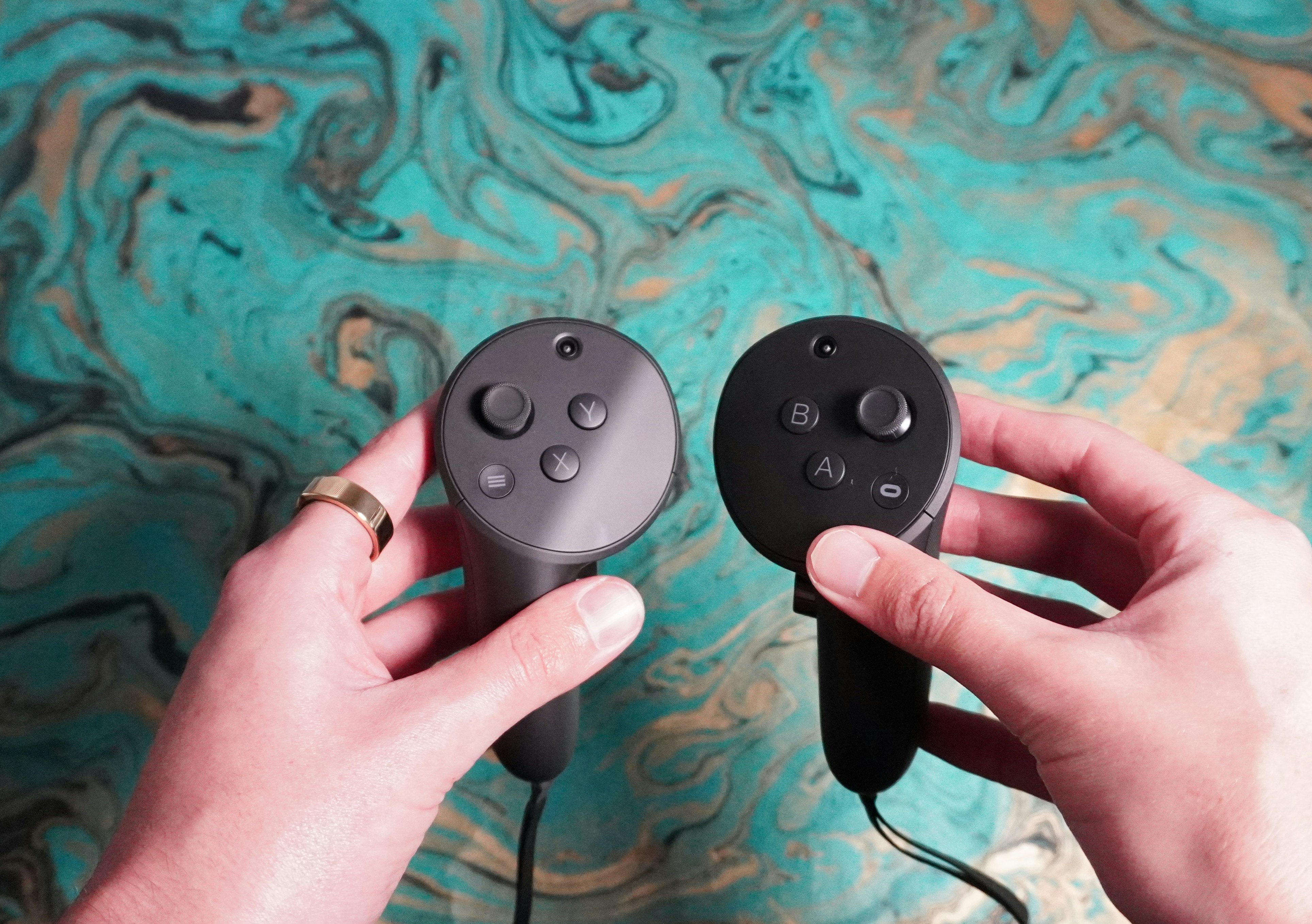
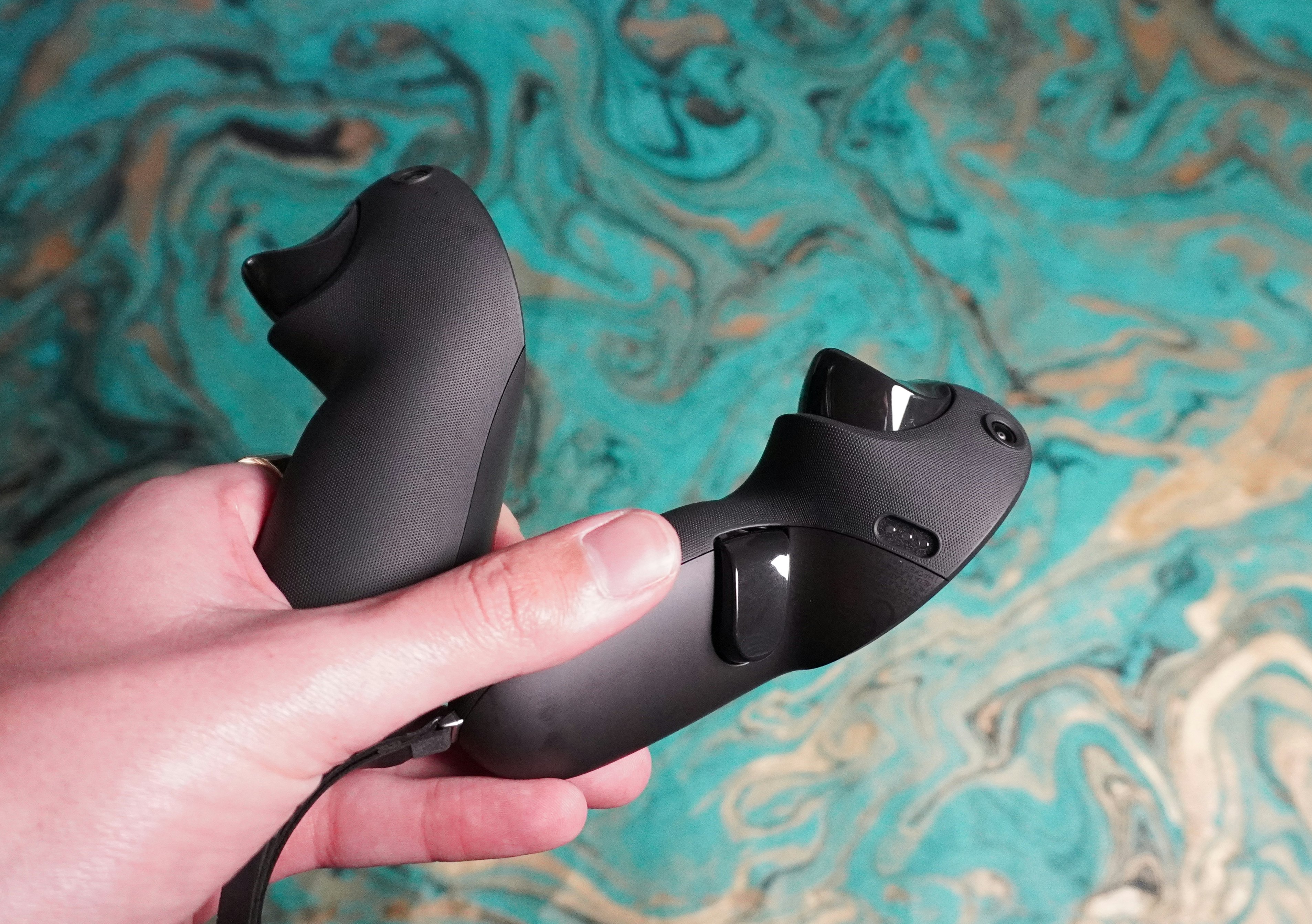
Turning to the Touch Pro Controllers, they’re a significant upgrade to the Quest 2’s. They work entirely independently of the headset, with built-in cameras for tracking, an onboard Snapdragon CPU, improved haptics, and optional attachments for turning them into pens for taking notes during VR meetings. There’s typically a slight delay while the controllers determine where they (and your hands) are when you first boot up the Quest Pro, but on the whole, I’ve found them to be far more reliable than the Quest 2's Touch Controllers, especially for fast hard-to-track movements in workout apps like Supernatural or rhythm games like Beat Saber.
Meta Quest Pro Specs
- Displays: 1,800 x 1,920 90Hz mini-LED
- Chip: Snapdragon XR2+ Gen 1
- RAM: 12GB LPDDR5
- Storage: 256GB
- Cameras: 5 external (one color passthrough), 5 internal
Of course, Meta isn't aiming the Quest Pro at recreational use, even if it's capable enough thanks to more RAM and the slightly more efficient XR2+ Gen 1 chip. The company has repeatedly stressed in briefings that this headset is aimed at professional use. The Quest Pro is meant to be used periodically throughout the day, or maybe once a day, for meetings, a design review, or to get some focused work done constructing a 3D model or working in a web app in the browser. It’s hard to say if the use cases for the headset were designed around hardware limitations or if that’s how Meta always wanted this device to fit into your life, but the Quest Pro’s two hours of battery life decide for you. Because of the new design and power-hungry sensors, there will be no marathon sessions with it on; it just won’t last without a visit to the charging dock.
The larger issue is that a key component of the mixed reality experience — the color passthrough view — isn’t as high fidelity as I, or I imagine the average person, would want. It’s way better than the grainy black-and-white view on the Quest 2, but it’s not like looking even through your smartphone's camera. There are the shortest of delays between the video feed and the real world, and noticeable noise, which combine to frequently break the illusion that this is your normal vision and not a creation of the Quest Pro. Get deeply engrossed in an app, and you can forget it, but if you’re sensitive at all to that kind of visual back-and-forth between video and what you can see in your peripheral vision, you might end up feeling nauseous.
There’s connective tissue missing

The Quest Pro runs all the same software that the Quest 2 can run. Meta has sectioned off a part of the Meta Store for apps specifically designed for the Pro that at least take advantage of its new features if you want to see the best of what the headset can offer.
One of my favorite games, Cubism, now lets you work through block puzzles in passthrough mode and see the tetrominoes you’re fitting together in the room around you. It’s not necessary to enjoy the game, but it’s a neat party trick if you want to change things up.
Arkio, a “spatial design” app meant for architects and interior designers, is a much better example of the professional uses Meta imagines. At its simplest, Arkio lets you create and view 3D models. You could construct a home and place furniture inside it or peer through someone else’s design, but with the Quest Pro, the app goes even further. If you “scan” in your room and teach the headset where your walls, windows, and basic furniture are just by measuring things out with your controller, you can actively change things in passthrough mode. You could change the color of the walls or place objects in the physical room you’re standing in! Add in the ability to collaborate on projects with other people simultaneously, and it gets even more enjoyable.
I found the most joy messing around in Figmin XR; an app explicitly focused on creating mixed reality “scenes” powered by Tilt Brush. There’s a vast library of user creations that combine GIFs, videos, drawings, and weird 3D objects with “physics” that are super fun to explore. It’s very odd in the best, most internet-y way possible. I’m not sure how useful Figmin XR might be to someone trying to create a mixed reality experience for their business, but it’s a very flexible creation system.
As I've dug into Quest Pro-specific software more, I've concluded that while the apps are technically impressive, I'm not 100% convinced that an individual creator or creative business should invest in one or more Quest Pros. If you’re already using one of these apps, then sure. If you’re certain these tools will do what you need to do, and you’re only going to be able to make what you want to make in VR, then have at it. Everyone else should probably look for a cheaper option or 2D software that can run on the computer they already have.
That applies to Meta’s more general productivity apps, too. Horizon Workrooms allows you to host virtual meetings with colleagues across 3D and 2D video-only environments, share files, and even write on virtual whiteboards. There’s also the ability to create a personal workroom (and connect your laptop to your Quest Pro) if you just want to work on projects on multiple, much larger virtual screens. My major issue with Workrooms is that so much of it is managed outside of your headset. If you’re scheduling a meeting, you have to use the Workrooms website. It’s far too challenging to get a workroom started. I could lay these odd quirks at the feet of Meta developers who, reports suggest, might not be interested in the Horizon apps they’re creating, but figuring out the right way to work and play in VR is a complex problem. Still, even the apparent solutions might be better than what currently exists. Like why can’t I send a message with a clickable link (I’m sure Meta would prefer I use Messenger, but why not an email or a text?) so that when you next put on your headset, you’ll just be taken to the workroom?
Work is not limited to one tool.
I think the more significant issue with software on the Quest Pro starts from that same premise: everything is too siloed off. I’m impressed by the individual functionality of these professional apps, but work is not limited to one tool. Most office workers juggle multiple applications and types of tasks, requiring different levels of engagement but ideally in the same environment. The Quest Pro doesn’t have an answer for that kind of work yet, in part because Meta imagines more of a focused “jump in and jump out" behavior but also because there’s not an entirely cohesive way to flow from your Horizon Home to your Horizon Workrooms to some creative app without pulling up menus, returning to your home environment, or searching through an app launcher. VR is about spatiality; why am I not navigating a space to do what I need next? Or better yet, why isn’t this perfectly capable machine pre-empting me and nudging me where I need to go next?
An experiment only for the determined
The Quest Pro is impressive. If you’ve used a Quest 2, you can appreciate the quality-of-life changes, and if it’s your first blush with VR, you’ll probably be pleased. But I’m not convinced it’s the immersive, creative, professional tool Meta advertises it as, mainly because it feels too niche —and if you’re intent on using Meta’s software — too fiddly to tolerate every day. Its new features work, but feel early, with developers slow to adopt them, mainly because the $1,500 asking price of the Quest Pro will naturally limit who’s going to want an app centered on passthrough or face tracking.
There's no doubt the Quest Pro is cutting edge and more than a little experimental. It's not unpolished because when it comes down to it, the headset is a beautiful piece of hardware, but it's clear Meta is settling for experiences and implementations that still need more tweaking. Maybe that was a result of not having enough time to brew in the lab, Apple's headset looming on the horizon, or both.
There's no doubt the Quest Pro is cutting-edge and more than a little experimental.
More than anything, I wish Meta’s software got just as much attention as its hardware. The company is constantly pushing updates to Horizon Worlds and Horizon Workrooms, but nothing that feels as revelatory as the jump from the Oculus Rift to the Quest 2. For a device like the Quest Pro to shine, it needs software to back it up, and right now, it feels like it’s playing at a disadvantage.


