If you love bold and playful colorful schemes within your home, then it's certainly worth exploring the world of primary colors. These foundational hues are saturated, vibrant, and crucially, 'true' colors that command attention.
In a world of neutrals and pared-back color schemes, decorating with primary colors is the ultimate take on dopamine decorating, prioritizing the mood-boosting effects of color above all else, while keeping things playful.
But when it comes to embracing these bold hues in interior schemes, how do color combinations work? The thought of primary color pairings can quickly seem overwhelming, but according to designers, there are plenty of stylish ways to master them.
Primary color pairings
While technically speaking, there are only three true primary colors: red, yellow, and blue – since they aren't derived from a combination of any other colors – there are also secondary colors that can have a similar lively effect when used as room color ideas.
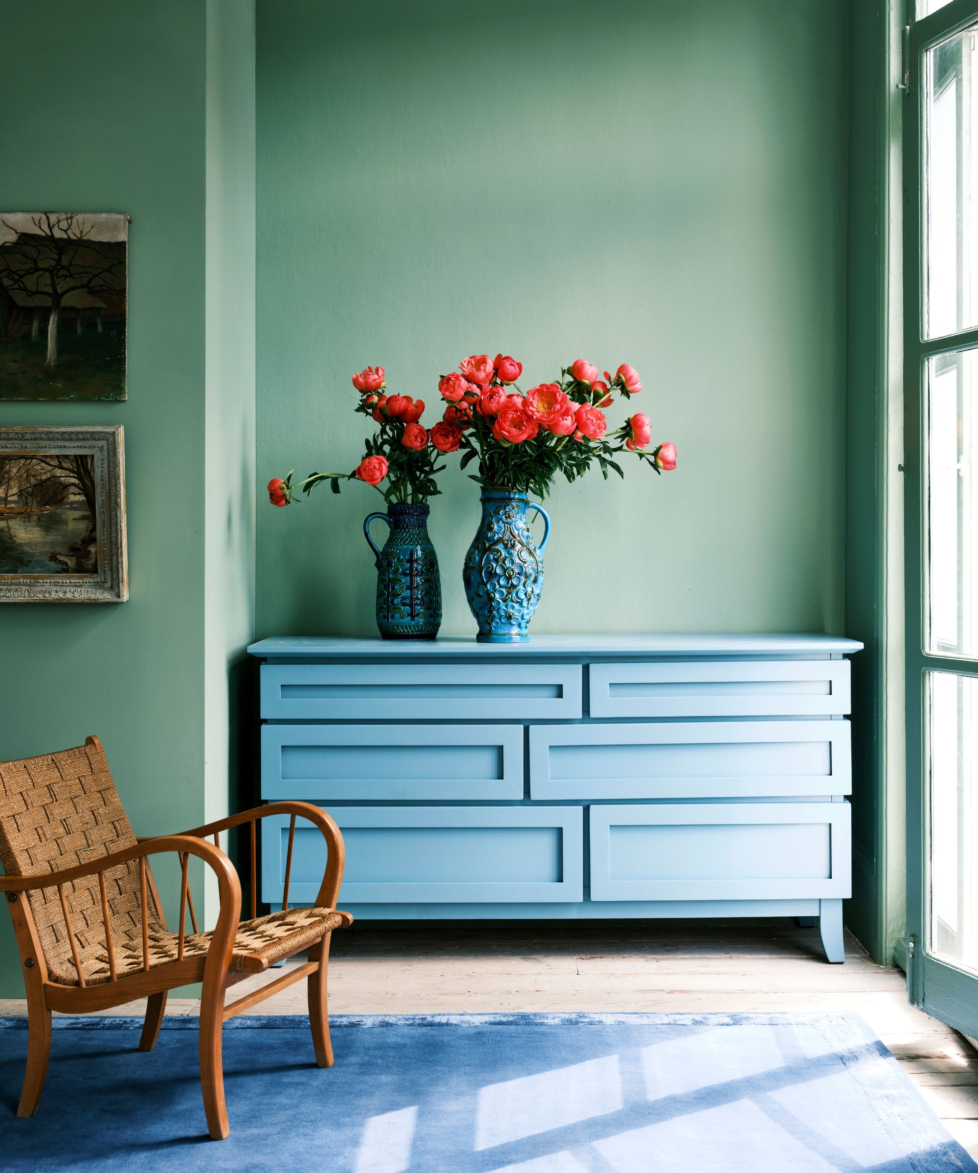
Specifically, secondary colors like green or orange can evoke a similar playful and nostalgic aesthetic in our homes, although they're not actually primary colors. And so, for the purposes of this feature, we've grouped green among the primary colors.
1. Yellow and blue
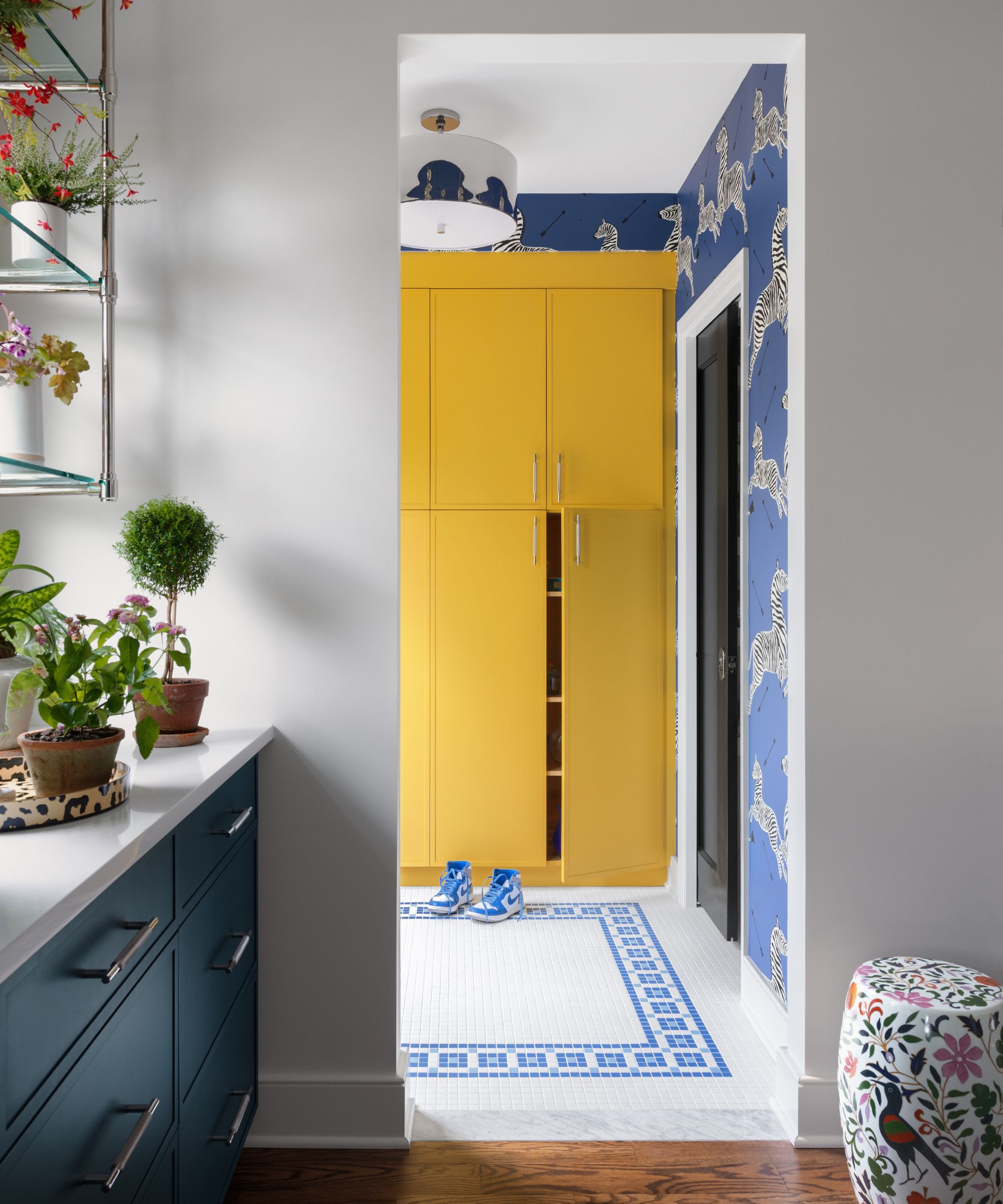
Decorating with yellow is known to be one of the happiest colors, but it's important to pair it with the right hues to ensure a liveable look. According to interior designer Sarah Storms of Styled by Storms, pairing it with blue is a way to reduce the intensity and create a cohesive scheme.
'Any excuse I can use to design with yellow I take it,' says Sarah. 'It is such a polarizing color with clients but I think it's just happy. Pairing it with blue often helps to tone it down.'
As demonstrated here, the blue patterned wallpaper provides a visual break from the bright yellow built-in storage, while maintaining the room's lively look.
Create a similar look with this blue patterned wallpaper; providing a calming backdrop when paired with bright yellow decor.
2. Red and blue
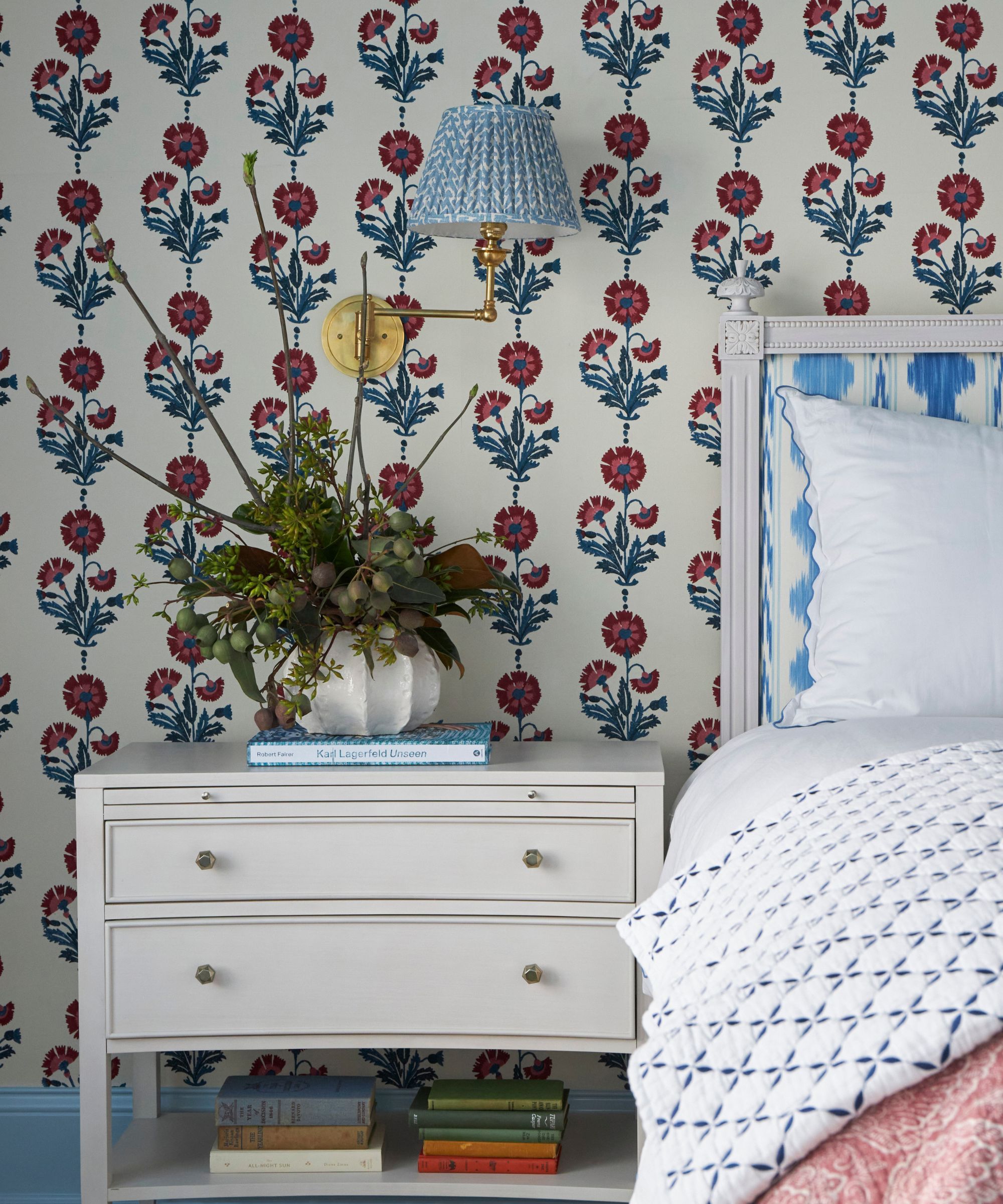
Red and blue is a timeless color combination, one that makes a statement and yet can be altered in intensity depending on the specific shades you opt for. In this bedroom, the prominent red and blue wallpaper and bedding are complete with white furniture to ensure a restful space.
'We adore this color combination of red and blue or more specifically carmine, indigo, and sky blue in this primary bedroom,' says interior designer Sarah Vaile. 'It is both warm and refreshing at the same time.'
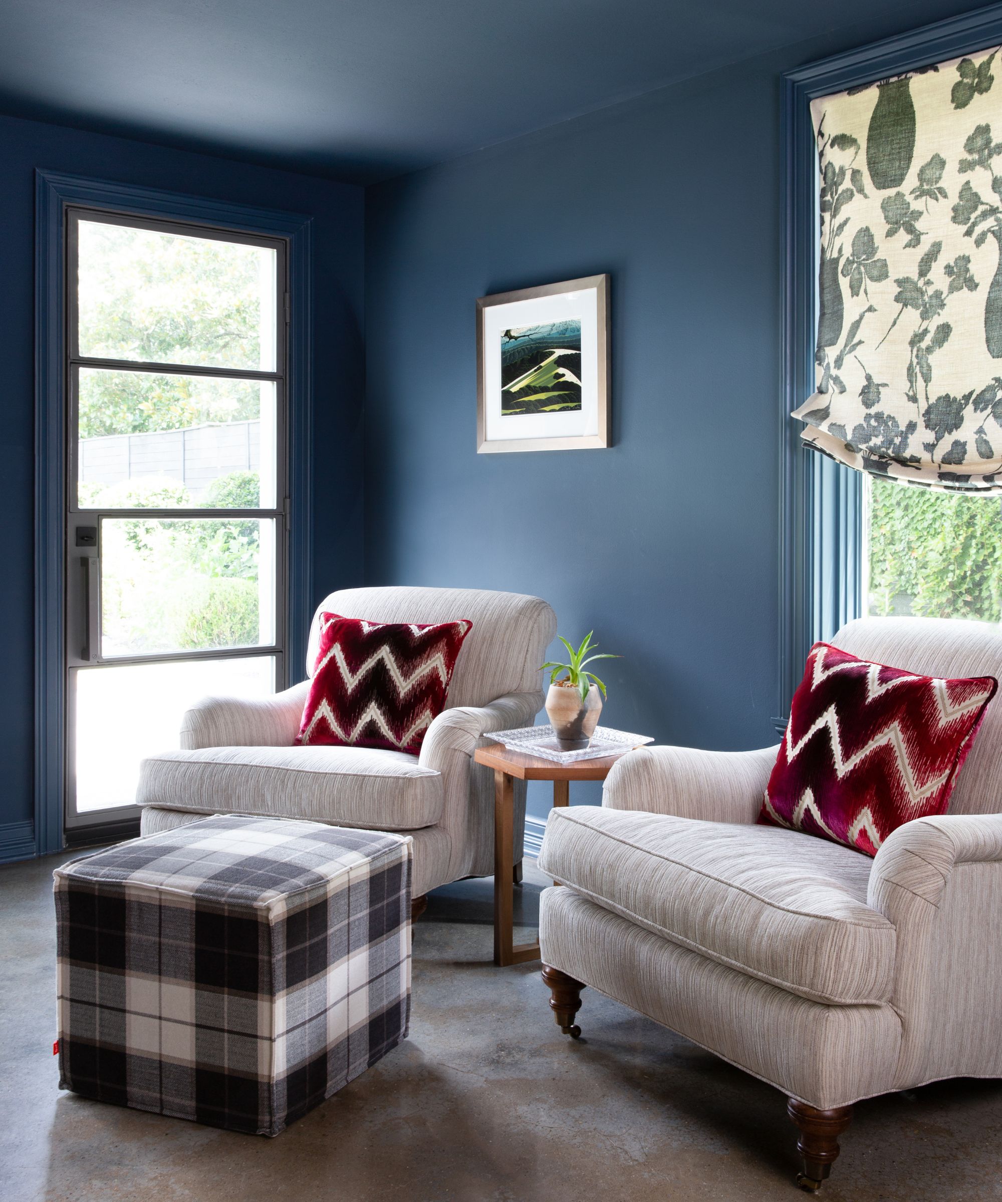
3. Blue and yellow
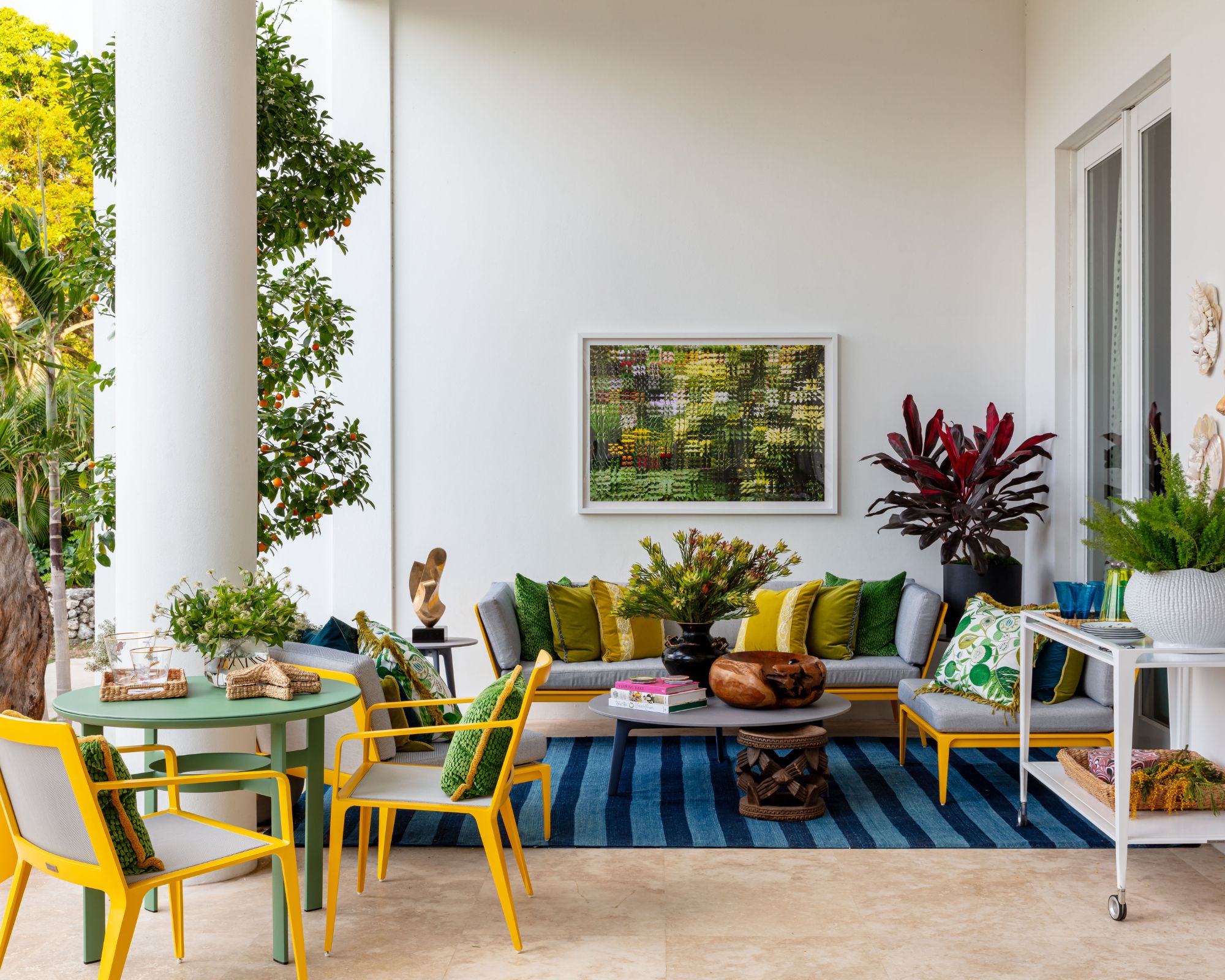
Another designer who enjoys the primary color pairing of yellow and blue is Nadia Watts, who uses these two bold shades in this outdoor seating area, complete with green as a third color to enhance the natural look.
'Yellow and blue make for a bright and bold pairing; they are complimentary colors that sit opposite each other on the color wheel,' explains Nadia. 'The high contrast pairing makes the colors feel more vivid and striking.'
'Yellow is attention-grabbing and evokes happiness and vibrancy, while blue is calming and balanced. The playfulness of this color combination provides both energy and harmony.'
Add a pop of bright yellow with this velvet-striped cushion cover, perfect for living rooms or bedrooms.
4. Red and green
Red and green don't have to be reserved for the holiday season. When done so cautiously and saturation levels are toned down slightly, red and green can look timeless and elegant year-long.
'Our favorite primary color pairing is green and red,' says Amanda Leigh and Taylor Hahn of House of Rolison. 'These colors are timeless and versatile, offering a vibrant aesthetic. The combination of these colors is beyond beautiful but needs to be carefully curated due to the riskiness of the bold pairing.'
5. Blue and red
If you're looking for an alternative take on the classic color pairing of red and blue, darker and richer variations of the two shades can give a more grown-up and timeless look, as shown in this calming living room designed by Mary Patton Design.
'Red and blue can be a little challenging to not have them scream patriotic, so using a raspberry still creates the same effect, while being a little softer,' explains interior designer Mary Patton of Mary Patton Design.
Looking to add contrasting red to your blue color schemes? Opt for this linen cushion cover for a sophisticated take on this bold color pairing.
6. Red and yellow
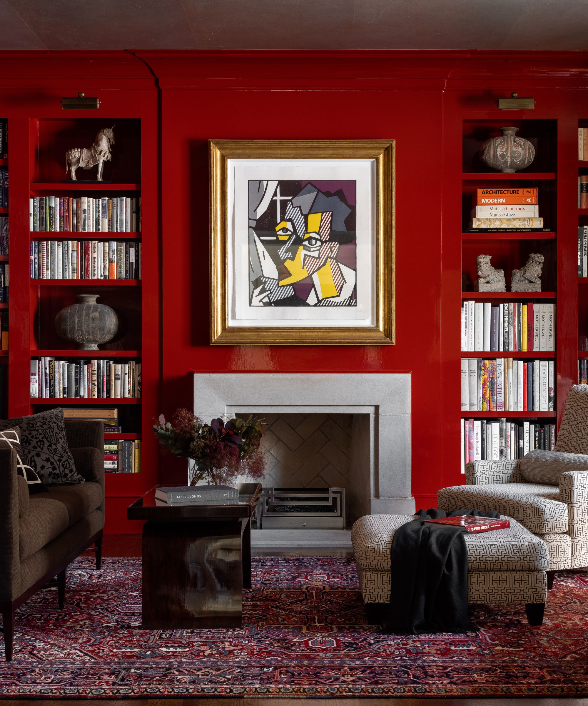
Two of the liveliest colors, pairing red with yellow is a guaranteed way to embrace maximalist color ideas.
'My favorite primary color pairing is yellow and red,' says designer Roger Higgins of R. Higgins Interiors. 'In this library that doubles as an office, red lacquer walls intertwine with pops of bright yellow that are brought in through the art. The two bold colors play off each other and create a dramatic and energetic environment.'
Since these two hues are so loud, it's a good idea to follow a similar suit and use one as a dominant color and one in smaller doses through accents, to ensure the colors don't compete too much.
Decorating with primary colors is all about embracing a bold and playful look, so you can really experiment and include whichever pairings you're drawn to most. Just remember to try out any new paint colors for the walls as swatches first, so you can get a feel for the shade before fully committing.