The PrettyLittleThing unicorn has had a makeover. Or should that be makeunder? The mascot of the notorious fast fashion label was once resplendent in pink, soaring onto the brand’s packaging powered by cartoonish wings. Its very presence conjured up images of bodycon dresses covered in cut-outs, of brand deals with Love Island stars, of an entire website section devoted to the concept of “jeans and a nice top”. But now, the unicorn’s wings have disappeared. It has been stripped back to a line drawing. And it certainly isn’t pink any longer. Instead, it’s embossed on a beige backdrop.
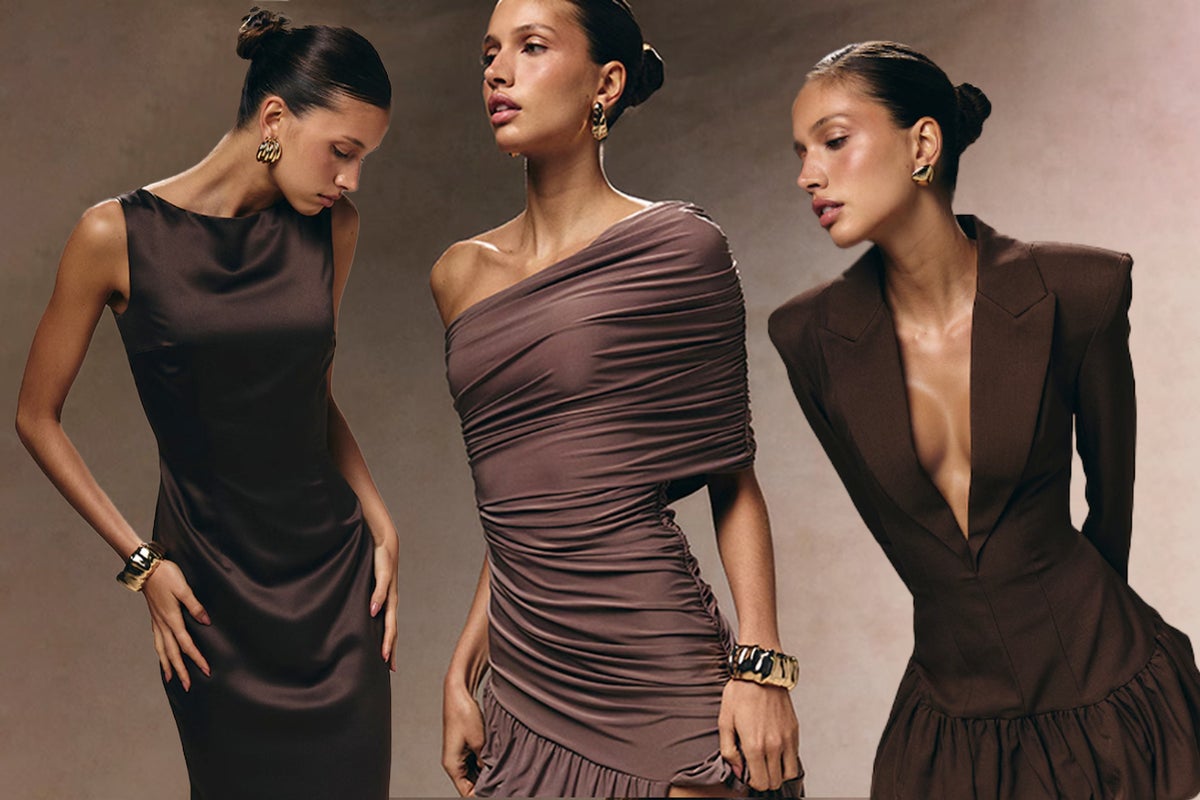
This toned-down emblem is just part of PrettyLittleThing’s sweeping rebrand, unveiled to customers earlier this week. Gone is the shouty, all-caps logo. In its place is a swirly calligraphy-style font. The bright pink visuals are gone, replaced by rich burgundies, browns, creams and yes, inevitably, plenty of beige. The clothes, similarly, draw from a drab palette. Waistcoats, bouclé co-ords and ruched, long-sleeved maxi dresses abound. So do buttoned-up, round-necked suit jackets reminiscent of Angela Merkel’s capsule wardrobe for a G20 summit. There’s barely a pattern, or an inexplicable cut-out, to be seen. According to PLT, this shake-up “heralds an elevated new era that celebrates the brand’s heritage while boldly reimagining its future”.