
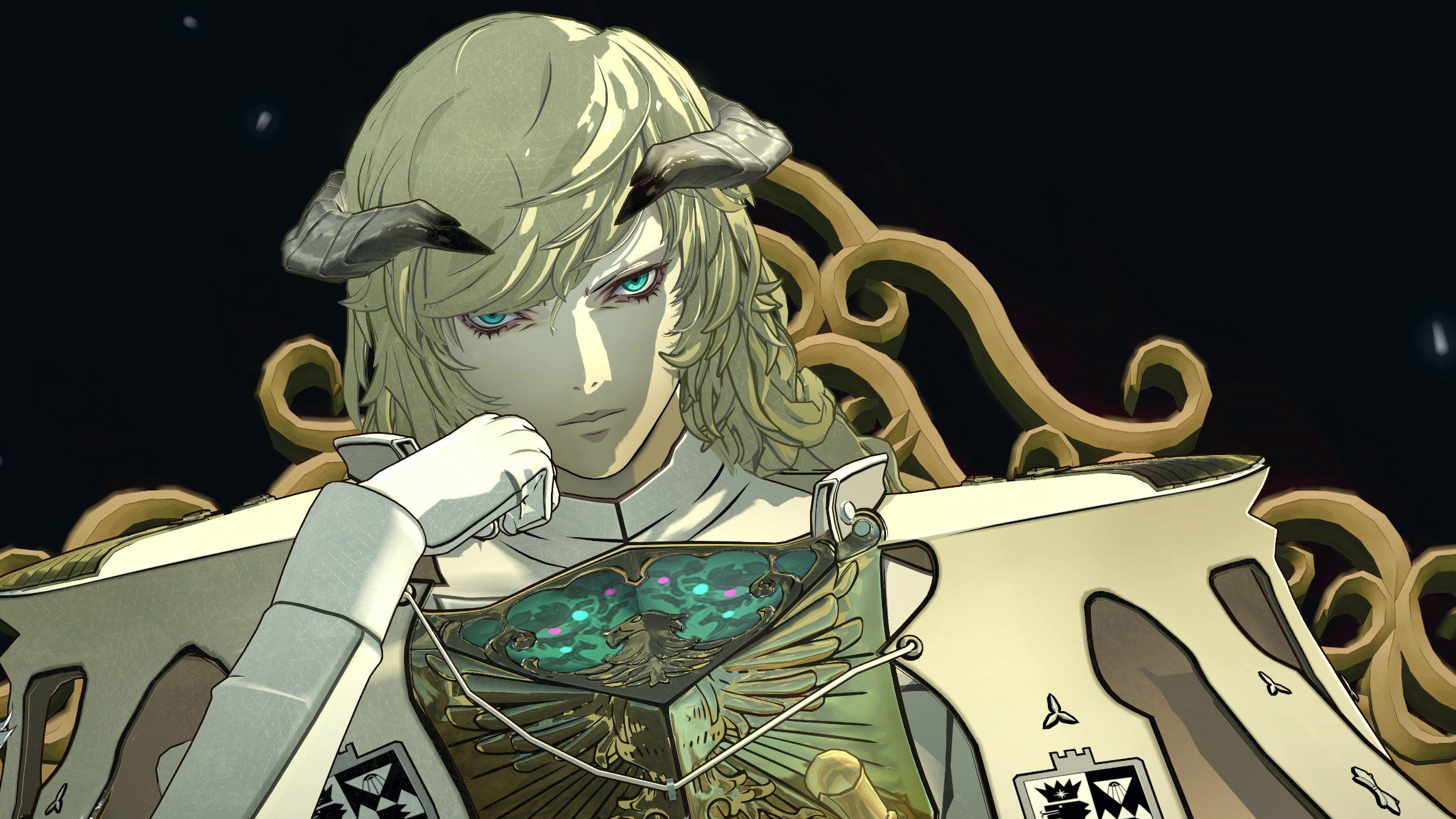
Atlus RPGs mean bold aesthetic decisions, and that includes the studio's menus. Where other games might be content to rely on the proven, dependable rectangle, Atlus's interfaces are as much modern art as they are menus. They're arranged at off-kilter angles; they tumble onto the screen as a collage of disparate elements. They might, in the case of Metaphor: ReFantazio, be embellished with runic transcriptions of encoded Esperanto. They're striking, they're satisfying, and—according to Persona series director Katsura Hashino—they kinda suck to make.
In an interview with The Verge, Hashino said that—like any game developer—Atlus has to balance aesthetics with usability when designing its menus and interfaces. However, Hashino explained that by having bespoke layouts and interface designs for every menu, the studio's basically chosen the most difficult version of the balancing act.