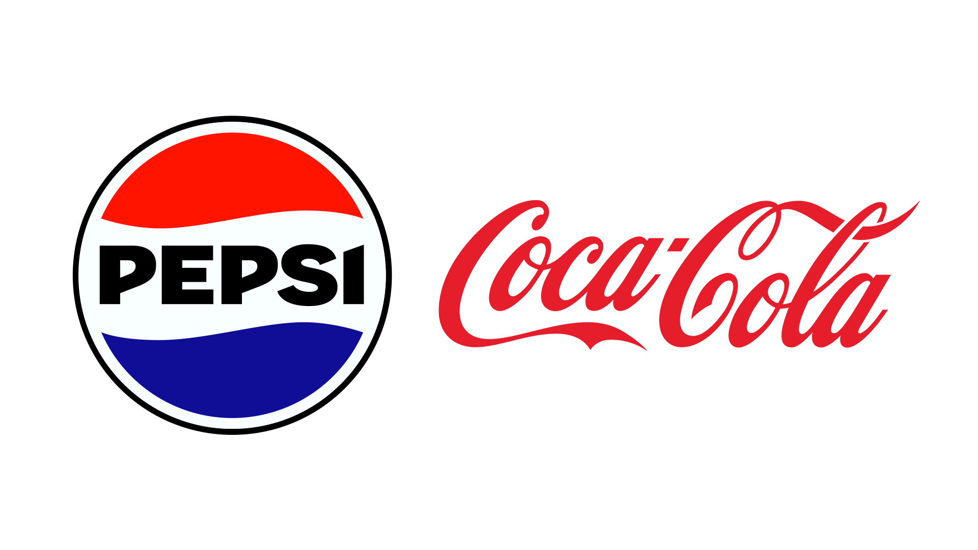
From Burger King vs McDonald's to Pepsi vs Coca-Cola, some brand rivalries feel as old as time itself. We often see brands poking fun at one-another, but in most cases, its the smaller of the two that tries 'punching up' at its more successful competitor. And in the case of Pepsi's most recent Coke-baiting campaign, it's arguably starting to look a little desperate.
The brand this month revealed its 'Tastes OK' ads, which prominently feature a Diet Coke can. While there's a clever joke at play (the 'OK' of 'COKE' is used to suggest that the drink tastes merely okay), the ad still serves to place Pepsi's competitor in customers' minds. And, even worse, some viewing the ad at speed might even think they're looking at a Coca-Cola ad.
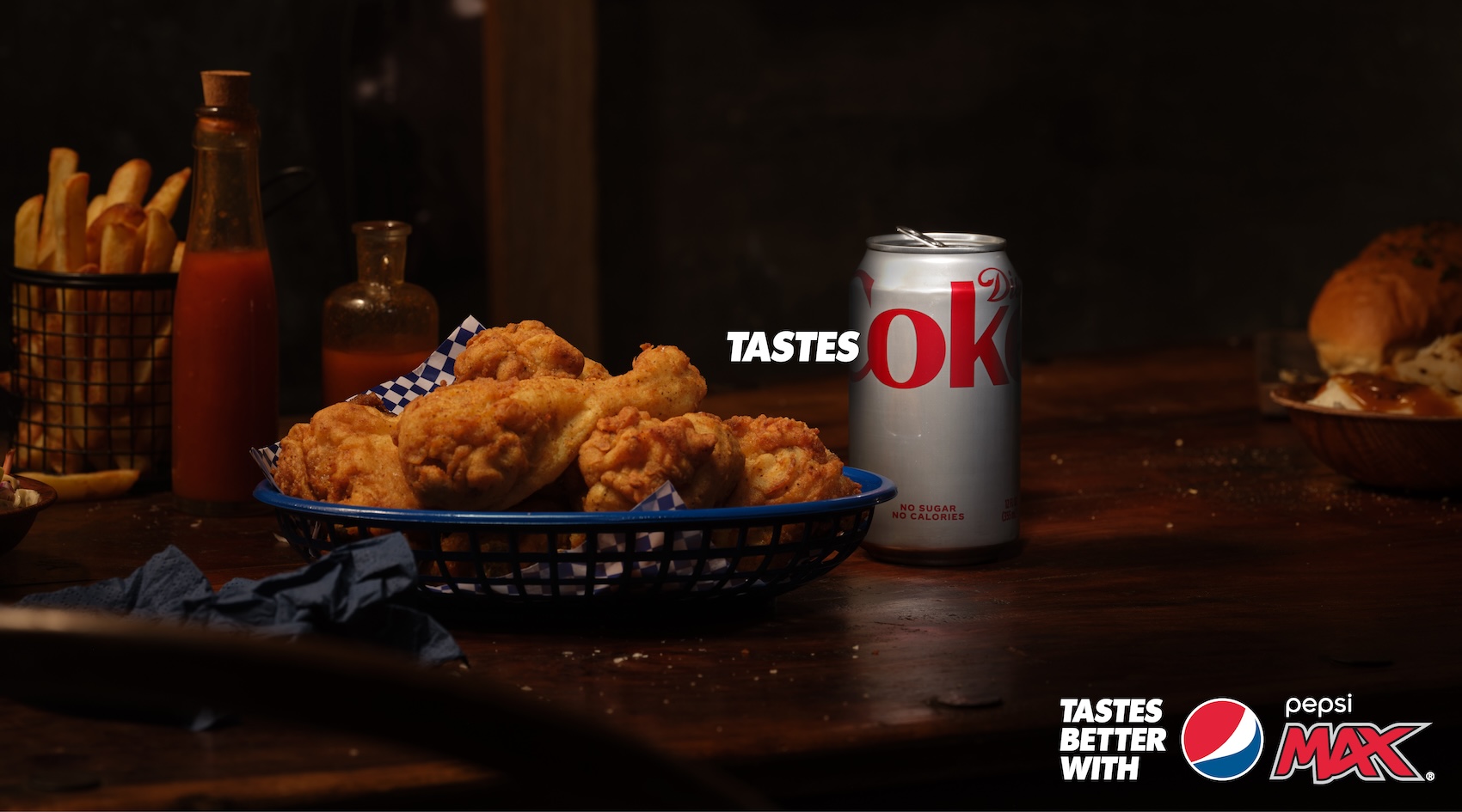
Distinctive BAT, an authority on distinctive brand assets, recently conducted research on the ad by presenting a 'debranded' version of the ad, with Pepsi and Coca-Cola's branding removed. And it turned out that while 47% of viewers thought they were looking at a Pepsi ad, 48% attributed it to Coke. We spoke to Distinctive BAT's Cathal Gillen about the research, and the campaign itself.
Is using your competitor's brand assets a wise move?The ‘Tastes OK’ campaign looks to poke fun at Diet Coke by using letters from their competitor's name. But is it wise to heavily feature your main competitor's brand assets in your advertising? We researched a debranded… pic.twitter.com/LrNZKhfsrYFebruary 7, 2024
Can you tell us more about how your own ‘debranding’ research?
As part of Distinctive Brand Asset research in Distinctive BAT, we “debrand” brand assets by removing mentions of the brand, retaining non-name elements. We do this across different asset types such as logos, icons, jingles, taglines, characters, packs, and ad styles. Through this research we uncover how well-known certain assets are to category buyers, and more importantly how many consumers can attribute them back to the right brand. This tells us how strong those assets are for the brand, and how much they help the brand stand out on shelf or indeed aid branding scores in communications.
In this instance, we debranded the Pepsi advert to gauge which brand consumers would attribute the advert to. The stronger an advert is branded, via the logo or other distinctive assets, the higher the brand linkage and ultimately the effectiveness of the campaign. You also have to remember that so much advertising is passive in nature, and just gently nudges and reminds consumers a brand exists. With this passive consumption, many adverts are misattributed to competitor brands and often the category leader, especially if the advertisement leans too much on category troupes. Even worse than including too many category generic assets is featuring your competitors distinctive assets, hence why we were interested in understanding potential misattribution with this campaign.
Were you surprised by the results?
We weren’t surprised by the results as it replicated results we commonly see in other studies. Time and time again, the power of pack assets in driving branding scores comes to the fore. We run so many A/B tests, for example one advert that contains a pack, and one without, and the brand attribution uplifts derived from the inclusion of the pack is very compelling in highlighting their importance. This plays out here with the inclusion of an incredibly strong Diet Coke distinctive asset in the form of the grey can, which drives people to associate the advert with Diet Coke or the parent brand. Related to this is the fact that logos can be blind spots, even well-known ones like Pepsi, especially when hidden away in the bottom corner. As creatives and marketers, we have to be conscious that consumers are often just passively scrolling their news feed or coming into contact with advertising when commuting or watching TV. More than a logo is required to ensure our communications is correctly attributed and consigned to memory.
Are there any aspects of this campaign that you think did work?
I would have probably loved this campaign as the naive 27-year-old working in agency land I once was. It is clever in many ways and “punching up” can often be a nice ploy in the creation of interesting and attention-grabbing advertising. It has also grabbed a slice of online conversation, however I’m not sure this extends outside our advertising & marketing bubble which should be the intended target! Aside from that, any time a brand drives association with occasions of purchase or consumption via advertising, they are making themselves salient for the moments that matter which is what all good advertising should aim to do.
Is there anything Pepsi could have done to make this particular campaign more successful?
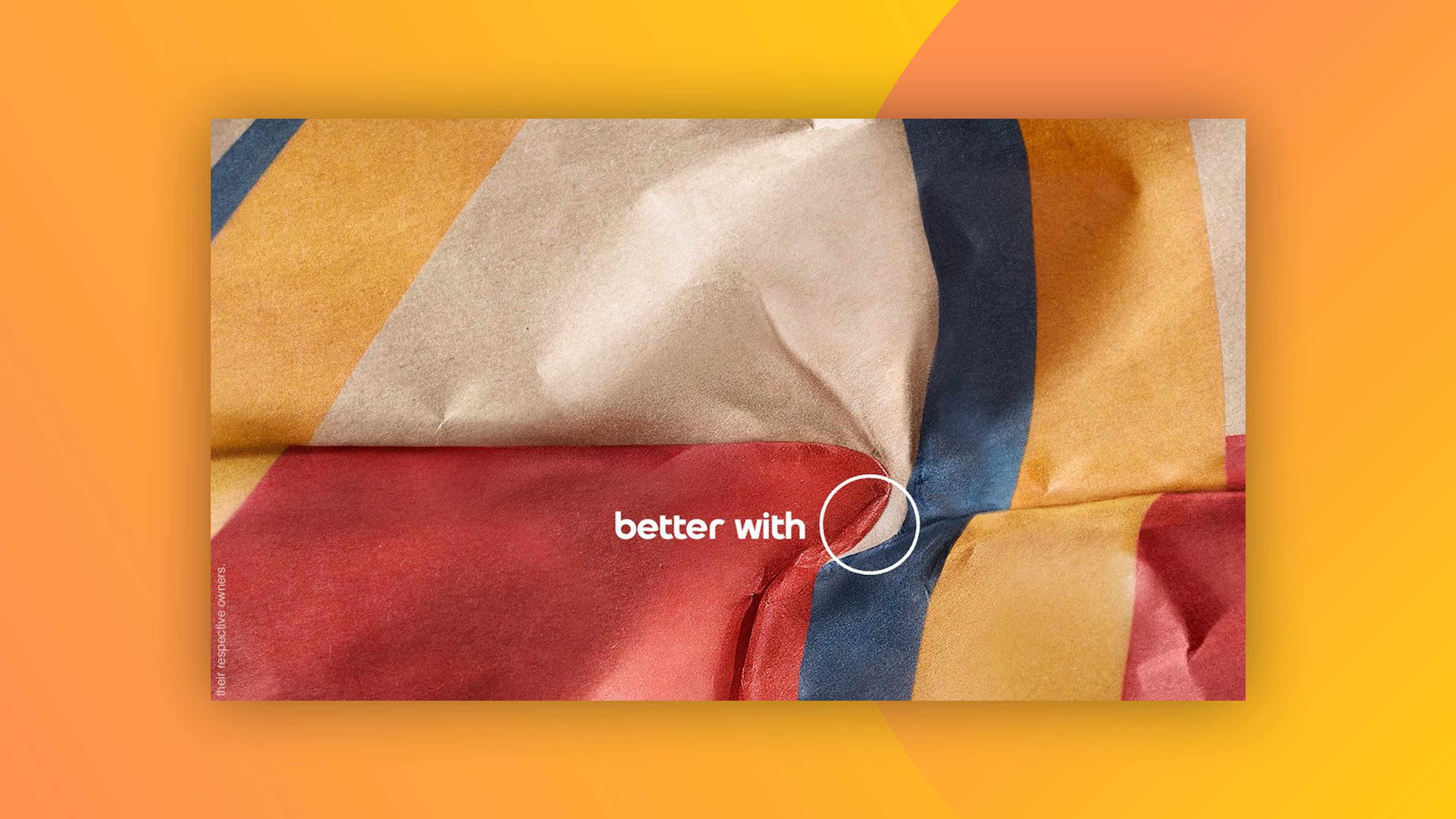
As Dave Trott pointed out on Twitter (below), some tweaks to the art direction could have helped negate potential misattribution issues. The fundamental issue however is that the whole creative idea is pretty reliant on the use of their major rivals’ distinctive assets which makes it a tricky one to execute.
A proper art director would have sorted it so the Pepsi line was as big as Coke: (half page) TASTES OK (half page) TASTES BETTER.Pepsi does it's ads in-house and this is what happens when marketing thinks it can do layouts. https://t.co/x9RCmynC14February 7, 2024
Pepsi often pokes fun at Coca-Cola in its advertising – do you think this approach ever works?
I think the “punching up” nature of this form of advertising can work but mentions of the competitor need to be more subtle and not the focus. As others have pointed out, Hertz have done this extremely well with their “We’re no.2, so we try harder” platform. Burger King often play in this space and mostly do it well with subtle McDonalds references, for example the Whopper Detour campaign, but then in a number of cases they do lean a little too much on McDonalds iconic distinctive assets. The key takeaway if undertaking comparative advertising is to remember that consumers won’t be reading the advert slowly on Powerpoint in a boardroom, but instead glancing at it for a few seconds while in the middle of doing something else. It’s all about a balance, between developing interesting and attention grabbing creative and at the same time ensuring it’s ultimately attributed back to your brand.

