We've come to expect strong opinions from residents when a local government authority launches a new logo, but this redesign for Westchester County in New York State is getting criticised for a surprising reason. Some people think they've spotted an unfortunate resemblance to a very different brand.
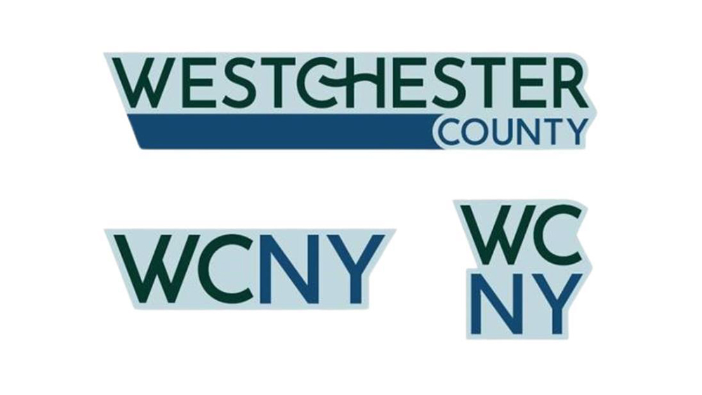
There are three new designs in total, and they're all being blasted for different reasons. The old logo was hardly exciting, but the country government probably didn't expect the new design to be compared to a dating app (see our guide to how to design a logo for tips for your own work).

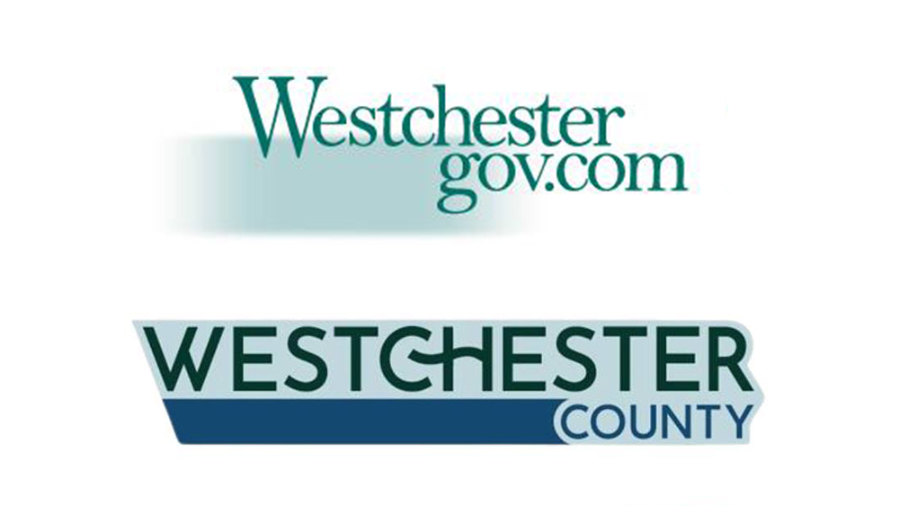
Westchester County needed an urgent rebrand because its old logo prominently displayed the county's '.com' domain, which it's been told to change to '.gov'. The result is a fleet of three new logos that sensibly avoid any reference to a domain name, but they're being criticised for other reasons.
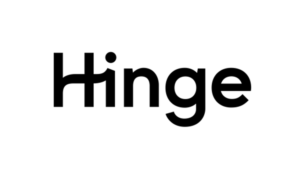
Authorities say the designs are intended to symbolise the county's "interconnected community and its enduring commitment to innovation, natural beauty, and shared progress." But some people think the squiggle for the crossbar on the 'H' was taken directly from the dating app Hinge.

Crossbar aside, the new logo's colour palette makes it look very boring for a dating app. "Screams 'Westchester is boring and bland'," one person wrote on Facebook. "It’s a poor logo that’s outdated before it’s out of the gate," the graphic designer Marcy Rauch wrote, while someone else suggests it looks "80s/90s but not in a fun way." Over on Instagram, one person thinks it "looks like a dated cheap motel logo."
Things don't get any better with the two abbreviated logos, which use the acronym WCNY. "It looks like an early 90s radio station logo," one person writes. Indeed, it turns out that there is a PBS station called WCNY, which apparently has a good Bluegrass show on Sunday nights.

Westchester County executive George Latimer has explained that the crossbar on the 'H' in the new logo is intended to represent a hook, symbolizing the fact that residents are "linked by rail, road, and air. By culture. And most importantly, by choice.” Meanwhile the colour palette uses 'Columbia Blue' to represent history, 'Dark Green' to represent the environment and 'Indigo Dye' to represent the county’s waterways.
A logo redesign is always going to generate some negative reactions, and the reaction in Westchester pales in comparison to the backlash that greeted the new Visalia logo earlier in the year (also see our roundup of the best and worst logos of 2024).


