The many risks involved in logo design are undoubtedly trivial compared to the dangers faced by military. But even the armed forces need to be careful when it comes to rebranding, and to how it's communicated.
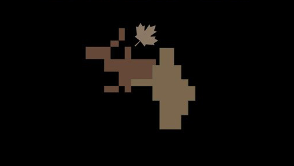
Part of the problem in the case of the Canadian Army logo design debacle was communication. And part of it may have just been bad design. Either way, it probably shouldn't have asked the public for opinions on a new icon that looks a piece of pixel art from Minecraft.
Introducing the revitalized branding for the Canadian Army! Tell us in the comments what you think about it ⬇️ pic.twitter.com/MInoJ51tjyMay 3, 2024
"Tell us in the comments what you think," the Canadian Army's official Twitter account implored as it revealed the army's "revistalized branding". And people didn't hold back. "It looks like a moose getting a prostrate exam," one person replied. "It looks like a Minecraft character milking an elk," another person wrote. "To me it looks like a moose taking a humongous dump that keeps getting bigger, so big in fact that it's already larger than the moose," was another opinion. People were also quick to draw up their own alternative designs.
Proposing this as an alternative... pic.twitter.com/a30YG2EHshMay 3, 2024
Other members of the public expressed concern for how much the exercise cost, while others suggested that measures that people be fired. "How did you manage to do this?," one person asked. "What policy are you putting in to make sure it never happens again?"
The backlash prompted the Canadian Army to follow up with a series of further tweets in which it attempted to clarify that the strange pixelated moose is not replacing its main logo. Instead, it's a camouflage pattern that will appear on uniforms and will also, for some reason that's not entirely clear, be used as a supplementary logo design "in the bottom left-hand corner of certain communications".
The Canadian Army has not changed its official logo. We remain proud of our official emblem.The icon launched today is a supplementary design only that will be used in the bottom left corner of certain communications products and in animations for videos. pic.twitter.com/iOLvJ2HBlBMay 3, 2024
A designer who says he has experience working with the Canadian armed forces also attempted to clarify things on X. "The pixelated image that looks like a moose giving a reach around is not the logo redesign, but a new camouflage pattern, known as CADPAT (Canadian Disruptive Pattern)." He goes on to suggest that may have gone wrong, starting with a lack of clarity: "The announcement was intended to publicize a new logo, a refreshed motto, and the CADPAT MT (Multi-Terrain) design, but the message was muddled. By combining all elements into a single image without clear distinctions, the essential message was lost in translation."
As Meta Pills notes, effective communication shouldn't rely on the audience having a prior understanding of military jargon or concepts. The decision to include the CADPAT pattern in the same image as the logo added to the confusion.
It's a shame, since Canada seemed to be on a roll with the Canadian passport design and the Canadian Space Agency logo. Alas, the Canadian Army can take solace in the fact that it's far from the worst logo we've seen from a military unit or state office. Let's just remember that the US National Intelligence Manager for Aviation US aviation has a clipart UFO on its logo.