Ninja has survived countless final circles in the battle royale games against very skilled players, but Marathon’s menu might be his toughest boss yet.
During a recent stream of Marathon, the popular creator found himself baffled by the tabs, sub-tabs, and layered screens before he could even drop into another run.
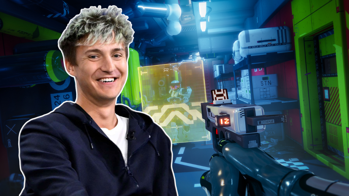
“This is hands down one of the most complex menus I’ve ever seen in my entire life,” Ninja said on his stream, audibly frustrated as he clicked through multiple interface panels trying to locate loadouts and progression options.
The reset between matches quickly turned into a deep dive through the game’s maze of screens and tiny tabs, enough to overwhelm even seasoned players.
Bungie’s reboot of Marathon leans heavily into extraction shooter systems, including gear management, contracts, faction progress, and customization trees. That depth is central to the game’s identity, but it also means players are required to navigate a dense web of information between runs. Moreover, the game’s sci-fi presentation, filled with neon accents and stylized overlays, adds visual noise to menus that are already packed with systems.
Ninja isn’t the only streamer who has voiced concerns about the UI, as Summit1g also expressed frustration with how unintuitive the menus felt during his time with the game. Beyond streamers, the broader community has echoed similar complaints.
One player on Reddit urged the developers to reconsider their UI choices, writing that it is “not intuitive at all,” describing it as somehow both cluttered and sparse, and difficult to navigate. Over on Steam, another user went even further, calling the interface an “awfully complex, disorganized mess” and criticizing its overall look and structure.
Extraction shooters often demand more menu time than traditional arena-based titles. However, with ARC Raiders already nailing most of it during its early showings, comparisons are inevitable. Many players have pointed out that ARC Raiders manages to present similarly deep systems with cleaner layouts, clearer information hierarchy, and fewer clicks between runs. That contrast only amplifies criticism around Marathon’s UI, especially when fans can directly compare two games operating in the same genre space.
The community reaction to the game’s UI underscores a common friction point in modern live-service design, balancing depth with clarity. If more players echo his concerns, Bungie may need to streamline parts of Marathon’s visual interface beforeits full release on March 5, 2026.
As of now, the developer is already addressing player feedback and acknowledging the main concerns on X. For UI issues, the developer has invited players to their Discord thread, where they can voice their pain points about the UI to help improve it for everyone.