One Domino Square in Williamsburg is Annabelle Selldorf's first residential skyscraper. With its launch, the New York-based architect (and principal of her eponymous studio) applies the pared-down elegance and blend of minimalism and sophistication that are signatures of her work, spanning art galleries such as Hauser & Wirth’s 22nd Street, residential buildings such as 42 Crosby Street in SoHo, and the high rise housing typology.
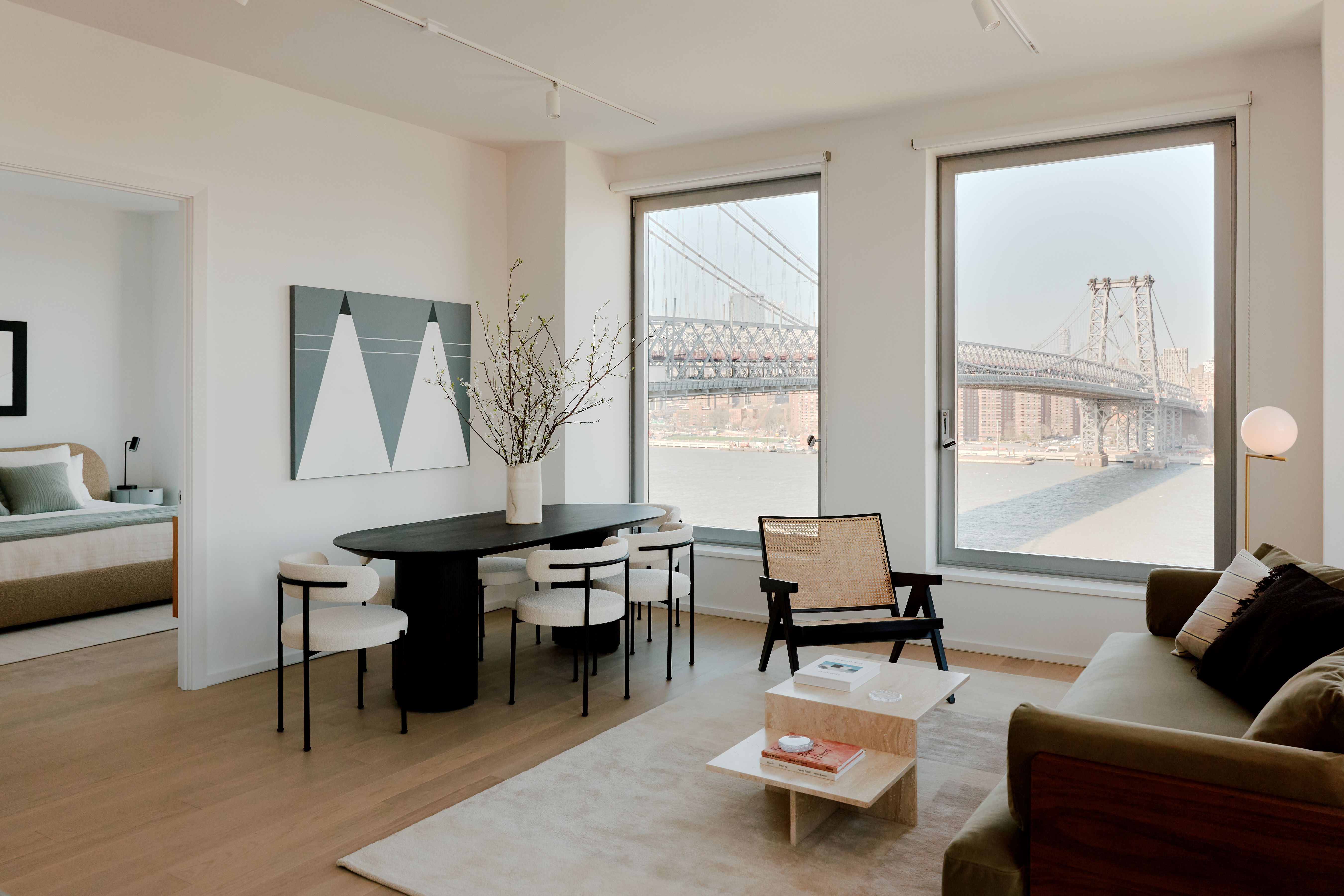
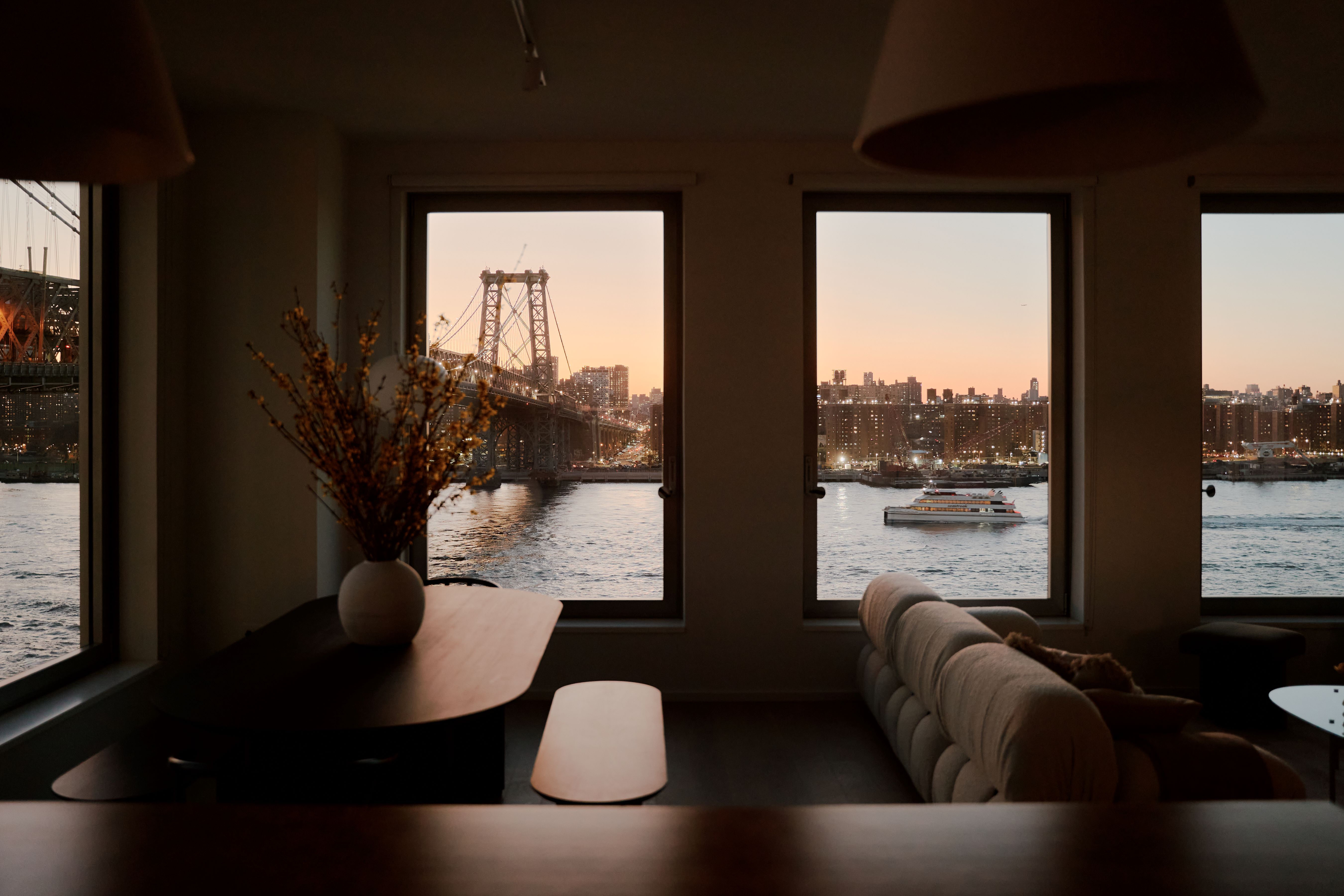
Commissioned by Two Trees Management, a Brooklyn-based, family-owned real-estate development firm, One Domino Square is located right on the Williamsburg waterfront, on the site of the former Domino Sugar Factory, and offers breathtaking views of Williamsburg Bridge. The new building is immediately recognisable thanks to its iridescent, porcelain-clad façades, designed to interact with natural light to assume a dynamic and ever-changing presence on the city’s skyline.

Inside One Domino Square
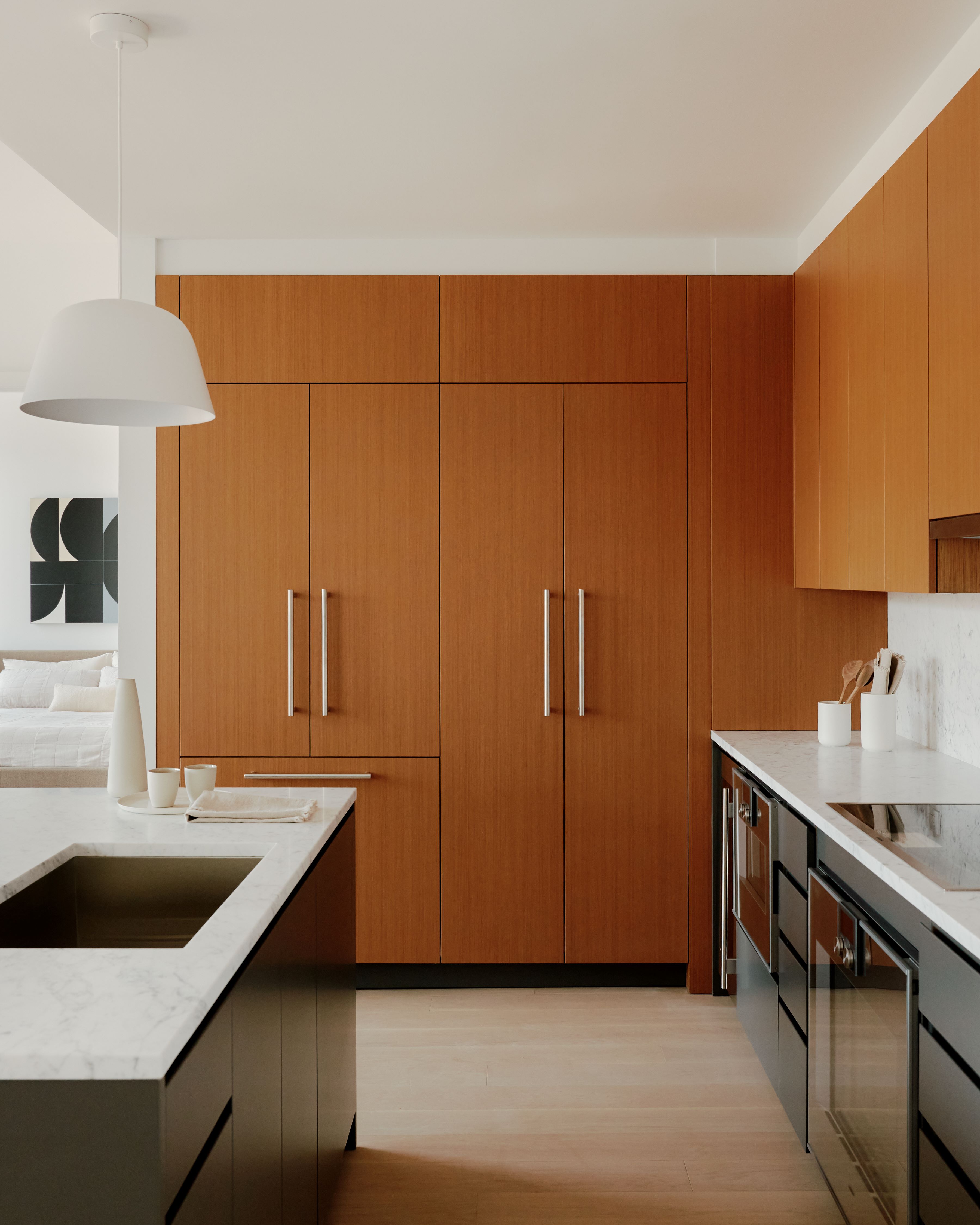
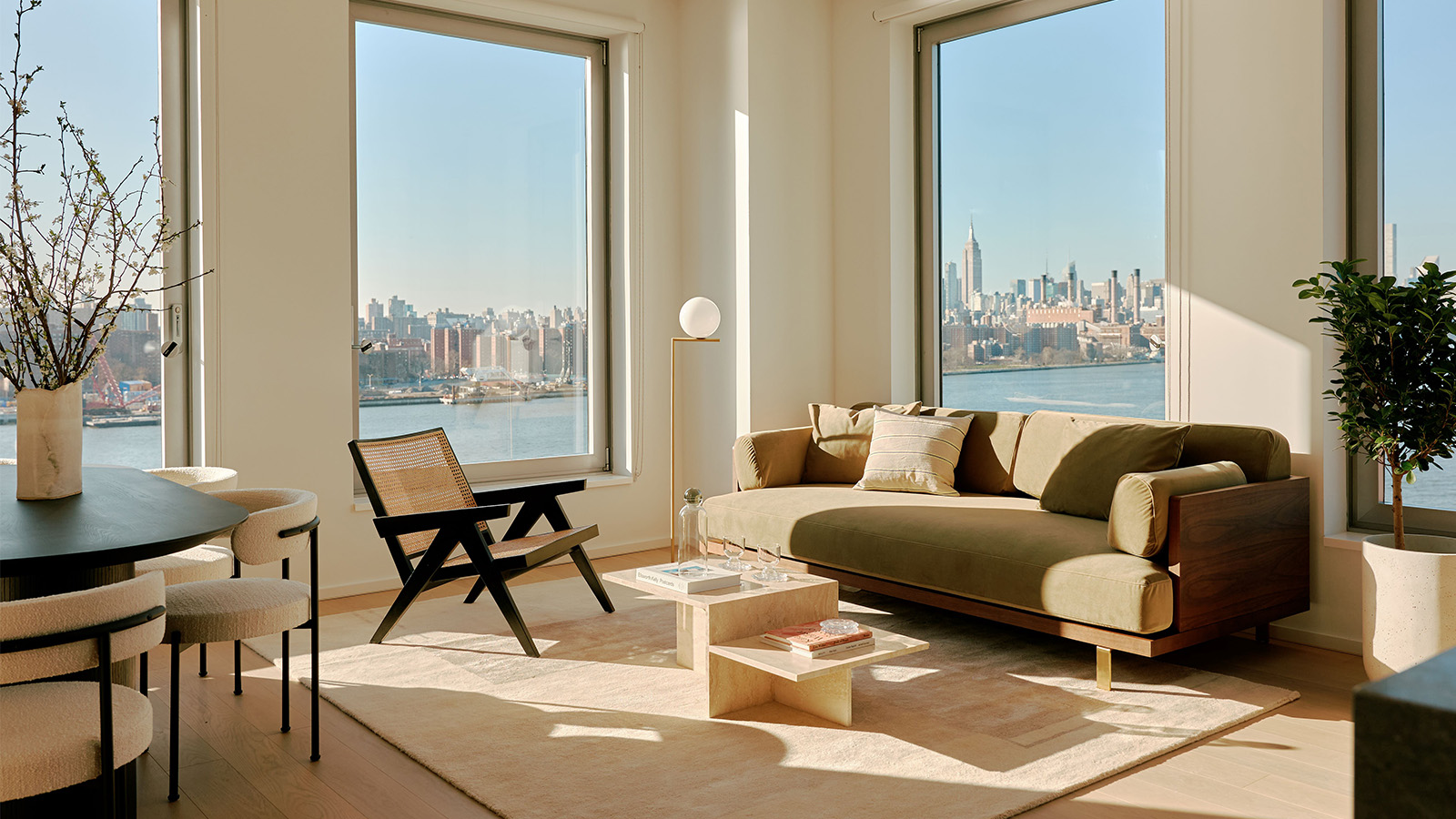
The development comprises a 39-storey condo tower (housing 160 condominiums and six penthouses) and an adjacent 55-storey rental tower, connected by a seven-storey podium at its base. The private residences are light and airy, while the colourful public spaces include a series of lounges with fireplaces and games, a luxurious indoor pool and wellness centre, and three terraces – including one with a landscaped lounge, heated outdoor pool and sundeck overlooking Domino Park.
Here, we talk to Annabelle Selldorf about the porcelain-clad towers and how they were designed in dialogue with the Williamsburg Bridge, the East River and beyond.
Annabelle Selldorf on One Domino Square
W*: How did the site’s history and stunning location influence your design?
AS: Many skyscrapers lack a sense of connection to their surroundings. They are too dense and too detached from the urban fabric they are joining. Our aim for the One Domino Square design was to foster an intimate relationship with the larger Domino Sugar Factory site and the unique location overlooking the East River, the Williamsburg Bridge, and the skylines of Brooklyn and Manhattan in the distance.
One Domino Square’s oversized windows open the project up and connect the interiors with the nearby Refinery at Domino with its preserved brick exterior and authenticity. The podium One Domino Square’s two towers sit atop are clad in granite panels and help ground the project in the Williamsburg waterfront and evoke the site’s history as a hub for industry.
W*: Do you have any links to the neighbourhood, or other projects in the area?
AS: One Domino Square is our first project in Williamsburg, but as someone who has lived in New York City for my entire professional career, it is a place that has always intrigued me. The Williamsburg Bridge has such an iconic urban presence. It has been fascinating to watch how the area has been transformed over the years from an industrial, gritty zone into a desirable residential neighbourhood with beautiful parks and interesting restaurants and shops.
W*: What led you to choose porcelain as the main material for the façade of One Domino Square?
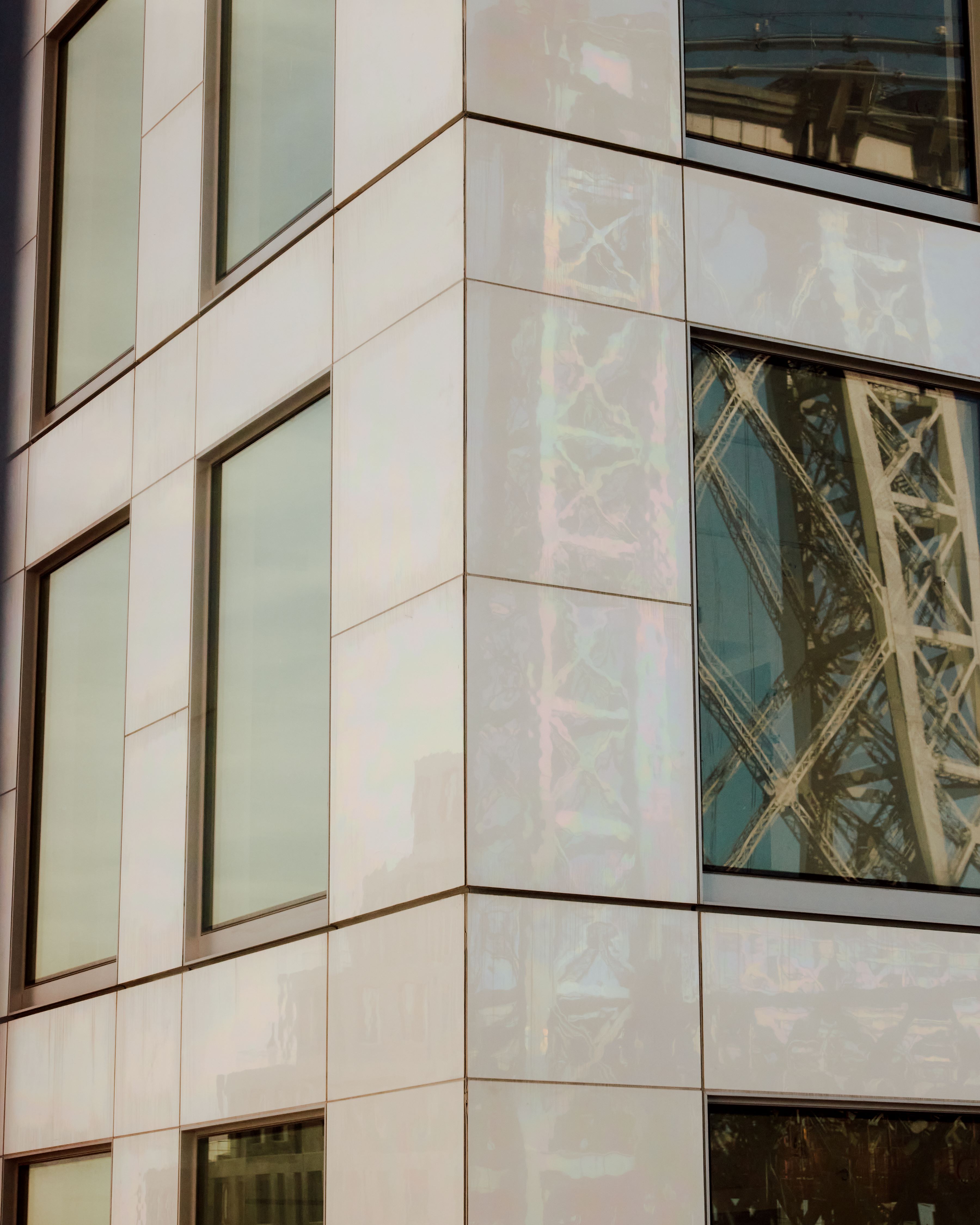
AS: From the outset we wanted a building that would have a strong and unique character and the façade material is a critical decision in achieving that goal. Porcelain is durable and simple in many ways but the finish we developed brings a captivating complexity. The porcelain changes as the light shifts, sometimes blending into its surroundings and at other times becoming quite striking and bold.
One Domino Square’s porcelain façade acts as a mirror capturing and reflecting the site’s remarkable light, the ever-changing water in the East River, the motion on the Williamsburg Bridge and places the project’s two towers in dialogue with the rest of the site.
W*: How was the porcelain façade actually made?
AS: The porcelain tile was made by Cor Asociados Arquitectos, an architecture studio based in Spain. This is the first use of the material as exterior cladding in the United States, and as the iridescent, pearl-like, porcelain tile reflects the sky, it creates a continually changing, animated effect on the façade – a unique design element.
W*: Was there anything particularly challenging or different about working on a residential skyscraper?
AS: We bring the same principles of design to any size building we work on, whether that is an eight-storey building or a skyscraper. For a building of this size, we wanted to ensure that each aspect, outside and inside spaces were well thought out and harmonised with the location and its views.

W*: Were there any ideas from your previous galleries and exhibition spaces (or other projects) that you brought to this residential project?
AS: There are certain preoccupations that are consistent regardless of the project type – thinking about volume, proportion, scale, the way light comes into a space or reflects on an exterior material. But most importantly we want to design buildings and space that people use – where they feel comfortable and welcomed.
W*: What would you say your main influences for the project were?
AS: I wasn’t consciously connecting to any other buildings or works of art in the development of the project but one sees things and stores them away, not always knowing or realising when they will reappear in one’s mind. Given the prominence of the site and its impact on the skyline of New York City, we had this concept of designing a building that would almost disappear at times. Of course, it never really does, but I was intrigued by the notion of a large building having a strong presence but also blending into the sky and nature at other instances depending on the weather conditions and time of day.
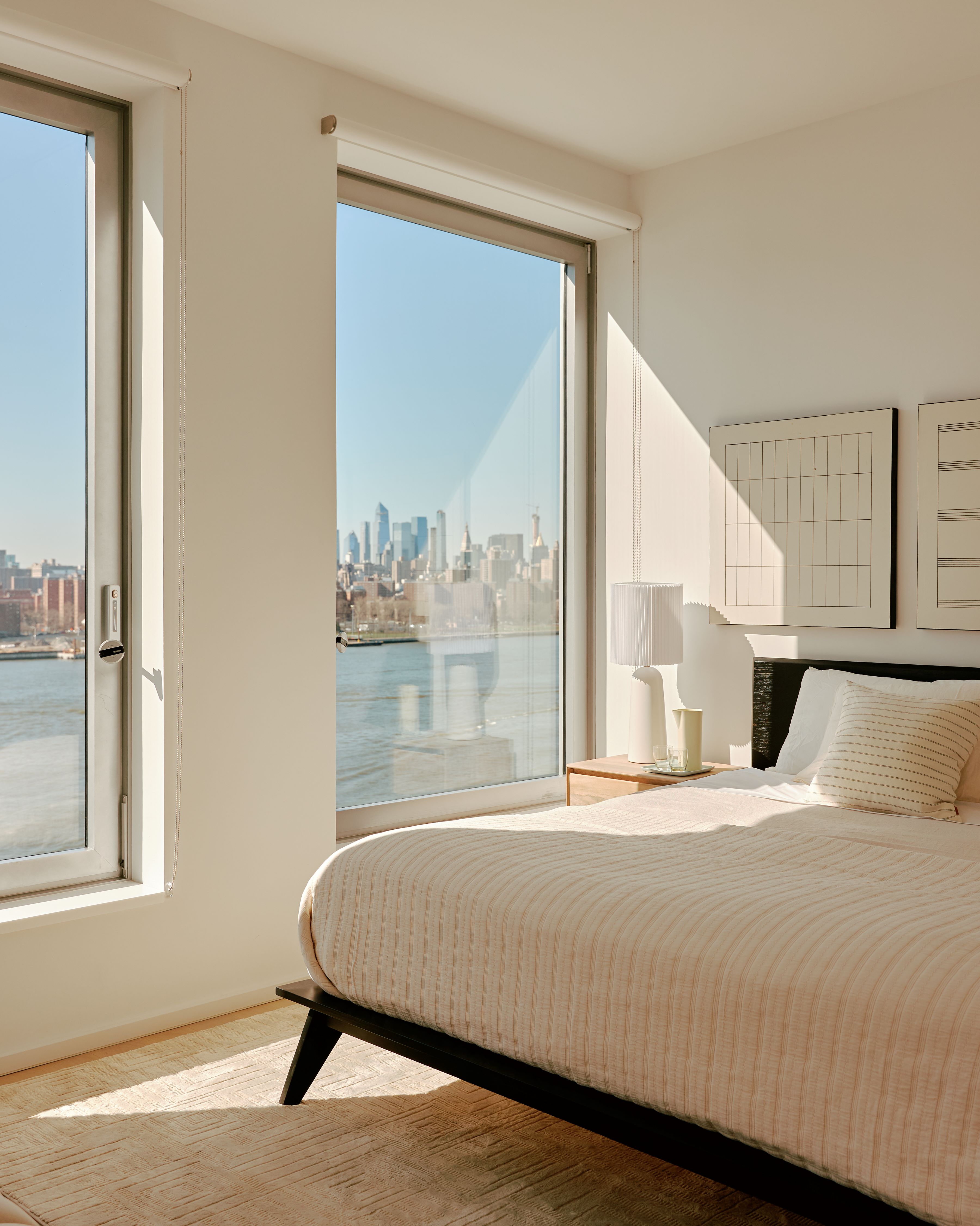
W*: You wrote that creating a relationship with the river and surrounding nature was vital for the design. Could you give some examples on how this was reflected in the apartments and public spaces?
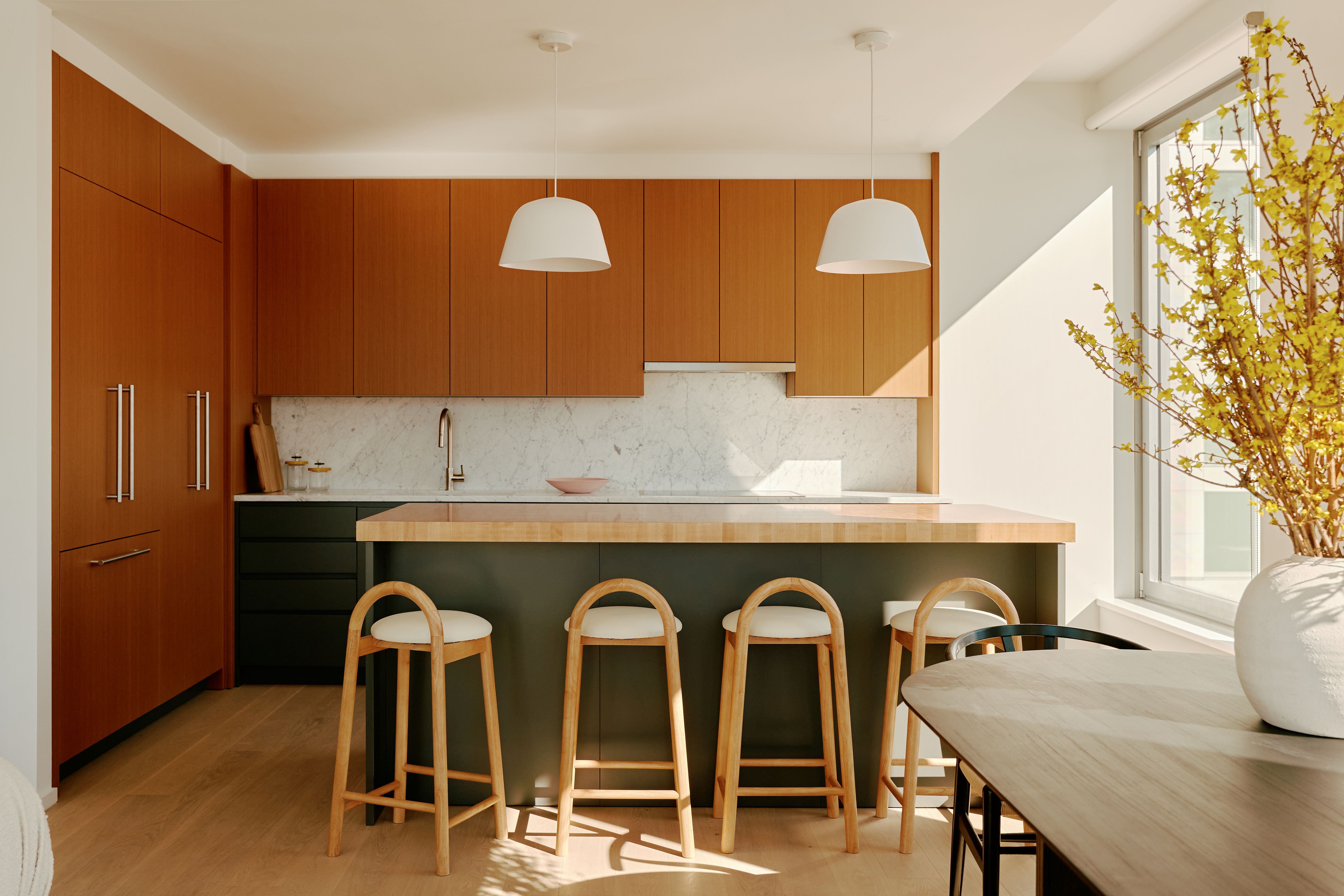
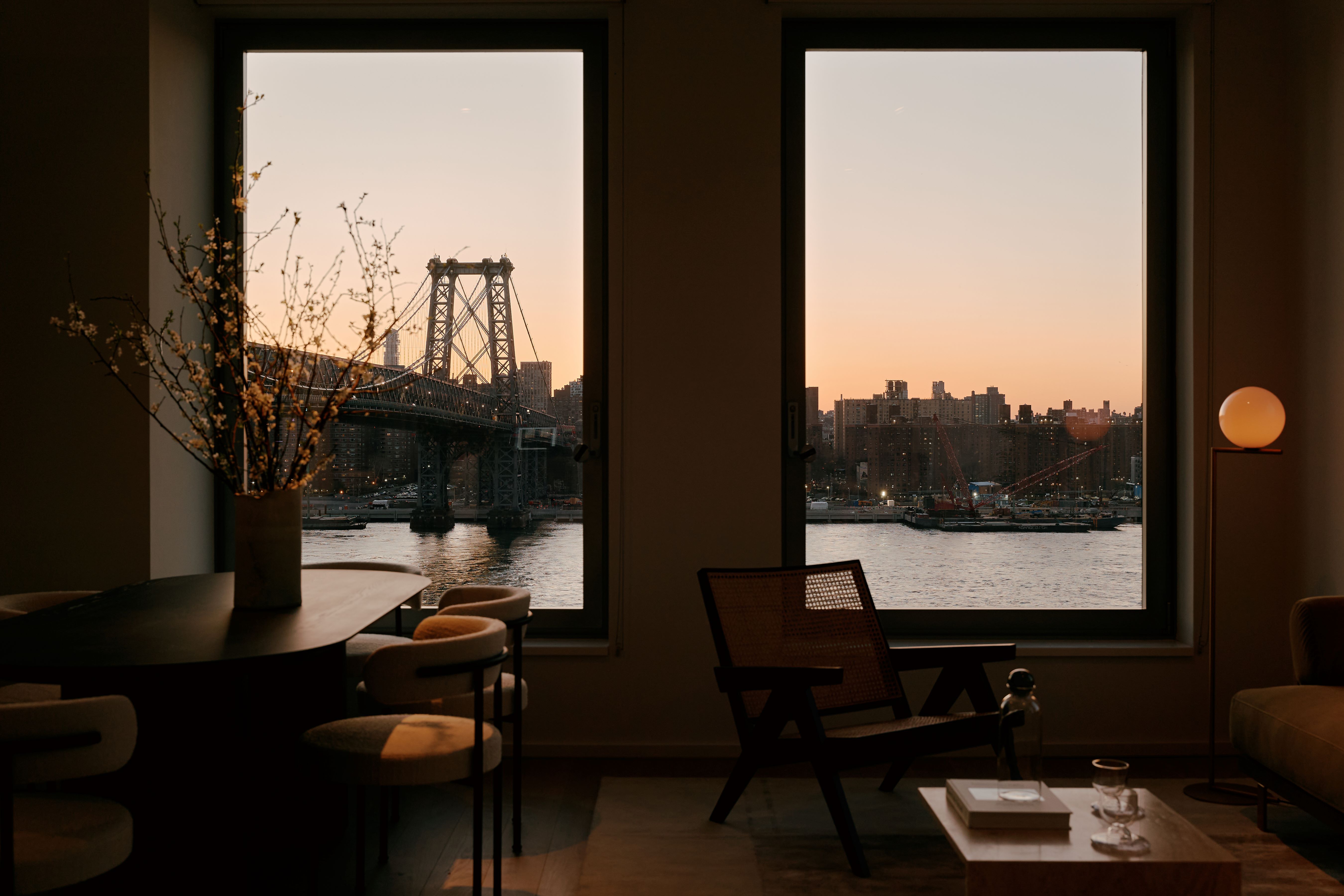
AS: In the apartments, we included tilt-and-turn windows to allow ample daylight to shine into each space and maximise the views of Manhattan and three of the city’s most iconic bridges, allowing the views to become part of the space. We also made sure the amenity spaces, which are colourful exuberant spaces, were connected to the park and surrounding outdoor spaces by incorporating shades of green, blue, yellow, pink, purple and red, creating a cohesive transition from outdoors to indoors, and ensuring the furniture layout of each space emphasised the views.
W*: Are there any details of the building or the interiors that you find are particularly successful?
AS: The porcelain façade is one of the most impressive aspects of the building’s design, and it creates a really beautiful, multicoloured effect as the light changes and reflects on the façade throughout the day. The building’s location right on the river and by the Williamsburg bridge also offers incredible and unique views of Manhattan, from midtown all the way down to the Statue of Liberty. From the enveloping amenity spaces you get close to the bridge in a way you can’t elsewhere – it feels like you can just reach out and touch it which I really love.
W*: What types of projects are you working on at the moment? Are you planning any more large-scale residential projects?
AS: We are lucky to have a range of projects in the office, from residential to institutional. We are looking forward to the opening of the Frick Collection at the end of this year. As our first real skyscraper design, One Domino Square was a real milestone for the office and something I am extremely proud of. I hope we will have more opportunities to design at that scale in the future.
