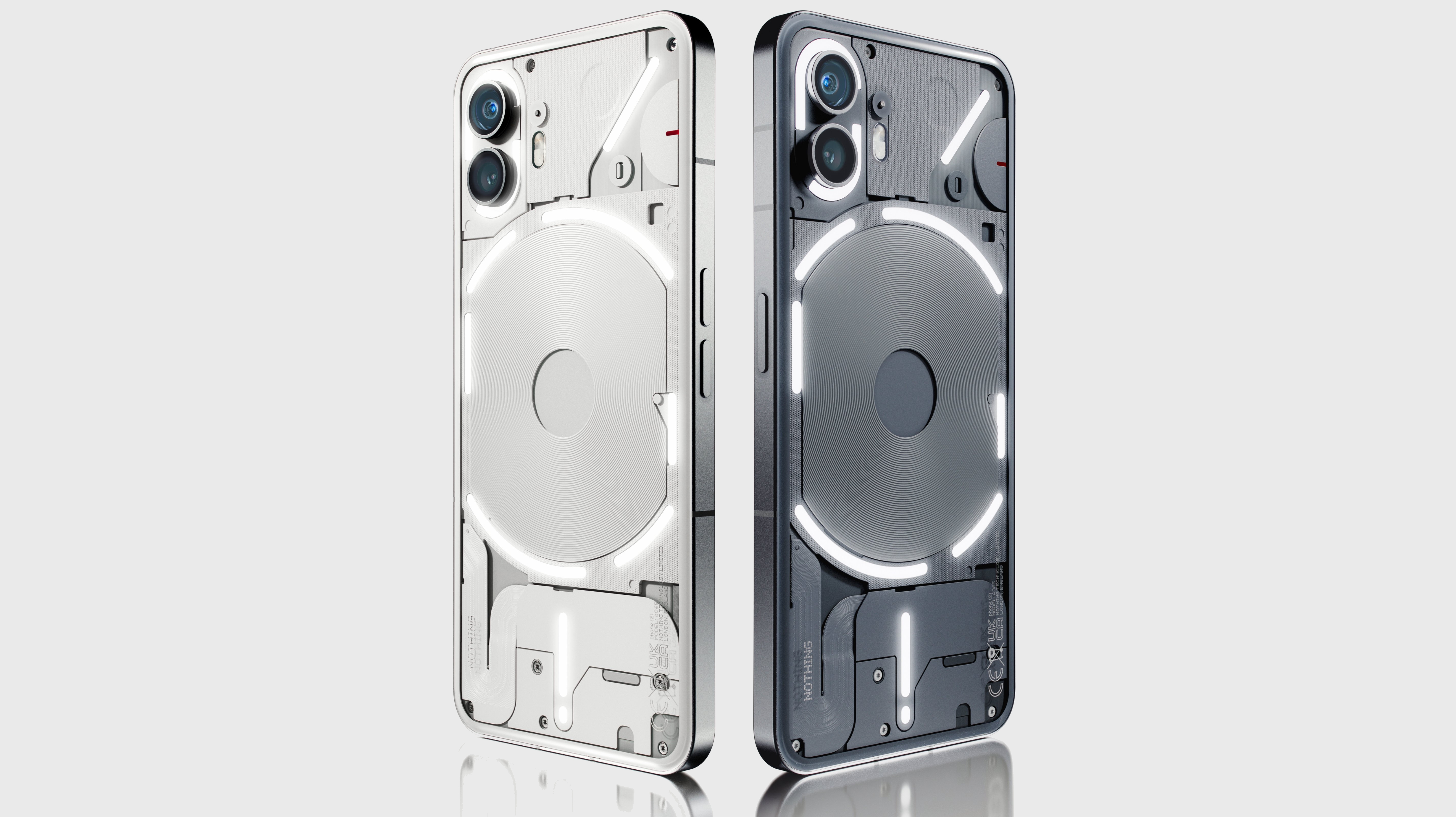
We’re just days away from the July 11 launch of the Nothing Phone 2, but you don’t have to wait until then for a full look at the design of the phone – or of its upgraded Glyph Interface.
YouTuber Marques Brownlee has been allowed to go hands-on with the Nothing Phone 2, and as you can see in his video (embedded below – jump to 12:50 for the Phone 2) it looks an awful lot like the Nothing Phone 1.
We’d seen leaks and partial pictures of the Nothing Phone 2 already, so this doesn’t come as a surprise, especially as the Nothing Phone 1 has such an eye-catching design that it makes sense that Nothing would want to stick with it.
There are some changes though, with Brownlee noting that the glass on the rear is slightly more rounded and that the gray shade used is slightly lighter. Note though that there's also a white model, which you can see at the top of this article and which Nothing shared in a recent tweet.
The main visual changes though are to the LEDs on the back, which are used for the aforementioned Glyph Interface.
For one thing, while the pattern of LEDs looks similar, it has more gaps in it than on the Nothing Phone 1, making for a larger number of distinct light strips, with 11 in total compared to five on the original handset. But within those strips, the Nothing Phone 2 has 33 individual LED lighting zones, which is up from just 12 on the Nothing Phone 1.
More than just a pretty light
That makes the whole Glyph system much more useful than before, because you can now use it as – for example – a volume indicator, with one of the strips lighting up more or less as you increase or decrease the volume.
You can also use one of these light strips to show a timer counting down, and these LEDs might get more useful over time, because third-party apps will be able to interact with them. Already, Uber and Zomato are making use of this feature, but we expect more to be added to that list.
Notifications have also been improved, because where before the back might flash when you got a notification, now you can set important apps to keep reigniting the LEDs for an extended length of time, so you know a notification is still waiting to be addressed.
Finally, there’s the Glyph Composer feature, which lets you craft custom ringtones that also light-up the LEDs in a pattern of your choice. We’ve previously seen this teased on the Nothing Phone 2 by Swedish House Mafia.
Sadly, all the LEDs are still white, so we’ll have to wait until at least the Nothing Phone 3 to add some color into the mix, but this looks to be a big upgrade to a system that was rather limited and arguably a bit of a gimmick on the Nothing Phone 1.
That’s a good thing too, because based on price leaks, this could be a comparatively expensive handset; it might even compete with the likes of the Pixel 7, the Samsung Galaxy S23, and some of the other best phones already out in the market.


