Nothing has confirmed what many were expecting, and even more were hoping: the company’s upcoming Phone (1) will be translucent.
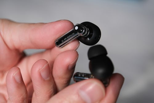
The clear casing of the Ear (1) was one of the design choices that made Nothing’s wireless earbuds stand out from the AirPods of the world, and now in a preview from Wallpaper, Nothing CEO Carl Pei says it’s applying the same see-through aesthetic to its mysterious Android phone.
Seeing inside from outside —
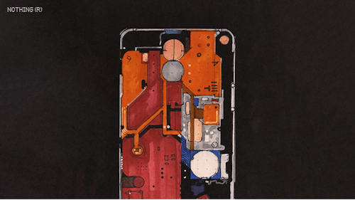
The company hopes to “bring the inside out” by highlighting smartphone components like the camera and wireless charging coil. “There are over 400 components in a smartphone, assembled in layers,” Nothing’s head of design Tim Howard told Wallpaper. “We wanted to celebrate the ‘good ones’, the things we thought were really interesting to emphasize.”

Based off what the company shared, it sounds like that’s required some rethinking of how it lays out the internals of the phone. Nothing specifically references 1970s New York City Subway maps in its explanation, which certainly raises some interesting ideas around colors (imagine color-coordinated components) and the overall “readability” of the back of the Phone (1), an admittedly weird thing to think about with a smartphone.

Glyph —
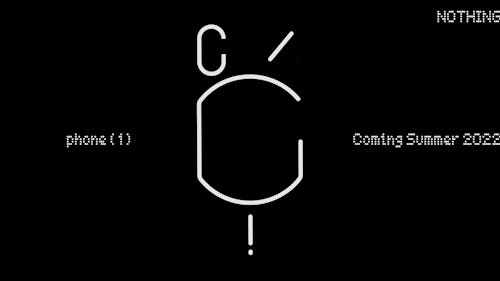
The other thing Nothing’s minor “pulling back of the veil” seems to reveal is that weird symbol it announced its phone with is almost certainly an outline of the components it’s “celebrating” through the translucent back.
That loop in the top left corner is the camera, and the shapes in the middle are wireless charging coils or magnets if I had to make an educated guess.
Drip feed —
Beyond that, the Phone (1) information trickle continues. The company is still favorably comparing itself to Apple — for example, it’s also using recycled aluminum in its phone — and harping on the design thinking behind everything.
Like I noted when I looked at Nothing’s custom launcher for Phone (1), Nothing OS, the company still isn’t giving us a lot to go on. The more Nothing shares, the less its whole plan feels like smoke and mirrors, but really, we just need to see that phone. And I guess we’ll be seeing a lot more of it now that we know it’s at least partially see-through.


